This month we’ve been talking about how we welcome a new year. Dani shared with us how she is handling the transition out of an old year and into a new in her post New Year – Wrap Up and Refresh!
Alison shared her thought process as she sets her intentions for the coming year in her post
New Year, New Intentions, New Outlook?
I am going to share with you how I am refreshing my style with a new color palate.
I have been a stamper for as long as I can remember and for the past 22 years my supplies have been made up primarily of Close To My Heart inks and cardstock. Working with those colors for 2 decades I have become VERY comfortable with them. I know which colors work together and which are my favorites, but lately I’ve been feeling like I wanted to break out into something new.
Enter The Scrap Smarter Experience last summer where I discovered Catherine Pooler Designs. I’ve slowly been adding new ink colors to my collection. As I add the colors I have been creating ink swatch cards showing each ink color both stamped, and direct to paper. I’ve placed them on a ring to enable me to pull forward different cards to view custom color combinations.

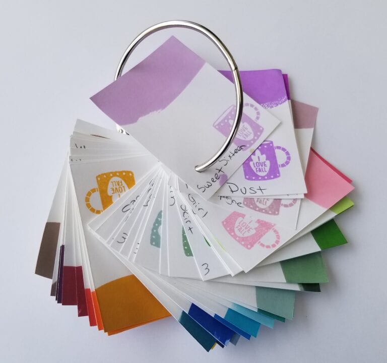
I chose a set of supplies I wanted to work with then pulled out my trusty ring to see which ink colors best coordinate with the paper I selected.
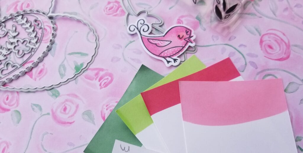
I decided on Seafoam, Garden Party, Party Dress and It’s A Girl.
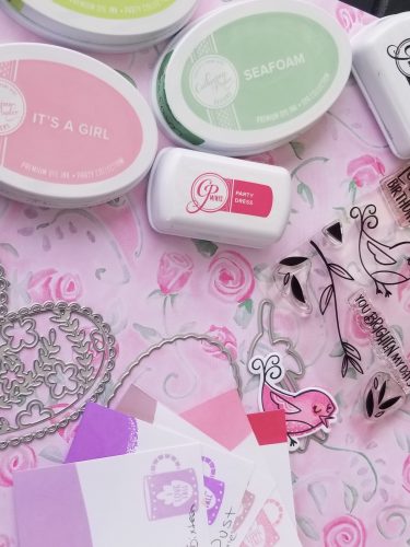
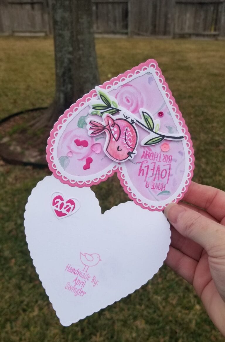
I wanted to create a shaped card base so I first scored my white cardstock and folded it in half and positioned my largest die slightly outside of the fold line so that part of the fold would not be cut, keeping the two cuts attached at the fold as shown
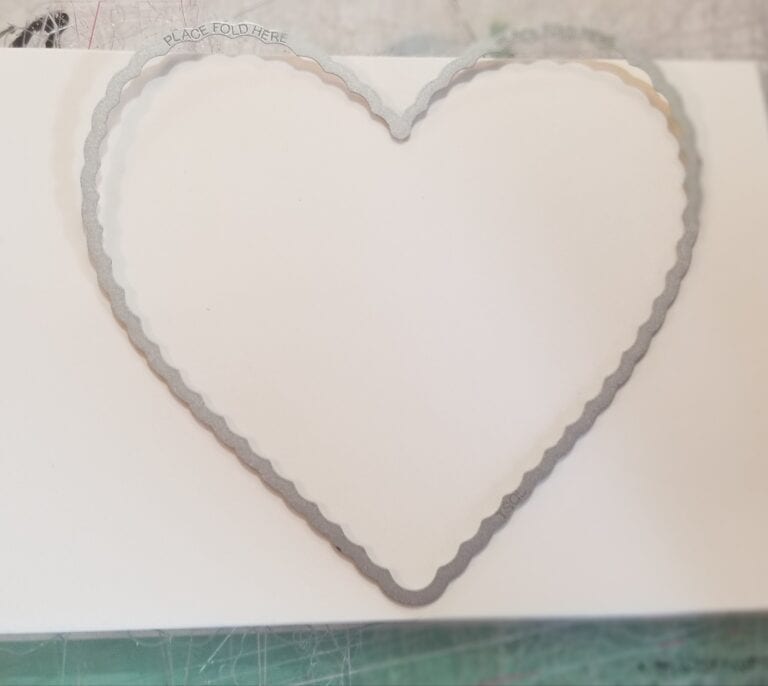
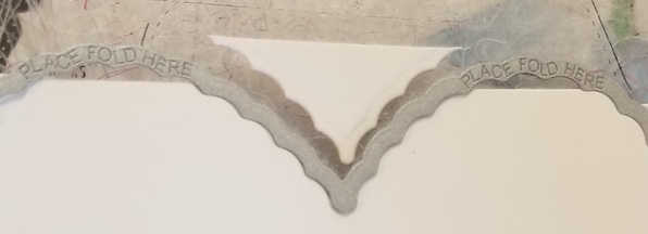

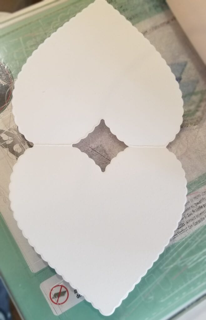
You may notice that the heart shape at the top of the card is incomplete because of the fold. This is easily remedied by cutting another layer with the same die and adhering it over the top of the card base, then you have a perfectly shaped folded card.
I stamped the bird image in Catherine Pooleer Midnight Ink I used the stamps to color the bird inking the stamp with the lightest shade of pink and adding dark pink to strategic areas of the stamp with a sponge dauber. I added additional shading using a blending pen to pick up ink from the lid of the darker pink ink pad. I assembled my card using foam tape to add some dimension then embellished it with sequins musical notes and hearts.
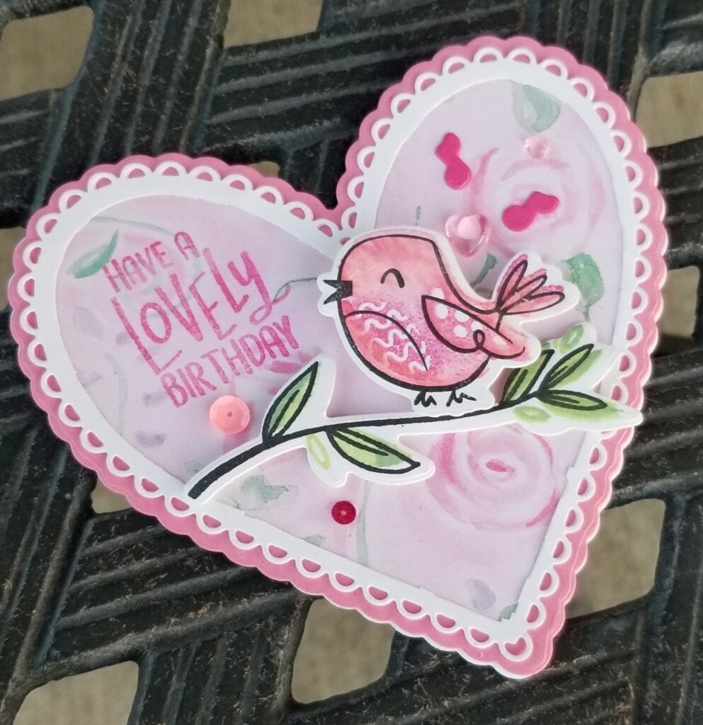
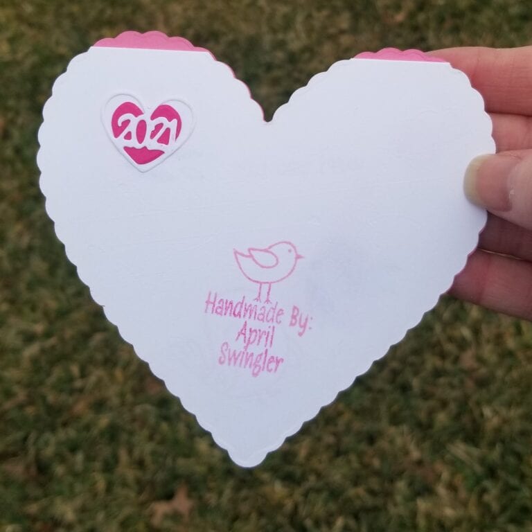
On the back of the card I used my custom stamp and added the year with a freebie die from The Stamps of Life January Die Hard Club shipment.
Supplies Used
- Scallop Heart Fold-It The Stamps of Life
- Lovely Birdies Stamps and Matching Dies Catherine Pooler
- Patterned Paper SONBURN Incorporated- Roses.
- Craft Medley Cup Sequins 7mm – Princess
- Heart Jelly Drops – Double Bubble Mix – Trinity Stamps
- Ink Colors Catherine Pooler – Party Dress, It’s A Girl, Seafoam, Garden Party, Midnight
- Tombow Blending Pen
- Metal Looseleaf Rings Binder Keyrings 3.5″
- Microtip Scissors Nonstick – Close To My Heart
- Art Glitter Glue
- Garden Friends Stamps and matching dies (musical notes) – Hello Bluebird
- Cardstock Guava The Stamps of Life
- Pink Cardstock – Unknown
- Astrobrights Cardstock – White (I use inexpensive office supply cardstock for card bases)
- Custom Stamp The Stamps Of Life
- Paper Trimmer Stampin Up
Additional Resource
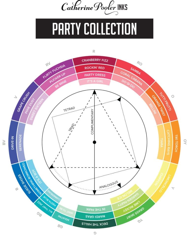
I would like to share with you this wonderful color wheel that Catherine Pooler has just released of all their Party Collection inks. You can download a PDF of the Color Wheel HERE
Below is a display image of what it looks like.
