It’s not easy being green. So sings Kermit the Frog in his iconic song. And he equates green with ordinary. The song laments how much attention brightly colored flowers get. And yet he goes on to remind us how beautiful green can be. So let’s set aside all the admiration forthose red and yellow flowers and take a moment to focus on their green co-stars: foliage. Along the way I hope to get you thinking creatively about using color and texture in your projects.
So lets start right off with the project that I made for this post and we will talk about all the thoughts that went into creating this layout.
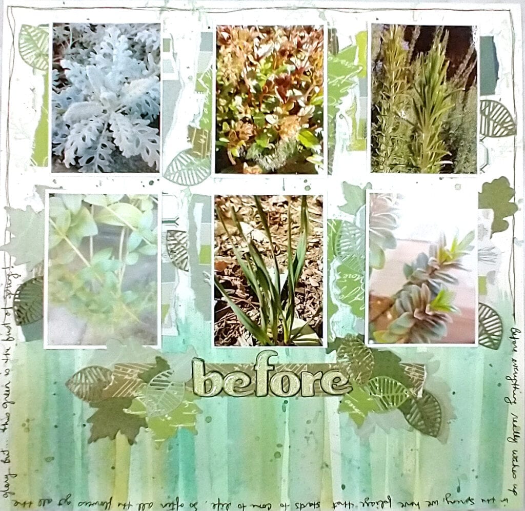
Take aways...
As you read this post I want you to think about these take away points.
- Monochromatic layouts can be interesting if you vary the textures and shades.
- I used technique of ink lifting and multi-generation stamping to create a background.
- I was inspired by the textures in nature, like the linear overlapping lines of grass.
- Leaves can be the star and not just the side-kick. Use punches and dies to add foliage.
- Paper tearing mimics natures imperfections.
- Play with the macro setting on your phone camera.
- Have an alphabet in your stash that you just aren’t sure what to do with? Feature it’s color and use it up.
- Not enough definition between layers? Add a pen border.
- Hold it all in with a big border and journal there.
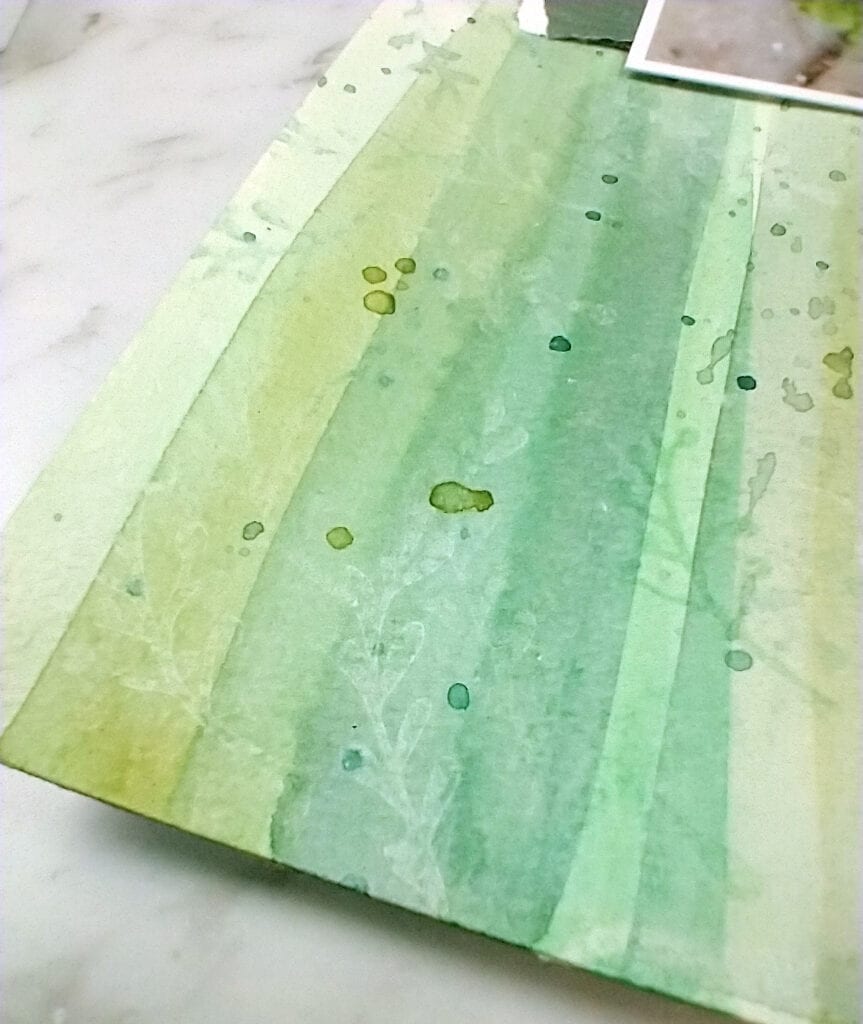
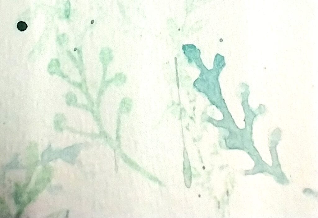
I used watercolor and stamping to create my background paper. Using mixes of greens I swiped paint upwards from the bottom of the page with a wide flat brush, overlapping colors as I went. I only painted halfway up the page to leave more white space at the top for additional interest. When the paint was dry I used a foliage stamp dipped in clean water and stamped over the watercolor. This reactivates the color and it can be lifted away with a paper towel. While I had my stamps out I stamped in green ink multiple times without reinking my stamp. This is called multigenerational stamping and it gives you varying color and texture without much effort. For even more texture I dipped my stamp in a puddle of watercolor paint and stamped with that as well. You can see the difference in texture on the right photo of stamping with ink versus stamping with paint. Don’t forget to top it all off with some spatters. All of these techniques add subtle details to the overall layout.
Next I turned to adding lots of little layers of paper. Punches, die cuts and paper tearing gave me bits to layer under and around my photos and title block. The torn paper reminds me of leaves damaged by sun, bugs and disease. I embraced those natural imperfections as beautiful!
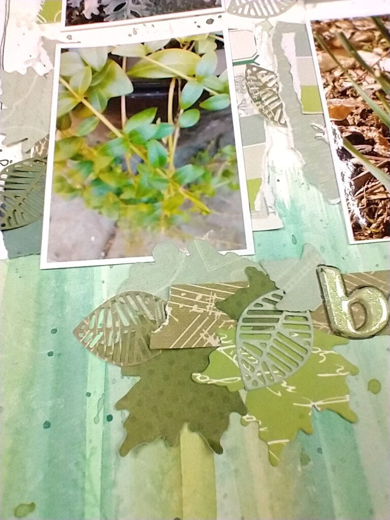
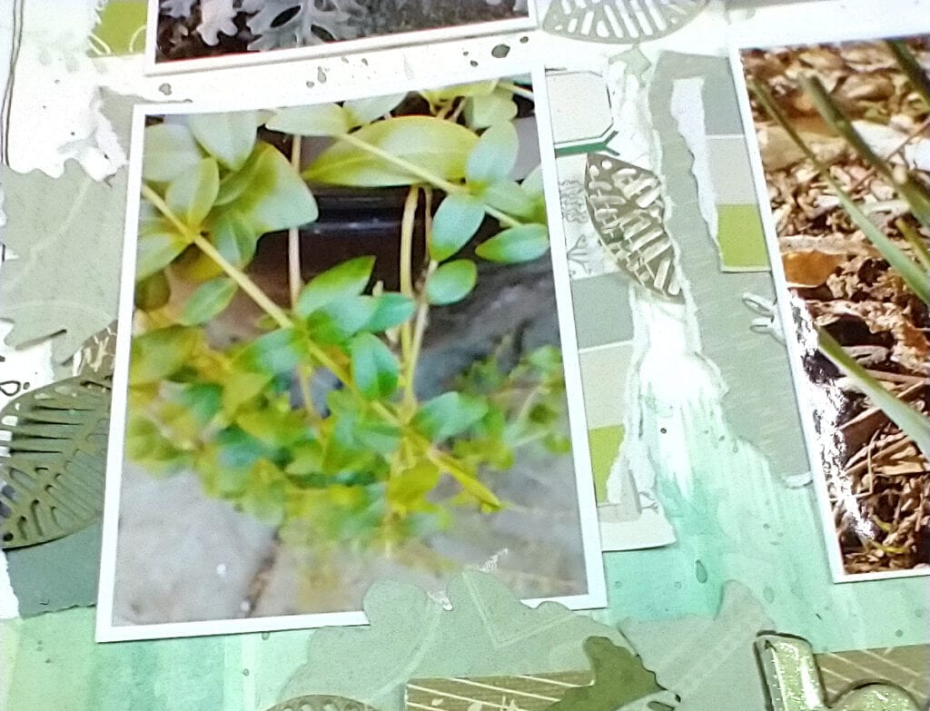
Photos can add their own texture as well. Have you ever played with the macro setting on your camera? It is usually a little flower icon in the camera settings. This allows you to get really close to a subject and it will keep that subject in focus while blurring the background. I used that tip here in photographing a cascade of leaves. The leaves at the top of the photo are in focus while the cascade blurs away.
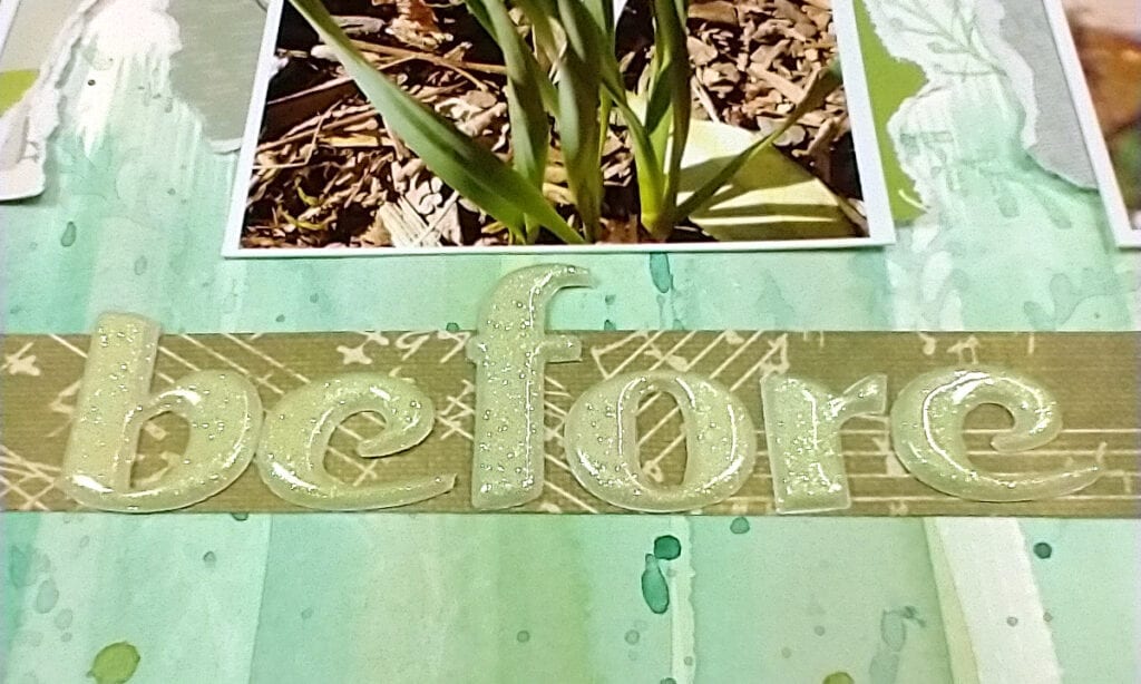
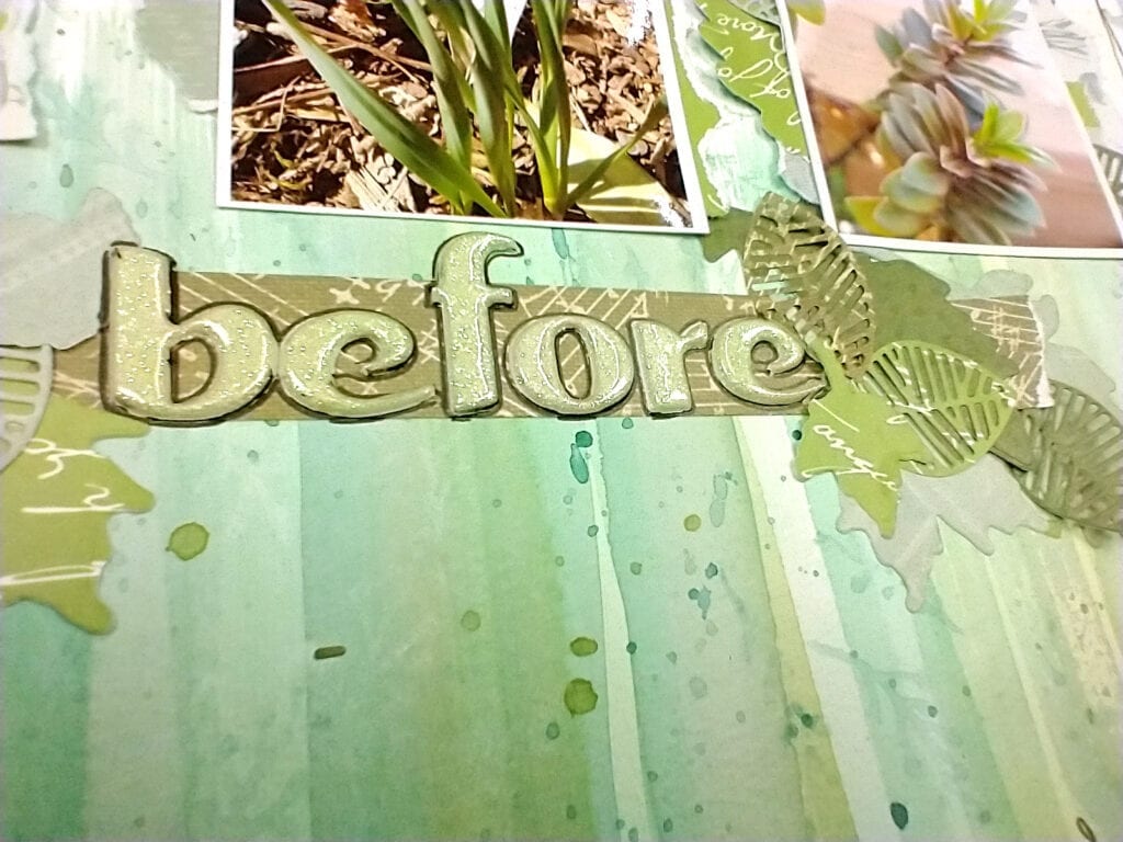
My title block came next. I’ve had this green glittery alphabet in my stash for years. I never imagined I would use it. — But I realized that this alphabet was an opportunity for a new scrappy tip. In the future I could take a “hard to use” item and work a monochromatic layout around that item! — I put my alpha down and something wasn’t quite working. While monochromatic is great, definition and detail are needed. The alpha was blending into the page too much. So I simply outlined it with a black gel pen and that helped it pop by giving it another “layer”. Easy peasy and something I do often.
The final detail was my journaling. I didn’t want a journaling block to throw off the monochromatic balance so I built my journaling into a border around the edge of the page. I love this technique! I actually mixed it up with a doodled border as well since I didn’t have enough words to make it all the way around the edge of the page.
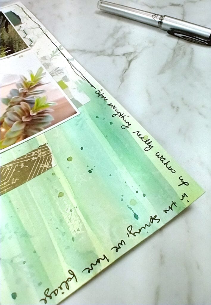
I used my monochromatic layout to feature plants in my garden before they go into bloom. It is a story of anticipation for which green works perfectly. But you can go green on camping layouts, kids or pets playing on the lawn, holidays like Christmas or St. Patricks Day, and so much more. What will you use green for?
I hope this post inspired you to see things in a new and verdant way. And as always if you create and share a project based on this post use the hashtag #scraphappy and we can check out your work.
Supplies:
- Ink: Concord & 9th, Sea Glass
- Stamp: Altenew, Beautiful Inside set (foliage only)
- Watercolors: Winsor & Newton
- Paint brush: Royal & Langnickel
- Leaf dies: discontinued (Simon Says Stamp; Studio Calico)
(PS: If you enjoy layout process videos you can watch me create this layout on my YouTube channel.)
