
Pools, Oceans, Rivers, Lakes? What’s Your Pleasure?
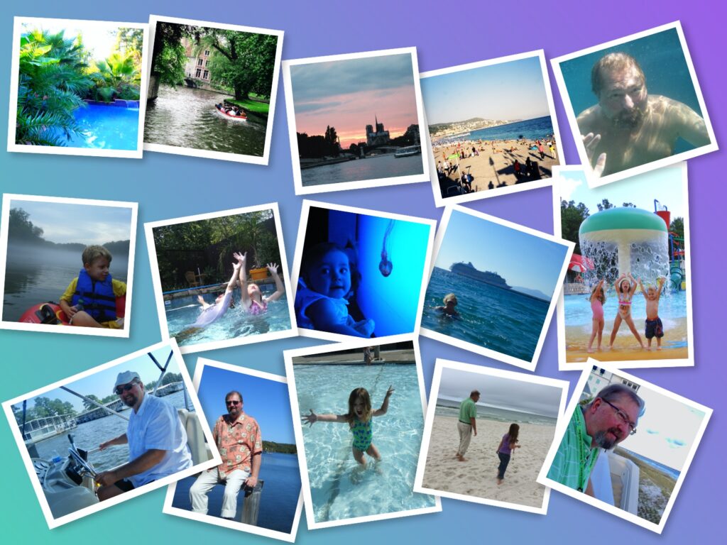
Last month I wrote about the outdoors and yes, lots of my association with the word “outdoors” (as indicated in my blog post photos and so many of my scrapbook pages) is also tied in with this month’s theme of “water”. Like so many others I’m drawn to water for its serenity and cooling effects. But it’s more than that — and that’s what makes it so appealing to scrap. Even if your jam isn’t jumping in and splashing about, I’m guessing that you’ve scrapped more than one photo that depicts just LOOKING at it!
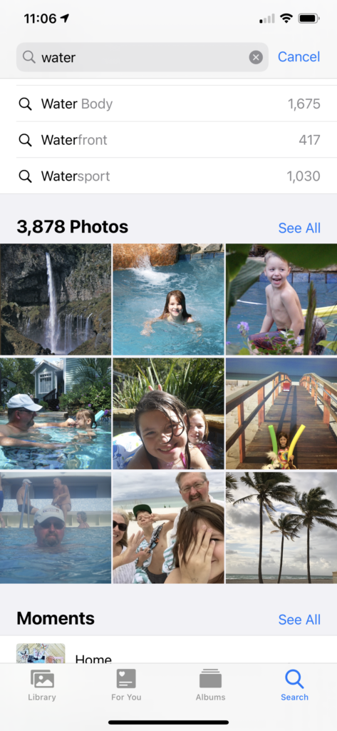
When I set out to find photos to illustrate this post I did a quick search in my phone’s photo library — just typed the word “water” — and as you’ll note my trusty little phone located 3,878 photos with what its image recognition software identified as water. I happen to know that there are many, many more — for example, it didn’t find all the hundreds of scrapbook page photos about water! My life and those of my family members could be told entirely in stories about and near and involving water!
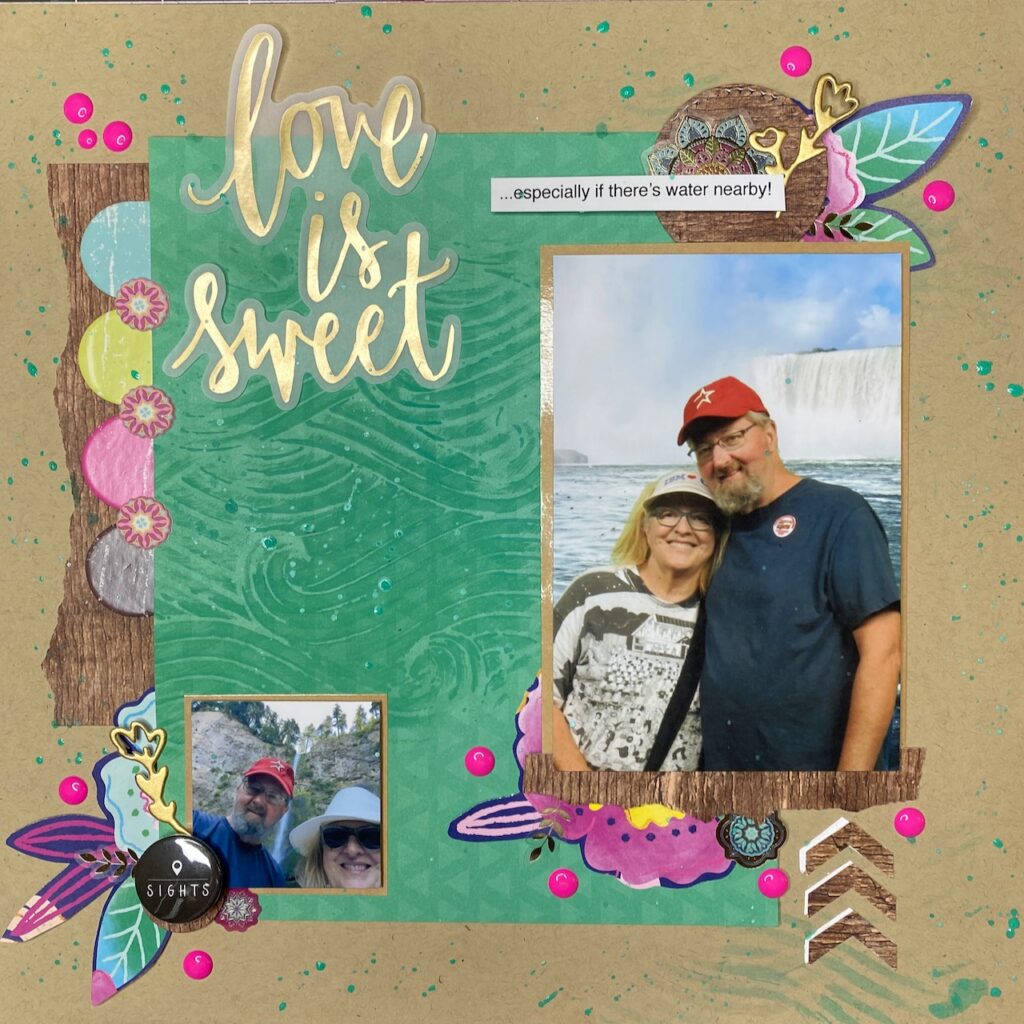
Whether it’s about celebrating the 20th anniversary of our first date taking in the sights on one of the canals in Bruges or getting our first glimpse of Notre Dame as we floated on the Seine or celebrating our 30th motoring around Lake Blackshear here in Georgia, SO many of our special moments have been associated with water. And SO many of them have found their way onto my scrapbook pages — challenging me to find new and interesting ways to depict or suggest or use water in scrapping watery memories.
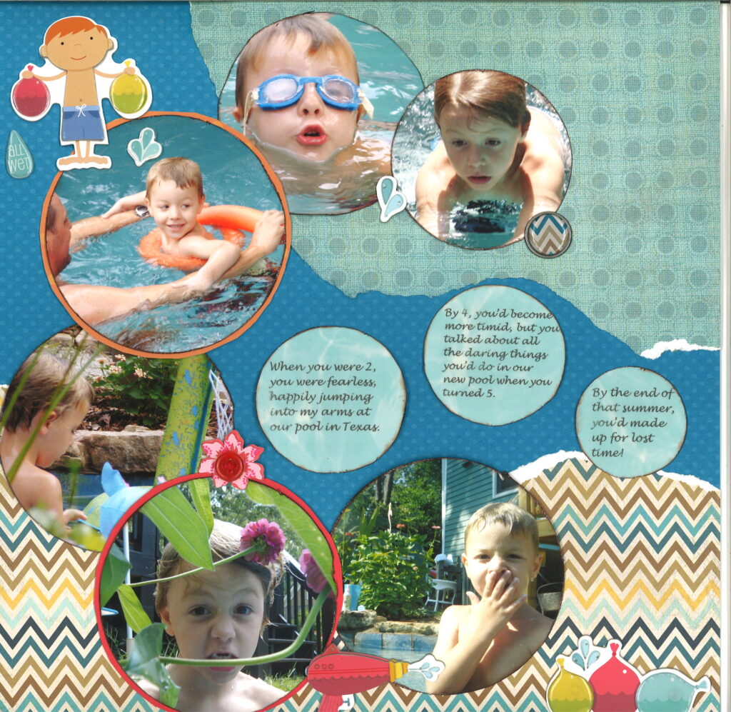
Lots of watery photos? Turn ’em into bubbles!
The two-page spread above should illustrate two things: 1) I didn’t quite understand the concept of “spreads” and 2) I really really really wanted to reinforce that “splash” theme with lots of bubbles (including not only the round photos but the clear bling I superimposed atop the actual splash droplets in the 12×12 photo that’s the background of the second page! And maybe you also notice I was determined to use those cute stickers whether they enhanced the design or not! And that palm is the first image I cut with my brand new Circuit!
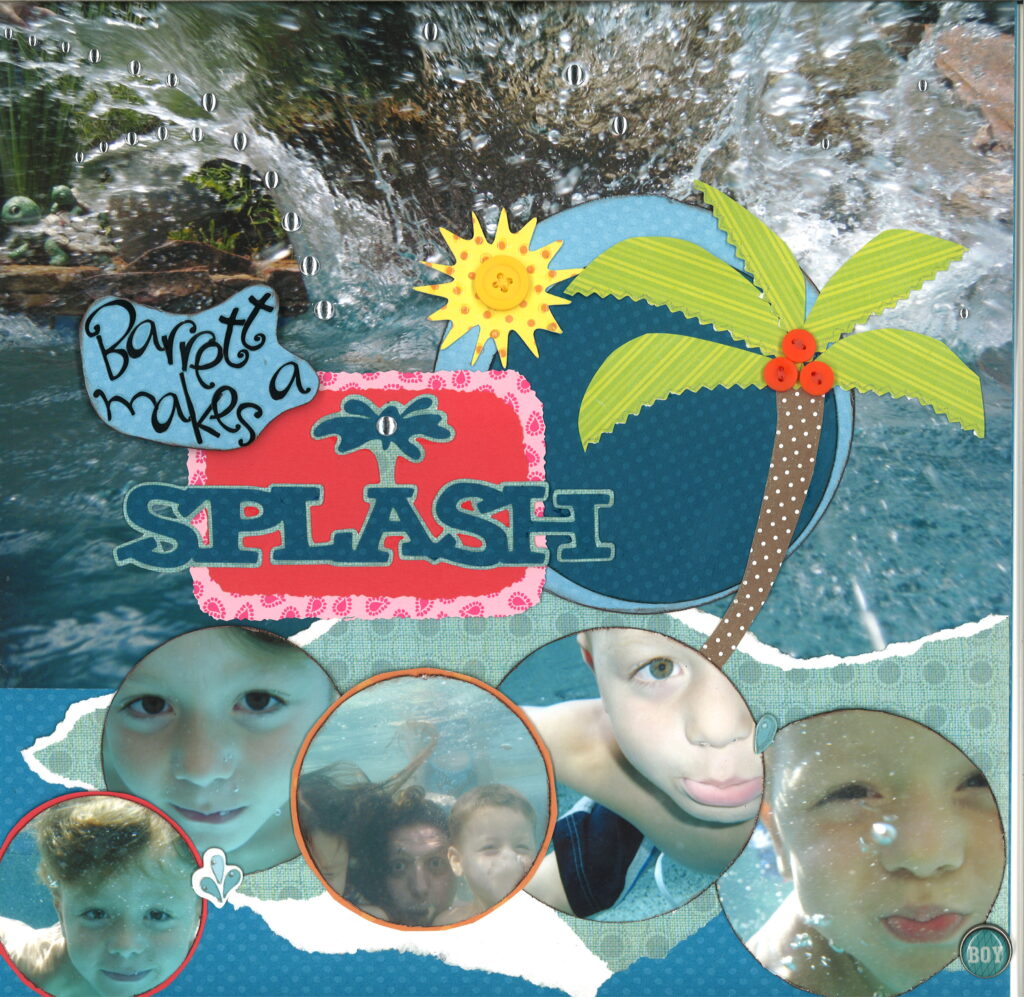
Pardon me while I take this opportunity to brag….
Way back in the dark ages before I had any human or imaginary scrappy friends (other than those I lifted from the pages of magazines) I posted these two pages in the Scrapbook-dot-com gallery because I was really happy with them. Years and years later I was approached by Scrapbook-dot-com for permission to use these very pages in a featured blog post on scrapbooking — wait for it — WATER!
More WATER through the (p)ages…..
W. A. T. E. R. W. A. Y. S.
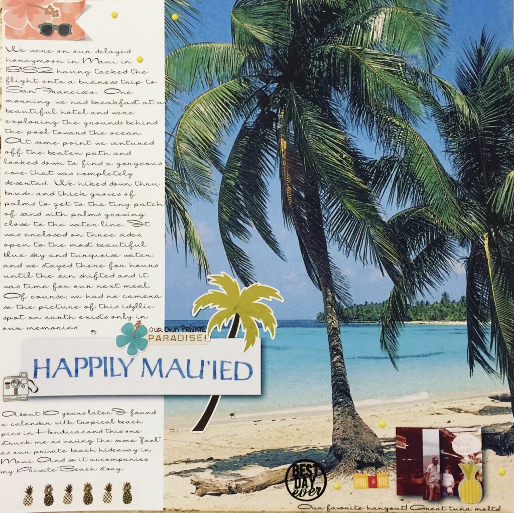
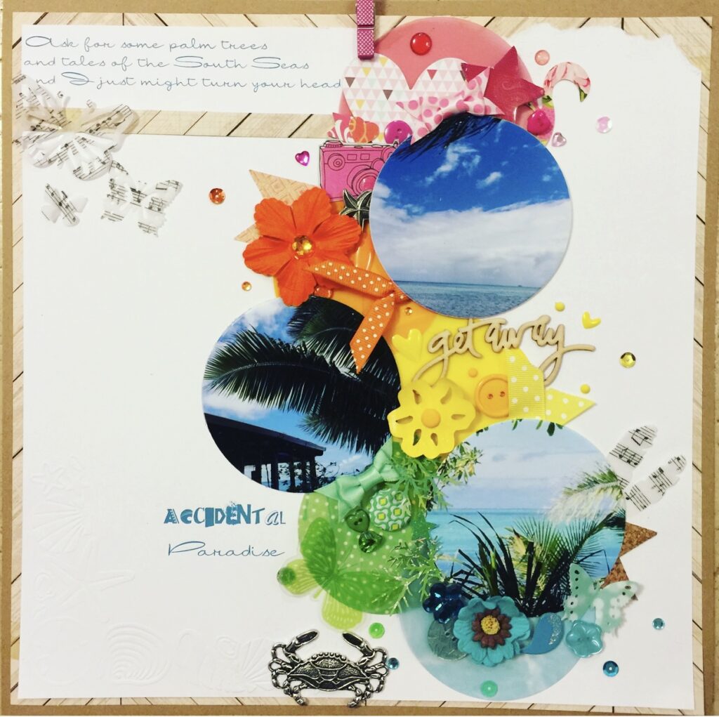
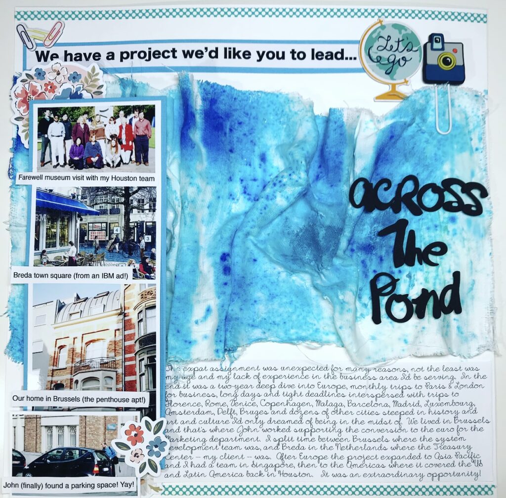
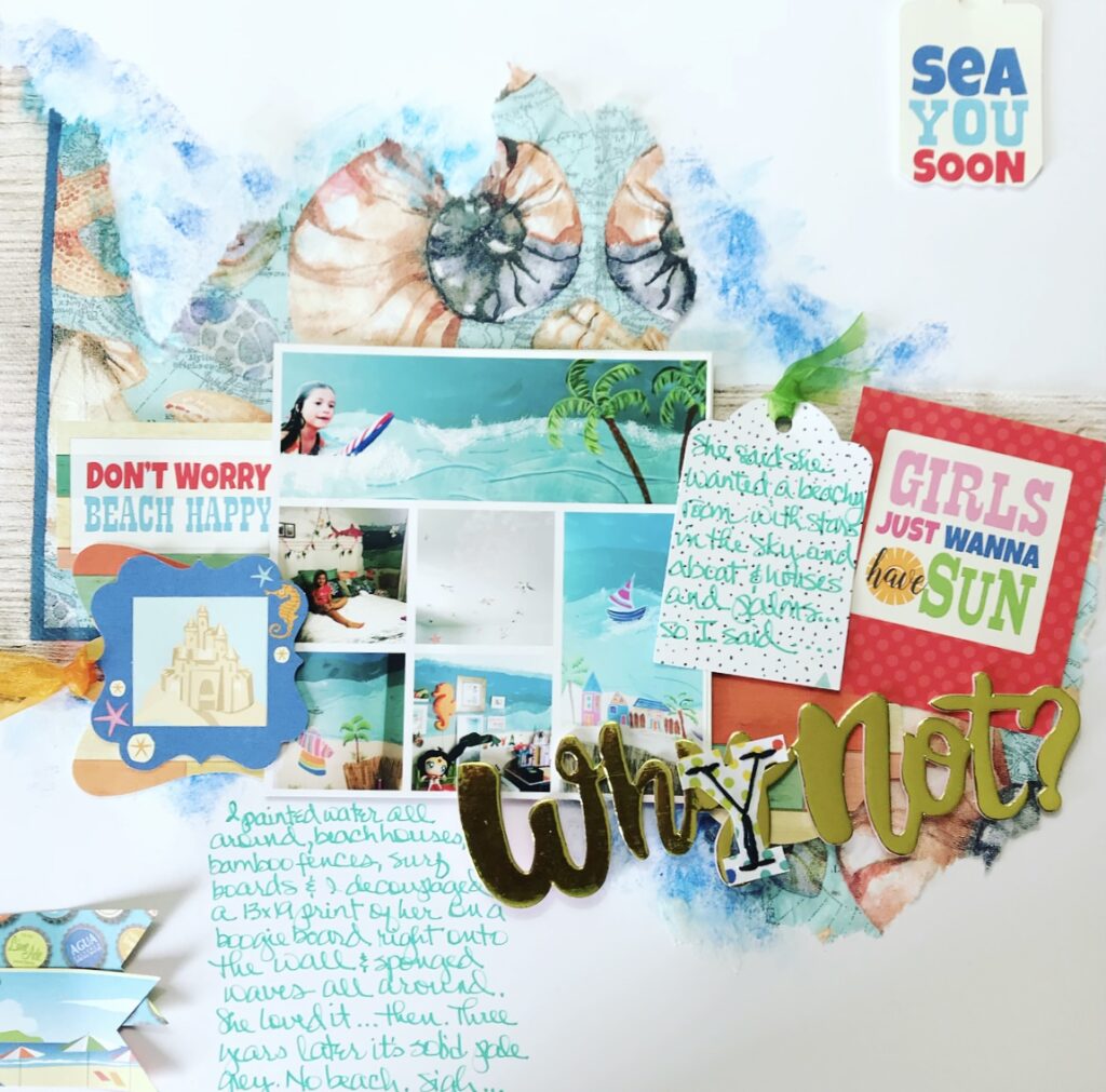
Over the years I’ve scrapped lots of pages that depicted water and I managed to find a few that made me laugh. The Happily Mau’ied page was for Calvinball a few years back and it has a large photo of the PLACE I’m writing about (though not one I took!) and a very small photo that is spliced pics that John and I took of each other in Maui in 1982. So in other words, the only water on this page was in a stolen photo that I printed 12×12! The second is another where I reinforced the water theme with circular photos among circular elements in contrasting colors to actually enhance the watery blues. This must’ve been a Calvinball page as well because how else could I explain three vellum sheet music butterflies? The third wasn’t about water at all, at least in the sense that the story wasn’t to do with water except that it took place “across the pond”. Khristina Sorge had sent me a cut of really interesting-looking gauze and challenged me to “do something with it” and I mixed up some Ken Oliver Colorburst powder and texture paste and mooshed the gauze into it and tried shaping it like the surface of a vast ocean (you can’t tell that, can you??) but in the end I had to rely on the title and the journaling to convey the “ocean” part! The last one is all about the body of water that John and I painted on Ava’s bedroom walls! There’s a collage of photos of the actual walls and ceiling but the “mixed media” behind the photo is a wet, torn dinner napkin laid on top of a bit of watercolor splotchiness and then brushed with matte medium to glue it down. I had so much fun painting those waves and palm trees and sailboats in her room! I wanted to move in myself! And it was fun scrapping about it even after the walls were white again.
Filtered Water
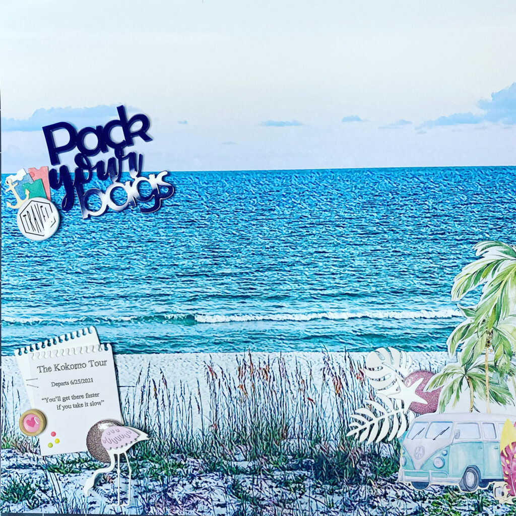
So here’s a more recent page that will help me make a bit of a transition to how I like to play with water these days. First, when I have a great photo like this one taken at our last Margaritaville stay, I could just let it stand on its own and print it huge and add a few embellishments and a bit of a story. OR if I really love the embellishments (like the fussycut scene on the right from a 6×6 pad of P13 Papers “Summer Vibes” line) I might go to the Prisma app on my phone and try various filters until I get the right “feel”. I tried several until the water color matched the VW bus and the sea oats had some pinks in them like the pattern on the surfboard. I think I settled on the “Airport” filter in the app. This filter left the photo looking fairly realistic but with a hint of a hand-drawn feel about it. In my original photo the transition from water to sky was pretty grey but the filter added a bit of aqua to the water and lavender to the sky so it wasn’t somber at all. Another side note: this page will be the cover photo of my 12×12 album about our upcoming Celebration of Life Tour to some of John’s favorite places. And yes, water will be involved in all tour stops: Pensacola Beach, Kemah Waterfront at Galveston Bay, Galveston Beach, The Woodlands Waterway and the Guadalupe River in Gruene!
Reflections
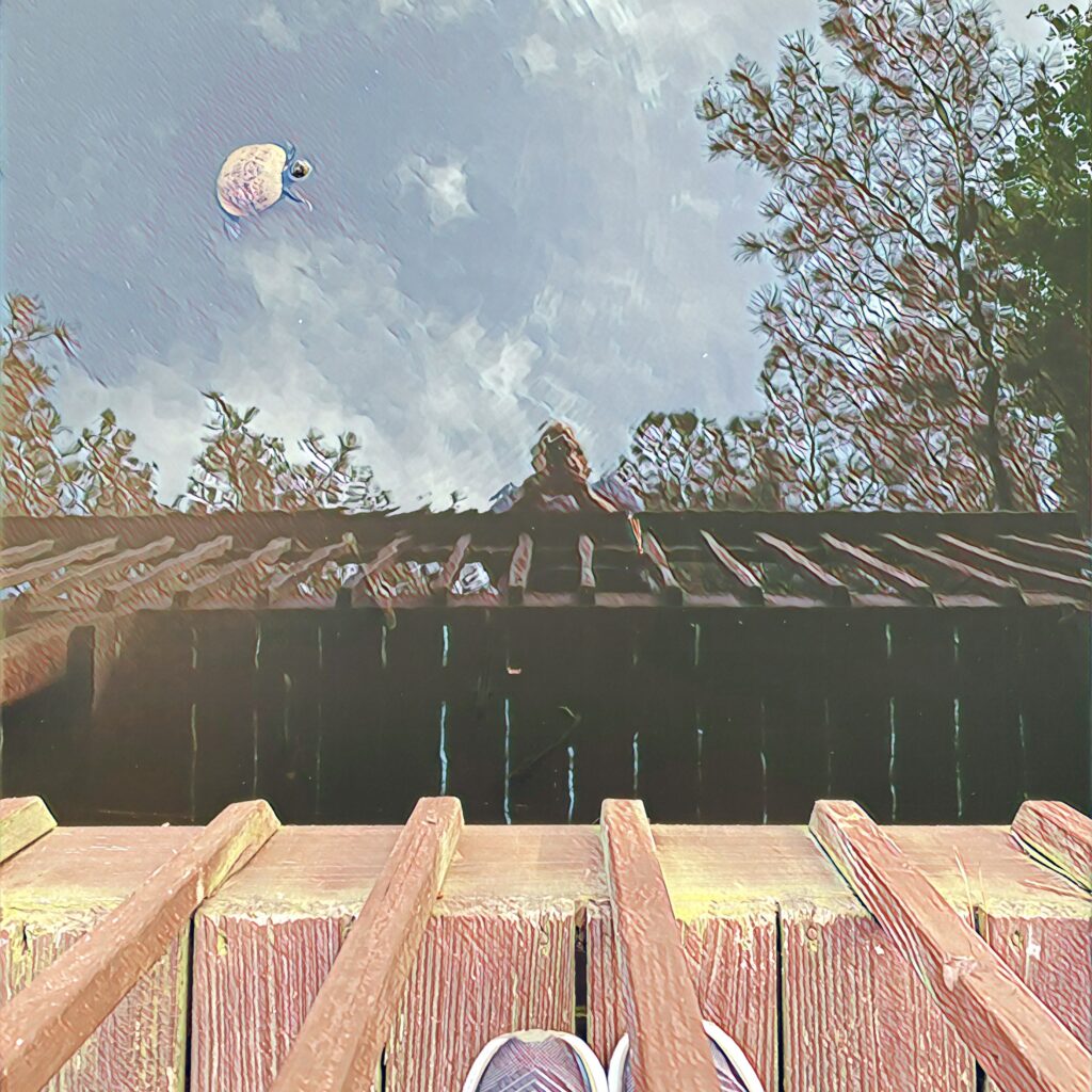
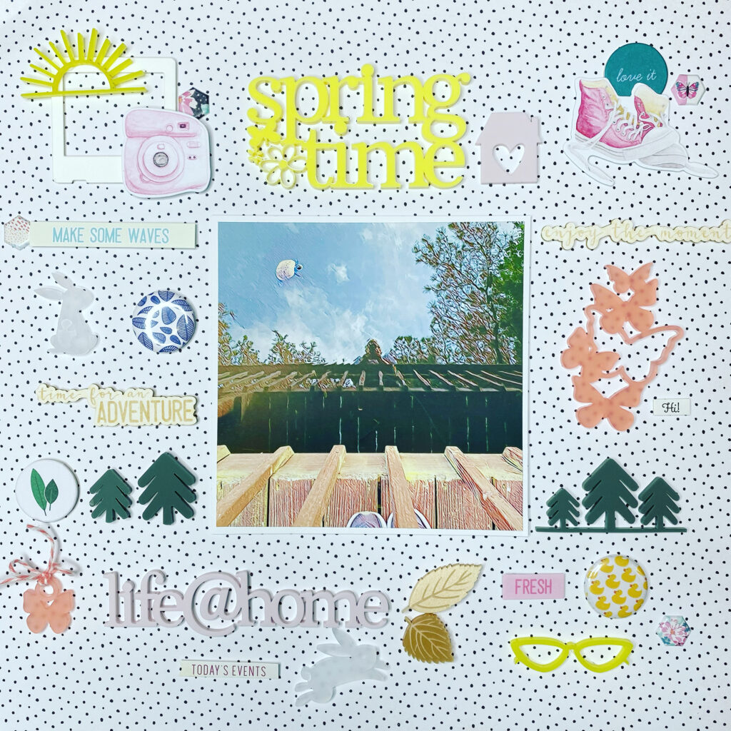
Even close to home, on my walks around the neighborhood, I’m drawn to water. There’s a tiny lake meant to enhance the backyard appeal of homes built on the rolling hills cut into woods that once stretched all the way to the Chattahoochee River a mile or so away. I often take a break near the end of my walk, sitting on a bench on the little dock, and before long turtles appear, soon followed by ducks (or geese as someone has suggested they might be….). I snapped this photo because I recognized this crusty old turtle whose shell is covered with “gunk” and at the time I didn’t realize how much it looked like the turtle is swimming among the clouds in the sky. So I became fascinated by the reflection depicted here and started looking at other photos I’d taken that day — and at others I’d taken over the years. Because this is something John and I have done together since we moved here 10 years ago, it does bring back memories and a bit of sadness. But mostly, the calm ripples in the water as the turtles and ducks silently move through it impart of nice bit of serenity and calm and I love it.
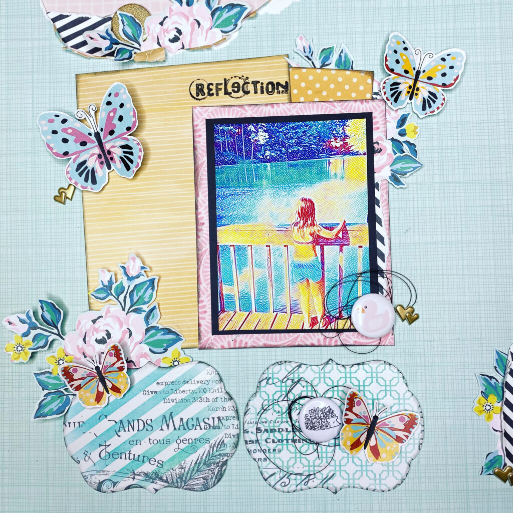
The photo on this recent layout is from 2013 when we visited the same dock with Ava as we were walking home from the pool. She loved the “duckies” and the “turturs” and always wanted to check that they were there. I filtered the photo (again to match the supplies I was planning to use!) with the “Paper Petals” filter in the Prisma app on my phone.
So what’s all this talk about FILTERING?
I’ve shown several examples of filters I’ve used recently and I’m often asked about them. I’m by no means an expert but I do love trying filters, especially on photos of water. Not all filters are appropriate for “people” photos but I LOVE using them for watery pics! I have shown a couple examples of the Prisma app filters — there are hundreds and I’m a subscriber so I can get all of them but even the free version gives you lots of usable choices and a daily featured filter. By far my most used filter with watery photos is Waterlogue which turns any photo into a watercolor painting.
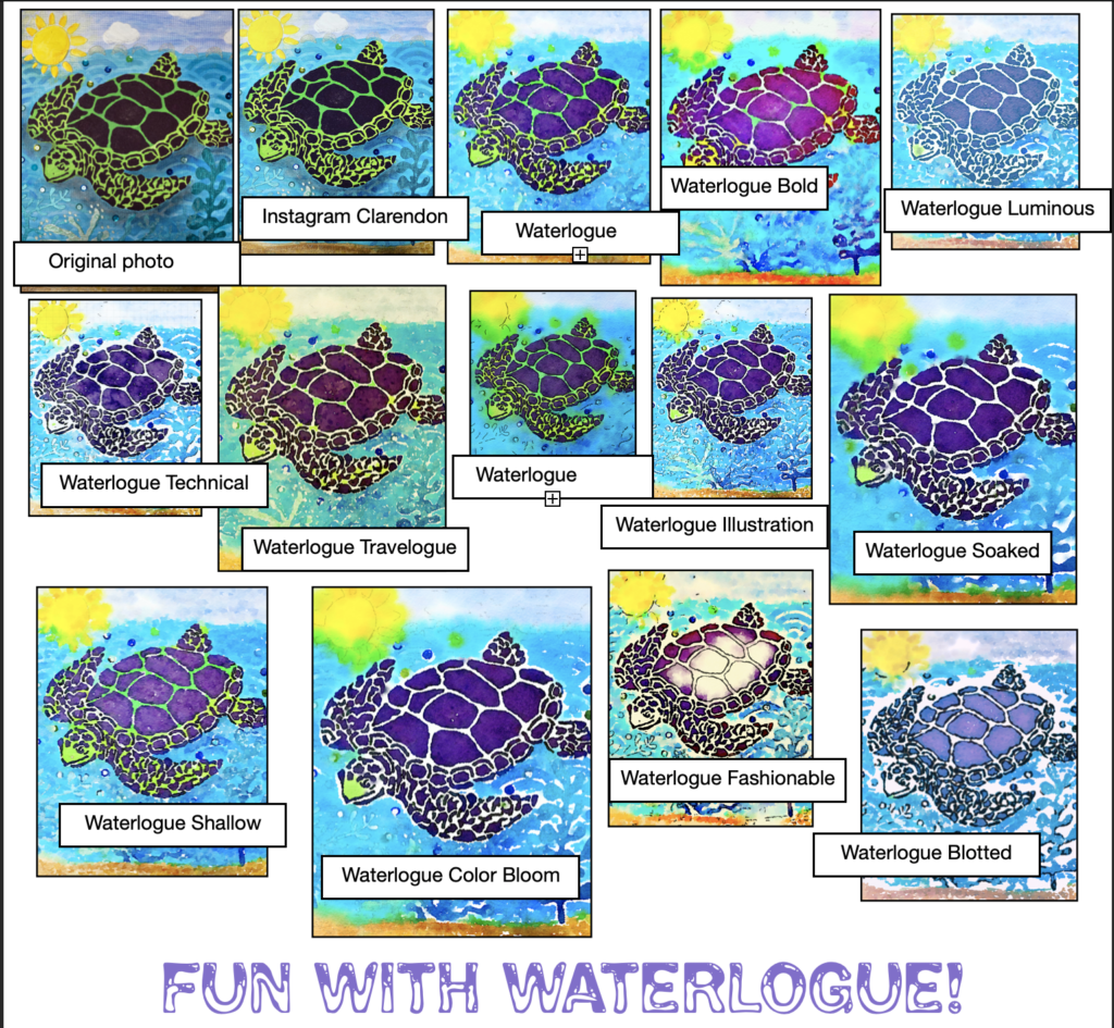
I usually start by running my photos through the Clarendon filter on Instagram to make the whites whiter and the colors pop. Sometimes it fades the colors and then I use LoFi which also whitens the whites but adds a touch of black point to the colors so they aren’t washed out. In the collage above you’ll see I started with a natural light photo of a canvas mixed media piece that I’d made using stencils and pastes and paints and glitter and sequins to make “water”. The Clarendon filter definitely brightened it and that got it ready for all the other filters shown. I used this as an example of how the various filters picked up on details in the “watery” part of the canvas giving each rendition a unique look and varying both color tones and sharpness to different degrees. You can imagine the fun you can have with a beach sunrise or sunset photo, for example, especially if the reflection shows on the water. I often use a filtered photo as background for a smaller, sharper print of the original photo, just for effect. It’s almost like “mixed media” on your photos without any mess!
And now for some ACTUAL mixed media…..
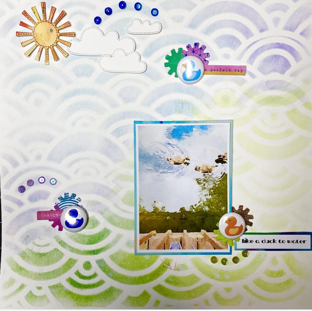
I used the same 12×12 “wavy” stencil from Redefined Kreative for both these layouts but on different types of paper and with different mediums. On the left I started with a gorgeous ombre paper from Cocoa Vanilla Studios and simply brushed clear gesso across the stencil lightly to create just a different sheen on the gesso’d parts rather than changing colors or textures. Here’s a link to the process video if you’d like to see how it came together: https://youtu.be/z4n-32u_4j8. The second layout was created especially for this blog post, and as you can see it uses one of the photos from my visit to the neighborhood ducks and turtles, this time filtered with Waterlogue instead of Prisma. I used two “blue-ish” and two “green-ish” Distress Oxide inks, brushing the blues thru first, then turning the stencil over and brushing the greens thru, somewhat mimicking the reflected sky and trees & underside of the dock in the photo. One of the ducks appears to be swimming in the “sky” so I used a duck flair up in the sky as well! I made an exclusive video of this process that will be available only for visitors to this blog for a few weeks before going public: https://youtu.be/DhK4zQsxJgI If you have any questions about either of these techniques for suggesting water on your layouts, please feel free to ask!
One last watery page…..
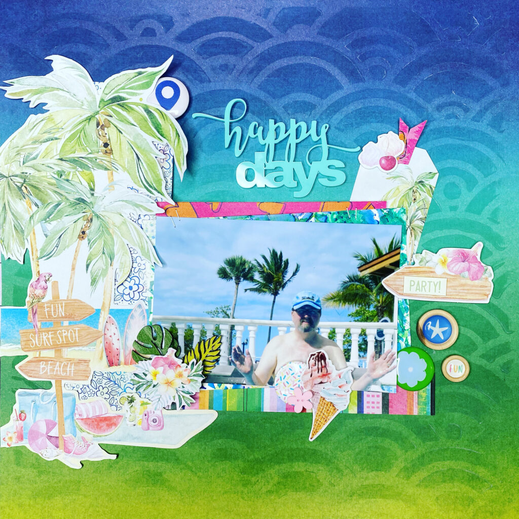
The video for this page goes live today as part of my series called Challenge Accepted! with Shannon Allor. For this week’s videos we each took on three challenges — one from Kraft Plus using a candy-themed mood board and bright candy colors, one of the June PageMaps sketches and one from Rediscover Your Stash June Spending Freeze issued by Kitaholic Kits and calling for several items/techniques such as woodgrain paper, fussycut florals and gold. So we stacked all those challenges and had a great time with it. Because I knew our series would go live at the same time as this blog post, I tied in the watery mixed media just for fun! I used a Vicki Boutin stencil and I mixed a bit of turquoise ink into clear gesso before brushing it on, punching up the textural look because of the slight difference in color as well as the difference in sheen. I added some splatters of Heidi Swapp Color Shine in Sweet Mint (ties into the title AND the Kraft+ theme, right?). Here’s a link to the process video for this one: https://youtu.be/JEWdTPhRQMk
……..and so in closing
Water is essential for life. Yeah we all knew that. But for me — and I expect for many of you — it’s essential for scrapbooking too! We scrap photos of it, of ourselves having fun in it, of our kids squirting it on each other…..you get the gist. We use stickers, ephemera, papers and mixed media to depict, suggest, coordinate and mimic the look, feel and mood of water. And we use water itself to blend and mix mixed media colors and to bring alive water-reactive inks and powders. And trust me, it’s ALL great fun!!!!!