“In truth a family is what you make it.” ~Marge Kennedy
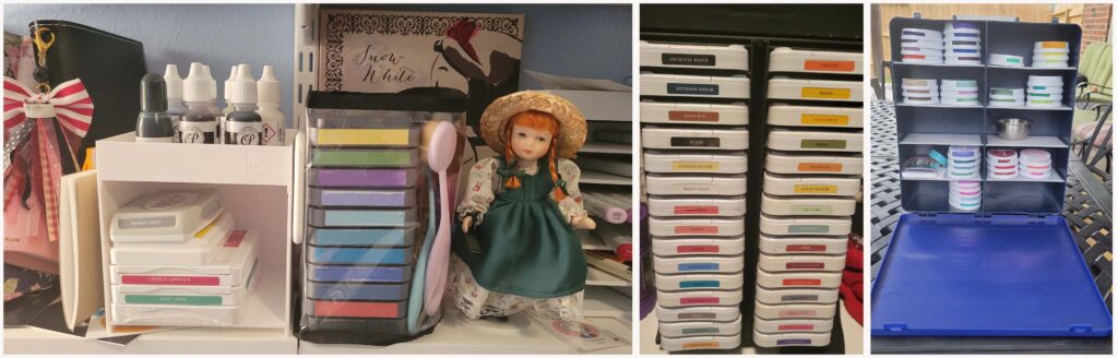
Do you have a system in place for working with colors. I have been stamping and scrapbooking for more than 30 years. In that time I have collected a lot of inks and colors and inherited what my mother had as well. I used to choose colors within Close To My Heart’s color seasons, I organize colored cardstock according to the rainbow. The thing that is the most puzzling to wrangle is ink pads. I have 138 colored ink pads of various brands.
Far Left: Misc Inks in Stampin’ Up! Open storage & topper storage. Distress Oxides in Totally Tiffany Monica Buddy Bag
Center: Close To My Heart Inks in Spinning tower
Right: Catherine Pooler & Misc Inks in Cropper Hopper Photo Supply Case
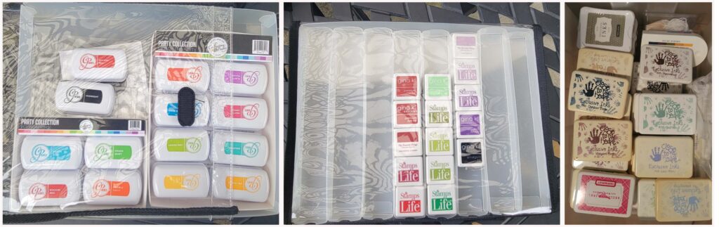
Left: Catherine Pooler Minis in Totally Tiffany Stamp Store & Go with Tray
Center: Mini Cubes from The Stamps of Life, Gina K, and My Favorite Things in Totally Tiffany 8 Drawer Storage & Supply Case
Right: Misc old Ink Pads in an iris cart drawer (I have not even counted what is in there, originally I kept them for kids’ art projects).
In the past I’ve tried various swatch formats
- Stamping on a sheet – colors were out of order as my collection grew and it was confusing to flip through multiple sheets.
- Swatches on a Ring worked ok when only a few but as my collection grew I had to remove the cards from the ring to view colors together
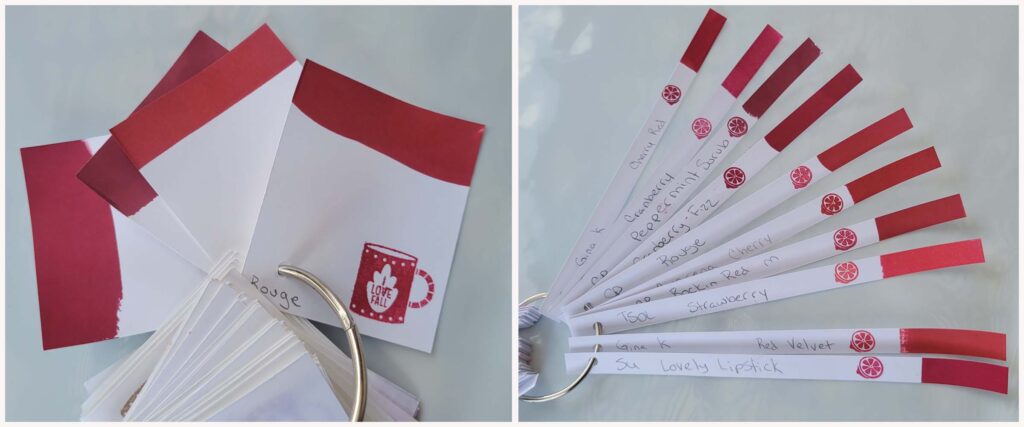
- And my current solution – ONE RING TO RULE THEM ALL – all brands of ink on one ring 1/2″x8.5″ This long skinny style is much easier for viewing color selections on the ring.
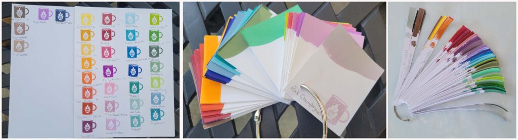
I am finding my swatches much more useful now that I have all brands swatched together on one ring. I write the brand & color name on the strip, then I stamp with the ink and I also apply the ink directly to the paper at the end of the swatch.
As you can see I can get a much better shade of red looking at 10 colors rather than just 4 from one brand of ink.
Let us talk a bit about color. Catherine Pooler Designs has an approach to color that I find very useful. They have divided their colors into two families.
The PARTY colors are clear saturated hues, the tend to be what I think of as more pure colors.
The SPA color have a grey toned undertone, they are less saturated but sometimes these color feel more sophisticated.
I’ve included a graphic of these two color collections to help you visualize what I am talking about. Unfortunately what is obvious in person is hard to see on a computer screen.
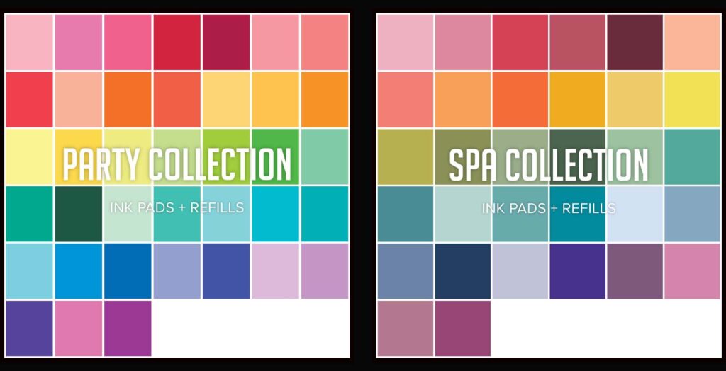
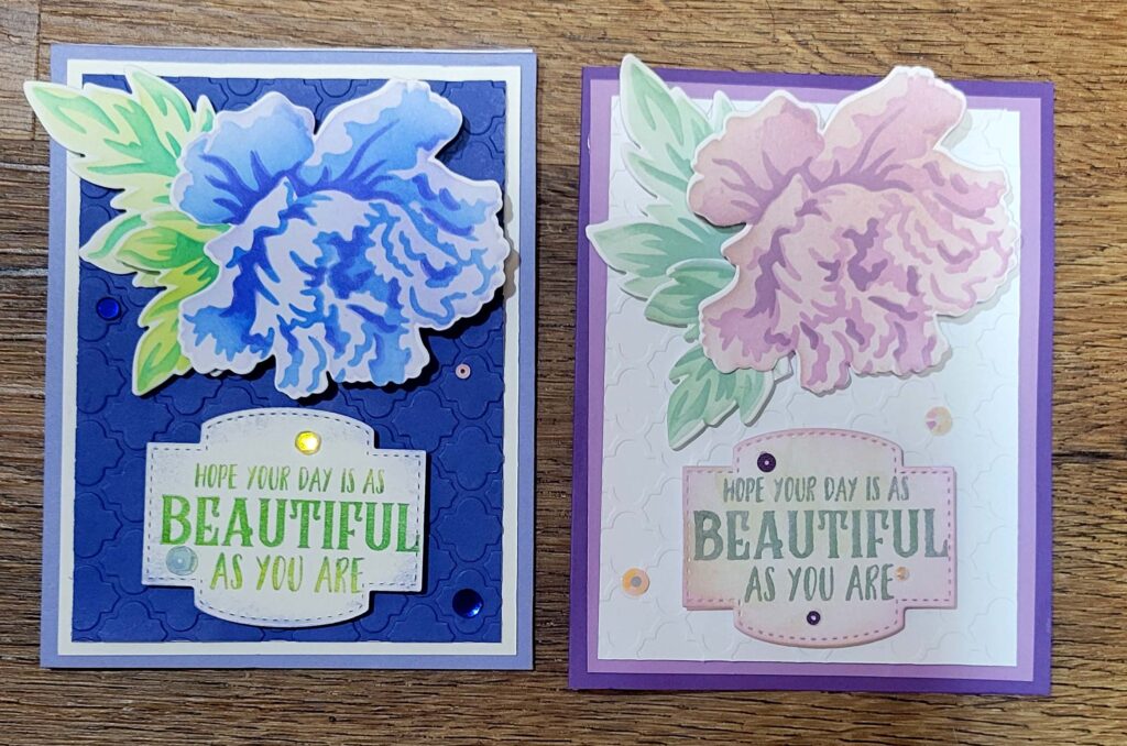
The idea between these two color ways is that Party Colors go well together, and Spa colors tend to go well together.
I have found this concept to be helpful in thinking about ALL my colors and select them accordingly. Sometimes Spa and Party DO mix, but this is the exception rather than the rule. Another way to use colors under this designation would be to use the equivalent SPA color to color the shadowed parts of and item that is party colored.
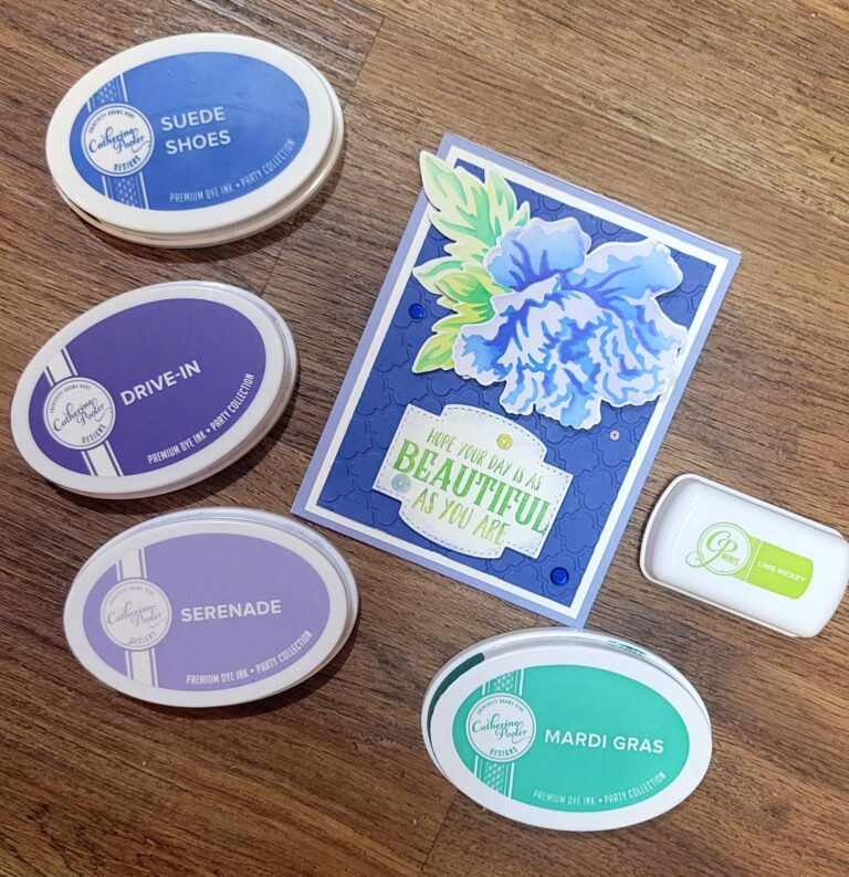
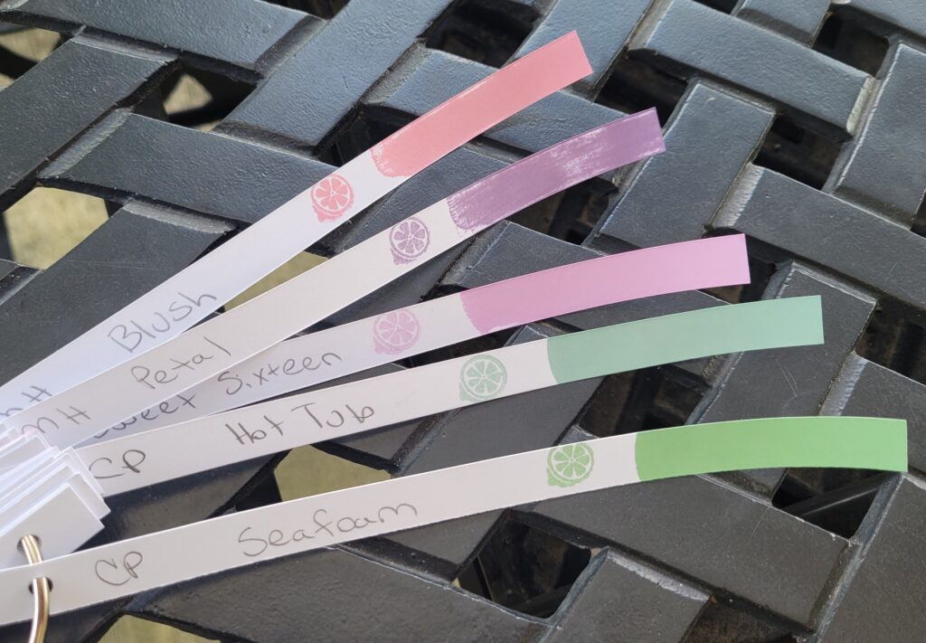
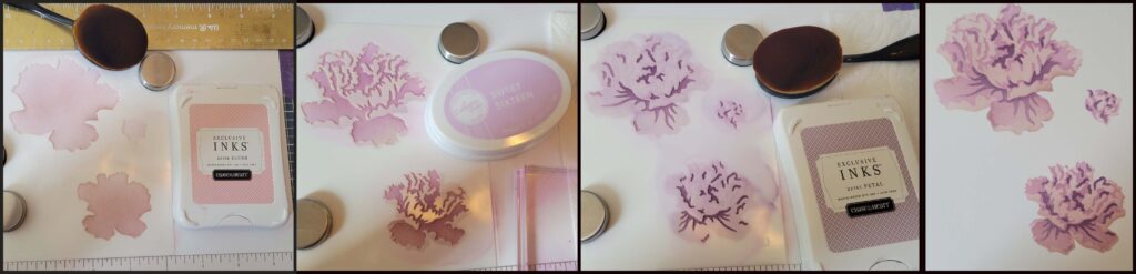
For today’s card my aim was to choose colors that would qualify as spa colors across multiple brands. I selected Close To My Heart Blush and Petal, Catherine Pooler Sweet Sixteen, Hot Tub, and Seafoam. Sweet Sixteen is actually a party color but I was confident including it in my color palate. These concepts are only helpful guidelines after all.
When I stencil I use a Wendy Vechi Make Art Stay-tion which is a metal work surface, and the included magnets to hold my stencils and paper in place.
I stenciled each of the 3 flower layers and the two layers for the leaves then used the matching dies to cut out the flowers and leaves.
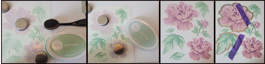
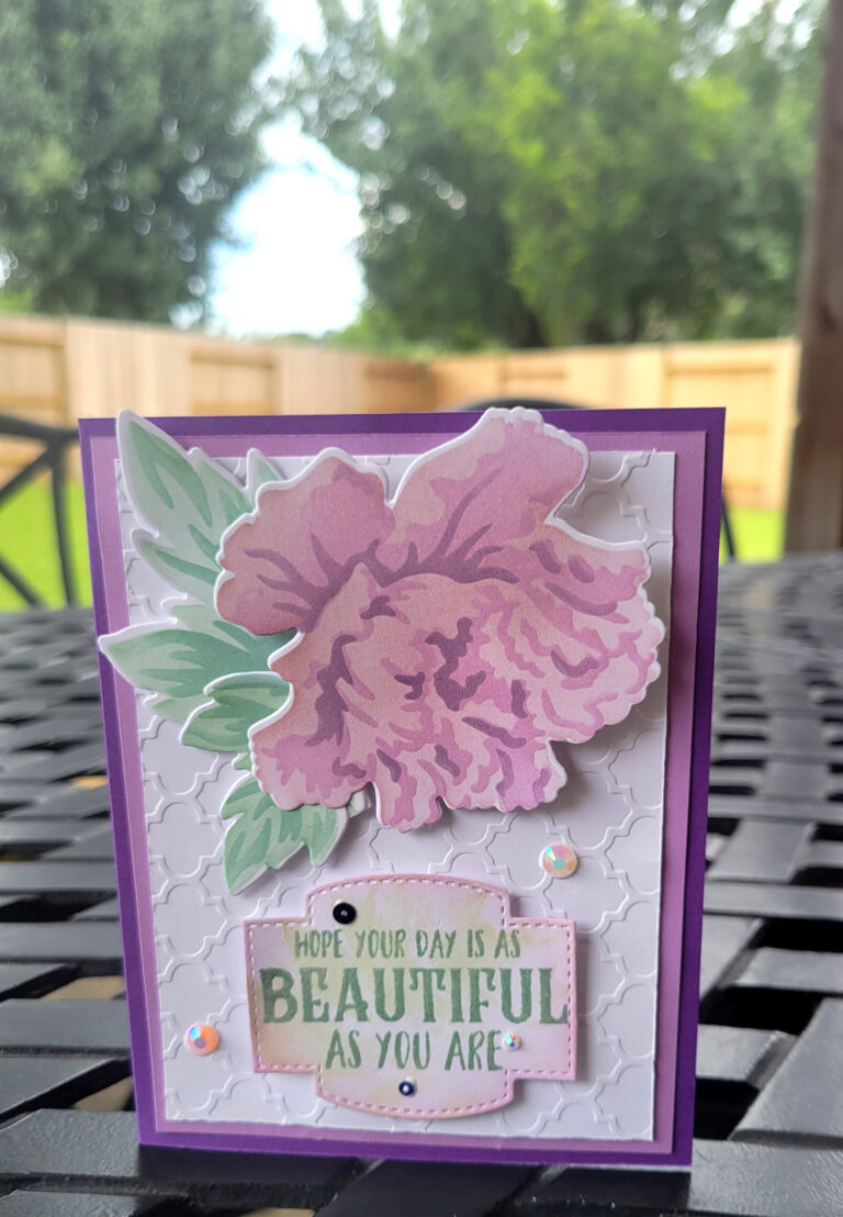
I layered cardstock in shades of purple and mauve with a layer of embossed white cardstock. I stamped a sentiment on a label die-cut shape, inking the edges with Sweet Sixteen Ink and lightly applying Opal Paste over all. Gems and sequins finished out this card which reminds me of a Chintz blazer I had in High School.
Catherine Pooler has finally released a color wheel for their Spa colors, you can download the SPA color wheel HERE
I shared the PARTY color wheel in a previous post. In case you didn’t grab it then you can find it on Catherine Pooler’s All About The Ink Page
We were all born into a family but there is also the family that we choose to create. I want you to give yourself the freedom to think that way about color.
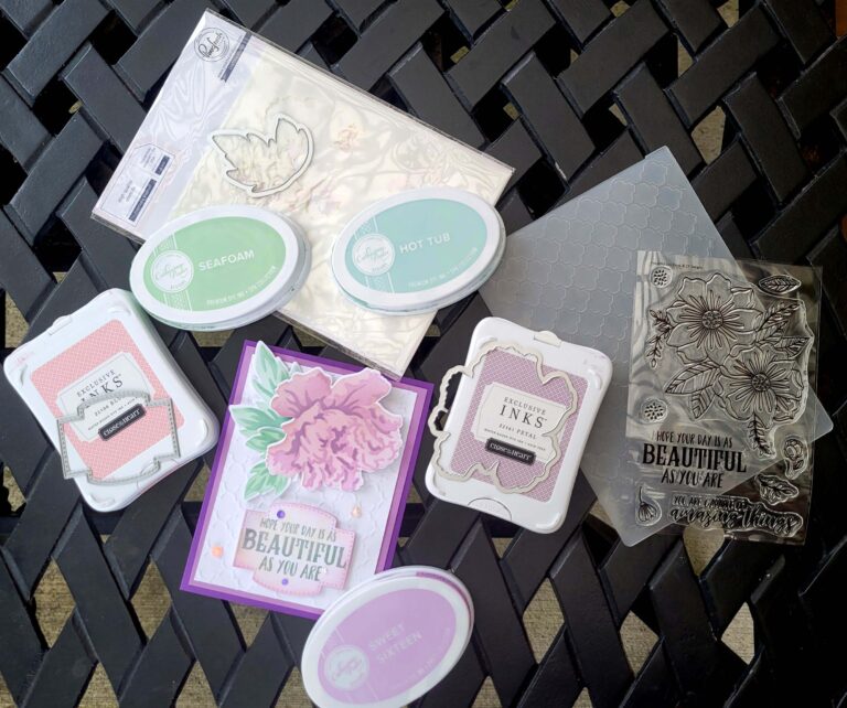
Products Used
- Friendship Blooms Layering Stencil by Pinkfresh Studio
- Friendship Blooms Dies by Pinkfresh Studio
- Life-changing blending brushes by Picket Fence Studio
- Wendy Vecchi Make Art Stay-tion
- Close To My Heart Ink Pads Blush, Petal
- Foam Tape
- Art Glitter Glue
- Paper Trimmer by Stampin’ Up!
- Catherine Pooler Ink Pads Sweet Sixteen, Seafoam, Hot Tub, Serenade, Drive-In, Suede Shoes, Lime Rickey, Mardi Gras
- Stamparatus Stamp Platform
- Quatrefoil Embossing Folder by Close To My Heart
- Stitched So Sweetly Dies by Stampin’ Up! (label)
- Beautiful Day Stamp Set by Catherine Pooler
- Lilac Pearl Opal Polish by Cosmic Shimmer
- From My Heart Faceted Gems by Stampin’ Up!
- Berry Mojito Sequin Mix by Picket Fence Studios
- Portland Sequin Mix by Catherine Pooler
Bonus Card made with Party colors.