
Here in the New Orleans area of the US, the month of March marks the important time of recovery and repentance from the celebratory carnival season that begins in January and extends through February. This period of time between Ash Wednesday (the day after Mardi Gras) and Easter, is also called Lent. While our blog theme for this month is Easter/Passover, I feel motivated to document the significant “in-between” time in my family’s spiritual life that leads up to Easter Sunday. This also directly ties into my project for One Little Word (OLW) which I introduced in last month’s blog post.
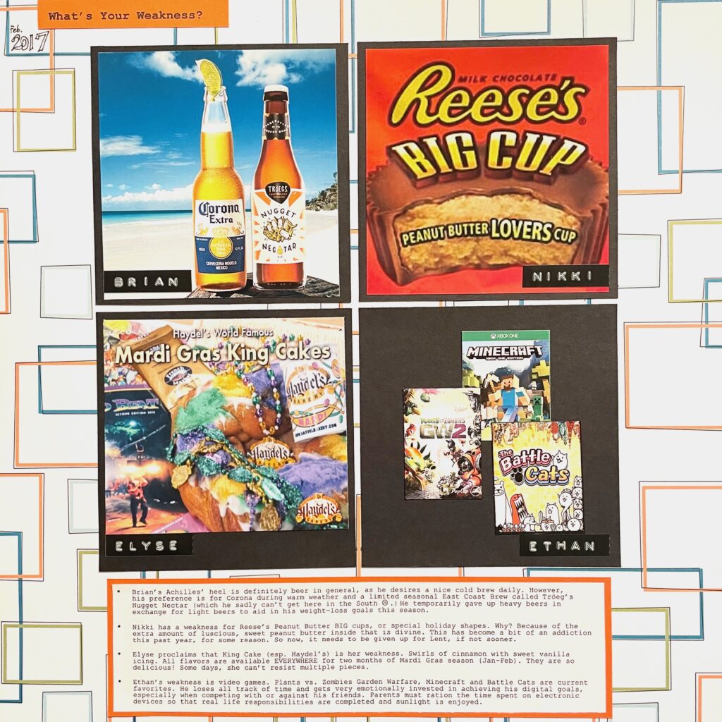
Before Lent, my family and I reflect on struggles or weaknesses in our current lives. Usually, what we may see as a weakness becomes what we “give up” for Lent. In the past, most of our “sacrifices” have been giving up some form of food or beverage. Back in 2017, I did a page for LOAD217 for the prompt: What is your weakness? For Lent, my husband gave up beer and I gave up Reese’s peanut butter cups. That may sound a little silly, but that year, I was addicted to them and eating more than one on a daily basis. It sure helped that others were “sacrificing” something along with me. My page was pretty simple with a patterned paper background, a small title at the top, a handwritten date, photos in a 4-photo grid with a journaling box at the bottom. That year, I was really into using my old Smith Corona to type out journaling and using a label maker to highlight phrases.
This year, my husband and I have made new commitments to our yearly Lenten practice. My husband decided to give up sweets and renew his low carb/high protein lifestyle that previously helped him lower his blood sugar numbers. It took me a while a make a heartfelt decision. Giving up food or beverages just didn’t feel authentic for me. It wasn’t until I had a discussion with my accountability partner and remembered answers in my OLW journal that my choice was clear.
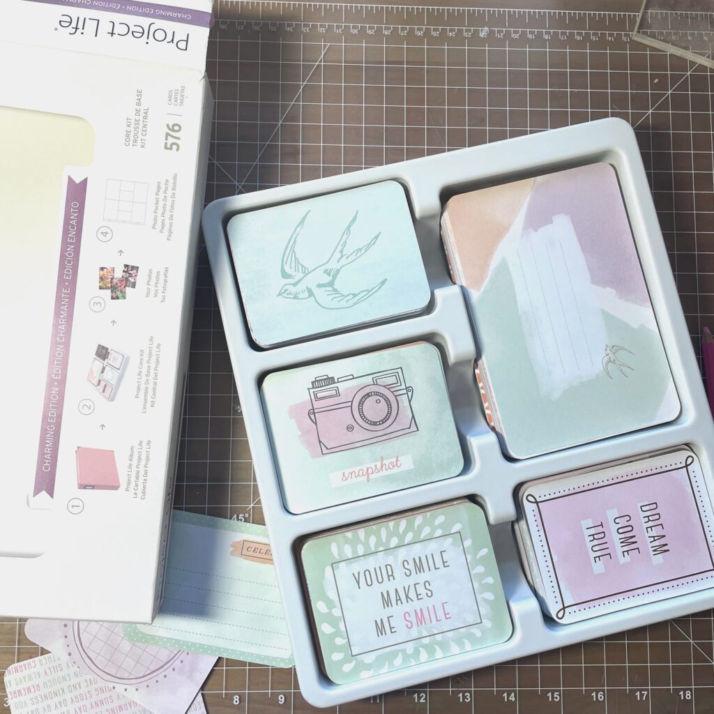
As I was trying to decide the style of this layout, a stack of old, rarely used Project Life packages came to mind. I just never did get the feel for creating pocket page albums. There was only project that I had some success with using the PL cards. It was my kids’ first days of school year albums. Honestly, though, my feeling about using pocket pages is lukewarm at best. I will admit that I like the cards themselves. They are little works of art. I enjoy the creativity of them as well as the sentiments. Occasionally, I add a single card to layouts or cut them apart as embellishments.
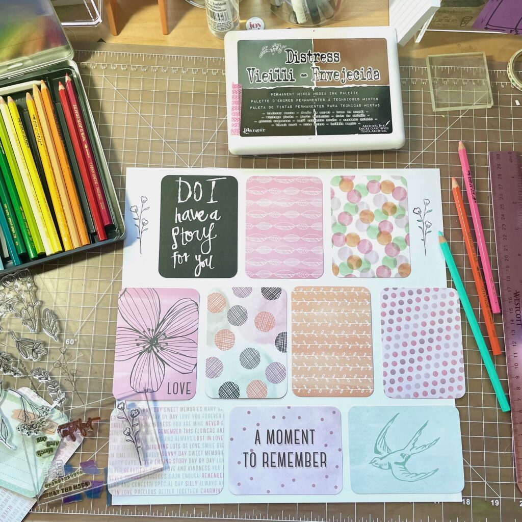
Suddenly, I felt inspired to take a new approach. As I looked through the Project Life cards, I found the Charming Edition, that had lovely traditional Easter pastel colors in pinks, greens, oranges and lilacs. I selected 9-12 cards and arranged them on a sheet of white 12×12 cardstock. Of the cards I selected, 3 were horizontal, so I placed them at the bottom. I liked the look of the words, “a moment to remember, in the center. It didn’t bother me that the cards extended off each side. The plan was to trim them flush to the white background. Then I placed 4 vertical cards in a row on top of the previous cards. I was conscious to make sure that similar textures or colors were not side by side. For the top row, I wanted 3 vertical cards, centered, which left some open white space on the left and right sides. I found a card from a different set (Sweet Edition) with an appropriate title. Since it is the only card with white text on a black background, it contrasts nicely.
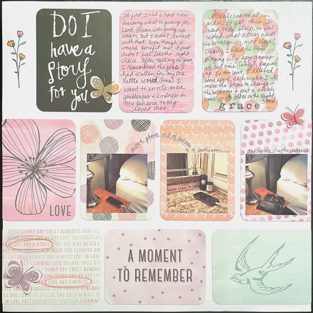
I found a cute little flower stamp in my stash and repeated it in black in both open spaces on the top. I pulled out my colored pencils and added pink and orange petals with green leaves to match the color palette. With those colored pencils, I then circled the words “love and kindness” 2x on the bottom left card since those sentiments relate to my OLW and Lent goals. I used the app called Print to Size to reduce my 3 selected photos down to 2.25” so they fit within the width of the PL cards. Then, I printed them from my Canon printer and cut to size using a trimmer. As final embellishments, I found old Jolee pastel butterflies and added them in a triangular way to draw the eye around the page. Finally, I added the journaling in my handwriting as well as the captions and arrow using a black Mircon 01 pen.
Journaling reads: “At first, I had a hard time deciding what to give up for Lent. Brian was giving up sweets. But I didn’t connect with that. Even though it would benefit me, it just didn’t feel like the right choice. After talking to Jenn, I remembered the goals I had written for my One Little Word (grace). I want to invite more gentleness and kindness in my behavior to my loved ones. I realized that in order to get this, I need more sleep, to feel rested. What action needs to be taken for more sleep? Clearly, I need to stop playing silly app games at bedtime, which keeps me up. So, for Lent, I deleted some apps, each night I will move the phone to charge in the bathroom and I put a sketchbook in its place on the nightstand.”
I am feeling very satisfied with my unexpected choices. Rather than selecting the usual products for this particular layout, I pulled out the rarely used Project Life cards from my stash. It was refreshing to create a different type of background. In much the same way, the choice to surrender the cellphone usage at night (rather than something easier or more obvious) is making me feel empowered.
“Life is Grace. Sleep is forgiveness. The night absolves. Darkness wipes the slate clean, not spotless to be sure, but clean enough for another day’s chaulking.”
– Frederick Buechner