
Over the years, I have heard scrapbookers say they have difficulty finding masculine product lines. This may be true, but we shouldn’t let this frustrate us and prevent us from telling the unique stories of our sons, husbands, brothers, fathers, grandfathers, nephews, uncles or friends. Instead, I choose to focus on the K.I.S.S. mantra: “Keep It Simple, Sweetheart”. I get more pages completed when I remember this. Another good mantra to remember is “progress over perfection”.
Some of my favorite (digital and traditional) layouts use a monochromatic color scheme of blacks, grays and whites with a hint of color. In many cases, the deciding factor for the only color on the page is the subject’s favorite color at that moment. Other times, I select a complimentary color to the photos or a color that is related in some way to the hobby, event or holiday.
Highlight a large photo in black and white
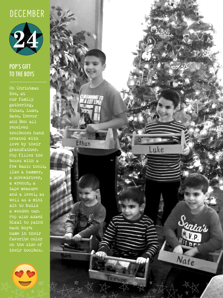
The original color version of these photos are not ideal, but they are necessary to tell the special stories. The light of the window is behind the subjects which put them in deeper shadow. Since I intended to highlight the toolboxes as well as their smiles in the photo on the left, I converted it to black and white in Photoshop and tried as best as I could to brighten it up without losing the details. When I increased the photo sizes, it did create some distortion and bitmapping. I decided I was ok with that. I chose completion over perfection.
Move the story front and center
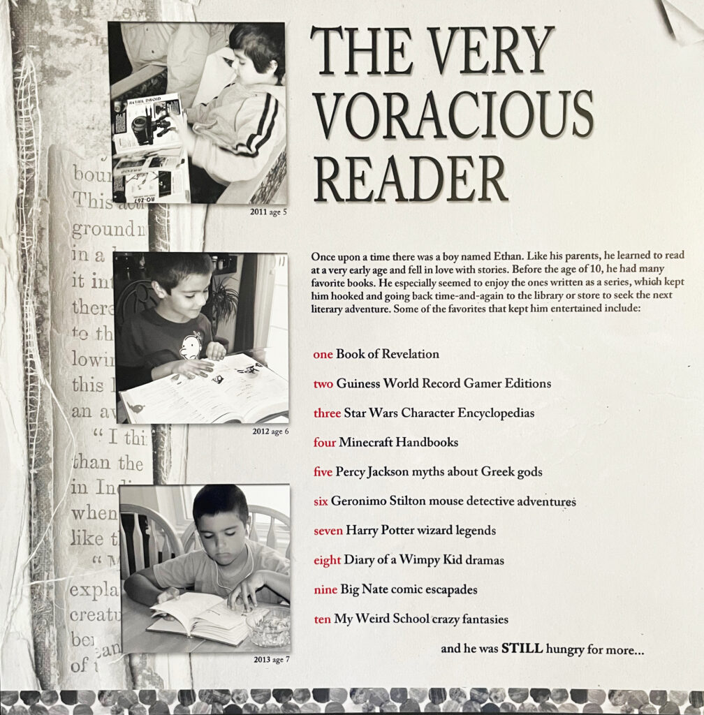
The main focus of this digital page is the story about how big of a reader our son was at a young age. The photos are complimentary and add interest to the story. I like the idea of keeping the photos, as well as the background book imagery, all monochromatic. This helps bring attention to the red sequential numbers, the only color on the page. It is reminiscent of newspaper style.

Choose monochromatic product & add hints of color
The theme of the above products is music and they are not gender specific. This can work for many interests or hobbies. I searched for all of the monochromatic music papers and embellishments that I had in my stash and layered them. I chose to add three pops of red in a visual triangle to draw the eye around the page. Red was his favorite color at this age. This is the only page of these examples that isn’t digital. The photos are more examples of poorly lit rooms. Converting them to black and white in Photoshop and brightening them (before printing and creating the layout ) was an easy decision.
The guys in my life usually don’t value the over the top gestures that scream “look at me”. They seem to appreciate the thoughtful and inclusive stories rather than the elaborately designed pages. For this reason, the ways I represent them in my albums tend to reflect a simpler approach. Using monochromatic photos or product while keeping the focus on the story can eliminate worry about not having the perfect product or kit.
Don’t forget! If you haven’t read it yet, Misty wrote a great article on her favorite small businesses. I would like to add, that my favorite small business is Cranberry Cat. It was an in person pop-up, many years ago, at a crop called Scrappetizer in Pennsylvania. Even though I no longer live on the east coast, I can still buy from their online store and so can you, no matter where you live!