As Nikki mentioned last week, the design team is tackling the fun, and sometimes head scratching, world of Challenges this month. When I first started scrapbooking, back in 2008/9, I blogged my efforts and submitted to various challenges. It was so much fun … once I got over the intimidation factor of sharing my projects in so public a way. But seeing as I now share here and on my store’s Instagram, I think I’ve gotten over my shyness! LOL!
That being said, I’ve definitely not been participating in challenges lately, so this month’s topic was a challenge of a whole other type. Thanks go to Design Team Member April Swingler for putting together a great list of challenges for us to tackle! There were so many great sounding ones on the list that I couldn’t choose.
Does that ever happen to you? I confess that when presented with many options that all sound good, I have decision paralysis and want to do them all! (Dessert menus are a real issue for me! LOL) Because I’m sure I’m not the only one with this problem, I thought I’d walk you through my process of choosing AND combining.
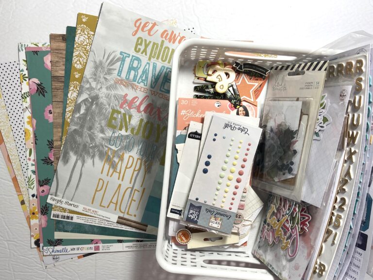
Starting with supplies is always fun for me. Flipping through my papers and embellishments sparks ideas while reminding me what’s there. Sometimes when I’m in the middle of a project I can recall a paper or sticker that would be perfect – all because I’ve recently gone through my stash. The kit of supplies above is one I put together to play with this month in response to one of the challenge suggestions April made.
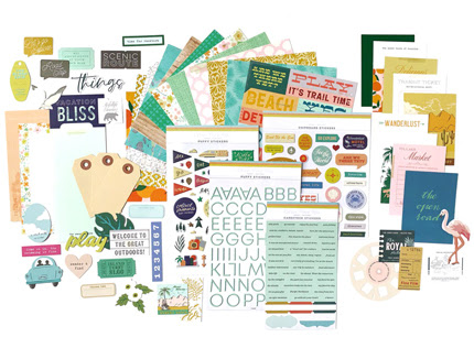
Subscription kits are very popular. I used to get a monthly kit of both scrapbook supplies and card making supplies. Now that I own a crafting store, I don’t need to subscribe to a kit, but I still like putting kits together. The Counterfeit Kit Club was started to answer the question of “what if you didn’t subscribe to a kit but instead used their past kits as inspiration to build your own from your stash”? Brilliant, right? Each month they choose a different older subscription kit to counterfeit. Here’s this month’s inspiration kit.
You can click on the image above to go straight to view the kit in its entirety on the Citrus Twist website.
My counterfeit answer to the papers:
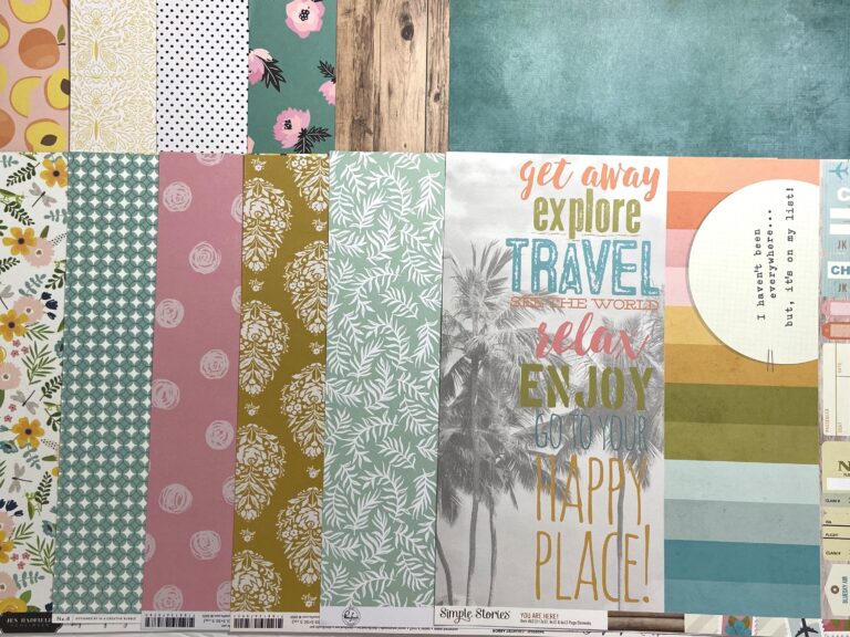
It’s a real mix of old stash and new(ish) papers that are currently in our store. Some new Pinkfresh, some recent Simple Stories and Maggie Holmes, and then some very old Pebbles, Simple Stories, and Shimelle. I tried to match colours and patterns as best I could to the inspiration kit.
Here are my embellishment choices:
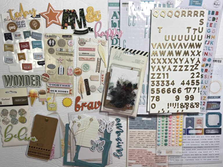
I have a really hard time editing down embellishment choices! LOL!
Now to actually use this kit. Because the point of putting it together is not to simply look at it and admire all its lovely pieces, but to use it to document memories, right? For that I turned to April’s list again and this is where the title of this post starts to make sense.
When you’re already participating in one challenge, why not add another? Nikki mentioned the LOAD challenge, hosted right here on ScrapHappy, which is fantastic for getting stories told that you may not otherwise think to tell, but since there’s not an active LOAD going on right now, I looked at other options. The Counterfeit Kit Club does challenges too and in fact they just posted their first challenge today – check it out here. Since that one came a bit too late for this blog post, I looked elsewhere and found the one on the PinkFresh blog. I was inspired by their colour inspiration this month.

They listed the ink colours that match those swatches but since I don’t have any PinkFresh inks, I looked to my Distress Oxides to see if I could find good colour matches. Here’s what I came up with, what do you think?
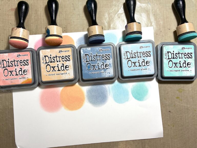
Their specific challenge this month is to create beautiful backgrounds, so I took those ink colours and a turnabout stencil from Concord & 9th and made this.
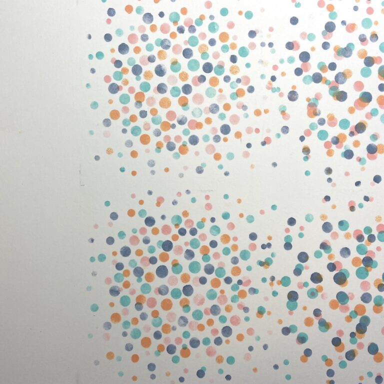
My stencil was a 6×6″ stencil which is why there are 4 areas of pattern. But I wasn’t concerned as I knew I’d be covering a lot of those dots with papers, photos, and embellishments. Here’s a look at my stencil process to give you an idea of how I did this.
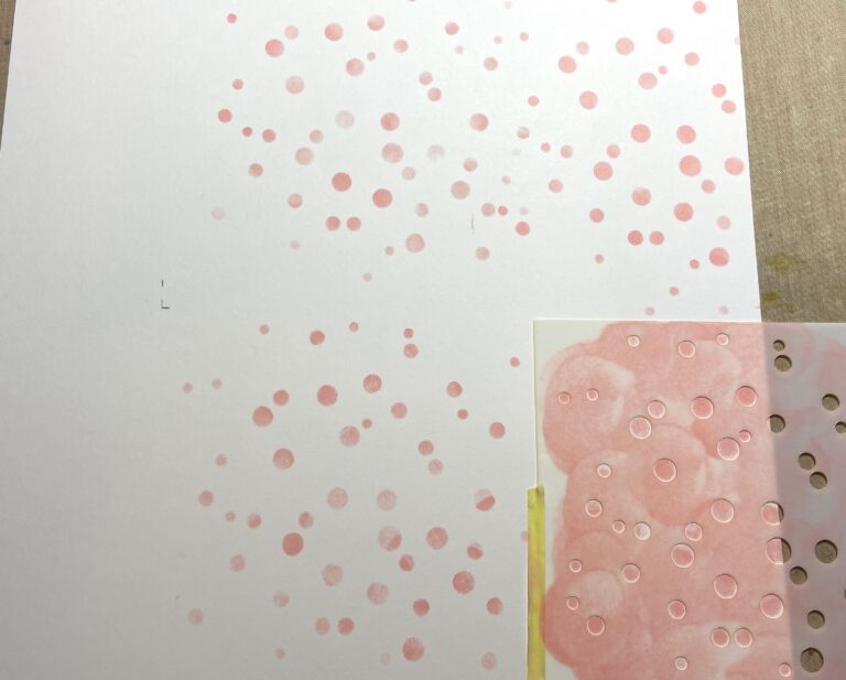
I had already decided to use the large 6×12″ cut apart, from my Simple Stories paper, down the left hand side of the page so when I placed my stencil to do the first inking, I purposefully pulled it away from the left hand edge several inches. I marked the corners of the stencil in pencil so I could line it up below when I needed to move it. Then I simply stenciled one colour at a time, carefully moving the stencil each time. The challenge was to line up the stencil after each colour change to get the correct pattern of dots. I didn’t see any sort of registration mark on the stencil itself so I’m not sure how they want you line it up. What I ended up doing after the first colour (after cleaning and drying the stencil) was to line up the stencil to what I’d just done, then rotate the stencil 90 degrees to the left, I clearly messed up at some point because my dot patterns are not all the same. Whoops!
After Adding all the papers though you can’t tell.
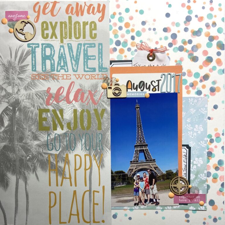
I think that qualifies as a Beautiful Background, right?
I took my colour cues from the large cut apart (and yes, I know there are no palm trees in my photo but … it’s more about the words on that piece than the graphics.) There was no green in the colour challenge inspiration palette so I purposefully didn’t pick up on that in my embellishments. Instead I embraced the orange which does double duty by emphasizing the blue of the sky.
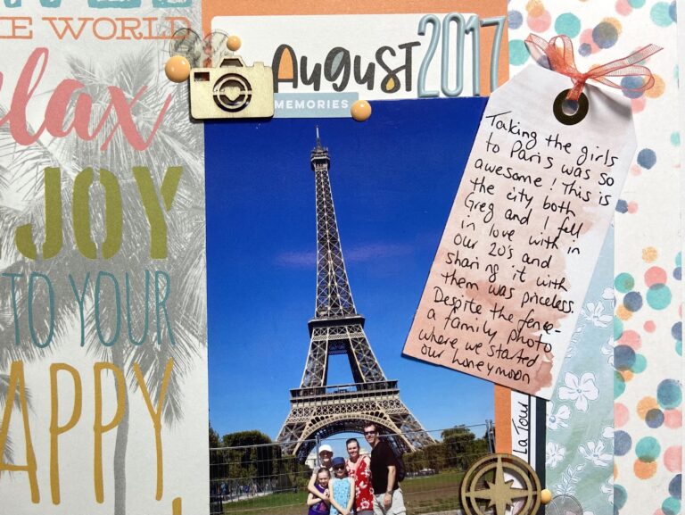
To help keep the page from getting too busy, I wrote my journaling on a tag and rucked it behind the photo block. The orange ribbon indicates to readers that it can be pulled out.
A few enamel dots, some wood veneer pieces in travel themes and acrylic hearts finish my embellishments. When you use a large graphic piece like that 6×12″ cut apart, you really don’t need to add much more to your page.
Thank you for joining us this month. What are your favourite challenges to participate in? We’d love to hear about them in the comments.

