
Welcome to our December color challenge! This month, I used winter color palettes from Pantone as a productive way to get moving (earlier than usual) with my custom Christmas card design. This process is very similar to how I would create a scrapbooking layout. Using tools to help me make quicker decisions, and have less to choose from, streamlined the project. As a person who has a habit of auditioning too many options in the design process, this is very helpful.
Latest Color Trends Based on Fashion
Pantone was first introduced to me in my college days of graphic design training in the early 90s. They are a valuable resource for all color in the design and style worlds. In this case, I found their inspiration from New York Fashion Week of Winter 2022-23. Here is how their color selection was described on the web page: “Contrasting colors that bring together our co-existing desires for rest and relaxation with exuberant expression”. What a fun way to be on trend (feeling nearly as hip as my 21 year old daughter) and go beyond the traditional Santa red, evergreen, or shiny gold. These two palettes present unique, contrasting styles that I may not have considered on my own. I embraced the idea of incorporating all five of either the holiday warms or the winter cools into my card design.
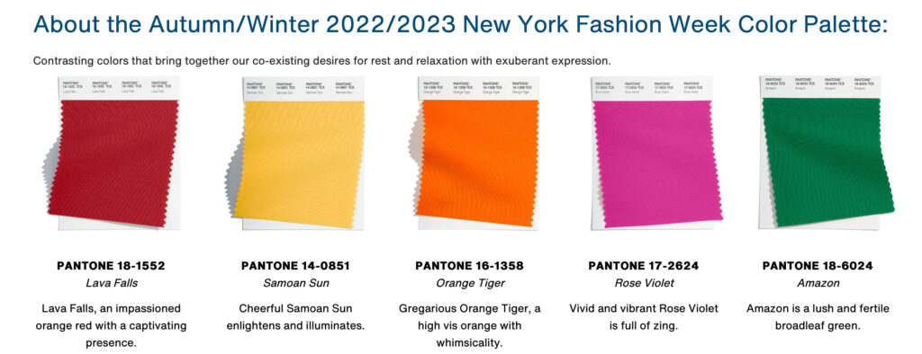
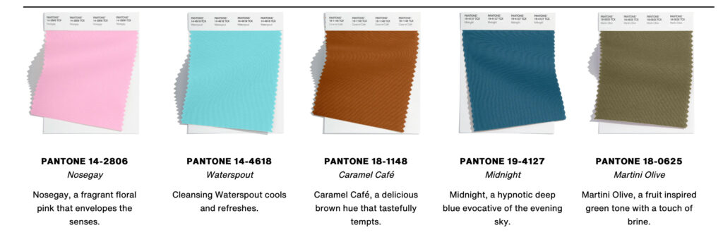
Photo Selection and Inspiration
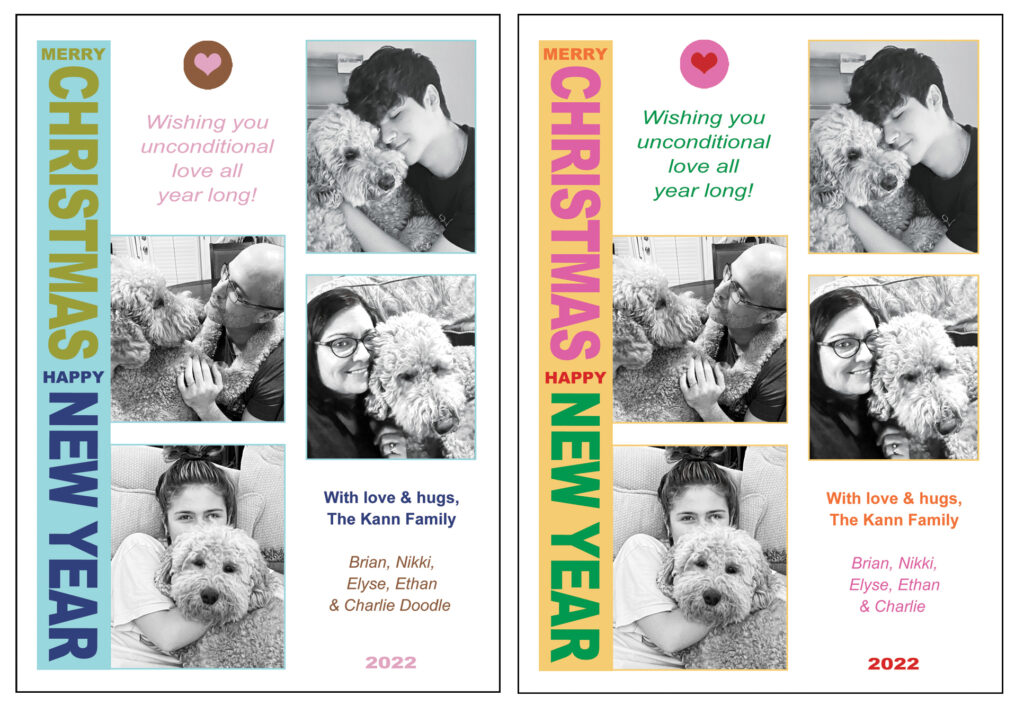
Next in my process, I looked through my photos from 2022, trying to find a flattering group portrait of our family of four. With the eldest in college most of the year, this proved challenging and there would not be an opportunity to get a group shot before I wanted to send out the cards. So I switched focus. Instead, I searched through individual photos of my son and daughter. All possibilities were placed into a new album (called Christmas Card 2022) in Photos. This album can be accessed from both my phone and computer, so when necessary, I can do searches or edits of photos on the go. So convenient! When the search of 2022 photos was complete and I reviewed my album, I found two sweet, candid photos of my kids with our dog, Charlie. Suddenly, a concept came to life! To match those, I located two different photos of my husband and me with Charlie. All the photos radiated love and adoration. His sweetness makes us all melt. In order to encourage the color palettes to pop, I converted all the photos to black and white. A tagline popped in my mind: “Wishing you unconditional love all year long”. Amidst the disharmony of the past two years, in both the world and our home, I am striving to manifest more love and peace where I can.
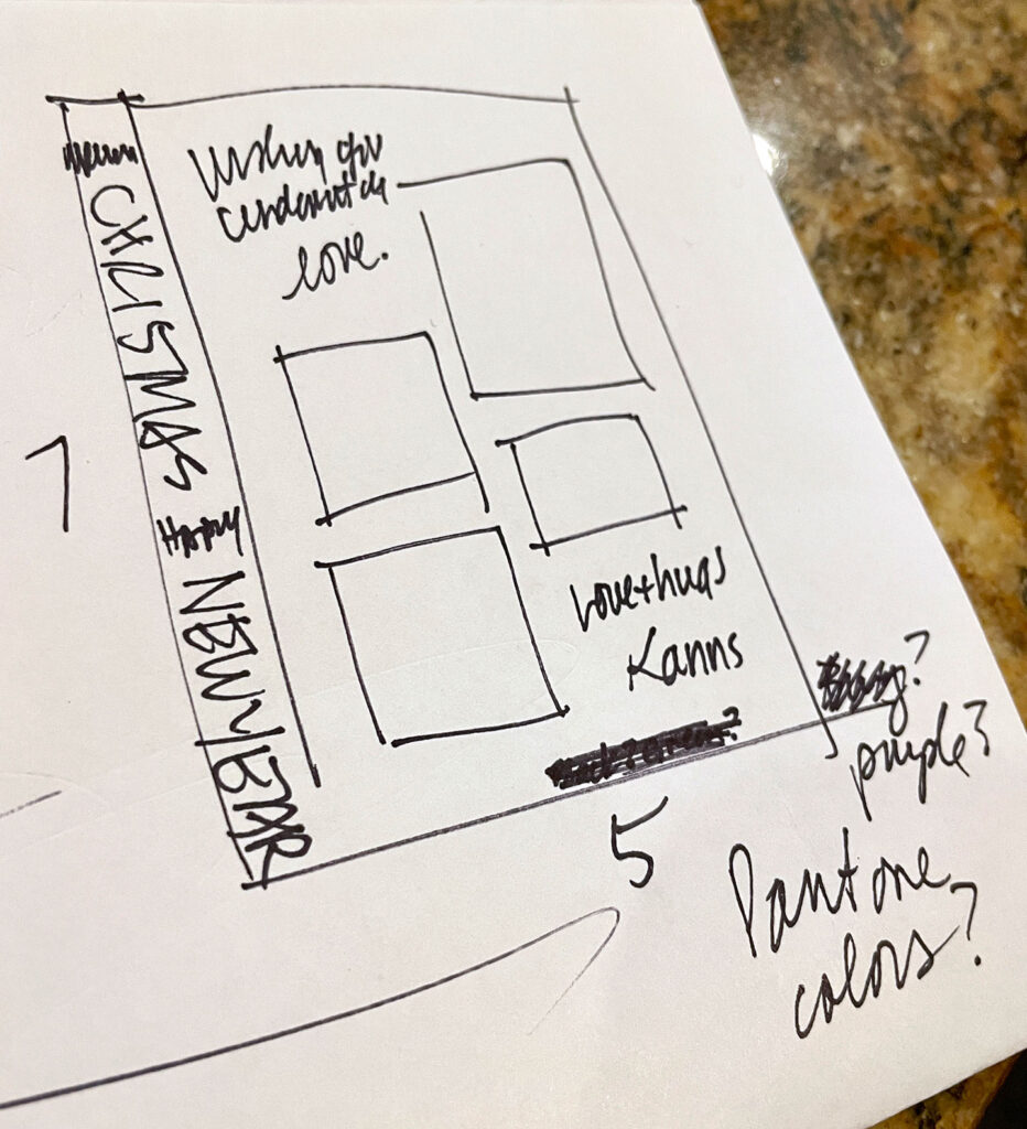
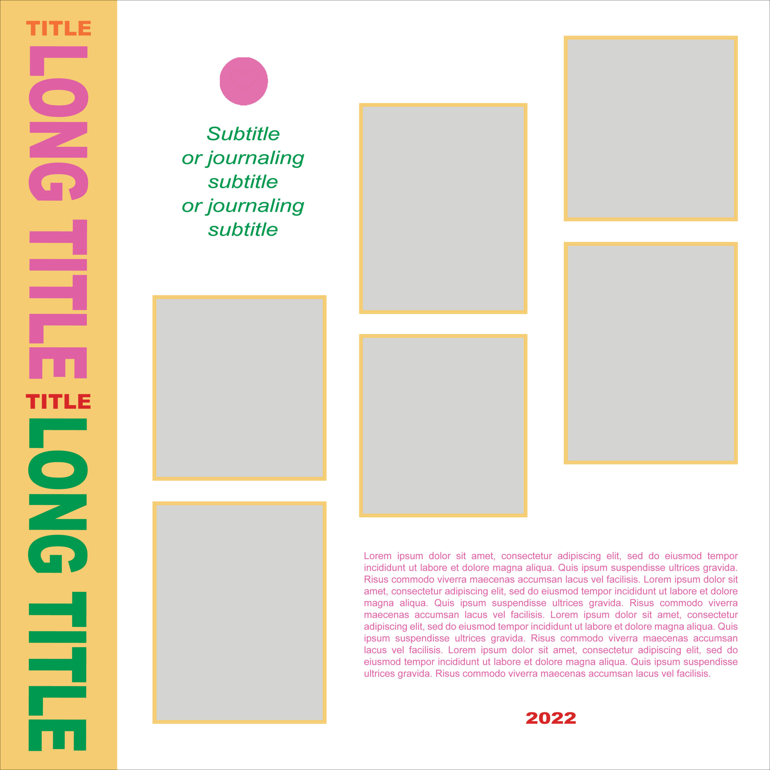
Finding Layout Inspiration & Creating an Idea Sketch
With photos chosen, it was time to decide on a layout and fonts. As mentioned in previous blog posts, the blank page can be intimidating to me. The use of sketches or seeing a variety of other designs helps to get my creative wheel turning. I did a quick scan of online card companies like Shutterfly, Mpix and Persnickety to get inspiration. From this inspiration hunt, I drew a sketch in a 5×7 vertical format. It is rare that I use a vertical title, and I have never used it on a Christmas card that I can recall, but I liked the uniqueness of it. Rather than a symmetrical grid, I also embraced the off kilter stacking of the photos.
Using Photoshop to Build the Layout
At this point, I built the layout in Adobe Photoshop and added the photos. I played with various serif and san serif fonts, but settled on the versatile san serif, Arial. For the title, I used both Arial Black and Arial Regular and extended or condensed the letter width as needed to fill the space. Arial Regular, Italic or Bold were used for the rest of the text. Once the structure of the design was finished and color swatches created in Photoshop to my liking, color location was the last step to complete before asking my family to pick between the warms and the cools. I played with the five hues of each palette, moving them around to see which placement was most satisfying visually. It really is a matter of taste and opinion. Once I finalized color placement, I created jpg proofs of each palette for family to view and vote upon. I was leaning toward the cools because of the unique, winter forest feel. Whereas my daughter, son and husband enthusiastically selected the vibrant, warm palette. My daughter reminded me that the card matches the on-trend brights of her newly decorated dorm room. So, I took that as a compliment!
Finding a Good Deal and Getting the Card Printed
Since I completed my design before Black Friday (unheard of!), I searched some printing companies for a great deal. Persnickety gave 20%. Even though their quality is good, I kept looking for a better deal. Shutterfly had disappointing reviews for output quality, so I moved on, despite a good deal. There are others I could have checked, but I ended up using 50% off at Mpix because I had used them before and was happy with the quality. This year, I opted to print on recycled paper to be more environmentally responsible. In the past, I successfully used TinyPrints, but I had forgotten to check their prices that day.
A Gift For You!
As a special gift for ScrapHappy sisters and blog readers, I created a 12×12 sketch. See below for the link for the Photoshop PSD file. It is directly inspired by my card design and includes the vibrant warm palette.
Here’s hoping that these fashion inspired color palettes from Pantone inspire you in card making, scrapbooking, room design or even your own clothing in 2023!
Wishing you harmony and unconditional love from both pets and people in the coming year and beyond. Check back each week for more color inspiration from the ScrapHappy Creative Team.
Happy Holidays to all!