
Let’s start off our new year by discussing a design concept called white space. This can be a controversial topic among scrapbookers. Some embrace it, while others believe it to be a waste of space. To be clear from the start, the term is a misnomer and isn’t limited to only white areas. It is meant as visual resting space. This month the ScrapHappy Creative Team is going to present to you inspiration for adding more white space (and less clutter) on layouts.
Less Is More
During my years in college, design professors emphasized the concept of “less is more” so much so that during our senior year, we (graphic design majors) made the unanimous decision to highlight that phrase on the title page of our yearbook section as a tribute. Now, to be honest with you, early in my scrapping years, I did not adhere to this mantra on my layouts. I compartmentalized design concepts apart from scrapbooking, because my hobby felt more like art therapy in many ways. Like many scrappers, I also got caught up in the trends of using elaborately patterned background papers, lots of photos and layers of embellishments. Eventually, I grew to appreciate and leave more white space (or use simple backgrounds) in layouts, less photos and less embellishments. It may have been because I started seeing more scrapbookers such as Ali Edwards and Cathy Zielske practice design (and white space) on layouts in a way that was familiar to me.
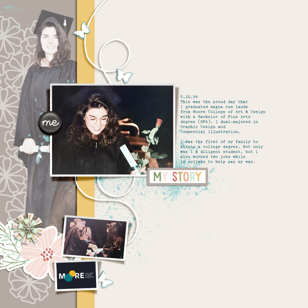
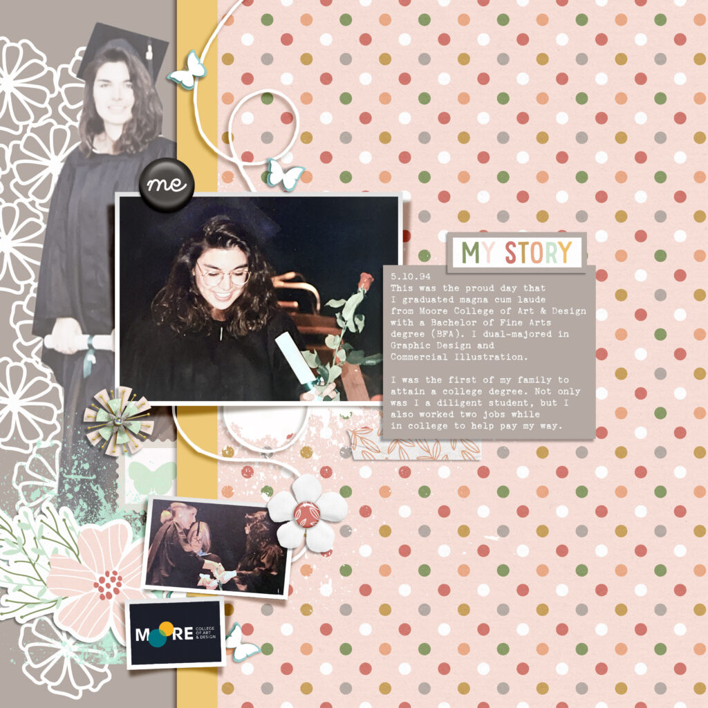
Comparing 2 Layouts
The first layout on the left shows plenty of white space or resting space for the eyes. For the 2nd, I added a patterned paper background and more embellishments. Even though I think both are attractive layouts, when I look at the 2nd, my eyes bounce around the page to follow the dots and don’t know where to stop. Whereas with the first, my eyes go right to the main rectangle photo and then the journaling. What about you? Do you agree or disagree? Prefer one over the other?
Why Use White Space?
With white space, the objective is for the human eye to have something to rest on and not be overwhelmed by visual clutter. When the eyes are given the rest, the brain can then take in more information and stays interested. While doing research for this topic, I found a web article written by a design and brand development company called NovaCreative. The company presents the following five benefits of white space as I remember learning them:
1. White Space Attracts. The eye is immediately drawn to what is different. When confronted with a page full of images and text, your eyes will automatically go to what stands out. Since it’s difficult to comprehend a large amount of information at one time, our brains tend to skip over the entire thing. White space automatically provides a place to rest.
2. White Space Improves Readability and Comprehension. Studies show that white space leads to better readability and understanding. This can be in the form of leading (space) between lines of type or between graphic elements. Making it easier for a viewer to read your message leads them to keep reading and not leave.
3. White Space Creates Balance. Messaging full of heavy text or multiple images needs something to balance it out, or else things get too overwhelming. Full areas can be used but must be balanced by areas of rest.
4. White Space Gives Emphasis and Direction. White space around certain elements directs the viewer to what is most important. People are busy and don’t want to have to figure out your message – instead, lead them to your focal point quickly and easily by highlighting using white space.
5. White Space Implies Sophistication. Most luxury brands make generous use of white space. Our brains have become accustomed to associating white space with sophistication, while clutter is associated with cheaper brands. Simply adding white space gives an upscale aura.
For the original article: https://novacreative.com/5-benefits-of-using-white-space-in-design/
Check back each week of January to see how other ScrapHappy Team Members use white space for more impact on their layouts or creative projects. We would love to hear your comments.
***Credits: For these layouts, I edited a template (fdd_MemoryLane_tp4.psd) I previously downloaded from Fiddle Dee Dee Designs at The Lilypad. It was created by prolific and creative ScrapHappy sister, Cheryl Ashcroft.
Digital elements from past bloghops:
- bbonneville_AAM_floralcutout.png
- bbonneville_AAM_Flower sticker.png
- bbonneville_AAM_Wordbit2.png
- bellagypsy_allaboutme_flair.png
- bellagypsy_allaboutme_burst.png
- For the 2nd layout, I added: bbonneville_AAM_paper1.jpg, bbonneville_AAM_tape.png, bbonneville_AAM_flower.png, bbonneville_AAM_stamp.png