
This month your Design Team is talking grids. Did you read Nikki’s post? Wow! What an amazing primer on grid design! If you haven’t read it yet, stop, go read it, then come on back. How she broke down the different types of grids, and the reasons behind why we love them, is nothing short of genius.
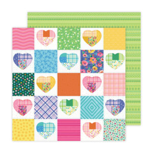
Me? I like a good grid and use them without thinking about it and typically in a fairly organic way. But for this post I wanted to keep it as true to what we generally think of as a grid as I could. I chose to tackle a 2″x2″ grid layout. I had a lot of fun with this and used a paper from Paige Evans’ new collection with American Crafts. It’s designed to look like a quilt and I could have used it as it was and called it a day, but … I like to mix things up too much!
Here’s Paige’s paper …
And here’s my finished layout.
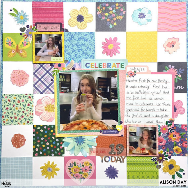
I didn’t worry about recreating her paper one little bit. And in all honesty, I didn’t think much about where I was placing each square except that I tried not to have two greens together or two with designs on them next to each other. That was the sum total of my planning!
Before we get into photo placement, I want to say a few words about HOW I got my grid to line up. You could totally use a tool like a t-square ruler, and if you are the type of person who needs to make sure that your grid is 100% evenly spaced and at all the 90degree angles, then you go right ahead and do that. I don’t need that level of perfection in my layouts (or my life, let’s be honest) but I didn’t use my usual technique of “eye-balling it” either. I used my squares! I knew that each square was 2″ x 2″ so I adhered my first one in a corner then placed another next to get the spacing right, then glued another down on the far side from my already glued corner piece. Hope that makes sense. And I used this to glue down all my squares, leaving blank squares separating each coloured square.
Next it was time to figure out photo and embellishment placement, and this is where I broke up with my grid a bit.
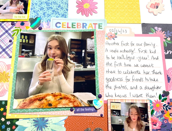
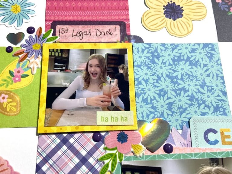
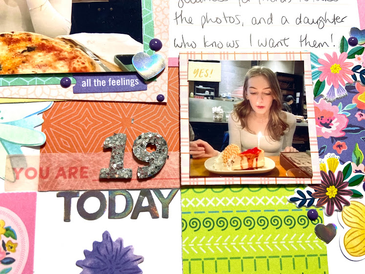
I got a Canon Selphy printer for Christmas, plus I use the Project Life app to create photo collages to print. I haven’t figured out yet how to print a square photo on my Selphy so using the PL app is my work around. I arranged three photos in the app so one would theoretically be a 4″x4″ square and the other two would be 2″x2″. But … once transferred to the Selphy they are slightly smaller than advertised. No problem, I’ll just mat them! Done.
To give prominence to the two smaller ones, I popped them up with foam tape. I could have done the same to the larger one but decided it needed a different treatment. Both to bring attention to it, and to add some energy to the layout. Grid layouts can start to feel stiff and formal because of all the horizontal and vertical lines so if you are using them to tell the story of a fun time (like I’m doing) you need to bring in some energy and movement.
One way I did this was to triple mat the large photo. The layer directly behind the photo is square to the photo, but the other two are on angles which instantly signals two things to your brain ; “look at me, I’m different” and “let’s have some fun”.
The other way I brought energy to my layout is by placing my elements on the diagonal from top left to bottom right. This is a favourite design for a lot of scrapbookers for the simple reason that in the Western world, that’s how we read. It also naturally forces your reader’s eyes to move across the page to see everything which keeps it from feeling stiff or stagnant.
When you start with a very orderly grid design, it can be easy to create a “still” layout. If you are scrapbooking a formal portrait or telling the story of a more serious event or time in your life, you may want that stillness. It will tell your reader that this is a serious topic so they can pause and appreciate it.
For my purposes, I needed to break up the rigidity of my grid so my readers know this is a story about a celebration. So, off-set photo mats on angles and a diagonal page design over top of the grid are my ways to signaling irreverence. And there was one more way I brought the “fun” to this page.
Embellishments!
I wanted to use a whole lot of the flowers in Paige’s Floral Ephemera pack but all my efforts to place clusters around the photos didn’t look right. Then I got the idea of adding the individual blooms to the empty squares. Eureka! It was an instant boost of colour and whimsy and I love it.
A few more bits and pieces and this page was all done.
I hope you like our exploration of grid designs this month. Thank you so much for reading my post. We’d love to hear from you. Leave a comment and don’t forget to check back each week for more Grid Designs from the team.