
What is split page design? I would explain it as dividing the page into full length vertical or horizontal sections. The sections can be varying widths, whether equal or not. The most popular example seems to be dividing the page in equal halves using patterned papers. Dividing the page diagonally could also be an example of split page design. Some choose to keep the content within those divided sections, whereas others layer across the divides. While doing a search, I found a blog post from 2020 by Katie Pertiet Designs where her team crosses the section lines with their photos and sometimes the embellishments. Even though it is from three years ago, I think it is worth checking out.
Narrowing Down Photo Choices
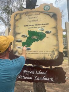
For this blog, I intended to scrap about our 24th anniversary trip to St. Lucia. I went into the Photos app on my MacBook and found 395 photos from our trip. Most of you can relate to this situation! Our camera phones make it so easy to get an over-abundance of photographs. It didn’t take me long to zero in on what part of the trip I wanted to work on, though. My favorite part of the vacation was our hike through Pigeon Island National Park. Then I thought of the memorable moments that I would add to the journaling. This helped me narrow down the number of photos significantly.
Making Decisions on Page and Photo Sizes
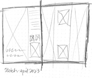
My next thought was that some of my scenic photos were so lovely that decreasing their size would reduce their impact. I really liked the idea of keeping a few of the pretty pics as large as possible. This solidified the choice to do a digital 12×12 two-page spread (in Photoshop) instead of a traveler’s notebook size, which would have felt limiting. Rather than second guessing myself, I quickly selected three scenic photos and five (to be smaller) supporting photos. I drew out a sketch for the double page spread leaving a certain amount of open space for journaling. I wanted the first photo of Pigeon Island to have visual impact, so I designated 3/4 of the page for it.
Creating the Digital Page
Next, I built the page design in Photoshop using guides and frames to indicate photo sizes. When bringing in the photos, sometimes I had to resize or crop as needed to create the look I desired. I searched my digital files for Ali Edwards’ travel word art, a geotag and a heart. It was at this moment that I decided to minimize the embellishments and keep a photo-journalistic look. Then, I added the titles, subtitles and captions. When typing up my journaling, I changed the font from my usual Remington Noiseless (wide characters), to 9.6 Adobe Garamond (smaller characters) in order to fit it all in.
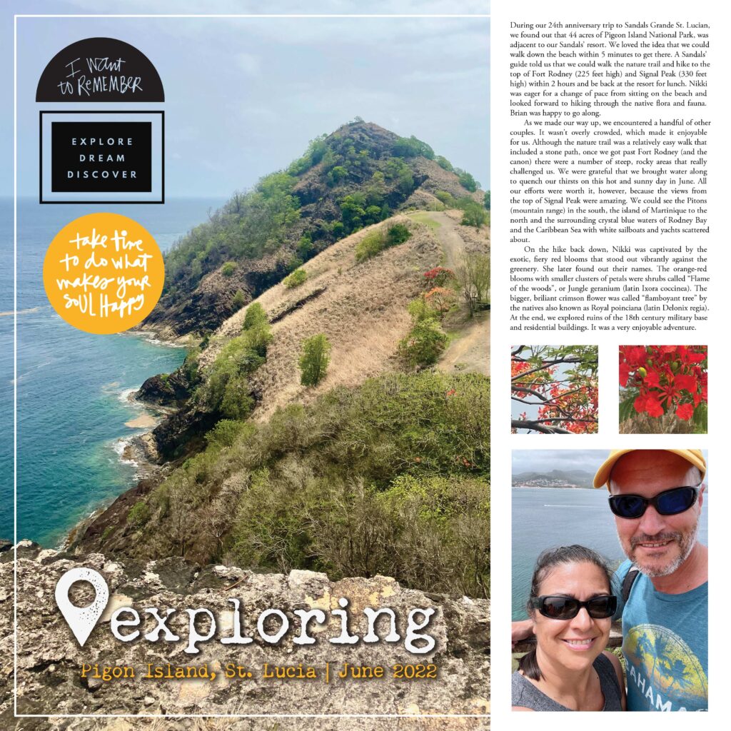
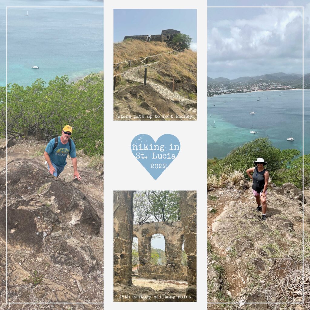
This split page assignment helped me to make some decisions that I may not have made otherwise, but am very excited about. It led me to choose, not just one, but three full length photos. Of course, in order to create this, it was quickest and easiest in a digital format. Because I decided to focus on the scenic photos, I did not use any digital papers and limited the embellishments resulting in a photo-journalistic look.
Remember to visit our blog each week to find out how each ScrapHappy Creative Team member interprets this design concept.