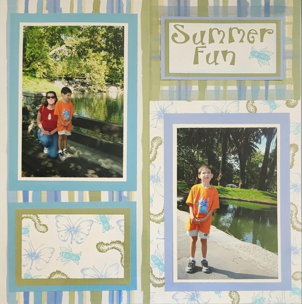
This month we are looking at Split Page Designs. I thought I would show you how classic this design concept is by sharing recent pages and some old school pages from back in the day.
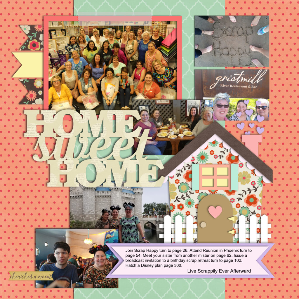
At first glance you might not notice that this is a split page design but if you look carefully you can see that the page is grounded by a strip of scrapbook paper running down the center. It grounds the page and provides structure for all the other elements. I like to cut a piece of 12×12 scrapbook paper in half then center it on the page. Back when I made double page layouts this was what I did if I only had one sheet of a paper design I wanted to use on both pages. The next 2 pages below are right side pages from double page spreads and use the same design.
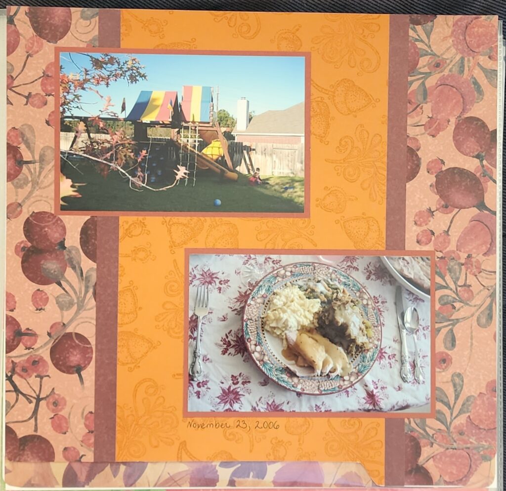
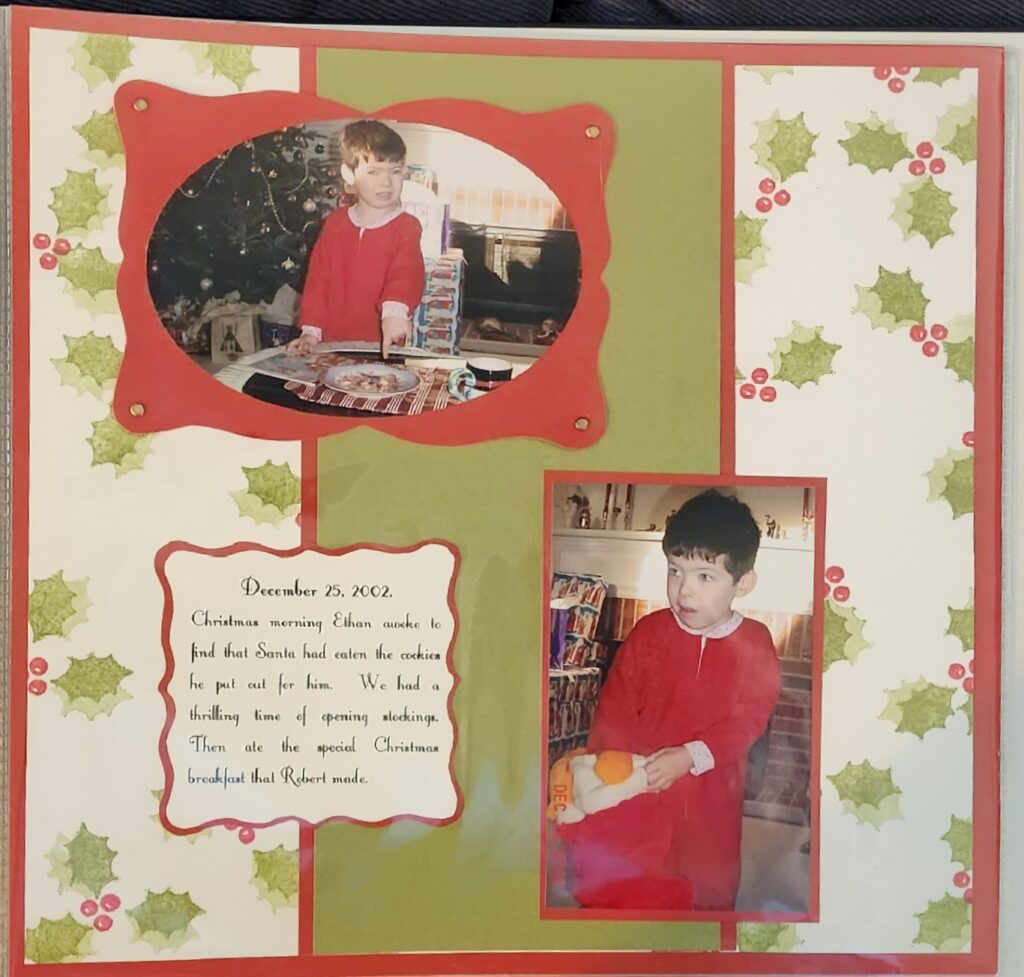
The next page is the same design with the center strip running horizontal rather than vertically.
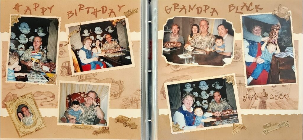
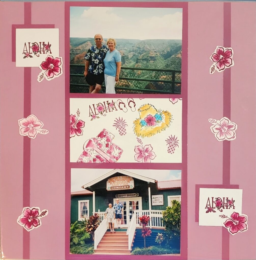
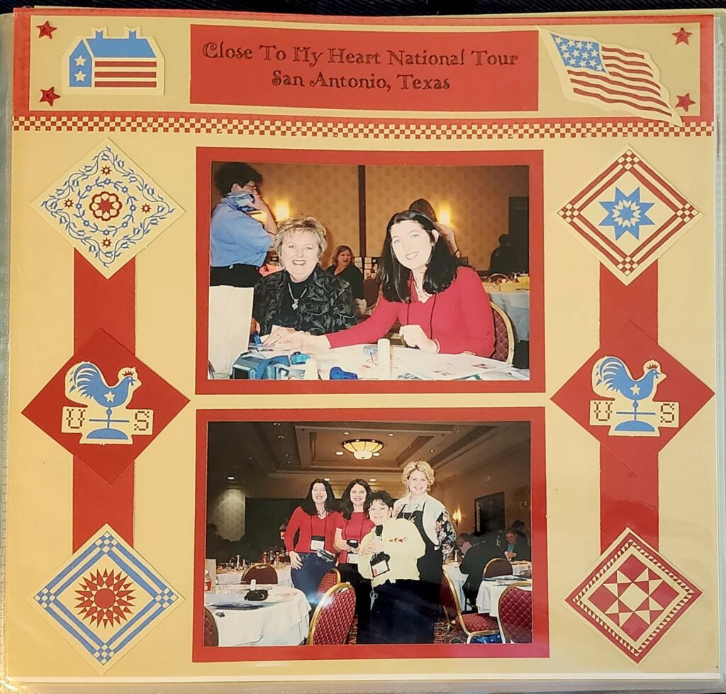
The two pages which follow are from my mother’s scrapbooks. She loved to place the photos in a stripe which divides the page and use accents to fill the space on either side. Mom passed in 2007 but good design is timeless. Wow look at those over-exposed faces, remember when we used film cameras and had to use a flash for indoor photos?!
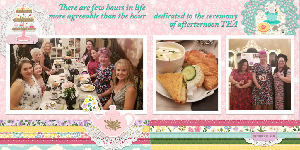
This digital page uses the same idea, the photo band is rotated so that it runs horizontally across two pages.
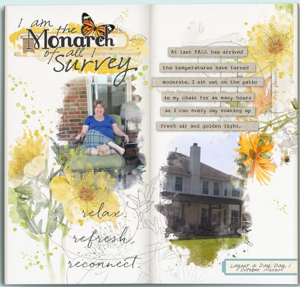
This next page mimics the two pages of a notebook but is really a 12×12 digital page. This is another way to create a split page design.
This page design splits the page in half vertically.
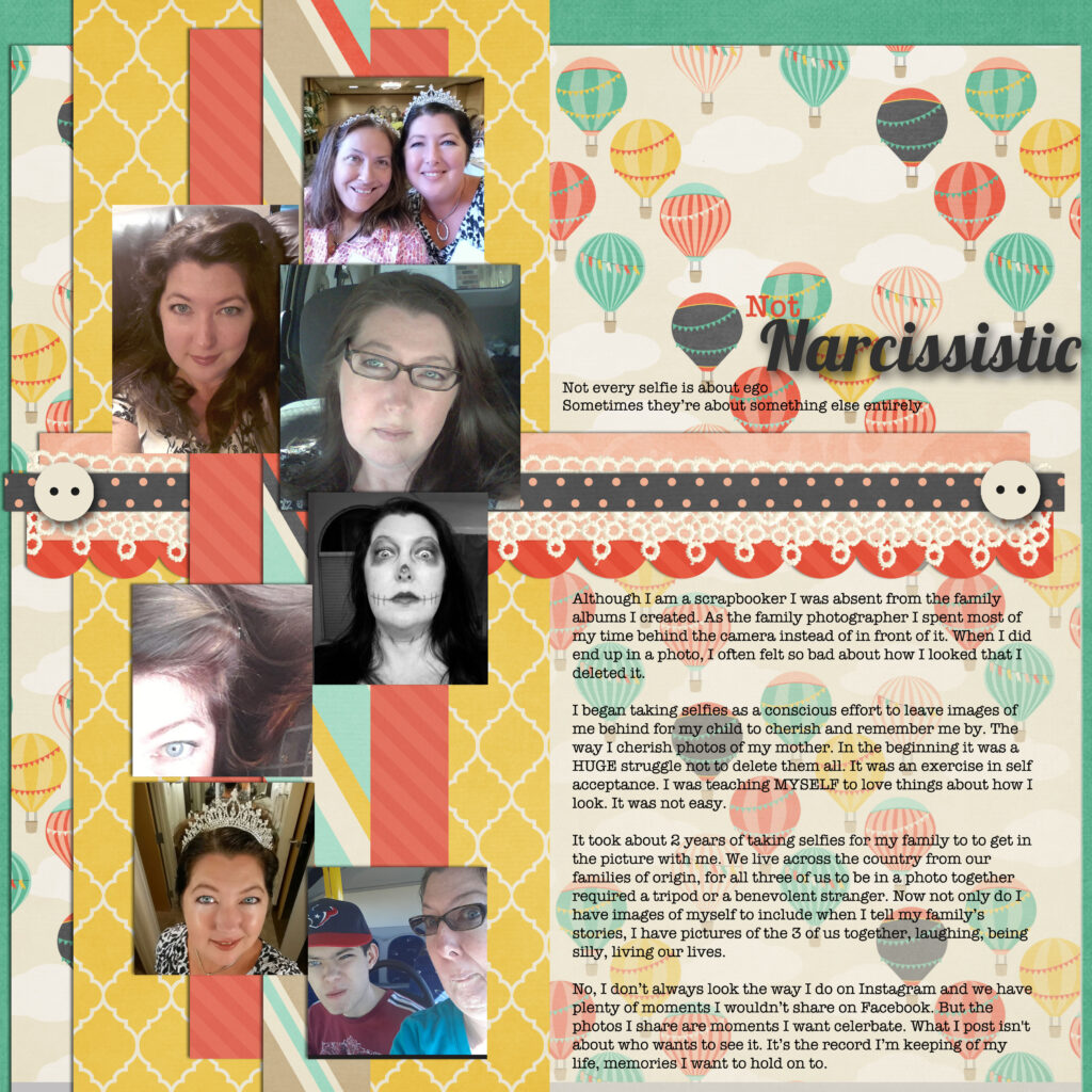
The digital page bellow is beautifully balanced. The page is divided in half vertically and also follows the rule of thirds with the photos occupying 1/3 the width of the page and the scallop and lace horizontal lines describing the top third of the page.
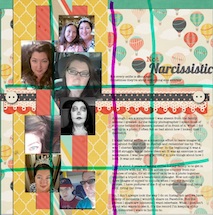
In this overlay the purple line divides the page in half and the aqua lines divide the page into thirds. The page is a strong design because it utilizes all of these ratios.
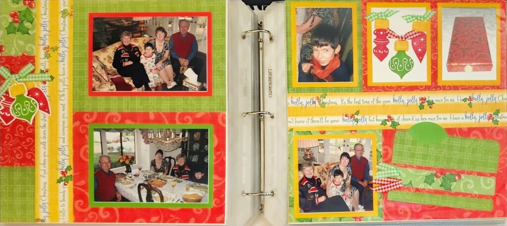
This is my final scrapbook example of split page design. Once again we see the left hand page divided into 1/3 and 2/3 vertically and the right hand page is divided in half horizontally.
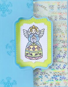
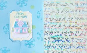
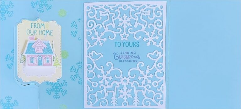
Since I’m usually the card maker I thought I’d also share a card example of a split design. This is a flip-it style card, it opens up into three panels.
What do you think? Do you make Split Page Design pages? Will you give it a try now that you have seen so many examples?
