This month your ScrapHappy Design Team is taking inspiration from cards to create their layouts. I make a lot of cards (and teach a lot of card classes at my store) but I’ve never purposefully looked at them to see if they could inspire a layout. Which left me a bit stumped.
Inspiration can come from all sorts of places though so I knew it was just a matter of time, and patience. Nikki found hers in an art shop while on vacation. I love that! You can read all about it in her post. Vacations aren’t really in my plans right now, so I looked a bit closer to home. Flipping through the Summer issue of Creative Scrapbooker Magazine seemed like a good place to start. I thought maybe I could take a card sketch and expand it to fill a 12×12 page and there were a few that I liked. I was about to create something with them, when I found this one.
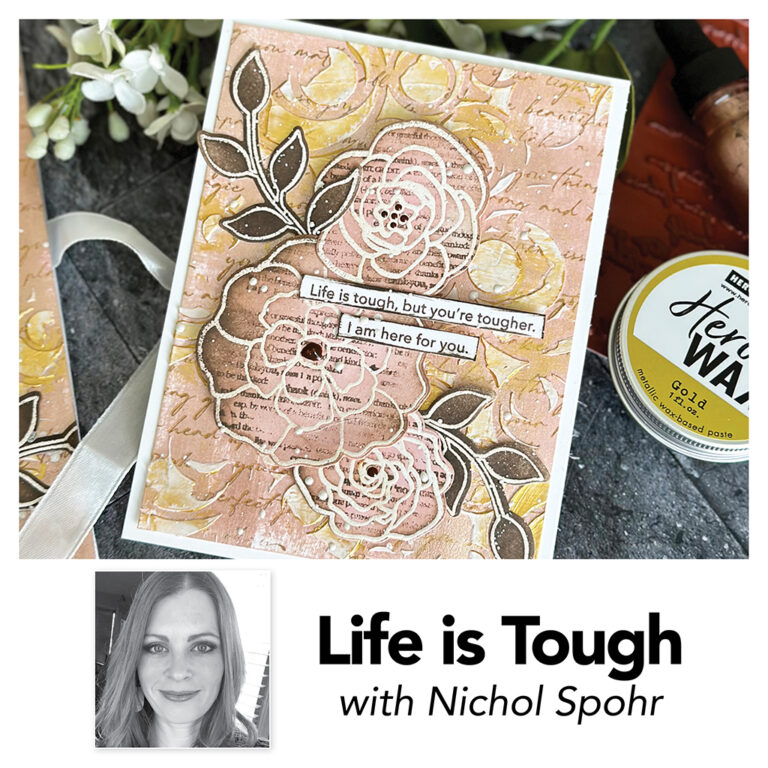
I had signed up to take Hero Arts’ Mixed Media Stamp Along last week and this card just jumped out at me as something that I could recreate on a 12×12 canvas. I am in a particularly trying stage of life so could totally relate to the “Life is Tough” sentiment Nichol used. Here’s a look at my process (okay, Nichol’s process that I followed and adapted!)
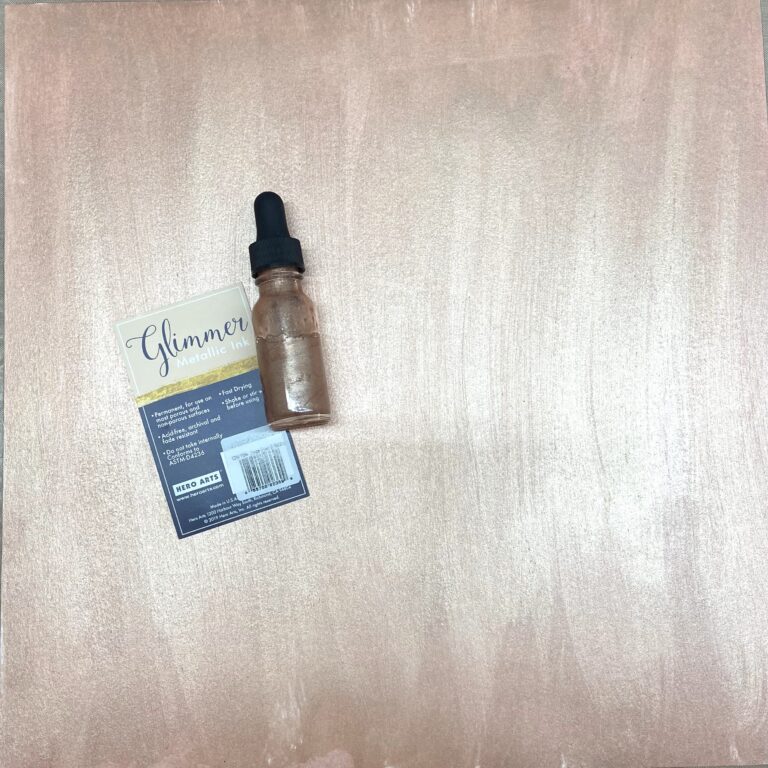
First I painted my entire sheet of Vicki Boutin Foundations paper with the Hero Arts Rose Gold Metallic Ink. While that dried I stamped a large flower image onto white cardstock and then heat embossed it with white embossing powder. I also stamped and embossed just the leaf portions of my image a few more times. I didn’t have the stamp set Nichol used but there are no shortages of flower stamps in my stash! The one I used is from Altenew.
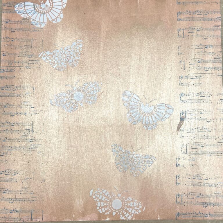
Next I added some stamping and stenciling to start the process of layering the mixed media techniques. I rummaged through our drawers of old stamps that we have in our store until I found one that spoke to me. (We have a whole wall in the back full of our old Stampin Up items, plus donated items, and newer products that we’ve bought for store use. It’s a total treasure trove for us and our customers!) The music notes represent a part of my life that I want to get back to, and the butterflies represent growth and change. That’s a story for another time though.
I got a bit overzealous in applying the white stencil paste and it went over the edge of the stencil. You can see the smudge on the right in the middle where I tried to wipe it away. Not to worry, I figured I could cover it later on. Remember, there are no mistakes in scrapbooking, just opportunities for embellishment!
Then there were a bunch of steps I forgot to take photos of! Yep. I’m living that IG sound bite “I shall record every step …. oh”. Sigh. Here’s my finished (sort of – I’ll explain in a bit) page.
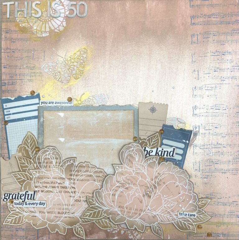
Steps to get here:
– using my finger, randomly work Hero Arts Gold Wax onto page and over stenciled butterflies
– ink flowers with Tattered Rose Distress Oxide (middle) and Ground Espresso (edges)
– add dimensional adhesive behind one of the flowers
– ink leaves with Ground Espresso Distress Oxide inks
– stamp some sentiments, cut them out and ink the edges with Ground Espresso
– find another sentiment and shadow stamp it over top of all the inking on the flowers. Realize you should have done this BEFORE you added the dimensional adhesive on the one flower but shrug and think, oh well, it’ll just look extra “artsy”.
– go through the Heidi Swapp Set Sail 6×8 paper pad and pull out papers to use as a photo mat, plus others to be cut out and used as embellishments plus journaling space.
– assemble it all together.
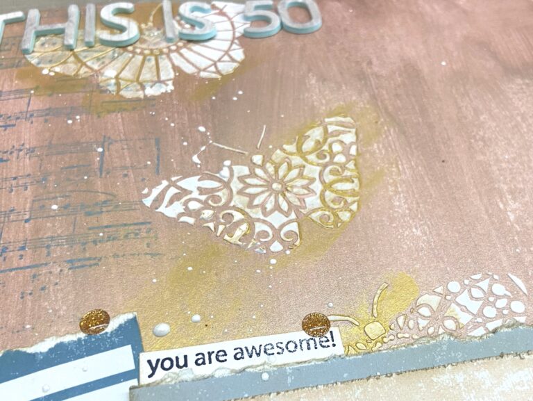
I alluded to the fact that this layout is not 100% complete. And that’s because it’s missing two major elements – a photo and the journaling. I turn 50 at the end of September so this is going to be my birthday documentation page. I will add both a photo and my thoughts on the whole 5-0 thing at that time. I wanted the stamped sentiment strips to reflect how I want to think about myself and how I want to encourage myself. Sometimes it’s hard to be confident that I am on the right path. A layout like this can help me to know that I just need to keep going with love and gratitude.
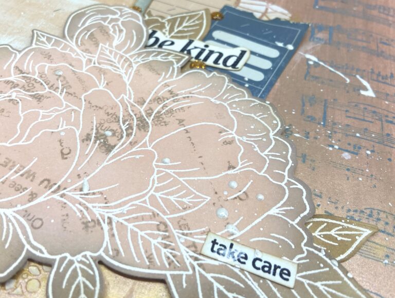
Once all my paper elements were in place, I flicked it all over with Hero Arts White Glimmer Metallic Ink. I used to use mists and/or watered down paints on all my layouts. I love the added texture it gives and really need to pull this out more often.
Have you ever taken inspiration from a card to make a layout? What about making a layout in advance of an occasion? Have you tried it, and did it help you document the event when it finally arrived? I’ll be sure to share my completed layout after my birthday.
And if you are ever in Delta BC, please come and say hi at Ladner Village Arts & Crafts.
