When I was invited to my very first Stampin’ Up party I remember remarking to the hostess that “I’ve been wanting to do more scrapbooking.” She gave me a nervous look and said, “Well, this is actually card making.” I replied with something along the lines of “Oh, it’s all crafty goodness.” Over the years I realized that my love of paper from layouts to cards and back again was not how most people thought of their paper based hobbies.
As you might imagine, I’m super excited that we are combining the two crafts this month on the blog! I see all the possibilities in both creative roles and I’m happy to carry over ideas from one to the other. I hope I/we can inspire you to do a bit of crafty role reversal as well.
Speaking of inspiration, Nikki has a fantastic post on using a word-art greeting card as her jumping off point for a layout. Alison created a stunning mixed media layout based on a card from a magazine. Their posts are very inspirational. Be sure to check them out.
Today I am taking my card inspiration from a Crop & Create Delivered card making event I participated in back in March. This card was created and taught by the lovely folks over at Spellbinders. What I love about card making classes is that they are full of techniques, color combos and focal points. This all translates beautifully into layouts.
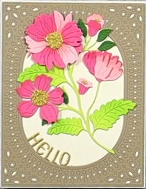
Taking a brief look at this card here are just a few ideas that can be pulled from this for a layout.
- A story idea about flowers.
- The “Hello” could lead to a story about visiting someone or even about trying out something new.
- Thinking about color, you could easily pull a brown, white, and pink color scheme. Or keep the brown and white and pick your favorite flower color to replace the pink.
- This card has a lot of texture. From the die cut and embossed frame panel, you could be inspired to use detailed textural elements like lace or doilies.
- Or you could reverse the design completely and use the flowers as the main framing elements.
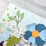
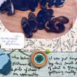
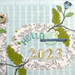
For me, I liked the frames since they relate very well to the photos on our layouts. I also liked the flowers, but I knew they would not be the focus. Instead I’m going to use them as part of the frame. In fact I am going to fully run with the framed element idea by creating four framed blocks on my page.
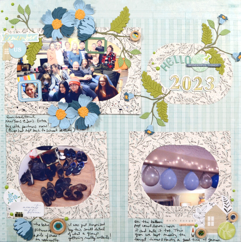
With slight variations to each block, I simply repeated the card’s main design idea four times across the layout. Each block has a frame, a focal—either the picture or the title—and some sort of foliage element. While I did add extra bits and pieces to my layout, as is my style these days, you could easily just stop with the framing and foliage and create a clean and simple layout.
For my layout I did use the exact same die cutting products that I used to make the card. However, that isn’t necessary (and is even very impractical if you are taking inspiration from someone else’s card!). This layout can translate well from any frames and any floral elements. Perhaps you don’t even want to use flowers! No problem. You could also replace those with other images such as stars or hearts or… This list is goes on and on. So, when you look to your inspiration image keep in mind your own style and product swap outs you can make.
If you enjoy layout process videos, this one is up on my YouTube channel.
Now go find a card and let your brain wander and free associate. You’re sure to come up with some fun ideas that will translate to your layout. When you create that page, be sure to share it with us over on our Facebook page. Even better you could join our ScrapHappy family an share your work in our Circle community. It is a nice place to have easy galleries and discussion topics without ads!
Product Information:
- Coverplate die: Spellbinders, Stylish Ovals Infinity Punch and Pierce Plate
- Floral die with hello greeting: Spellbinders, Stylish Oval Hello You die set

