
I’m gonna be honest. I am no cluster master. Adding clusters to my pages is not something that comes naturally to me and I don’t do it on every page. More often than not, I tend to shy away from too many layers and too many extras that distract from the photos or the story. After surveying a pile of my layouts, I was pleasantly surprised to find examples of these 4 simple ways to highlight the use of embellishment clusters.
- Add balance to empty space.
- Draw the viewer’s eye to certain places.
- Help highlight or frame a photo.
- Create a header, footer or border.
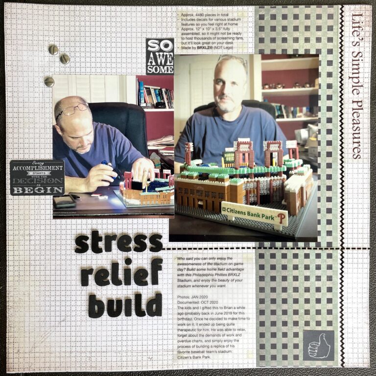
- Add balance to empty space.
This layout was nearly finished when I noticed that it was right-side heavy. I searched my stash for something small to add in the upper left corner. Since I used the word build, I thought it was appropriate to add a cluster of brads that look like screws. I tend to stick with the rule of 3s or odd numbers when clustering (but not always). I possibly could have added a couple more. Instead, I stayed with the thought that less is best.
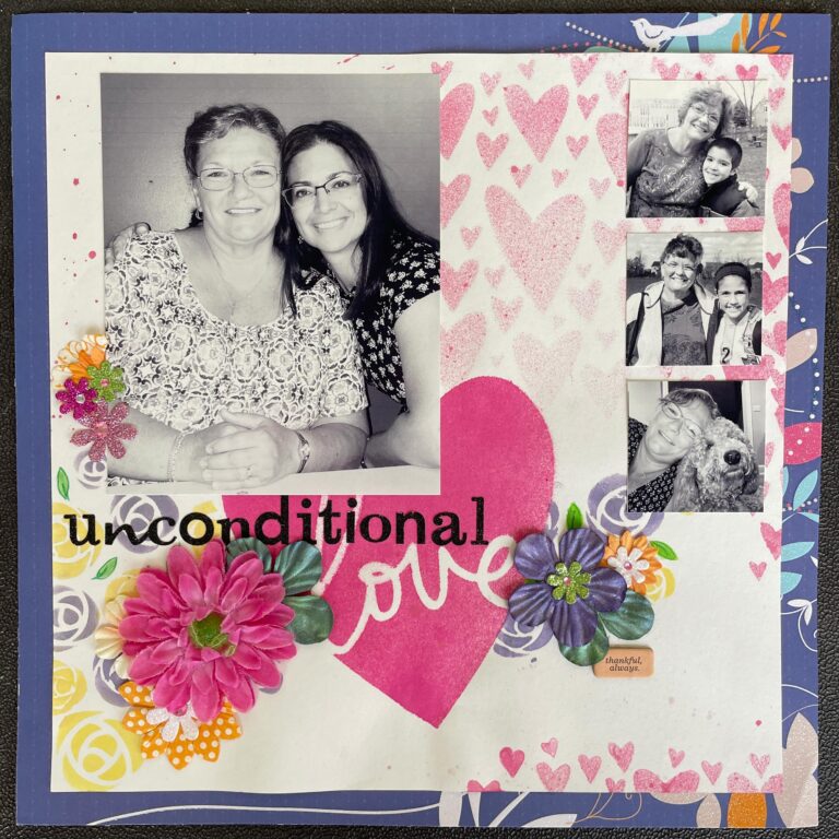
- Draw the viewer’s eye to certain places.
My impression was that the natural gaze would follow the eyes in multiple photos, starting from the main photo, then over to the right, then down the vertical column of 3 photos. So, I added 2 clusters of flowers on either side of the title to bring the eyes back across to the left. A third cluster of glitter flowers was also added to the left of the main photo to continue the gaze up and around.
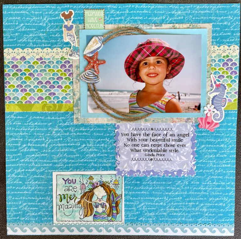
- Help highlight or frame a photo.
This photo is a favorite, so I wanted all the attention there. That precious face! The beachy circle with the shell cluster forces the eye around her face, then the subtle seahorse-flower-shell cluster on the right directs the gaze back around to the left. As you can tell, I stuck with my rule of 3s in this example.
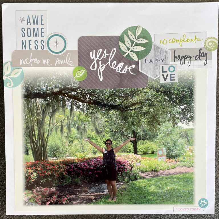
- Create a header, footer or border.
The intention here was to highlight the beauty of the garden in a full page photo, so it made sense to me to keep most embellishments off to one side. In this case, the word art, pocket cards and stickers create a decorative header or title for the layout. Notice that I did add a small cluster of only 2 stickers (ignoring my personal rule of 3s!) at the right hand corner, which helps to lure the gaze down to there.
I’m sure many of you could teach me a thing or two about embellishment clusters. I look forward to learning more from our SH team this month as well. Here’s hoping these four brief examples will give you a spark of inspiration to consider for your next layout. As always, check back each week for more tips and tricks!