A few weeks ago, my accountability partner, Jenn, asked me an important question. “What scrapbooking project do you feel excited about right now?”
It was a lightbulb moment. Her question made me realize that, too often, I have a case of the “shoulds”. These were either the projects or pages I had started and should finish or if an interesting scrapbooking event or deadline was imminent, then that should have my focus…or maybe because of FOMO.
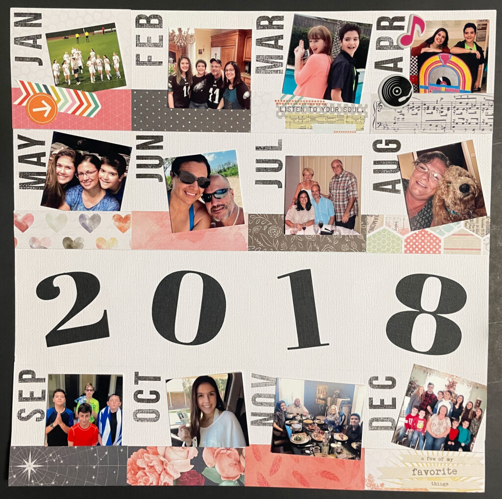
After really considering this question, it helped bring to mind an album project that I have been wanting to complete for quite some time now. It all started with one traditional paper layout. It was a summary layout of 2018 with one photo for each month. I divided the page into a grid of 4 columns and four rows. One row was kept open across the page (rather than sectioned off) to make space for the layout title. In this case, the title was the year. The rest of the 12 spaces were for the 12 monthly photos (as well as embellishments and captions).

Once the layout was complete (except for captions – to be added later), it was satisfying to see so many family photos representing our stories on one page at a glance. I realized then that it would be even more fulfilling to have an entire album, perhaps 20 years worth, of annual summary layouts. This project idea filled me with eagerness and anticipation then, as it still does now.
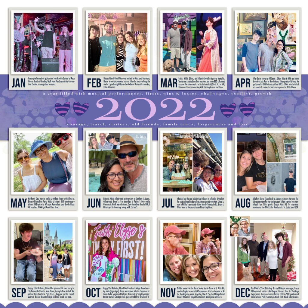
So, when it came time to consider my focus for this months theme of multiple photos on one page, I found it to be the perfect incentive to get a second year completed. The year 2022 seemed like a wise choice since it was the most recent completed year and I still had some memory of the events. As you can imagine, the most challenging and time-consuming aspect was photo selection. Having to narrow the dozens or (sometimes) hundreds down to one can be frustrating. At first, I was determined to only have 12 final photos as I managed to do with the 2018 layout. However, because I decided to go digital this time, it was much easier to fit more than one photo in the designated space, if I wished.

For this multi-photo layout, as I perused the photos, I made it a priority to make notes of all the events that occurred in a month. I decided that if there was enough space, I would add as many of those anecdotes as would fit. Another difference from the first layout, was that I didn’t add papers or embellishments to each monthly section. Instead, I got creative with the header or title area behind the year title. This choice allowed more space for each of the captions.
This yearly summary layout is one way to get multiple photos scrapped on a single layout. It is the kind of layout that requires either careful consideration or quick decision-making, depending on your perspective. It can be time-consuming in the beginning with photo selection, overall. In the end however, the final result feels fulfilling and worth the extra time and effort.
Check back weekly for blog updates on creative ways other ScrapHappy Creative Team Members work with multiple photos on their layouts. Another thought: consider reading SH blog posts that you may have missed!

