
This month’s blog topic is color blocking. What exactly is color blocking? Nikki answers that question very well with a bit of art history. If you haven’t read her post, you really should check it out. She offers a quick and simple lesson that gets to the heart of the matter.
To put it in simplest terms, color blocking can be described as clean lines and sections filled with 2-3 bold colors.
Nikki Kann Tweet
While Nikki explains the roots of color blocking, concepts often grow out from their roots! I’m going to do just that today by shifting color blocking in a softer direction.
There are two main ways I soften up the color blocking concept.
- I use zones of color, big or small. Those zones often are not the square blocks as is traditional.
- My clean lines often get blurred with embellishments. This moves the design away from the rigid lines of color blocking.
Let me show you this example to illustrate what I mean.
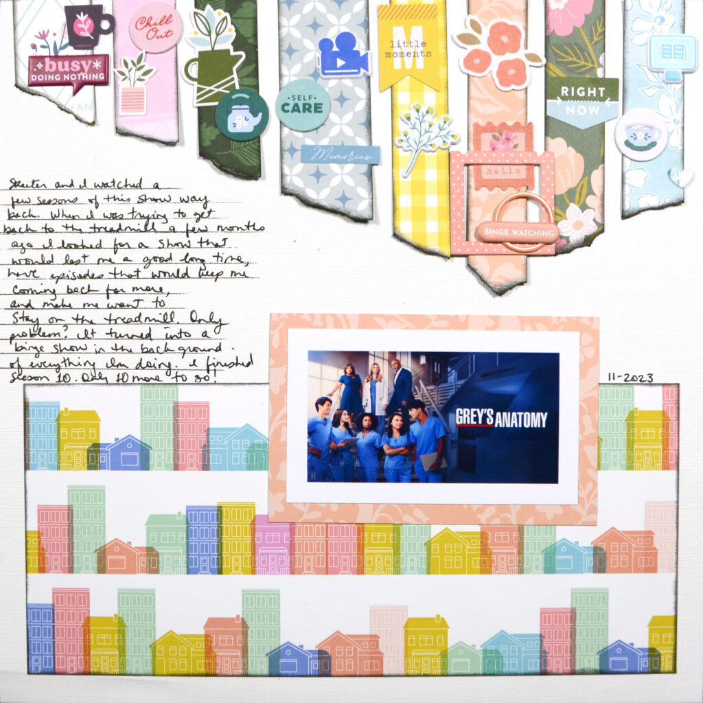
My first choice for this layout was the house pattern paper. It has it’s own zones of color. Those colors largely have contrast with the adjacent colors. That contrast is one of the foundations of color blocking. Yet the varying shapes, sizes, and overlapping edges creates a softer feel.
Moving on from there I repeated the blocking of the houses at the top of the page. I used those color options to pull pattern papers for creating stripes of color. While color blocking tends to be solid colors, pattern papers have, well, patterns. I do tend to choose subtler patterns to keep the zones cleaner so that the heart of color blocking isn’t entirely lost.
My stripes of color also don’t have the pure clean lines of color blocking. Torn edges and angled trims give a different feel from a traditional color blocked layout. Yet the inked edges provide definition to each zone and calls back to the work of Piet Mondrian, who made color blocking iconic. His zones were delineated by stark black lines. (Nikki shows off his classic artwork in her post. You’ll know it when you see it!)
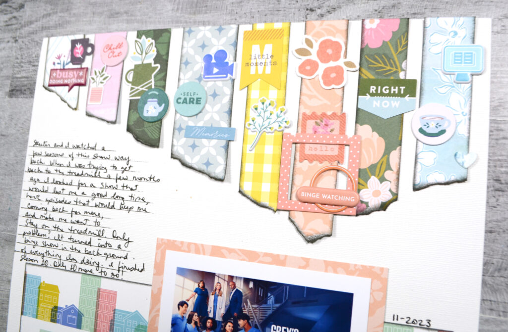
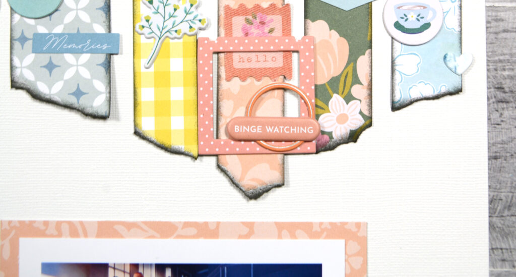
I could have stopped with just the stripes of paper for my blocking. However, my style is to do more. I added lots of little bits of embellishment that more-or-less matched the pattern papers. No match is perfect, but the overall coordination is there. If embellishments stray too far from the paper color you will lose that blocking feel. More on that in a bit.
As you can see, this is also where my blocks get a bit blurry. That works to relax the marching rigidity of the stripes leading the eye to the photo.
So, if I’m moving away from color blocking this much, why worry about that design element at all?
Remember the clean lines and zones of color lend a very repetitious feel to a project. That visual repetition supports the story I’m telling. Yet this technique also has a calming note to it. Breaking up harsh lines lends a different mood! The combination of repetition and relaxation is what this story needed!
That wraps up my post for this month. I hope Nikki and I have inspired you to use color blocking, or color blocking-adjacent techniques on your projects.
Join us next month as we dive into some layout sketches!