
I am a big fan of sketches. It is an instant way to break the blank-page anxiety. Many times I will start with a sketch and then peruse photos until I find a story that fits. The process of finding a story always has the challenge of my story needing something slightly different. So, once the story is in place I start to tweak. I’d love to walk you through two ways that I’ve tweaked the sketch that the team is working with this month.
First, let’s take a look at the sketch and the original layout inspired by that sketch. This layout is from our own fearless leader, Alice.
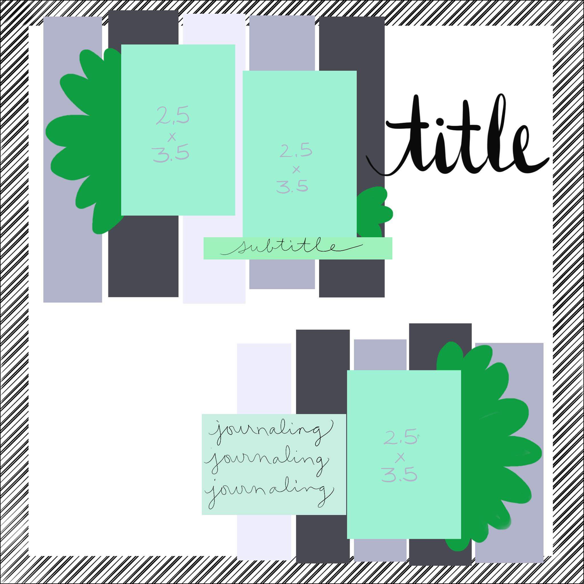
When I look at a sketch the very first thing I take note of is how many photos it calls for. In some cases you can add more photos, and in almost all cases you can reduce the number of photos. There is always flexibility. For this sketch the photos are small and yet, each photo zone is quite large. That makes it a bit tougher to add in too many more while still retaining all the elements. Yet in the second layout I share you’ll see how I kept elements of the sketch and still made it work for story & photos.
Before we get to that however, let’s take note of other elements of the sketch that can be put to use.
- There is a full border to the page.
- There are two photo zones that can be used for related, yet different photos.
- We have room for a nice big title.
- There is a decent space for journaling.
- The zones are defined by strips of paper which can be very useful for using up scraps.
- There are just a few embellishments and those are set on a diagonal.
Now that I have ideas of what I can use for my own layout it is time to get started. First off, I’m going to pull three photos. This leads me into the place where I need to start tweaking. I have some vacation photos to work with and one is a landmark photo while two include people. First change I will make is moving the single landmark photo to the top to set the scene of the whole story. This photo is larger than in the sketch, so that will naturally mean making other adjustments.
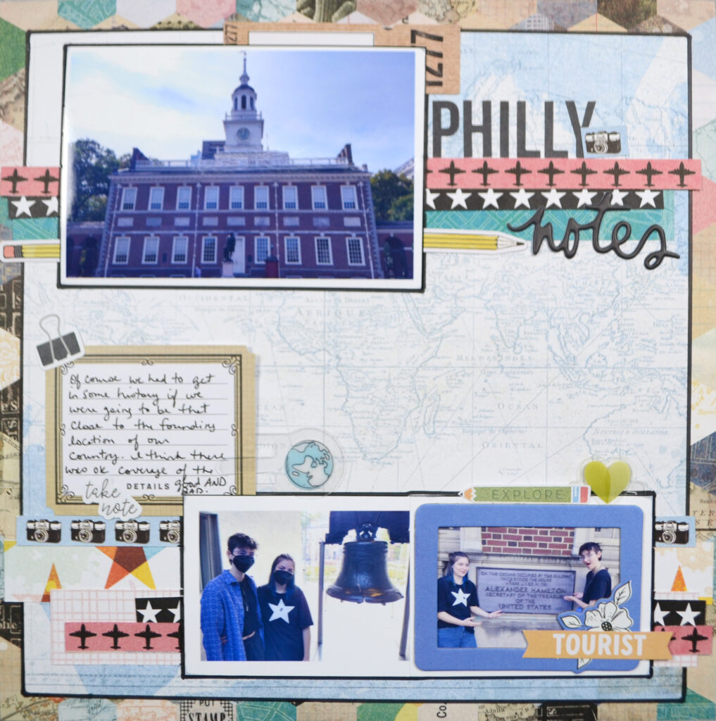
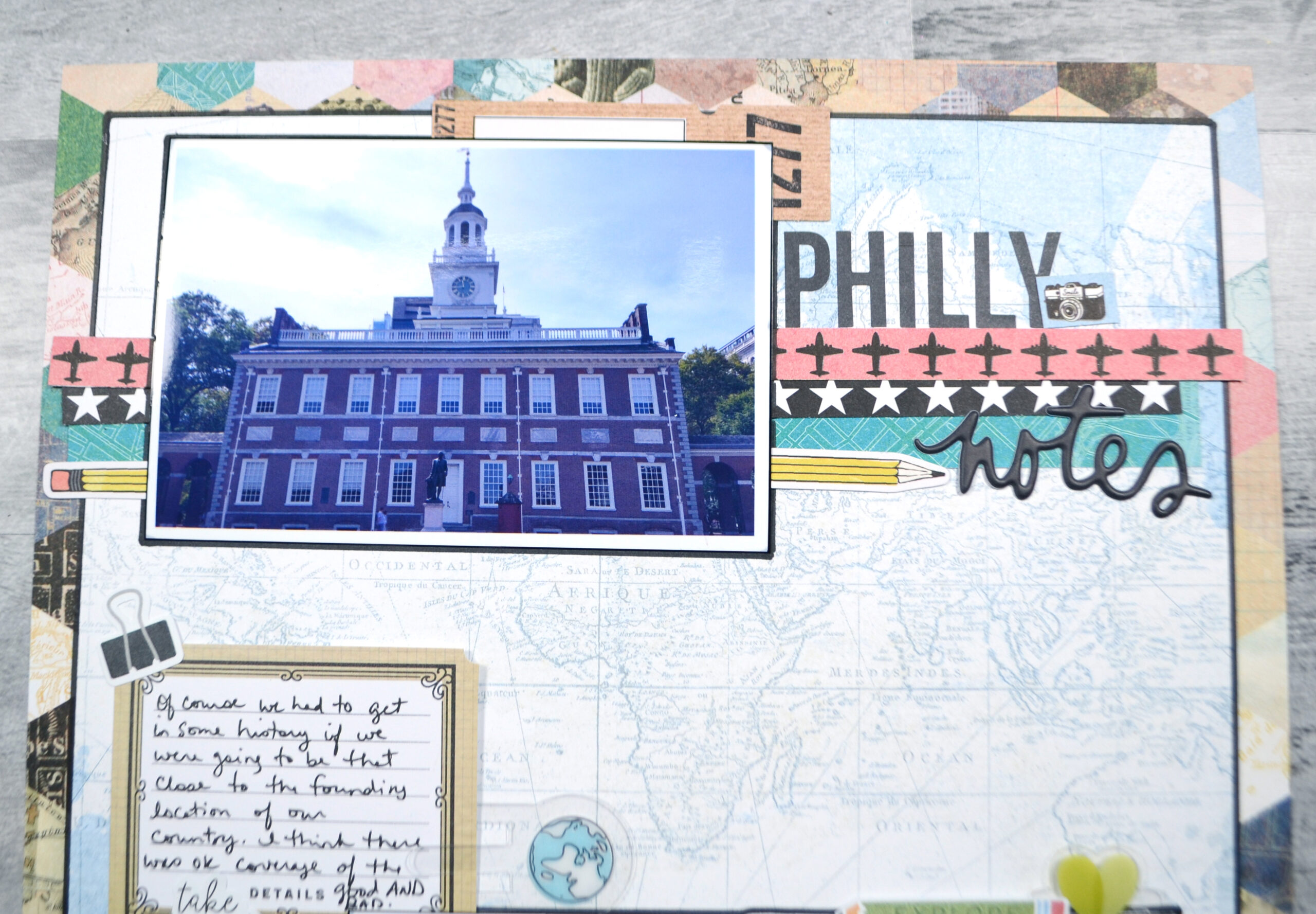
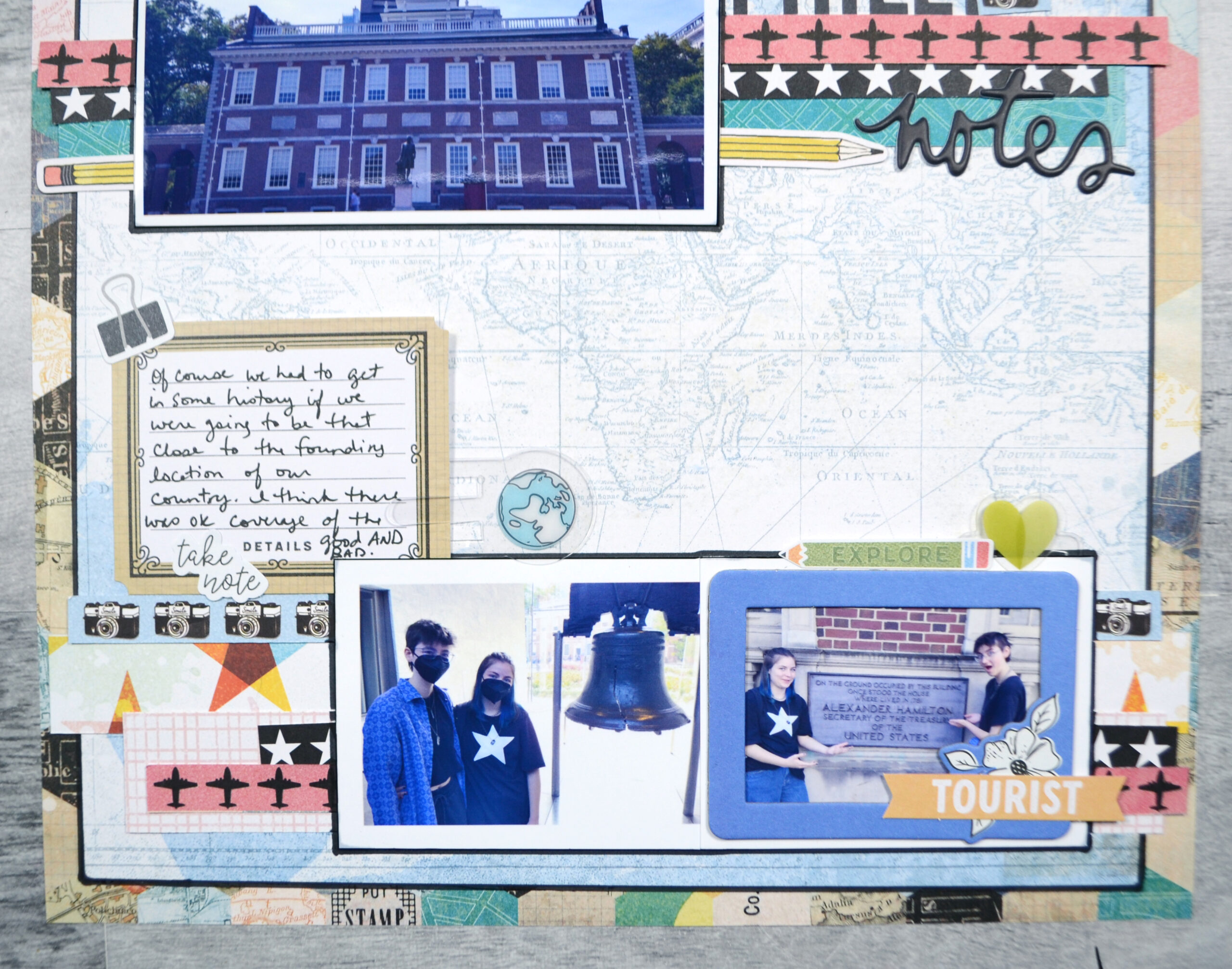
From this point, those adjustments were pretty minor. I turned my strips of paper horizontally to allow more breathing room between the two photo zones. I need this extra room since my journaling had to be shifted upward to accommodate photos of differing sizes and orientations from the sketch. Other than those few changes, things look very similar to the original.
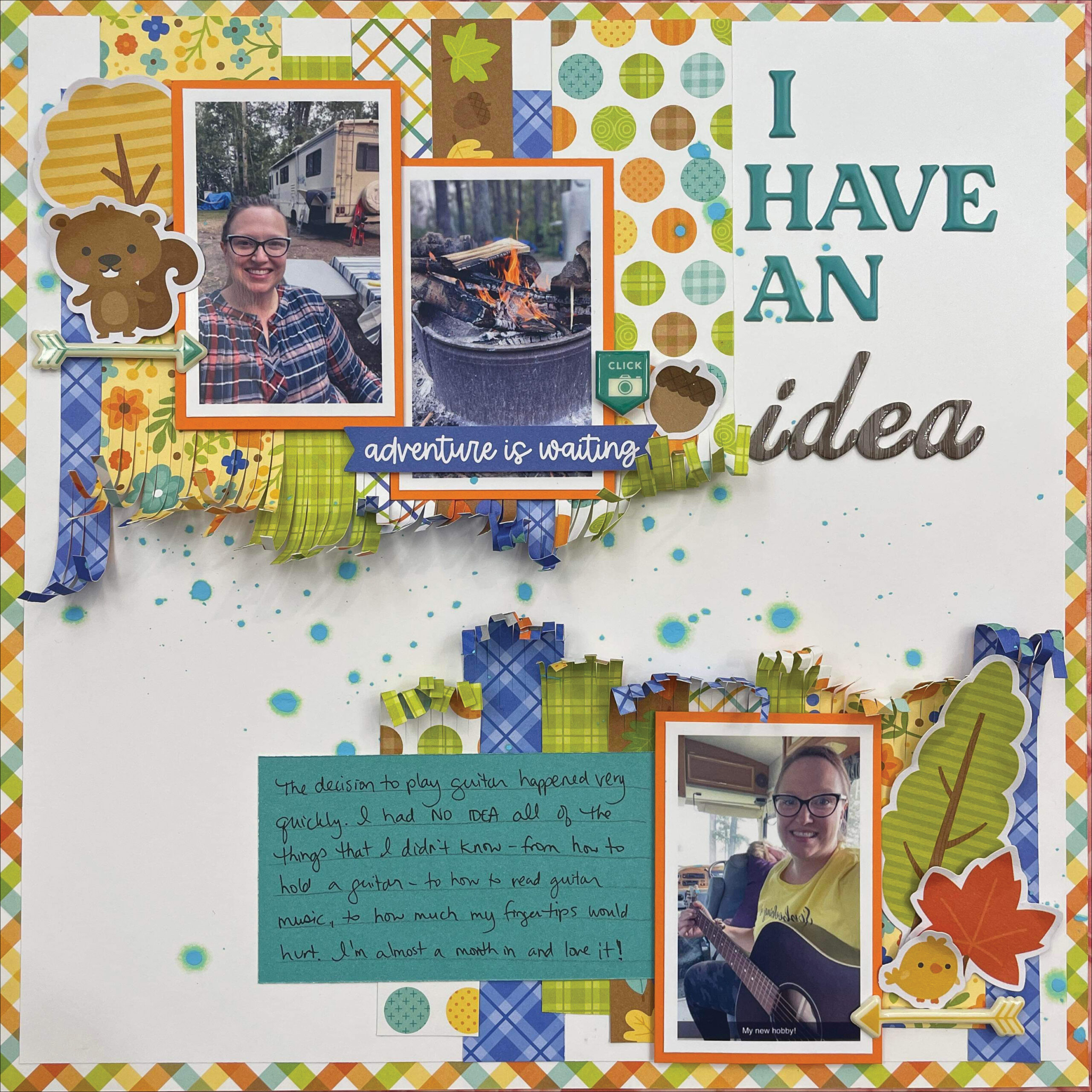
Now, let’s take a look at the layout where I made more significant changes. These changes may make the layout look quite different than the original, but trust me, those key sketch elements I mentioned above are still floating in my head as I work.
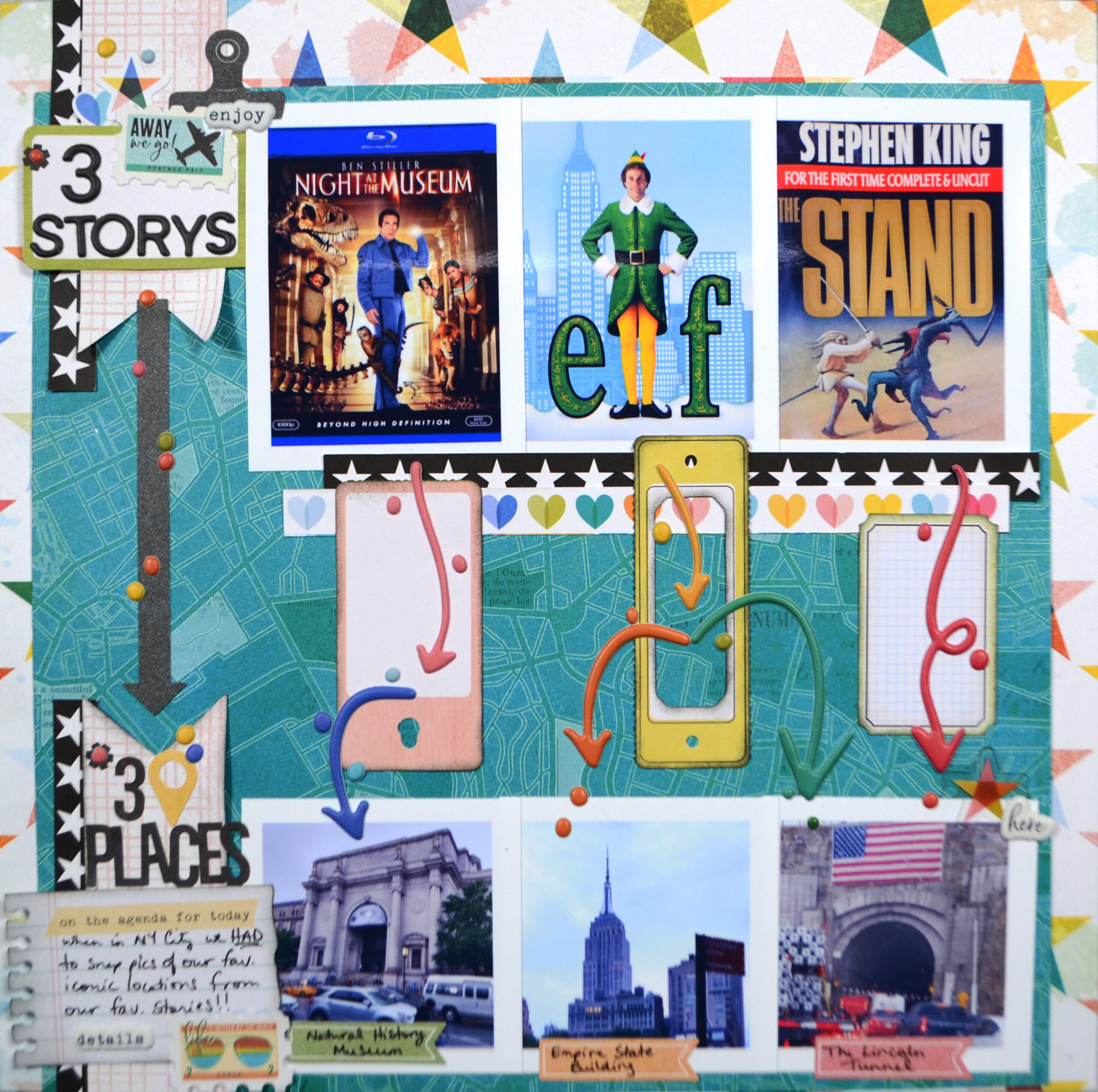
Remember when I said it can be harder to add in extra photos to sketches? In this example I have done just that. I’ve increased from three to six photos. These photos do still fall into two story-telling zones: fiction and reality. Thus that part of the layout stays true to the original.
More photos does mean I have to squeeze things more tightly together. However, by tweaking the lower photos to be slightly smaller than the upper ones, I still have the space to allow for those two distinct zones. For the next change, I did choose to specifically align my photo zones directly over each other so that I could use the arrows to visually draw connections from the upper zones to the lower zones. In this case the arrows and tags are filling in some of the vertical visual movement that the paper strips would have been doing.
Speaking of those largely missing paper strips, most of the remaining changes to the layout stem from the photos taking up more room than originally intended. That means I simply had less space for all the paper strips. I did still keep a few in the upper photo zone, and I added a few to my title and journaling zone to make up for that eliminated element.
With those changes in place I had to reduce the size of the journaling and titles. However, reallocating the paper strips to these areas also helps those elements stand out a bit better despite the smaller size. With that my layout is complete. Not much embellishment is needed since those arrows have a lot of visual movement happening.
Alright, that is it for me for this month. I hope you found it helpful to read about my thinking process when using sketches. If you haven’t seen Nikki’s take on this sketch, you should check it out. Not only did she make the sketch work for her story by tweaking a few things, but she was also inspired in a much bigger way. You’ll have to read her post to find out more!
Happy New Year to you all and we will be back in 2024 for another year of scrapping inspiration for you.