
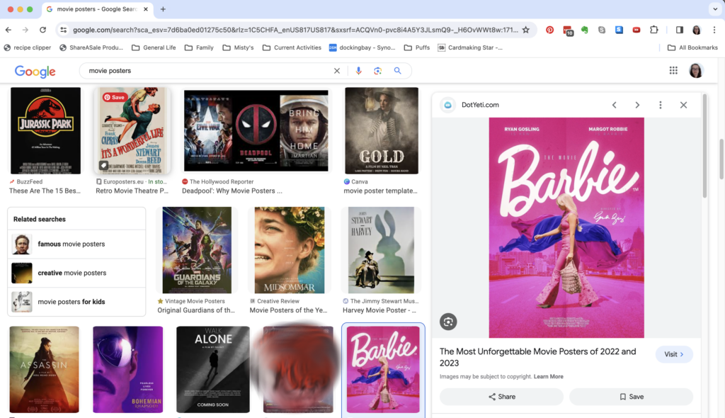
We are continuing our 2024 series on unexpected inspiration. This month we are taking a look at movie posters. This is an abundant source of inspiration. I could spend hours scrolling through the image gallery from a Google “movie posters” search. Luckily, I didn’t need to!
I stopped scrolling as soon as I saw this image of the Barbie movie poster.
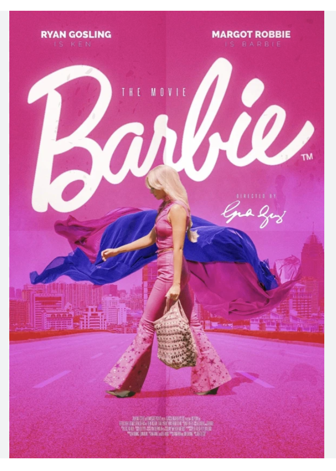
The colors and the flow of the blues and pinks made me instantly think of some alcohol ink art I have sen in the past. No doubt about it, I was inspired to pull out my alcohol ink collection and try a flowing color technique!
The Technique
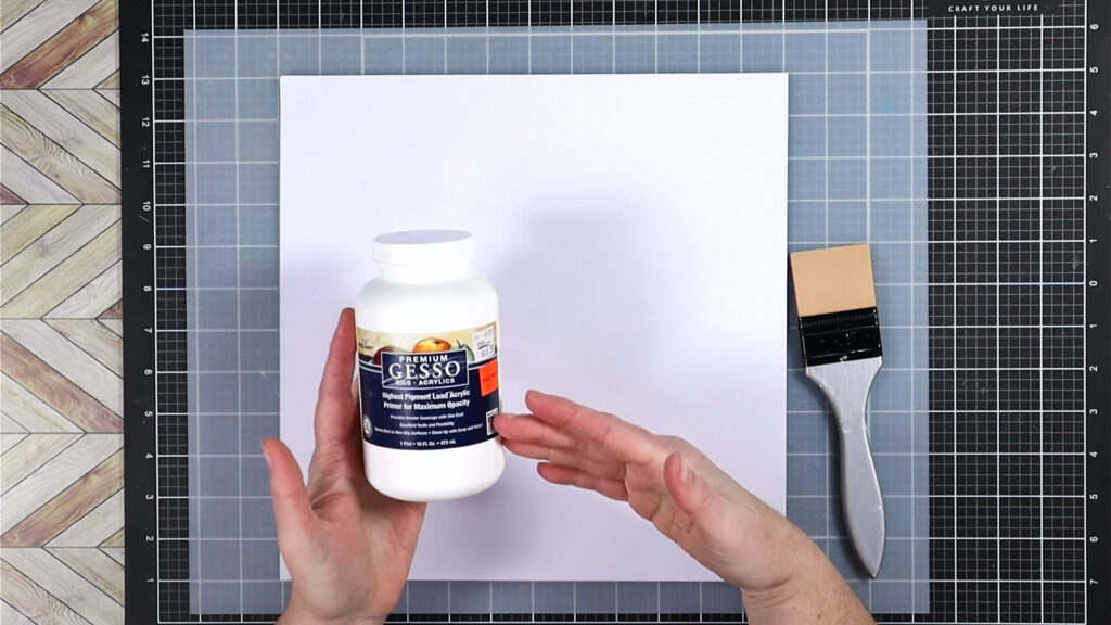
If you have never worked with alcohol ink before, there are a few specialty items you’ll need. First and foremost is a non-porous surface to work on. This allows the inks to flow and swirl as you work with them. If you use these inks on plain cardstock the ink soaks right in and creates blobs. Not what this medium is made for.
That specialty non-porous surface is often Yupo “paper”. It isn’t exactly a paper, but more of a plastic type product. That means the inks won’t soak into it, but instead float on top of it until the alcohol substrate evaporates away. Yupo is expensive though, and finding it in 12×12 size is very difficult. My solution is to make my cardstock non-porous by covering it in a coat of gesso.
Gesso is an acrylic based paint product. It is used specifically to fill in the pores of canvases so that paint won’t just soak into the fibers of the canvas. We can use that to our advantage for alcohol inks as well!
Adding a second coat of gesso is a good idea as any thin or missed spots will allow the ink to soak into the paper. However, I worked carefully to make sure I had good coverage. I was able to do just one coat. I let the paper dry for a few hours and then I was ready to get inky. (FYI, in the future I plan to mass produce pre-gessoed papers to have on hand when I want to play!)
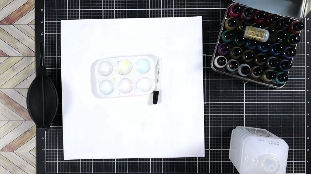
I pulled out my inks, a blower and some rubbing alcohol. A couple of other useful tools are a paint pallet with wells and an eyedropper. Those are optional, they just make life easier. Now the blower is a little more crucial. However, you can use a straw and your breath to blow the ink around. Just be careful not to suck! Alcohol inks aren’t edible, LOL. Plus if you are blowing, you may be lightheaded after a while. The blower tool is just worth the investment if you want to play with alcohol inks!
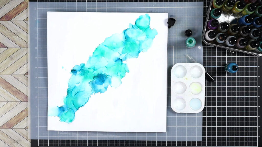
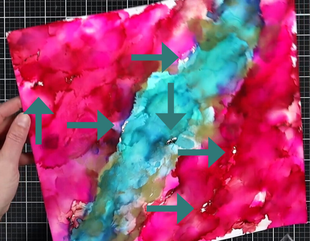
Start by dripping rubbing alcohol on the area of your page you want to apply color. This does two things, it lightens the intense color of the inks and it helps the ink flow. Drip your ink colors over the alcohol. Start with just a few drops since you can always add more.
Now start blowing the ink around! If you blow straight down on the drips you’ll get circular splat shapes. If you blow from a low angle on the side of a drip, you’ll get more elongated flowing shapes. That is what I wanted for this page to mimic the wrinkles in the fabric of the inspiration image. However, my first layer of color is more of that splat form as I was just getting warmed up with working this piece.
As you work, keep in mind that alcohol inks mix readily. Be aware of what colors you are placing near each other. If you put orange next to blue and they mix together, you’ll end up with brown. Yet knowing this bit of color theory can work to your advantage. You can invest in just the three primary colors of alcohol ink–red, yellow and blue–and end up with a whole color wheel of possibilities.
Notice below how I ended up with some purples forming at my junction between the pinks and blues? I tried to avoid this by working each color in its own zone. I would place my rubbing alcohol near–but not touching–the previous color and blow the new color away from the previous color.
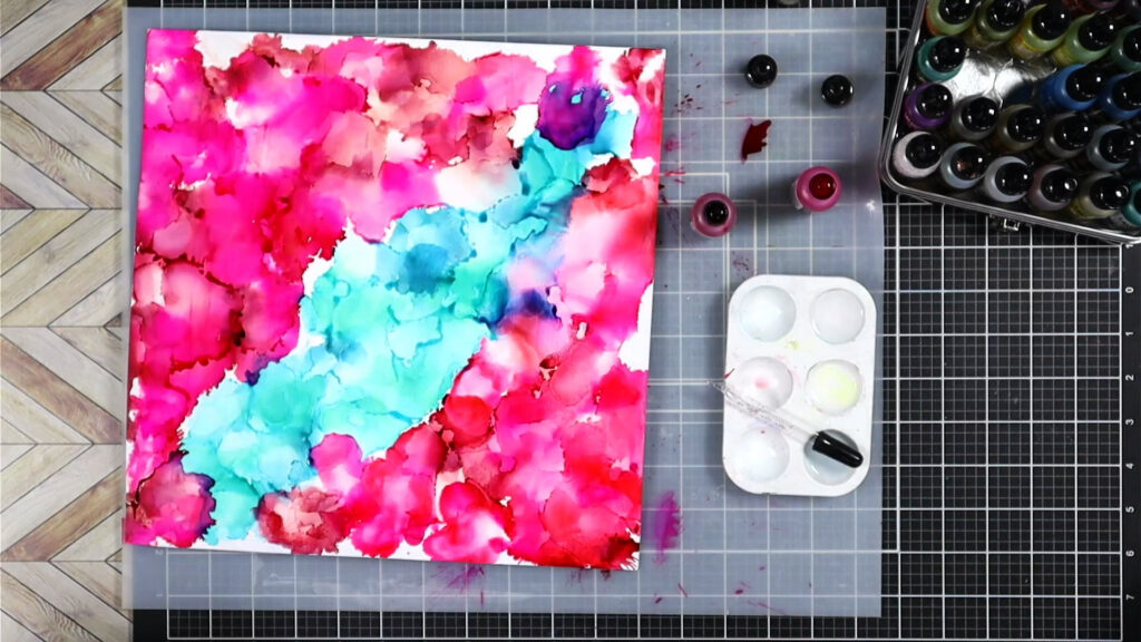
Since I didn’t really what purple, I added more fresh rubbing alcohol on top of the purple. Then I blotted up the reactivated color with a rag. This helped “erase” that area.
When working on Yupo, this is a very forgiving option. Working on gesso is somewhat less forgiving and the color lift wasn’t perfect. However it was good enough for me and you’ll see the results in the photo below.
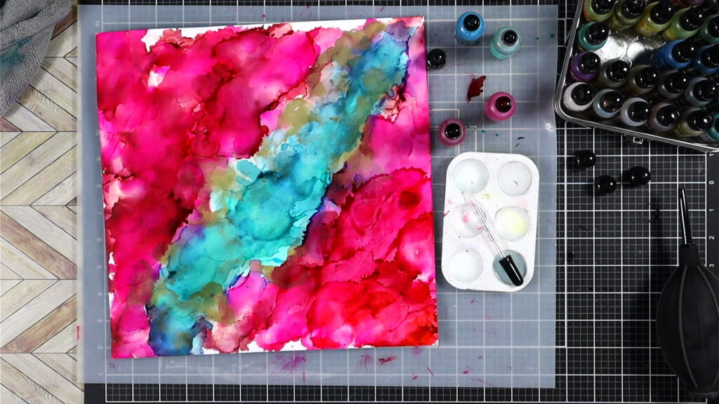
Alcohol ink drys pretty fast, usually in a few minutes. This means it is easier to move on to the next step. For that I went ahead and added a second layer of color directly over my first layer. This is totally optional and can be a bit counterintuitive. Since alcohol will reactivate the layer underneath, you may end up just moving what was already there around to new spots. This step really requires playing with your inks to see how to manipulate them and work with them, especially on gesso.
In the end it was well worth it! Look at this flow of color! So eye catching. Note, that I also added a gold metallic alcohol ink at the junction between the blues and pinks to help those zones meld better with minimal purple creation. However, the purple that I did end up with is so pretty despite wanting just pinks and blues.
Bonus Technique
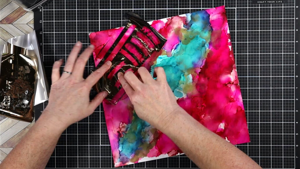
When your alcohol ink is nearly dry, yet has a bit of sheen in veins when tipped in the light, you can do one more step. Use some foil sheets to press areas of foil to those shiny spots. Those areas are actually just slightly tacky and will grab onto the foil. This can give you shimmery veins to your project!
Do note that the type of foil you use is important. You want the toner reactive, aka heat laminator style. This can be easily confused with the newer “Hot Foil” system foils. When purchasing if you note that it can be used with toner, a laminator or glue/adhesive, you should be good to go.
Finally, this can be a little bit of a temperamental technique. Getting the ink at just the right dry stage is something you have to practice at. So give yourself grace if it isn’t working well.
This is a bit tricky to capture on camera, but hopefully you can see it. In person it is much more dynamic and beautiful.
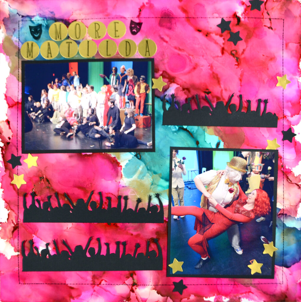
The Layout
As this post is all about the alcohol ink technique, I’m going to jump this layout to it’s final form. You can see that I kept the layout really simple so that the paper is the real star of the show! With a stamped and punched title and a couple of die cut embellishments, I was done.
A word-and-photo tutorial is difficult for this technique. Luckily I’ve filmed it all and have it up on my YouTube channel if you want to see how all this works in action!
I had such fun playing with my inks. I don’t do it nearly often enough. Glad I was able to share my mixed media love with you today. Can’t wait to see how you interpret movie posters. I’d also love to know if you try out this technique!
Until next time, happy scrappin’.