It is time for a new Unexpected Inspiration challenge. This time around we are talking about wedding cakes. As soon as I heard the topic, I instantly knew what I wanted to do. I went looking for a wedding cake image that matched my idea.
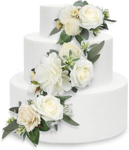
When I think of wedding cakes I think of circular layers with a cascade of flowers. The colors are often white or very pale. There may be a pop of accent color. The picture above contains all of those elements. Of course not all wedding cakes are this way, but it is a pretty traditional idea.
Working with this concept, I wanted to incorporate circles, an abundance of flowers, and a subtle color palette into my design.
Background
There was a time when I didn’t use many flowers. My layouts were always fairly candid every day life and flowers often didn’t fit the mood. Yet I’ve seen many ideas featuring heavy florals. I even recently completed a project for a class that was rich with florals.
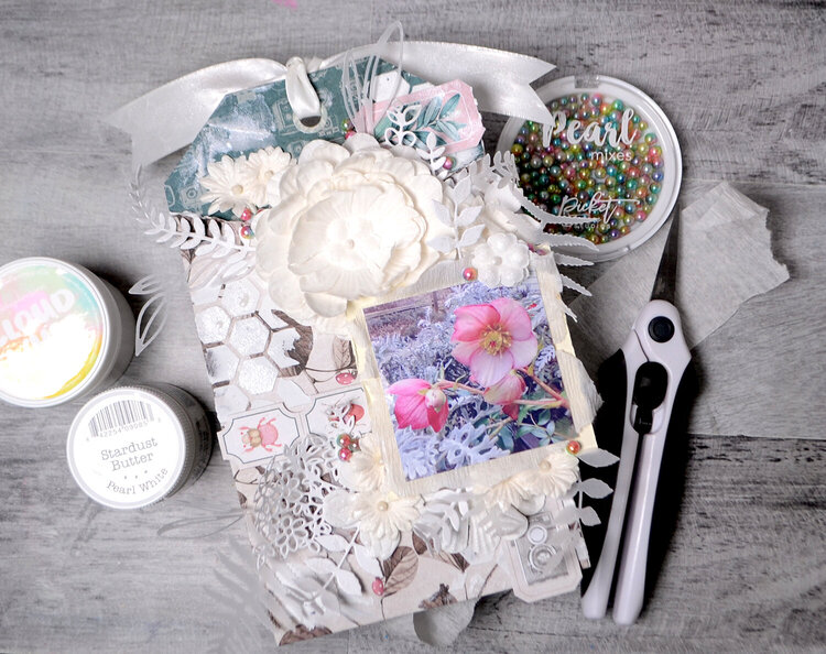
My relationship with flowers is changing and I am loving it. That made this wedding cake inspiration right along my current interest path.
The Process
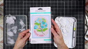
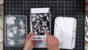
First thing I had to do was figure out where all my flowers were going to come from. In the past I’ve used this (left) Spellbinders die to create lots of die cut flowers. This time I had this new die I just received for an exclusive class. I decided I wanted to play more with the new lovely die set.
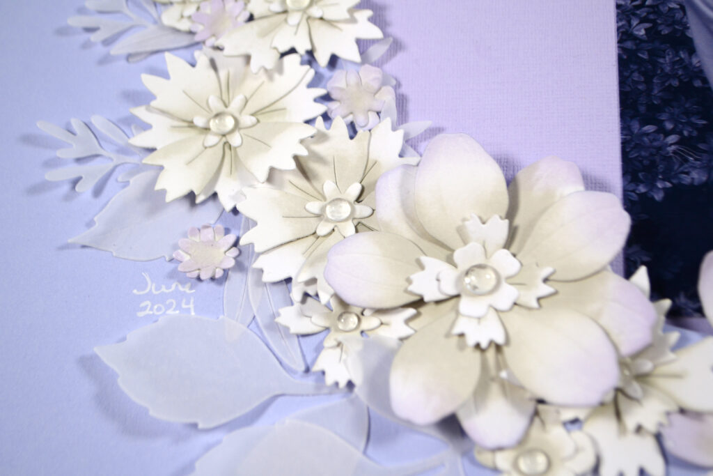
The best die set to use is really the one that has the most die pieces in it! Die cutting all these flowers will take a bit of time. Plus, having different shapes and sizes of flowers will make the end result more dynamic. Don’t forget about cutting some foliage to fill in the gaps. I cut all my flowers from white cardstock and my foliage from vellum. This all lends to the soft romantic feel.
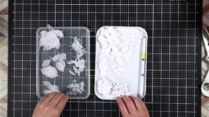
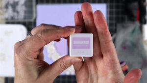
Now it is time to add just a hint of color. When I started this whole process I had no idea what story I was going to tell. I just started by making a pile of flowers. So to add color, I wanted to keep it really neutral so that it could fit in with any story I may use these beauties for.
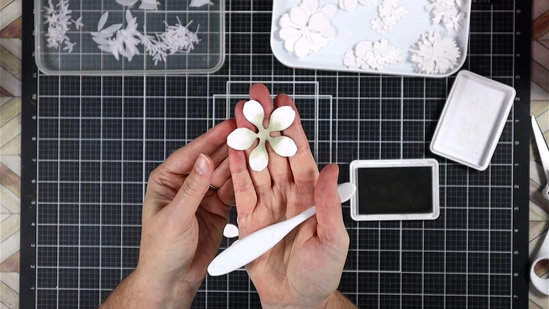
It is good to have music, an audio book or even a TV show to keep you going while you do all your cutting, ink blending, and assembling. It really does take time, but the end result will be stunning and well worth it.
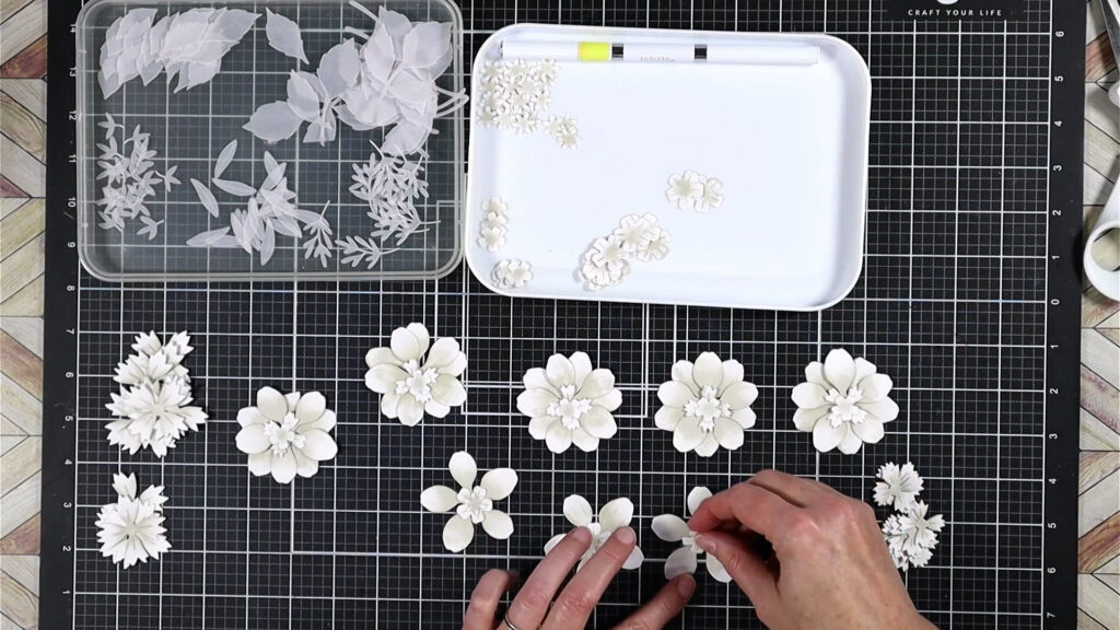
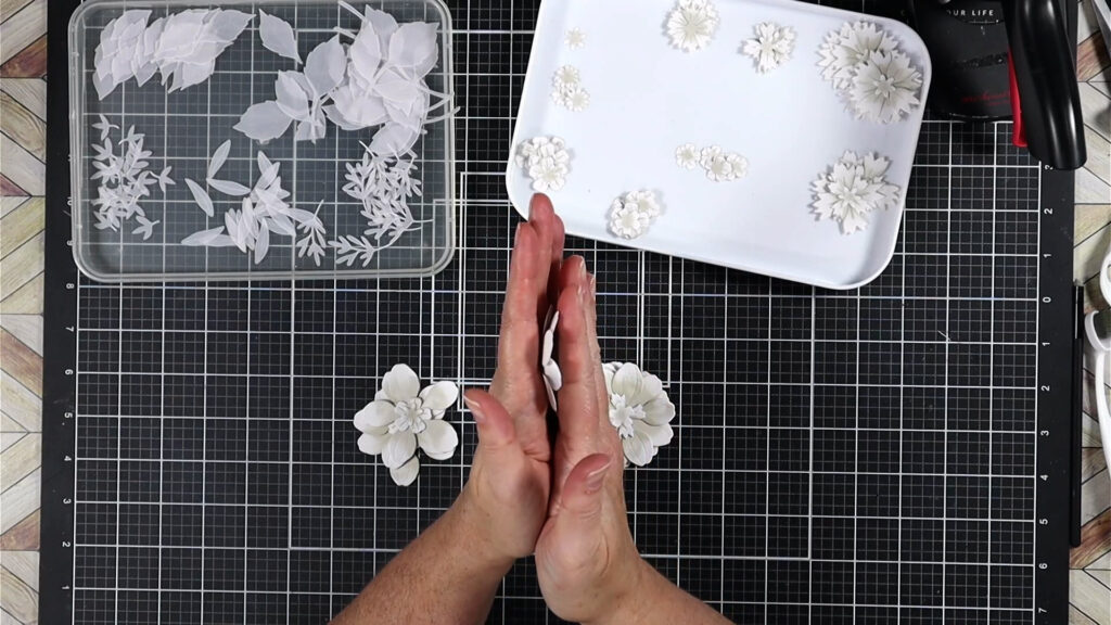
Once everything is inked it is time to layer. Mix and match flower types to make each flower layered and full. Just a dab of liquid glue in the flower center will hold everything together. That leaves the petals open for shaping for even more texture.
In the photo below you can see how the flower is now cup shaped. This is easy to achieve just by tipping each petal slightly up.
The Project
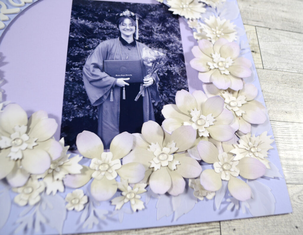
With all my flowers ready to go it was time to decide how to use them! Since I was going for a soft romantic feel I chose this college graduation photo of my middle kid. I converted the photo to black and white so that the bright red graduation gown would not clash with the rest of the layout.
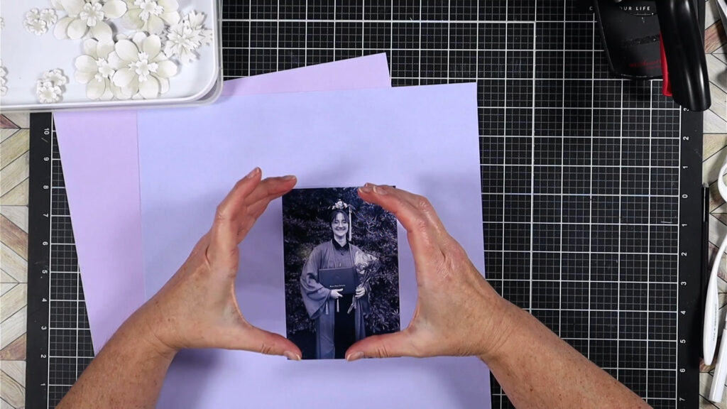
Remember at the beginning of the post I mentioned adding a pop of color? Now is the time to bring that in. It so happens that my kid’s favorite color is lavender so I added in cardstock in that color palette. Using two layers of cardstock allowed me to cut a circle in my top layer and pop it up using foam tape. That created a natural frame to tuck in my photo. Then it is time to surround that frame with my cascade of flowers!
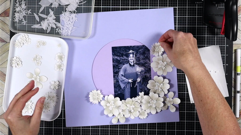
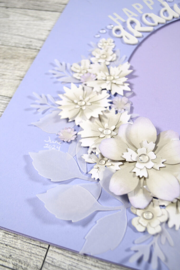
I added the larger flowers to the bottom right of the framing circle and tapered the flowers off as they curved around to the top. That will leave me a space for my title as you’ll see in the final photos.
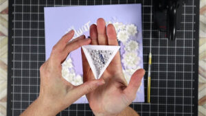
I was sure to use the foliage pieces to fill in any gaps as well as add detail. A few final touches, like inking the largest flowers with more lavender color and adding some sparkle, really pulled everything together.
The Results
That left me with a wonderful layout all done!
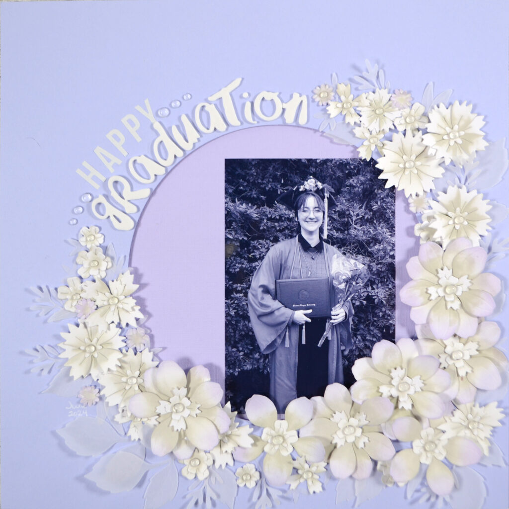
I hope you find this layout as beautiful as I do! If you want even more details on the creation of this project, here is my process video.
Now, I took my layout to the traditional soft and romantic vibe. However I have been to weddings that featured really bold colors — one was largely orange, and a second was magenta, golden yellow and royal blue. It would be amazing to create flowers in those tones and feels also. It would make for a very different layout story mood!
If you decide to try that, we here on the team would love to see your work! Be sure to share it in our Circle Group. Until next time, happy scrappin’.

