Load Mini Day 4
If you are not already a ScrapHappy member, then you likely don’t know about LOAD. That stands for LayOut A Day. It is a daily scrapbooking project that our group runs several times a year. In the summer we do LOAD mini which is just a week long project as opposed to our typical month long challenge. If you’d like to try this mini LOAD idea for free, there is a link to do just that. Be sure to check it out.
If you are a member and know about LOAD, I hope you are playing along with our mini version here in August. We are being inspired by the movie Foot Loose this time. I was able to provide the featured layout for our Day 4 story. Let’s take a look at what my prompts were and how I made them work for my scrapbook layout.
The Prompts
Each day we get optional prompts to help our creative process along. However, as featured designers our job is to use those prompts to their fullest extent. That way we can share ways on how to fit those ideas into your own processes.
My story prompt was to talk about something learned and my technique prompt was to use a favorite technique.
My Project
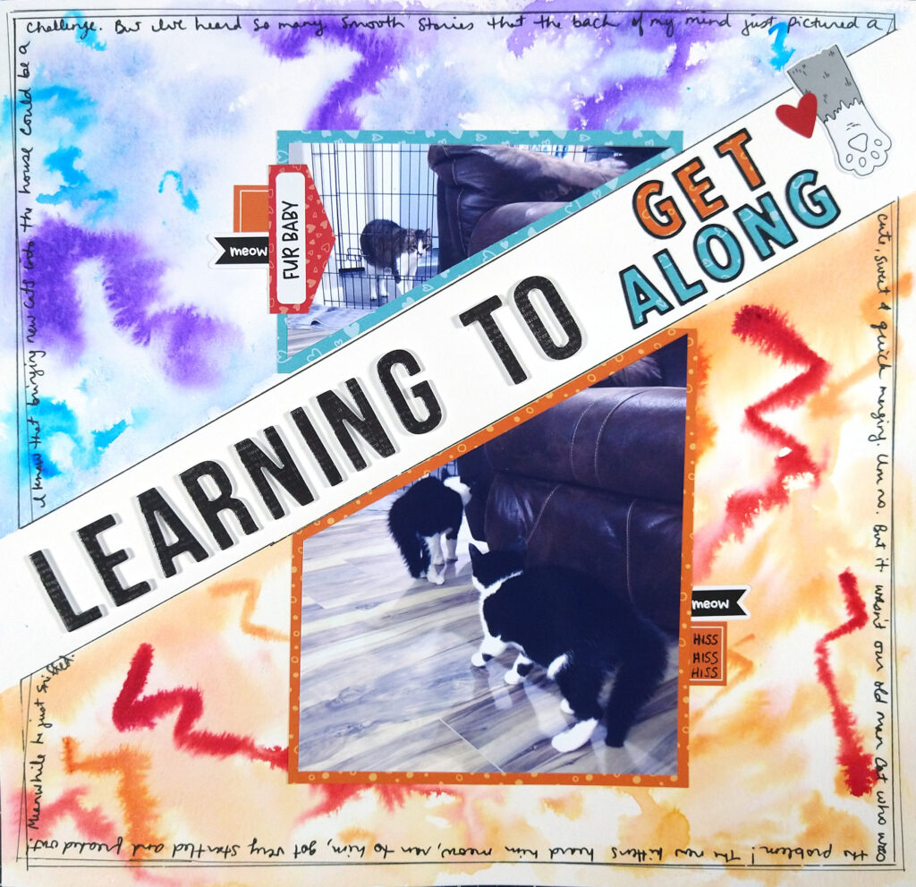
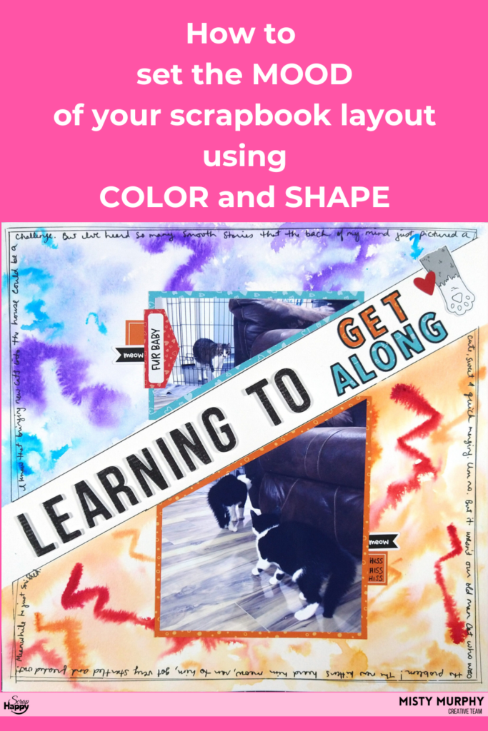
When using prompts you do not always have to talk about yourself. You can tell the story from any point of view. My layout give a bit of a twist to the point of view. I’m telling it from my cats’ perspective (kinda-sorta)! We just got two new kittens and they are slowly meeting our Old Man cat. Our lives are totally in the middle of them learning to live with each other peacefully.
Since the technique prompt was to use a favorite, I turned to watercolor. I decided I could set the mood of disharmony using both color and shapes. Let’s look at those a bit more closely at these ideas.
How to Evoke Mood
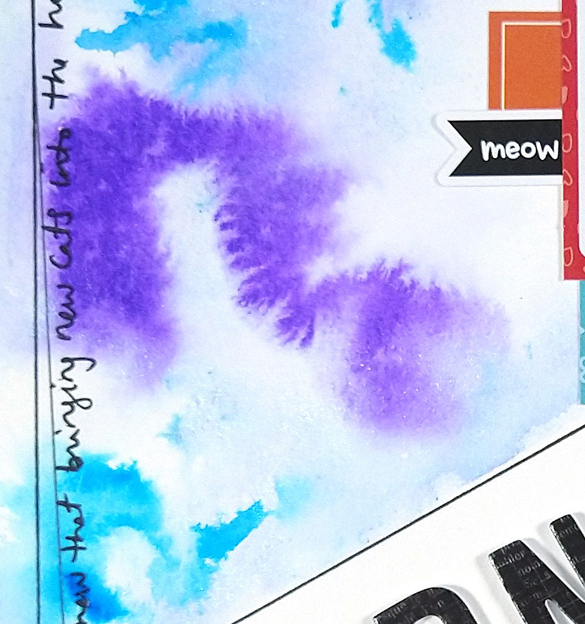
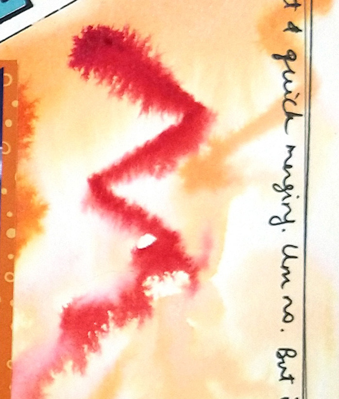
In cultures all over the world colors and shapes tend to hold significant meaning. In Western cultures, red color tones are often signs of energy and danger while blues are mellow, calm or even sad. In this layout I used both to set the tone for each side of the photo. The kittens were scared and angry while the Old Man was confused and tentative. I even blurred these colors and images out to lend a sense of messiness to the feelings.
I further set the mood by using shapes as well. Just like the color red can represent danger, shapes with sharp angles can do the same. Just think of the language we even use to describe these angles… they are sharp. Knifes are sharp, needles are sharp. We set our minds up to link the two ideas—sharp and danger—together.
The curved shape of the question mark set against the sharp angles of the lightning bolt instantly show a disconnect between the two halves of the layout. I increased that disconnect by physically cutting my photo apart and separating the pieces across the paper. The choices in color, shapes and distance tell the story before the journaling even comes into play.
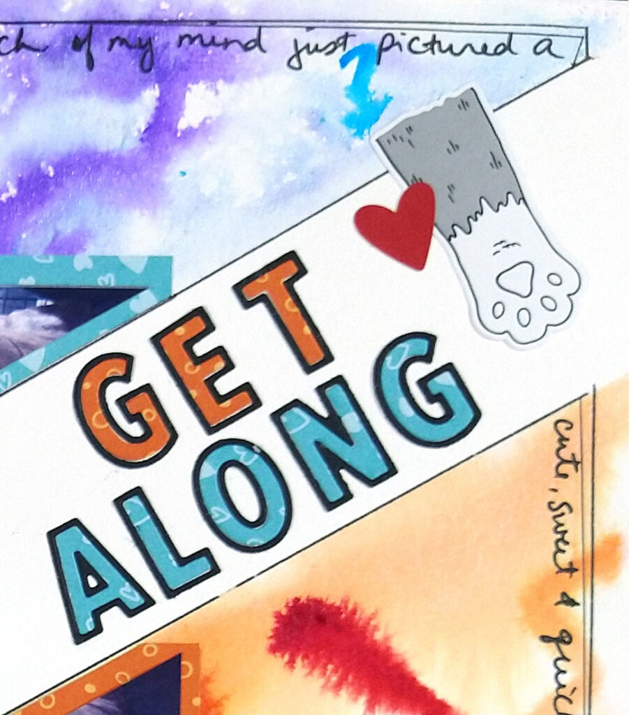
I didn’t want to leave my story there though. After all, my prompt was about learning. I wanted to be sure to bridge the gap between the two sides of the layout—and the two emotions of the cats. I used my title to do that job. Not only do the words imply unity, but mixing up the placement of the title colors leads to the idea that these sides can change. I also used small embellishments to show the cats “reaching across the isle” to learn to get along.
If you want to see more about how I created this layout, I do have a process video available.
I hoped you learned something by taking this tour through my thought process when I created my layout. I encourage you to give a little more thought on how you use color and shapes in your stories.
And if you want to join us for LOAD and more fun prompts, head over to the blog to follow the sign up links!
