You can find inspiration anywhere and everywhere. Sometimes I forget to notice it though which is why I am loving the Unexpected Inspiration series that Alice and Sara Scraps have been doing within the ScrapHappy Community. (If you are one of Sara’s YouTube Members then you get an inside look into how she creates her layouts from the inspiration piece she chooses.)
Their latest source for inspiration is …. STORE WINDOW DISPLAYS.
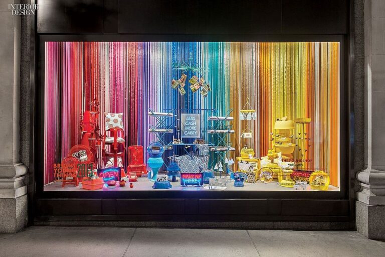
I love to look at how store’s style their windows but I’ve never thought to take inspiration from the Mall to the scrapbook layout. Until now that is! After an extensive image search and many a rabbit hole, I chose this image as my inspiration.

I am a sucker for a rainbow background and own many a patterned paper with a rainbow stripe, but this was different. That backdrop is (I think) made up of those tinsel curtains. You know, the shiny metallic kind that you hang up for New Year’s or find at a high school dance? And this particular one is not a standard ROYGBIV rainbow stripe either.
It took me some time to figure out how best to recreate this with paper – watch my process come together in this video.
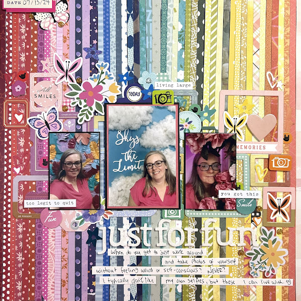
I am so happy with the finished result!
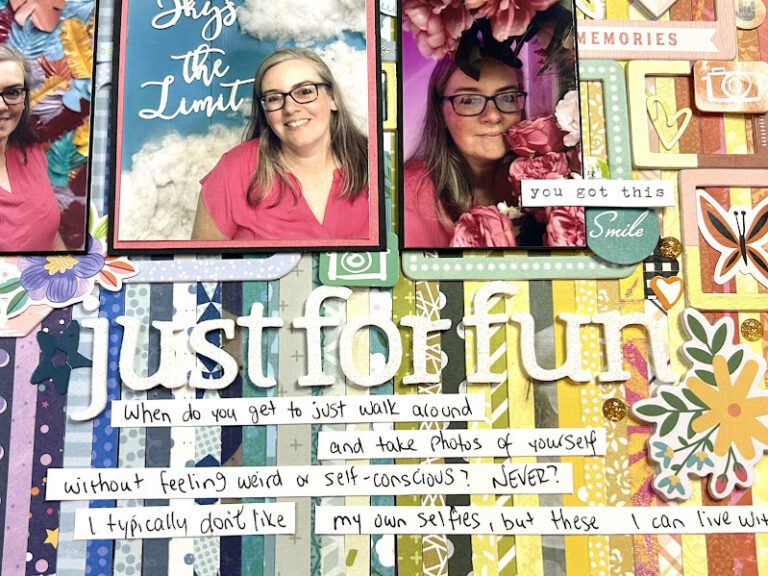
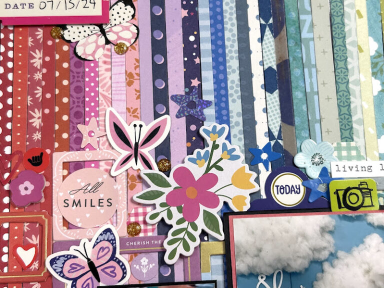
Those thin strips of paper in a random colour order really mimic that curtain in the inspiration image. And how much fun was it to add all the embellishments? Let’s take a closer look.

One thing I noticed in the inspiration image was how the colours didn’t transition smoothly from one colour to the next. In most rainbow stripe patterns, your colour bands are a consistent shade throughout. This curtain had multiple shades of each colour before and sometimes while transitioning to the next colour.
To mimic that I made sure to mix up my strips and even have a couple outliers like the yellow strip on the far right that’s deep into the orange section. When looked at as a whole image, the effect is one of undulating colour, just like the curtain in the inspiration image.

The other bit about the inspiration image that I loved was how all the items inside the window were colour blocked according to the section of curtain they were in front of. So I tried to do that with my embellishments.
My first layer was all the frames. As you saw in the video, I had several packs of Pink Fresh chipboard frames that really just needed using up. One of them had been in my August Counterfeit Kit and I’d done a fairly good job of using them throughout our Mini LOAD challenge. But I’ve been wanting to make a layout like this for a while – one where I get to pile on so many frames with impunity! With three different packages to choose from (and even though one was a Christmas themed set) I could easily match the colour of frame to the section of background.
It was almost a shame to cover it up with the photos but I knew that would happen. And you can’t have a truly layered look and still keep everything on show. It just doesn’t work that way.

My colour blocking extended to my embellishments as well. And let me tell you, if you’ve never gone whole hog and put down every sticker you can find that make a rainbow, you need to try it!
Individually, it’s a lot!
As a whole, it works! (I hope)
I started with larger pieces like the foam stickers from Shimelle’s Reasons to Smile collection. Then I went through all the 6×12″ sticker sheets in my stash and just pulled off any that spoke to me. I was looking for smaller images. Solid or mostly solid colours. And motifs that fit – cameras were an obvious choice, followed closely by hearts and stars. Butterflies hold a special place in my heart and in the hearts of ScrapHappy members so they worked on this too. Plus that poor purple butterfly from Shimelle’s Main Character Energy sticker sheet has been moved around so much it just really needed to find a permanent home!
With all that colour on the page, when it came time to think of a title and journaling, the only choice I could see was to go with white. Plus the floor of the window in the inspiration image is white so it just made sense. If I had maybe planned the layout better, I could have framed cardstock in a similar tone to the frame and placed my journaling there instead. But I really like how this keeps things feeling light and allows all that colour and pattern in the middle to shine.
Thank you for stopping by today. I hope you have been inspired to look at your local store windows a little bit differently now. If you make a layout based on this inspiration or any store window display that inspires you, I’d love to see it. You can leave a comment here or tag scraphappyorg or knotjustyarn_ladner on Instagram so I can see your page.
