Elevate Your Layouts with Creative Planning
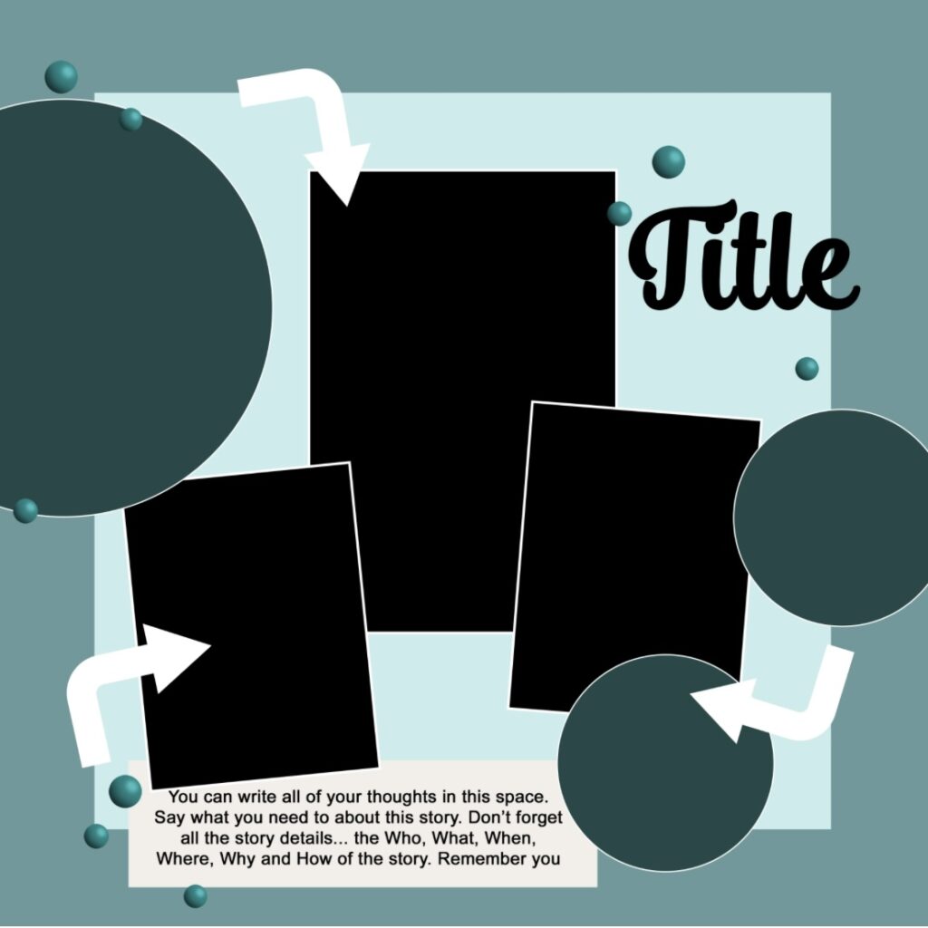
Today we are delving into using sketches as a jumping off point to get your creative juices flowing. There’s no shame in using sketches. I do so all the time. It’s a fast and easy way to complete a layout with stunning results. Several of our team members, including me, have used the same sketch to create a layout. First, let’s take a look at the sketch and then see what everyone has come up with. Oops. I almost forgot, this sketch was created by our very own Misty Murphy.
Laurie's Scrapbook Retreat Layout
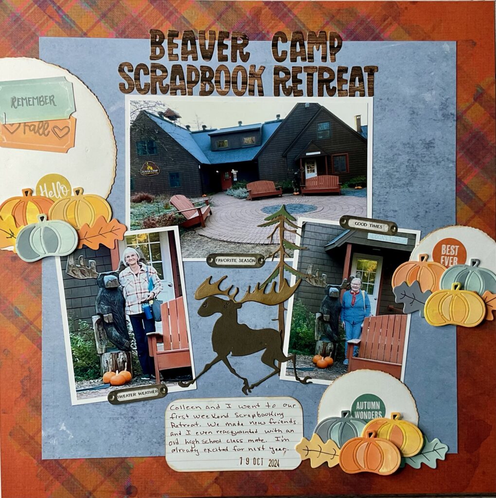
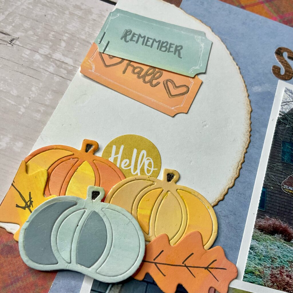
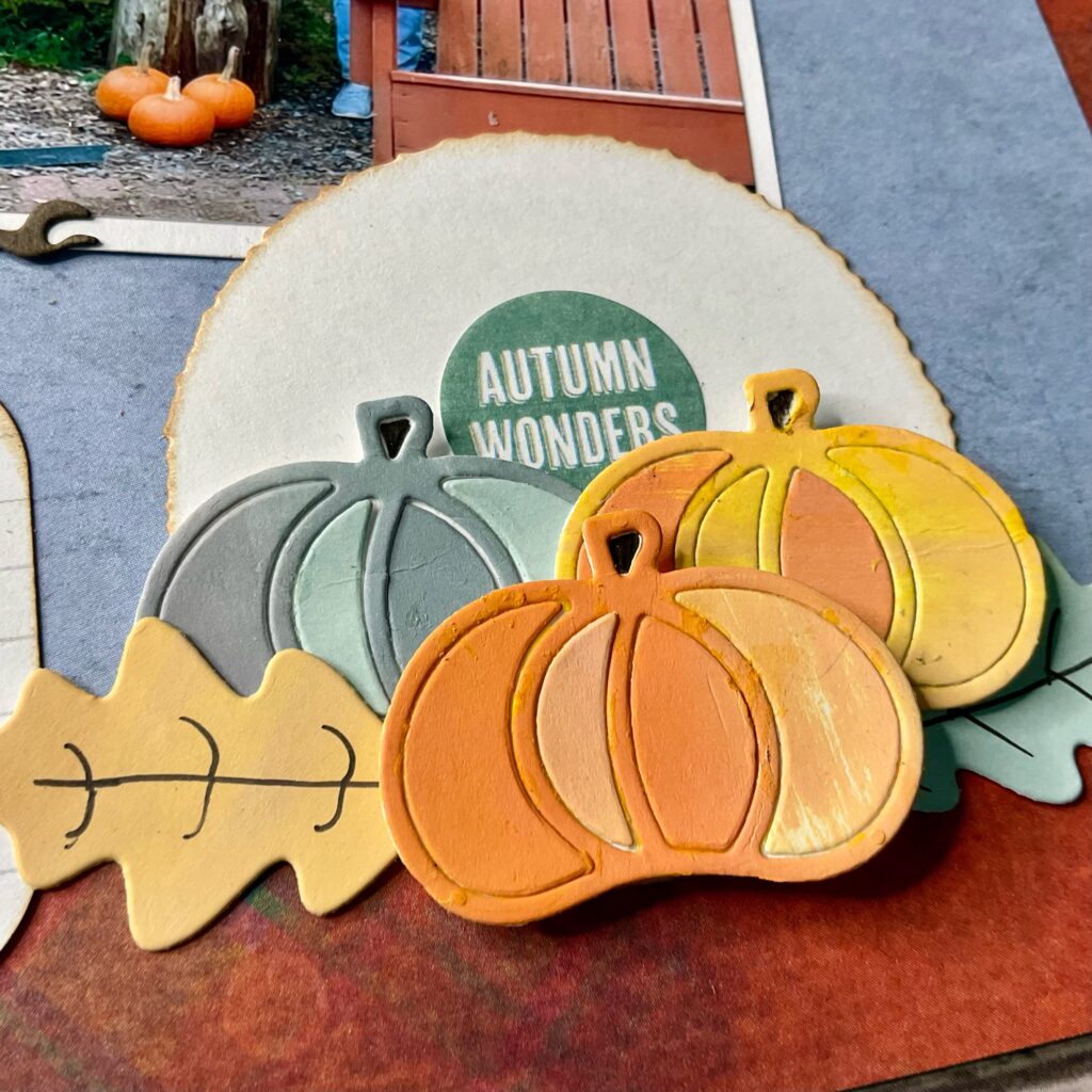
I positioned the photos just as they are in the sketch, which creates a visual balance. I did use a landscape photo in place of a portrait, which gave me a resting place for my rather large title. I used the circular elements in the sketch as a placement for my clusters. I utilized the suggested space in the sketch for my handwritten journaling. I felt the open space between the two smaller photos gave me the perfect opportunity to place a cute moose embellishment and tree.
Now, let’s see what Lindsy created.
Lindsy's "Joyful" Layout

Sketches are a great source of inspiration in scrapbooking, offering a clear starting point for layouts and design ideas. By analyzing the different shades and layers within a sketch, I can easily decide on the number and types of papers to incorporate. This helps me to visualize the overall composition and balance of the page before diving into the creative process.
Although I tend to take the overall composition literally, one of my favourite things about sketches is how easy it is to make them my own. Full disclosure…I’m not always a fan of tilting pictures! But, it was easy to straighten my photos out while still maintaining the overall feel of the original template. I also tend to go “rogue” when adding finishing touches, eliminating certain features (like the arrows) or placing gems (the dots) in close-but-varying places on the layout. It’s these small choices-along with colours, patterns, and the story that will give my version of the design it’s own flare!
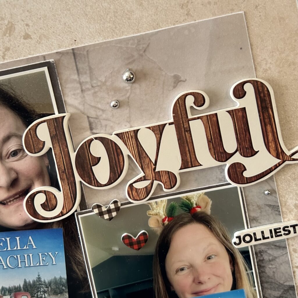
I thought the placement for the title was perfect on this sketch. For my layout I chose a bold, dimensional title and overlapped it over the edge of my largest photo. To ensure it wasn’t the only photo with overlap, I added some cute hearts and a smaller dimensional word to the second photo nearby. This created continuity and added visual appeal to the cluster surrounding the title.
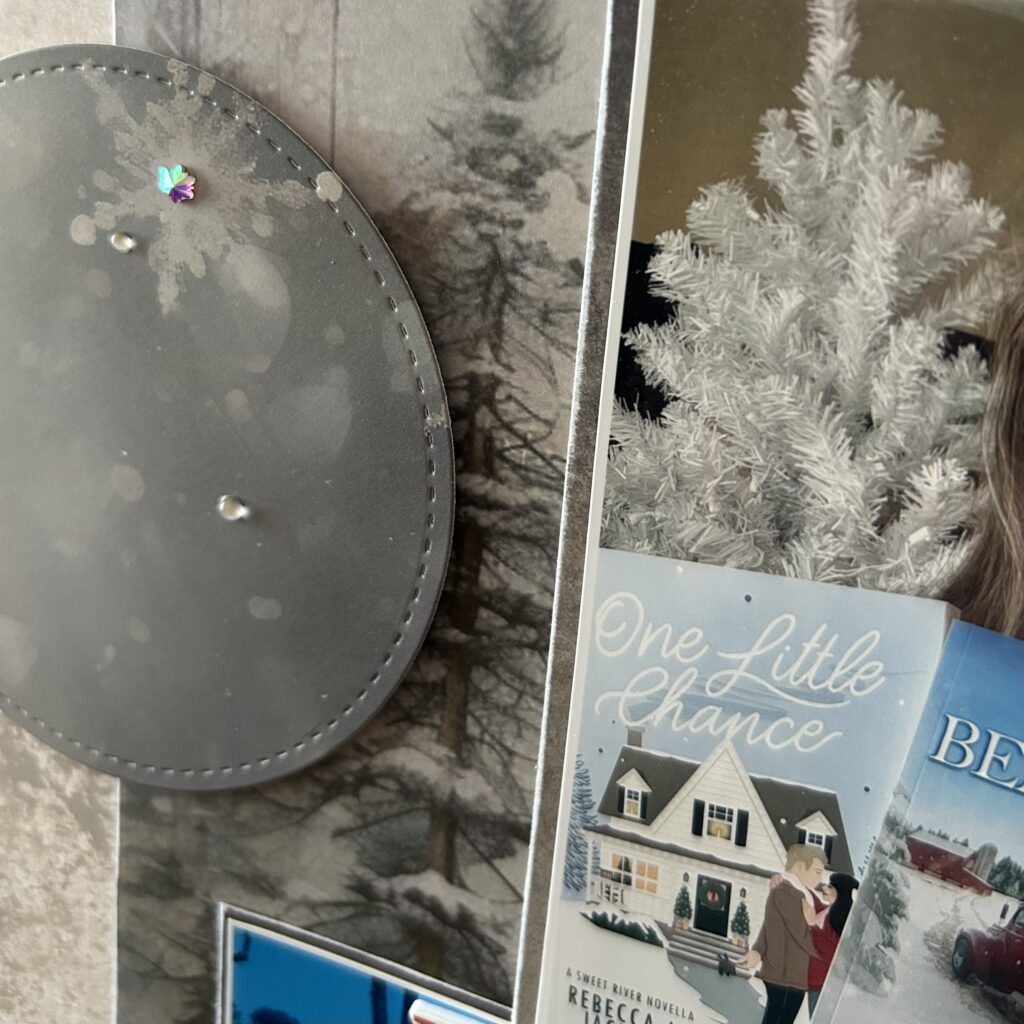
For this sketch I absolutely LOVED the circular elements! They are not a shape I tend to use much anymore, so this design felt like a throwback to my earlier years of crafting, I used a stitched die to cut them out, which added a lovely textured detail. I also popped the circles up using foam squares, creating dimension and shadow.
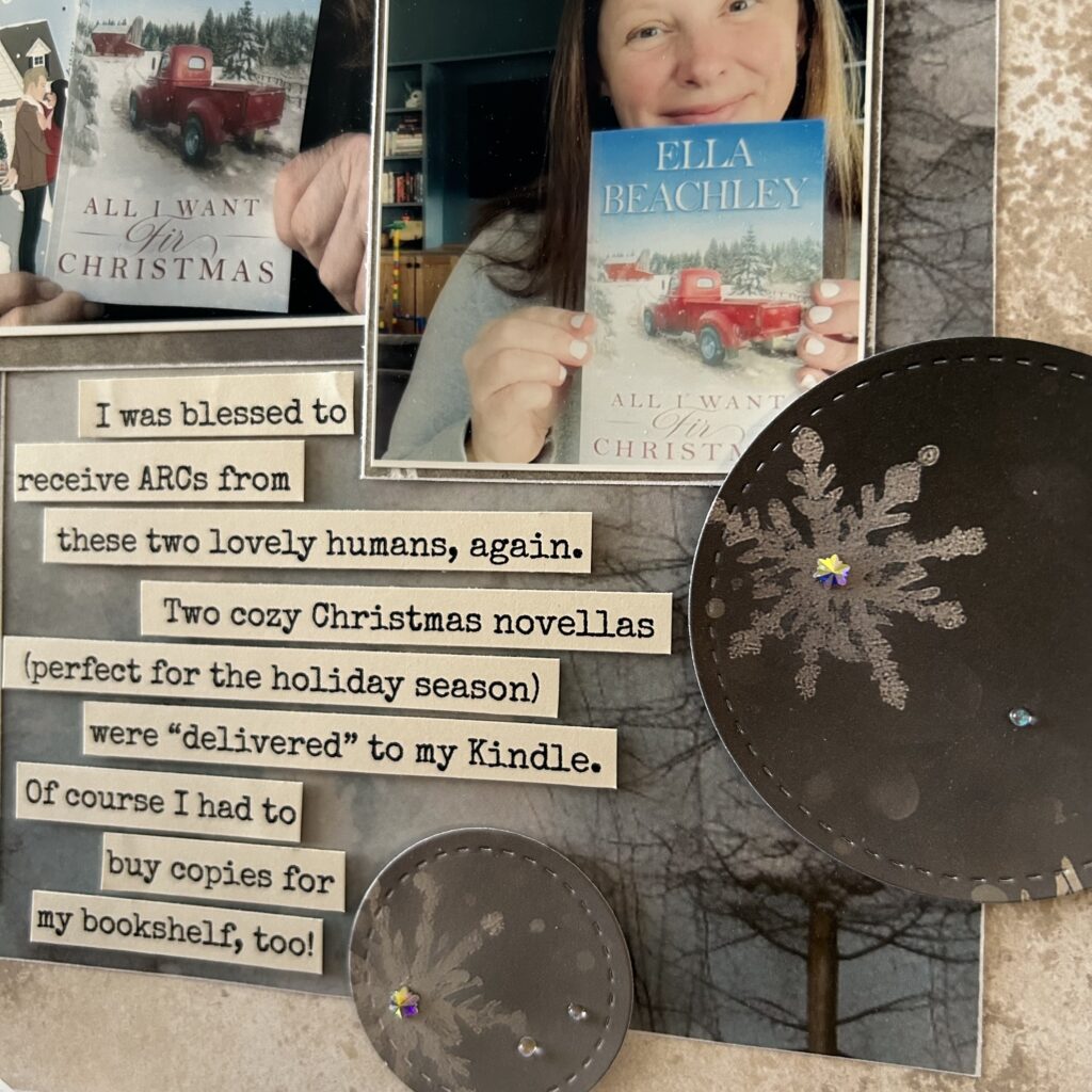
Because I changed the placement of my photos I was left with a slightly altered negative space than the original sketch design. To accommodate my story I decided to go for a more free-flowing look, as opposed to a journaling box. I typed my thoughts, printed on coloured cardstock, and then cut the words into strips (popping the strips up with thin foam for yet one more added bit of dimension).
Next up is Claire W.
Claire's "Adventures"
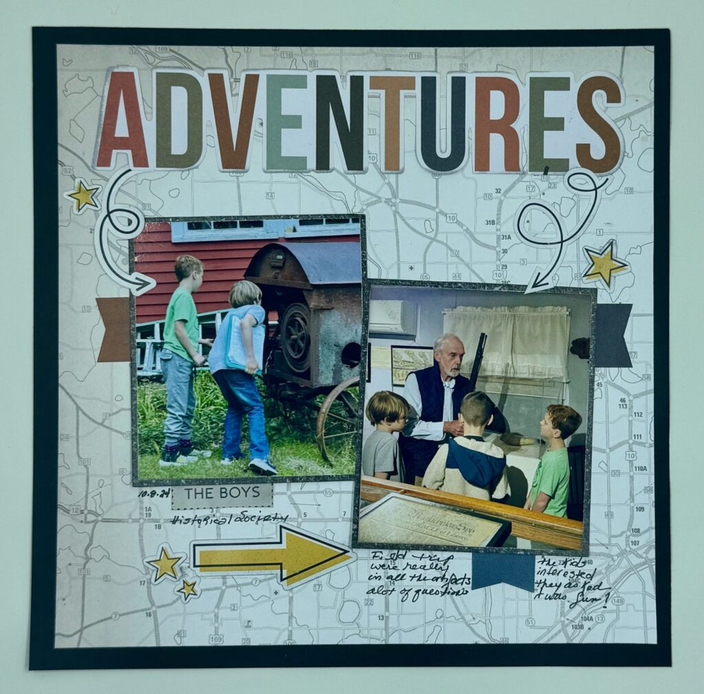
I created this 8×8 layout using two 2.75×3.25 photos placed at a slant I kept the arrow embellishments, but replaced the enamel dots with stars. The circles would have overwhelmed this layout so I went with small banners in their place. I opted for a larger title, but kept the journaling on the bottom. I enjoyed this sketch and will use it again.
Next, we have Claire C.
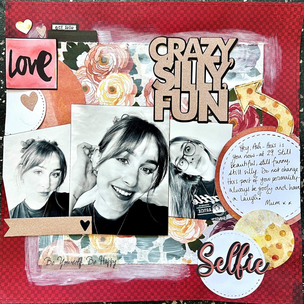
Taking inspiration directly from the sketch, I allowed the elements to guide my creative process. Without preconceived images, I selected paper from a Vicki Boutin collection and began by cutting out circles and other shapes. Feeling that the floral patterns were too bold to support a title, I softened the background with a layer of white paint.
The overall design exuded a feminine charm, prompting me to seek out photographs my daughter had shared with me. To maintain harmony and avoid visual clutter, I converted these imges to black and white. For the title, I chose rose gold glitter paper, which complimented the floral motifs beautifully. To ensure a cohesive look, I die cut a few embellishments from the same glitter paper, adding an elegant consistency to the layout,
Need More Inspiration?
There are tons of places to find sketches to jump start your creativity. Here are a few to get you started. PageMaps is a great source. They are on hiatus at the moment, but you can still access all their sketches. Another one is Misty Murphy’ s blog, Crafty Soup. Of course, you can always check out Pinterest too.
I hope you’ve found this helpful and inspiring!
