Using Sketches
Let’s talk about using sketches in your everyday scrapbooking.
As we all know, December is one of the busiest months in the entire year. If you’re like me, you would still like to find time to fit in some scrapbooking. I find it to be relaxing and a great stress reliever, especially after all the shopping, gift wrapping and baking.
Using a sketch can simplify the creative process and keep your layouts fresh and cohesive. A sketch serves as a visual blueprint, providing guidance on things like, photo placement, embellishments, and journaling spots.
The first step is to choose a sketch. Remember, you do not have to follow it exactly. You can rotate it, flip it, and/or swap out elements to fit your theme and supplies.
Here’s the sketch we chose for this month.
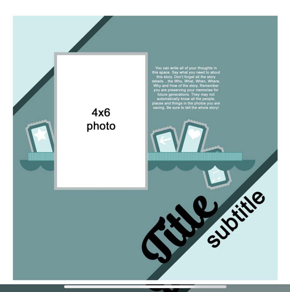
This sketch was designed by Misty Murphy, one of my fellow team members. Let’s take a look at the layout I created using this sketch as guidance.
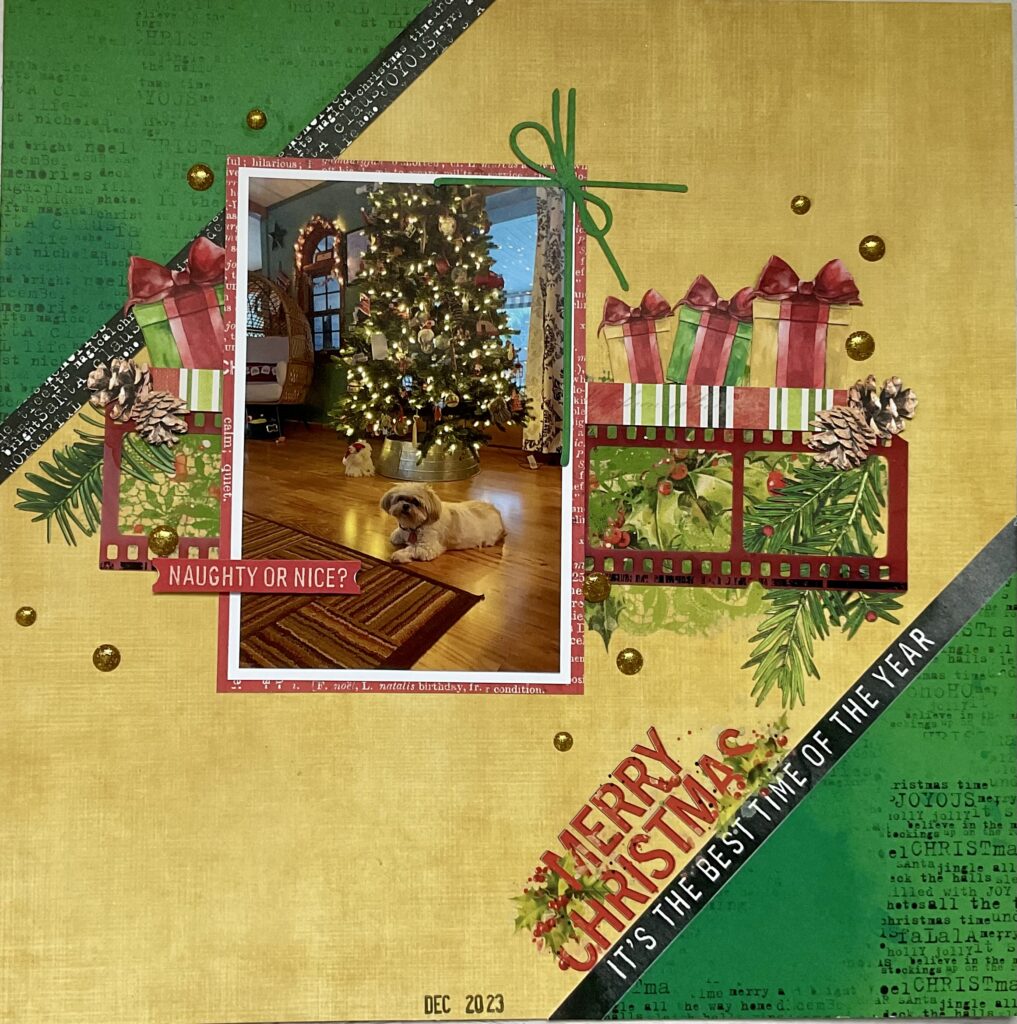
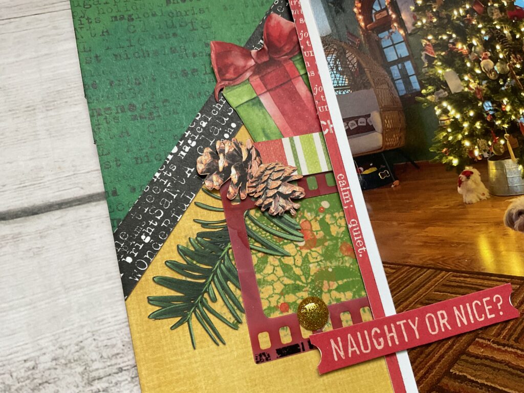
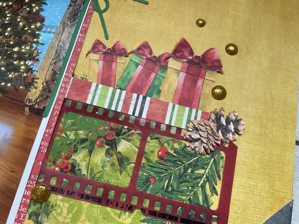
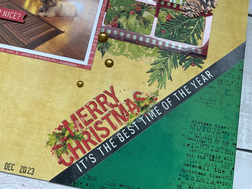
Because I was in a time crunch I pretty much followed the sketch as designed, using the diagonal split as the foundation. I placed my photo centrally, just as the sketch suggested. I created a shelf for my photo using a filmstrip and adding some festive greenery along with presents as embellishments. I stayed true to the placement of the title and sub-title, which by the way, is a border strip cut from another piece of paper. I didn’t really feel the need for journaling since I felt that my photo seemed self explanatory. The final touch was to scatter gold accents to capture the holiday spirit. Here are some close ups.
Now let’s take a look at what fellow design team member, Lindsy did with the same sketch.
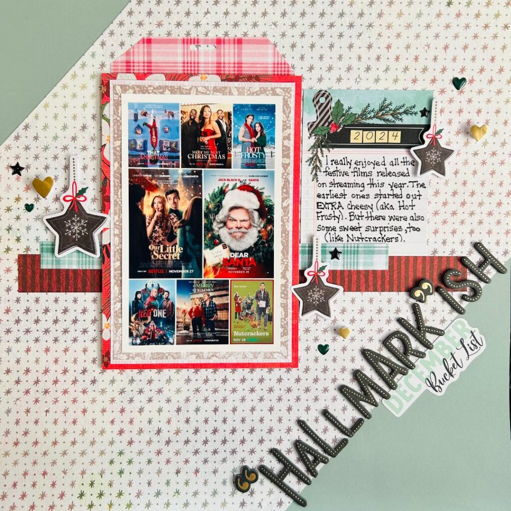
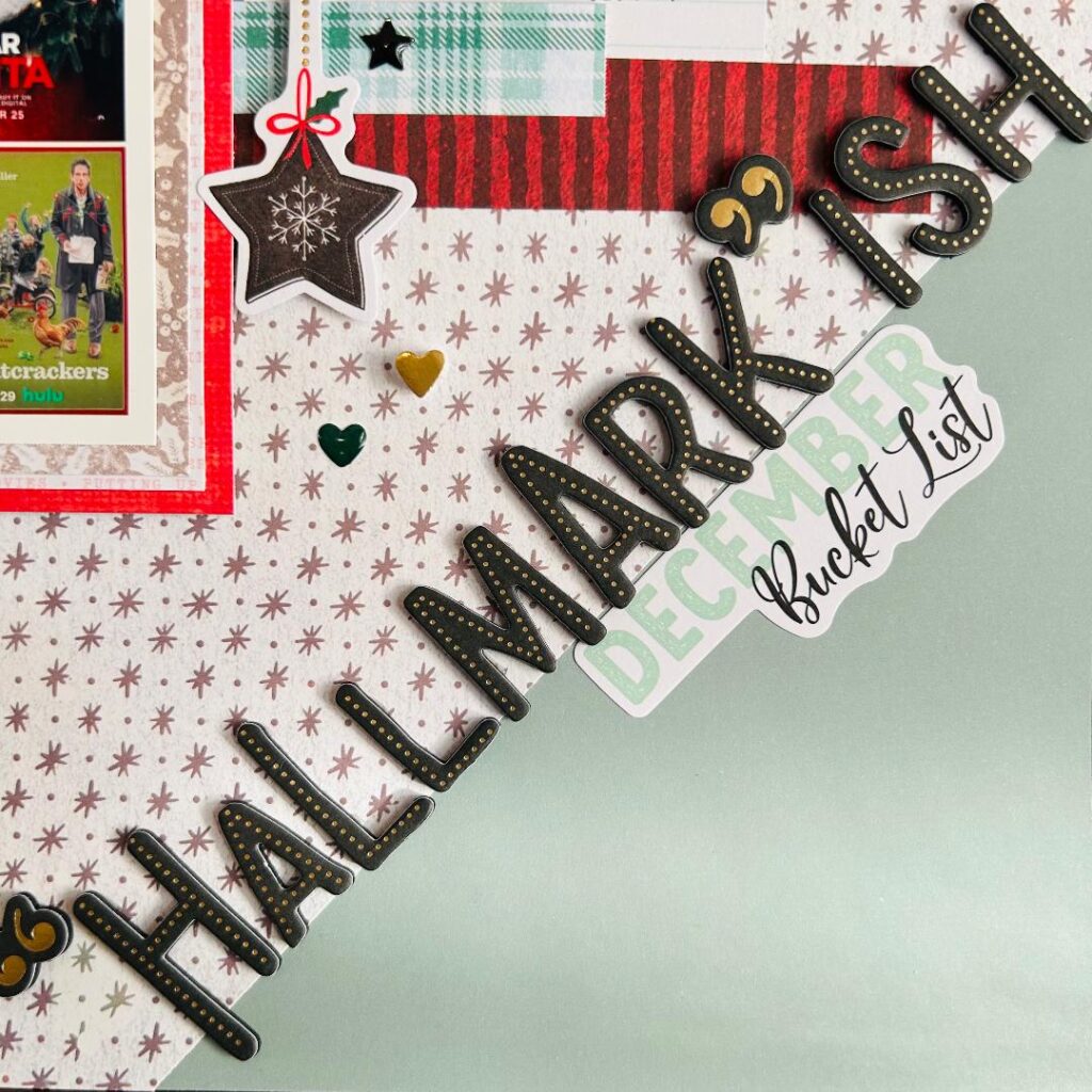
I loved using this unique sketch to create a modern festival layout, particularly because of the use of diagonal lines that gave the page a dynamic and unique angle.
While the sketch suggested a single 4×6 photo, I adapted it to showcase a grid of movie posters instead. This is a technique I use a lot when I want to feature more photos on my page, and I love how I can use my Canon SELPHY to easily create and print photo collages like this at home.
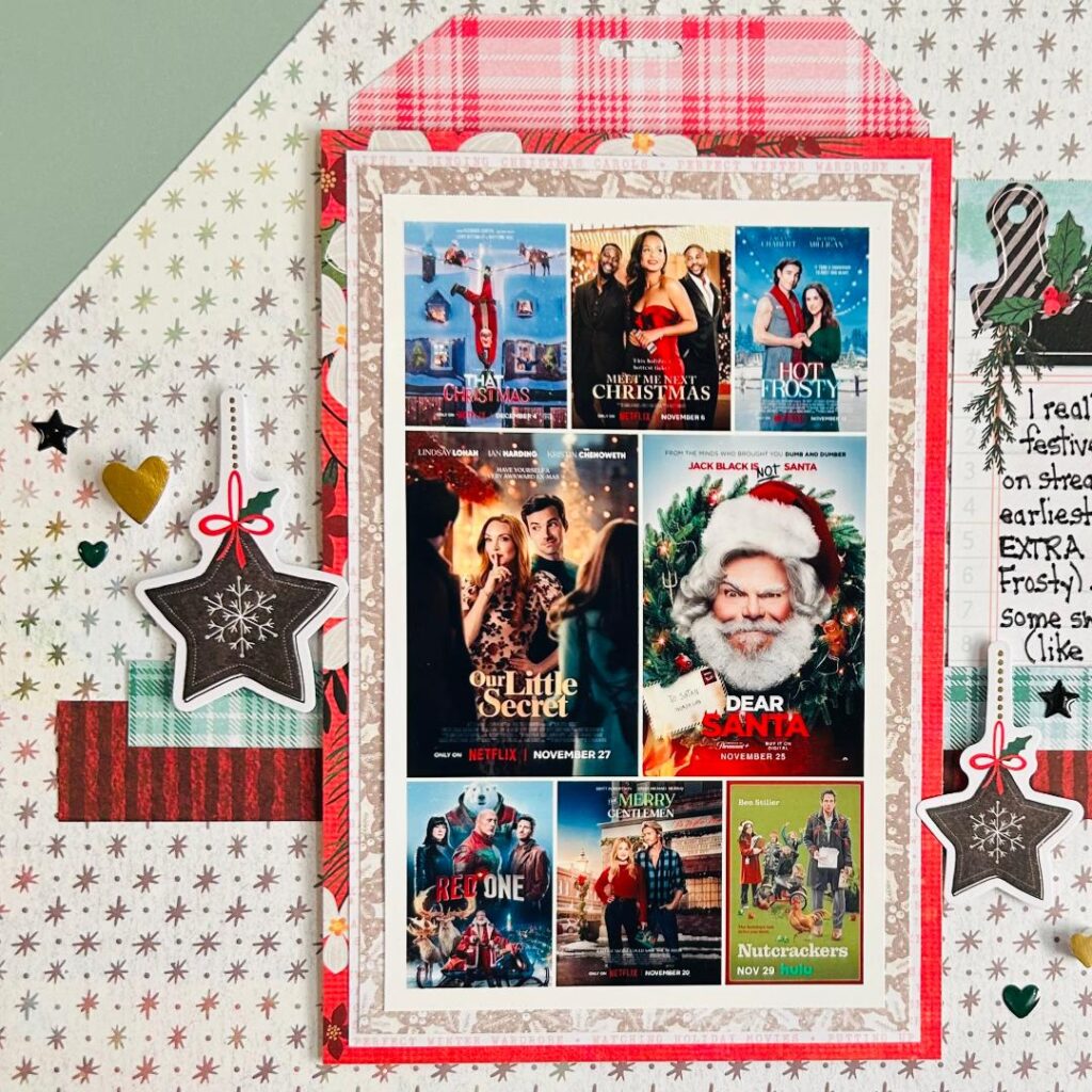
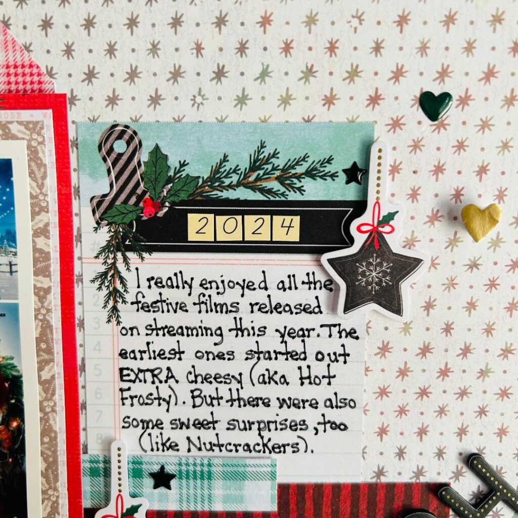
Like the sketch, I added layers and embellishments, such as the star decorations and patterned papers, to create visual interest. However, instead of a more open journaling space, I chose to include a handwritten note card clustered closely to the photo to balance the layout and provide a personal touch. If you’re looking to elevate your printing, might I suggest adding tiny dots to your letters to create a font that feels fresh (but is still done by hand)!
The similarities between the sketch and my project lie in the clean, structured look and layered elements, However, I made the design my own with festive, bold patterns (Vicki Boutin’s “Wrapped in Ribbons” collection for the win!) and a holiday theme.
That's A Wrap!
That’s it for me this month. I hope Lindsy and I have inspired you to create a layout using this sketch. Remember whether you stay true to the original design or adapt the elements to suit your needs, a sketch serves as a strong foundation to simplify the creative process and to spark inspiration. Don’t forget to share your creations in the Scraphappy Circle.
Happy Holidays to you and your families! I’ll see you next month with a new sketch!
