In the beginning there was...
Remember scrapbooking 20+ years ago? When shaped photos, themed paper packs, and sticker overload were all the rage? Believe it or not, it might be time to consider bringing a few trends back—but with a glow-up! Instead of hearts and zigzag scissors, think geometric shapes, layered textures, and mixed-media magic. It’s like giving your old layouts a trendy, modern makeover—kind of like putting a classic denim jacket on your stylish 2025 self.
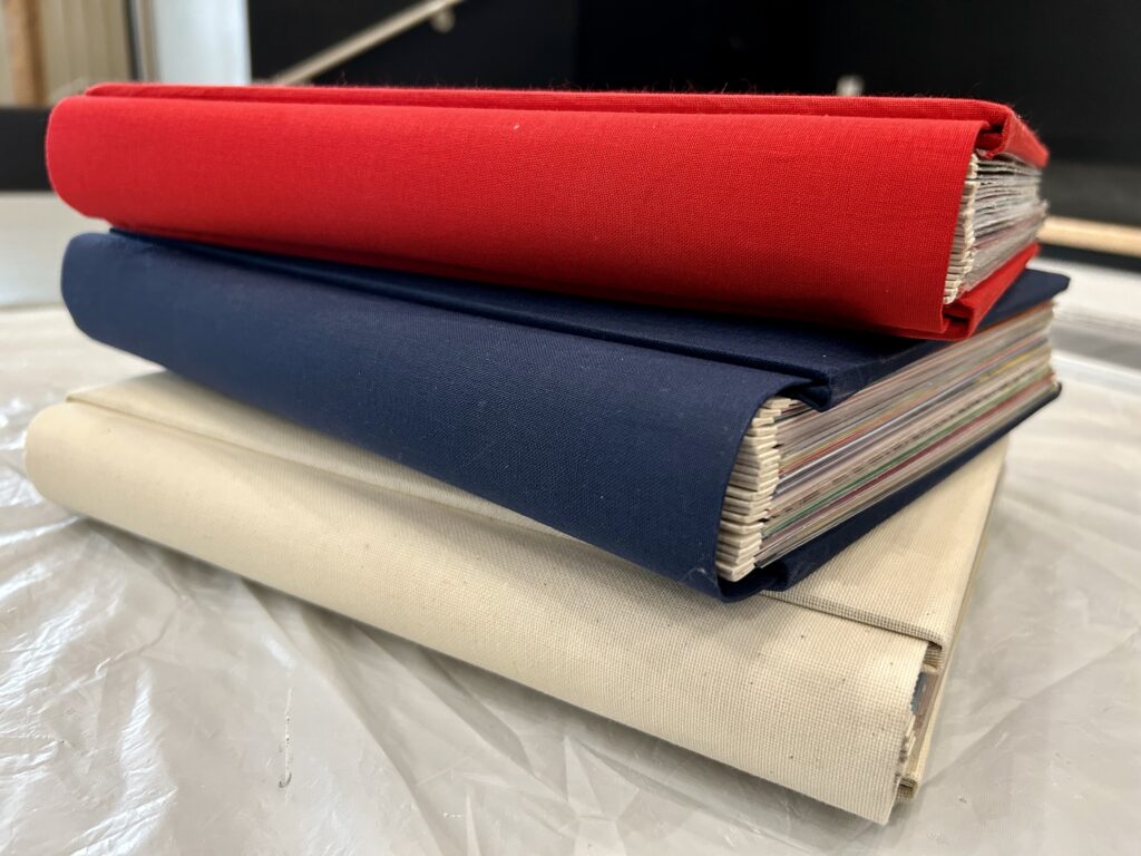
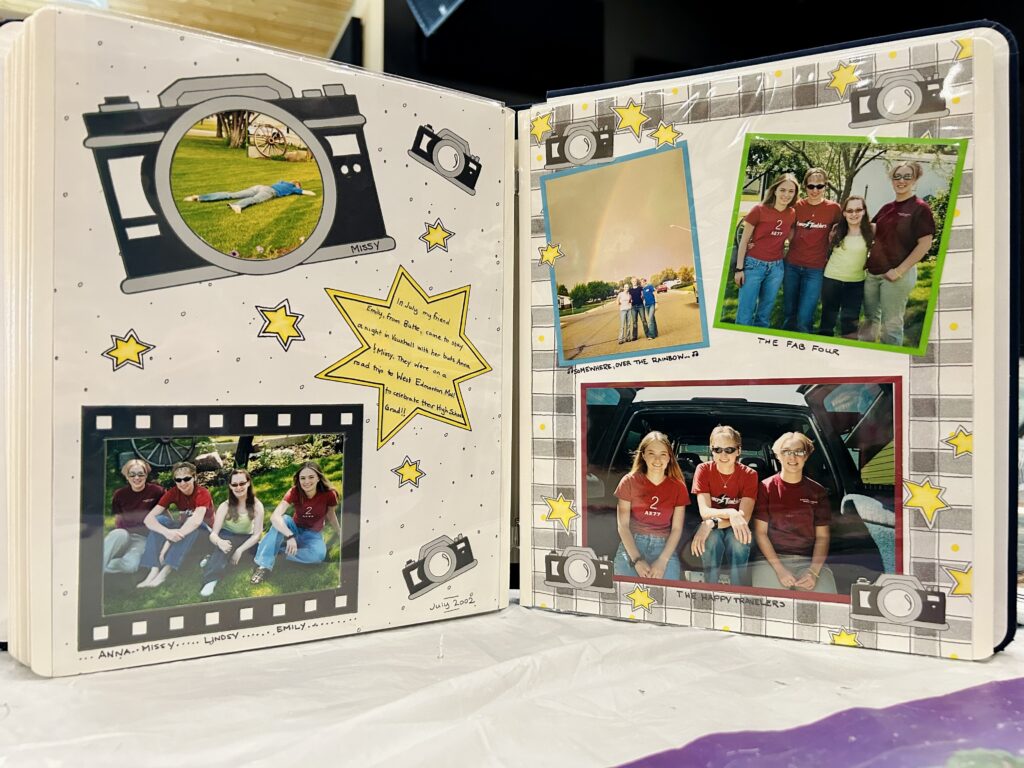
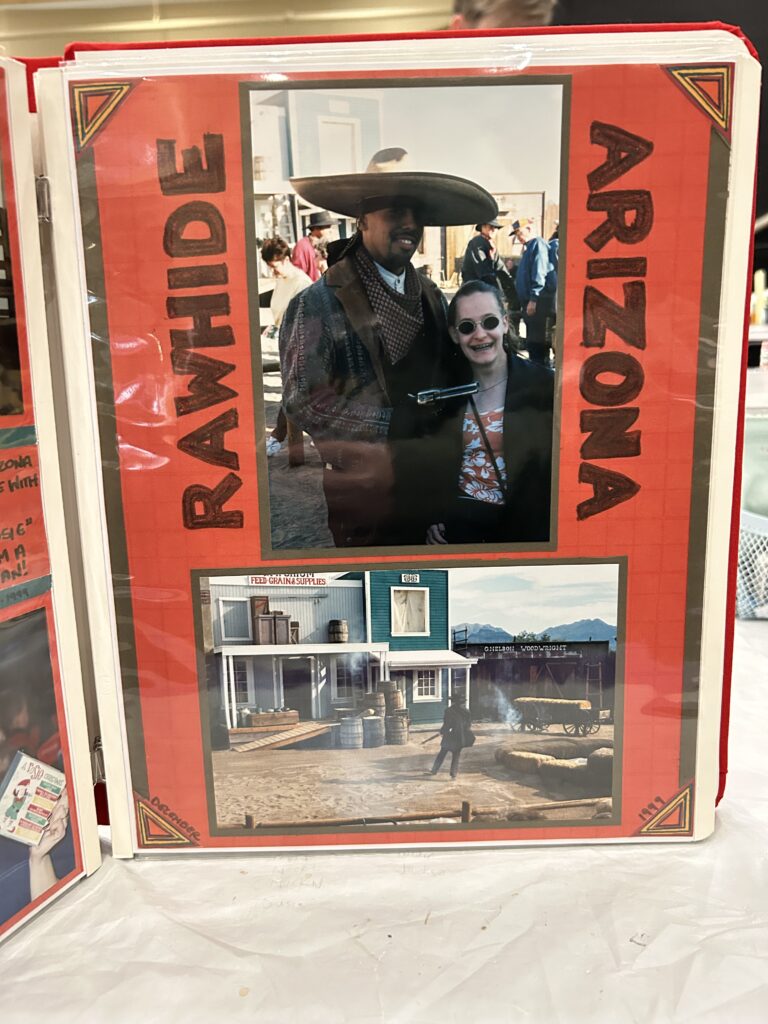
To usher in the beginning of a new year, I’d like to take a walk down memory lane. I’m dusting off some of my very first scrapbooks and layouts (are we prepared for this?!) in order to explore ideas that will make what’s old new again!
Whether you’re embracing minimalist embellishments or swapping sticker chaos for sleek clusters, it’s all about blending nostalgia with a fresh twist. Because hey, your scrapbooks deserve to age as gracefully as you have!
1. Premade Borders → Layered & Mixed-Media Edges
- Original Trend: Premade borders were used to frame photos or divide sections of a layout. They were often patterned, brightly colored, or sticker-based.
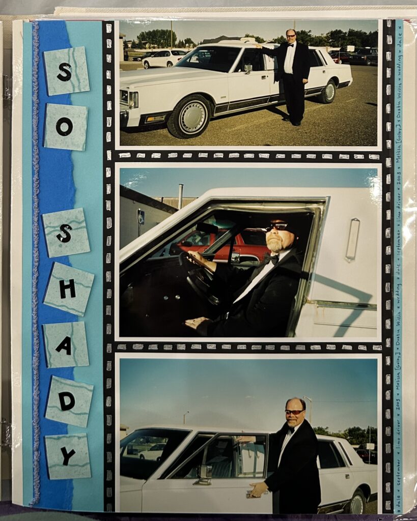
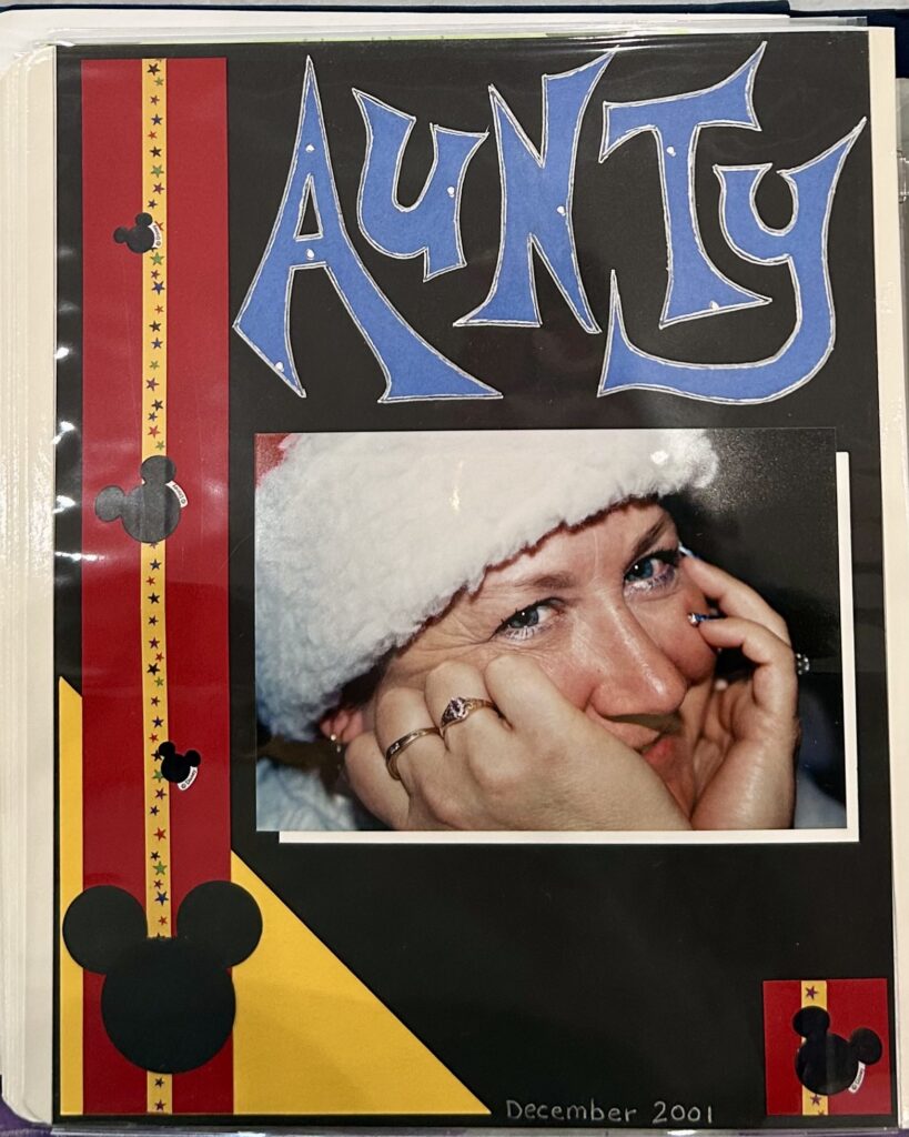
- Modern Update: If you’re looking to incorporate that bordered look, consider…
- Using layered textures like washi tape, lace, or stitched ribbon for added depth.
- Incorporating mixed-media techniques such as stamping, stenciling, or applying modeling paste to create unique, tactile borders.
- Using digital scrapbooking tools to help create custom border effects
2. Shaped Photos → Digital Overlays & Abstract Cropping
- Original Trend: Photos were cropped into shapes like hearts, stars, or circles using templates or stencils.
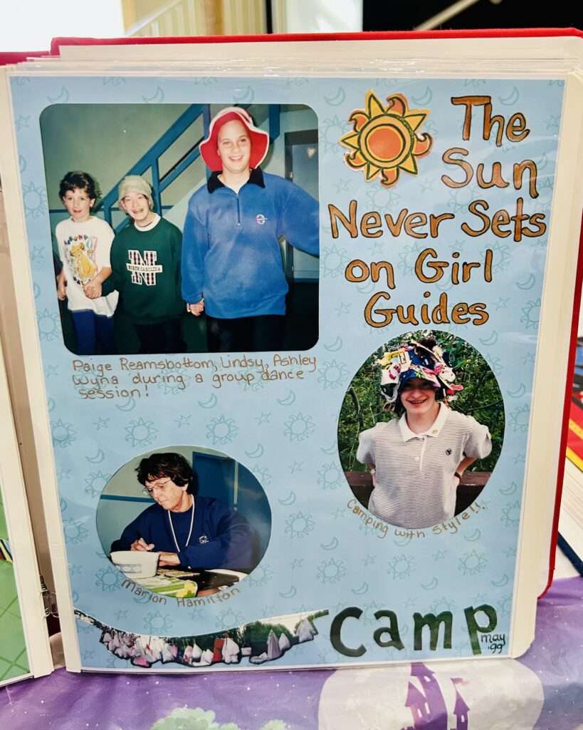
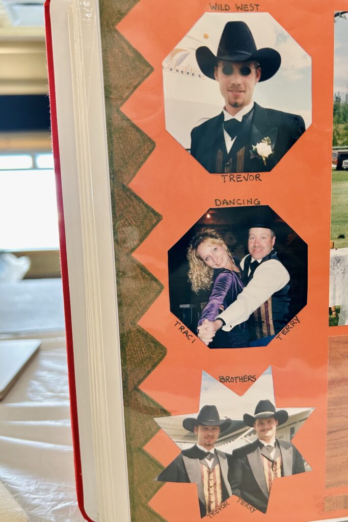
- Modern Update: If shapes are your jam, you might…
- Experiment with freeform shapes like hexagons, triangles, or asymmetrical designs (in your backgrounds or embellies) to give your layout a contemporary, geometric look.
- Blend cropped photos with digital overlays (e.g., text effects, gradients, or filters).
- Pair abstract photo cropping with layered mats in vellum or patterned paper for added contrast.
3. Sticker Collages → Minimalist Embellishment Clusters
- Original Trend: Pages were often filled with themed sticker collections (e.g., seasonal or holiday-specific stickers), often in over-abundance.
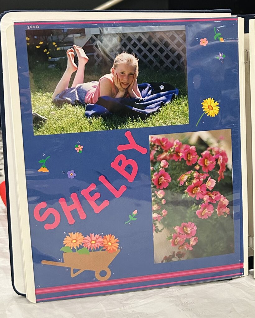
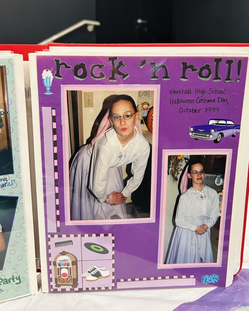
- Modern Update: Stickers can still be your friend, but you might considering incorporating other types of ephemera instead. Refresh that sticker explosion vibe by…
- Focusing on “less is more” by creating small embellishment clusters. For example, group 3–5 small elements (like chipboard pieces, stamped images, or enamel dots) near photos or journaling sections.
- Using metallic or transparent embellishments to keep the page clean and polished.
- Layering stickers with other materials like die cuts or hand-drawn accents for a mixed-media feel.
4. Themed Paper Packs → Neutral Palettes with Pops of Color
- Original Trend: Brightly themed paper packs (e.g., holiday, travel, or event-specific) dominated layouts.
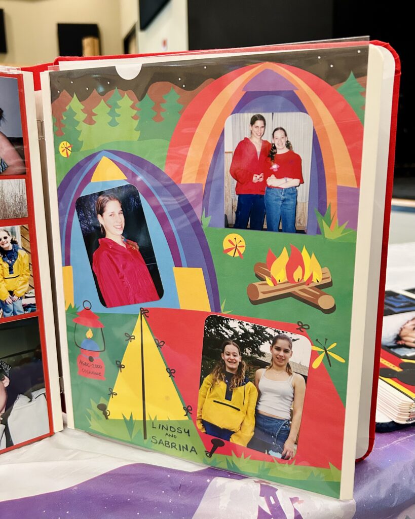
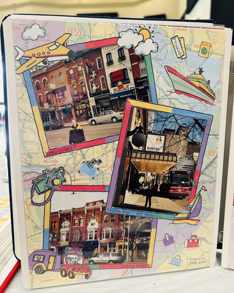
- Modern Update: Have a themed project your dying to document? To elevate the look you can…
- Choose a neutral base like kraft paper, white, or gray, and use bold colors as accents. For example, add splashes of neon or jewel tones through embellishments or brushstroke patterns.
- Experiment with ombré or gradient papers for a fresh, modern vibe. Then add subtle ephemera or embellishments to complement your theme.
- Mix and match patterned papers from different collections to create more eclectic, layered designs.
5. Themed Layouts → Story-Driven Pages with Journaling
- Original Trend: Pages often revolved around a single theme, with a heavy focus on stickers or patterns.
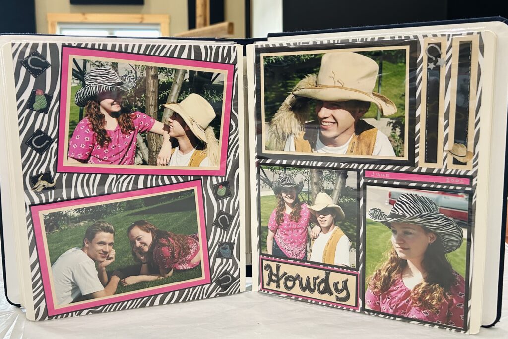
- Modern Update: Don’t just let the product do the talking. Instead…
- Make journaling a central design element by incorporating hand-lettered quotes, typed captions, or hidden journaling pockets.
- Focus on storytelling by combining multiple smaller photos to create a cohesive narrative.
- Add QR codes linking to digital content, like videos or audio recordings, to create an interactive experience.
6. Die-Cut Titles → Custom Fonts & Layered Typography
- Original Trend: Titles were created with premade die-cuts or stickers from coordinating collections.
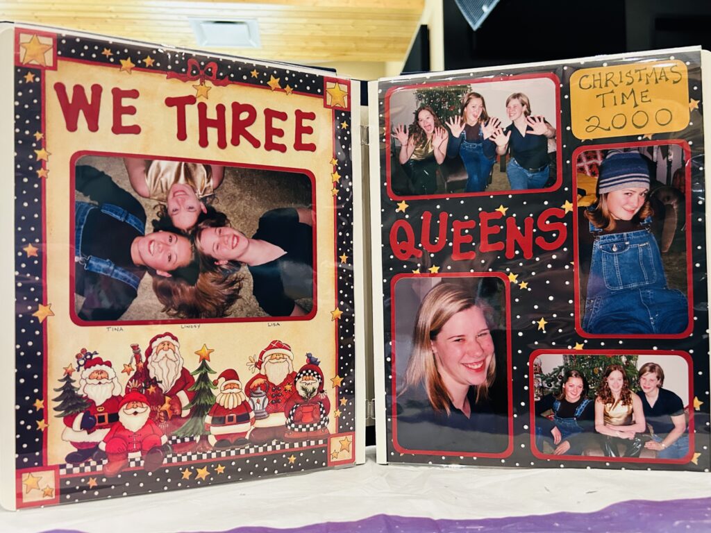
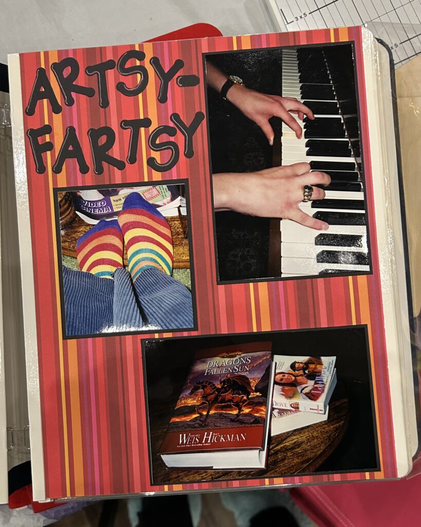

- Modern Update: Not a lot has changed in our desire to use bold lettering for our titles. But if you’re looking for a little variety you might…
- Use digital cutting machines (e.g., Cricut or Silhouette) to create personalized, layered titles.
- Combine different font styles—like pairing bold block letters with elegant script fonts—for a trendy, eclectic feel. An easy way to do this is by mixing and matching sets of Thickers!
- Add shadow effects or metallic highlights to elevate the design.
7. Handwritten Captions → Hand-Lettering & Calligraphy Accents
- Original Trend: Simple handwritten captions or titles added a personal touch.
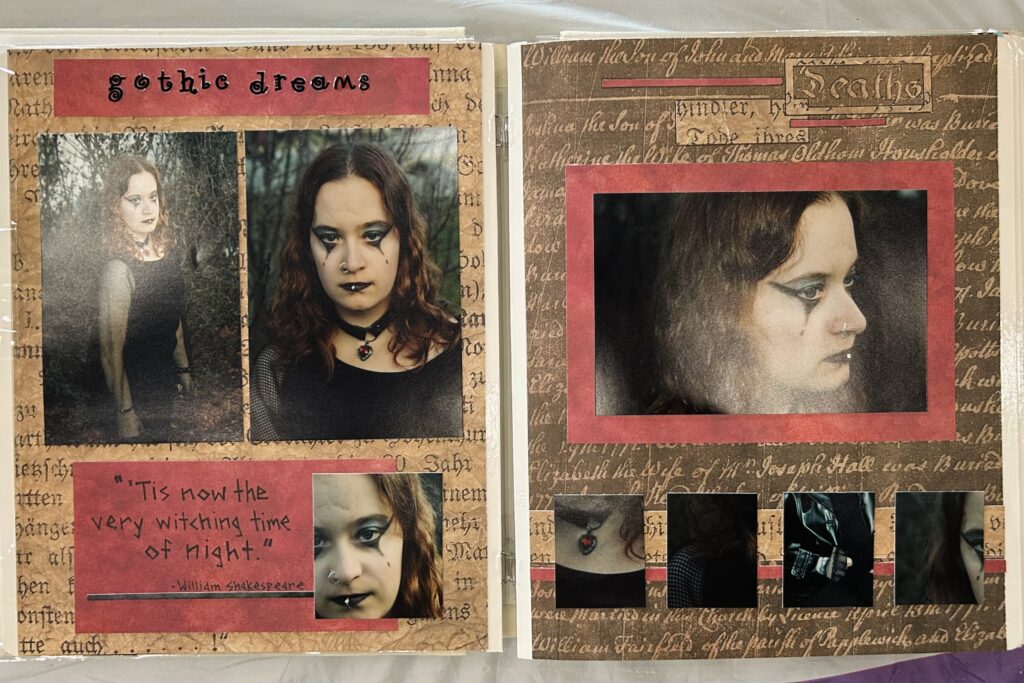
- Modern Update: keeping our own handwriting present on layouts IS important. However, simple tweaks can easily be done to make your projects feel current, such as…
- Using modern hand-lettering techniques or digital calligraphy for captions, titles, or quotes.
- Experimenting with metallic pens, gel pens, or watercolor lettering for pops of color and texture.
- Combining hand-lettering with pre-designed stamps or stencils for a balanced layout.
8. Decorative Scissors → Edge Distressing & Layering Techniques
- Original Trend: Decorative scissors and punches created borders or frames with scallops, zigzags, or floral motifs.
- Modern Update: If you’re feeling a little ‘edgy’ you can…
- Distress edges of papers with tools like edge distresser blades, sanding blocks, or ink pads for a soft, vintage look.
- Layer papers with intricate laser-cut designs or digital cut files for an updated, elegant feel.
- Add metallic accents or foiling to elevate the look of layered edges.
9. Photo Corners → Layered Frames & Photo Mats
- Original Trend: Decorative photo corners were popular for adding flair to pictures.
- Modern Update: Photos are still THE biggest feature on our layouts. To make them stand out…
- Frame photos with layered mats in mixed materials (e.g., vellum, textured cardstock, or holographic paper).
- Use printed transparencies or stitched frames to give a handcrafted, dimensional look.
- Incorporate shadow effects or torn edges for a casual, artistic touch.
Looking back to leap ahead...
By taking nostalgic trends and incorporating modern techniques and materials, as scrapbookers we can refresh our pages in ways that feel both personal and contemporary for 2025. So don’t be scared to take a peek at your OG projects…you might be surprised to find that next jolt of inspiration!
Thank you for taking this walk down memory lane with me. Until next time…stay fun and fantabulous, scrappers!

