
We will compare some basic shadowing techniques and their effects on your page and I will show you in detail how they can be done in Affinity Photo. Since the basic kinds of shadows are the same, the implementation might vary from program to program.
We will start with the easiest way of shadowing, the drop shadow.
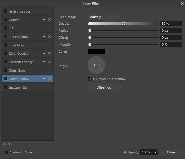
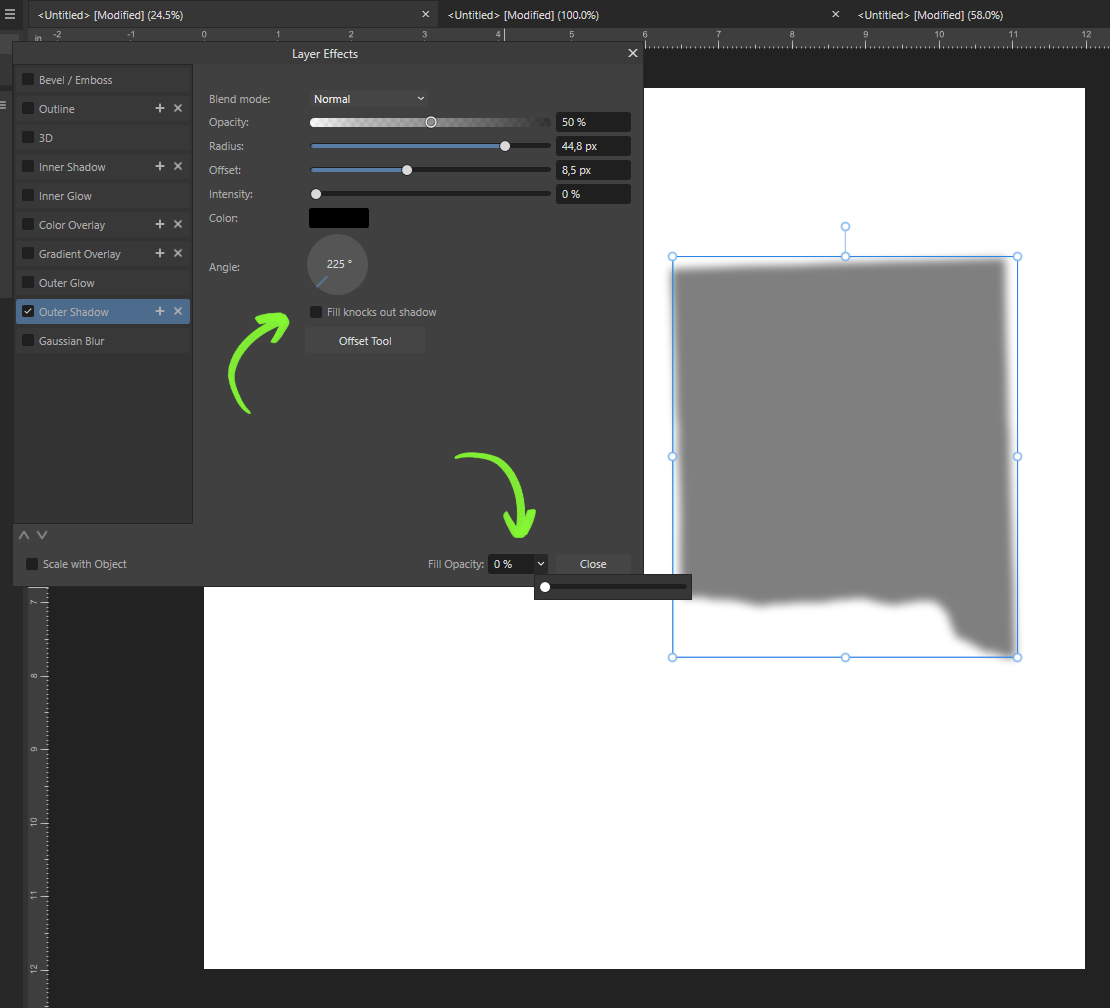
You can add a drop shadow, called Outer Shadow in Affinity, via the fx window. There you find different ways of adjusting: Blend mode, Opacity, Radius, Offset, Intensity, Colour and Angle.

Usually I use settings like this. A very low to none Intensity and a high Radius to get a soft and more subtle shadow instead of a harder outline effect.
Of course the details of the settings depend on the object, the background and your personal style. You can just play with the settings and try different Blend modes to find the fitting style for your project.
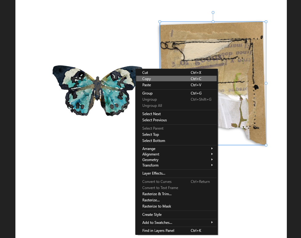
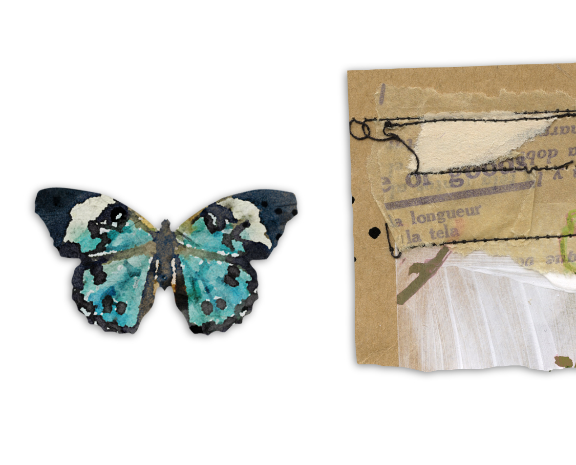
Usually you have more than one element on your page that needs some shadowing. Since the light would be the same on the whole page you can easily copy the Outer shadow.
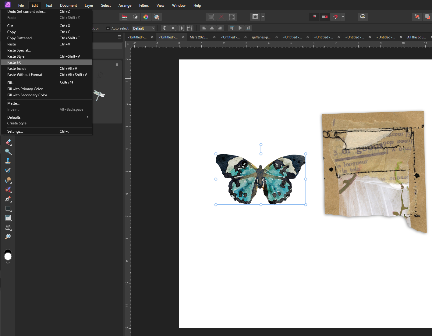
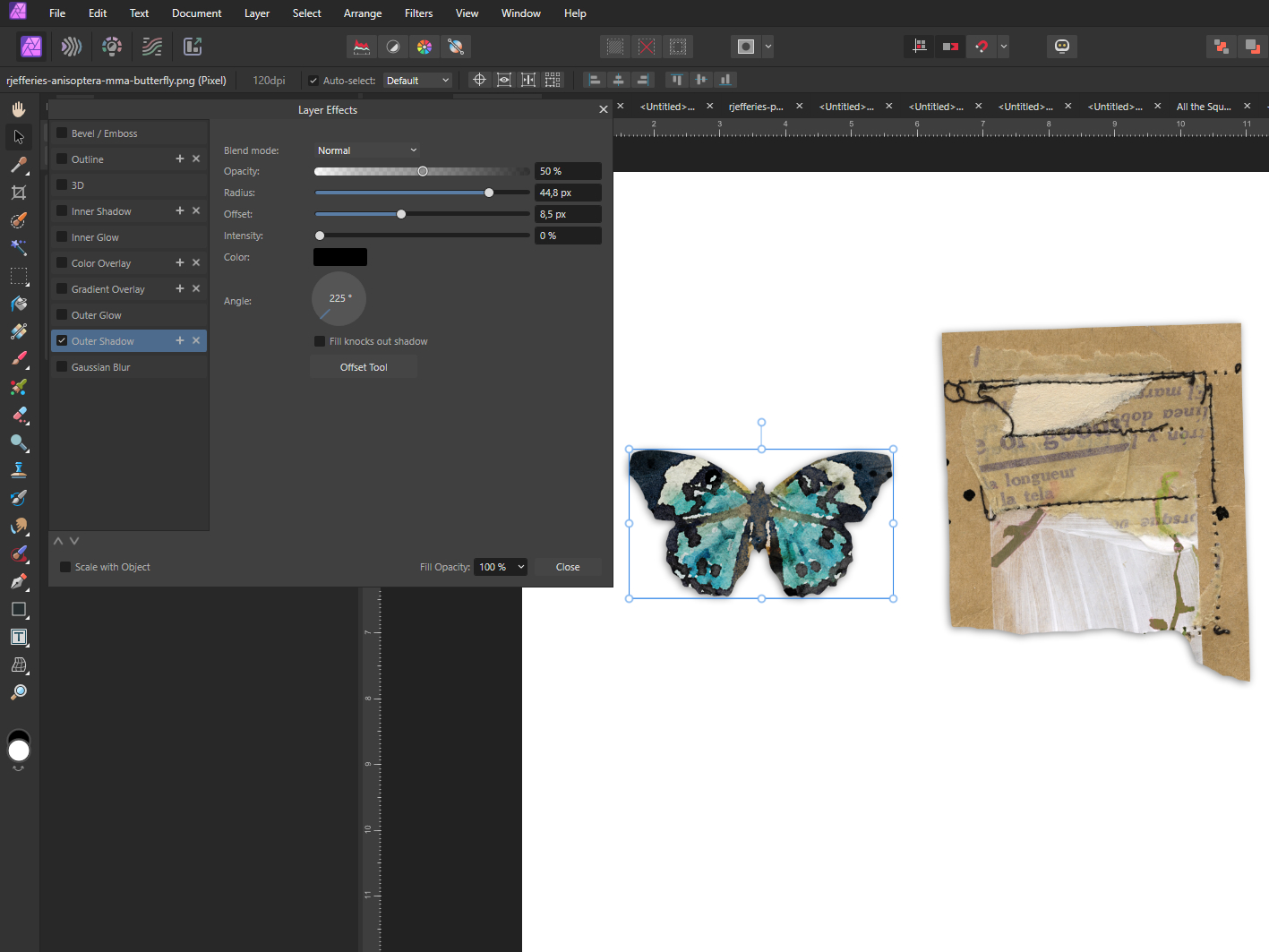
First you copy the element/layer with the shadow by right clicking on it. To paste it you choose the element/layer the shadow should be copied to, the butterfly in our eaxmple, go to the Edit Menu on the upper left corner and choose Paste FX. Now you have the same shadow on both elements.
This can also be very useful when working with templates that come with drop shadows. You just copy them to your added elements and have cohesive shadows for your whole page.
If you want a more vivid and realistic look on your page you can use some advanced shadowing techniques.
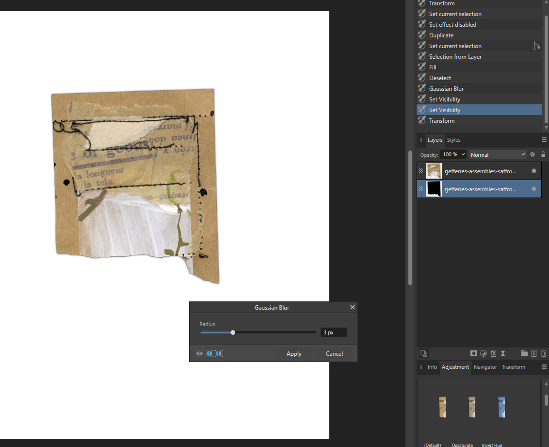
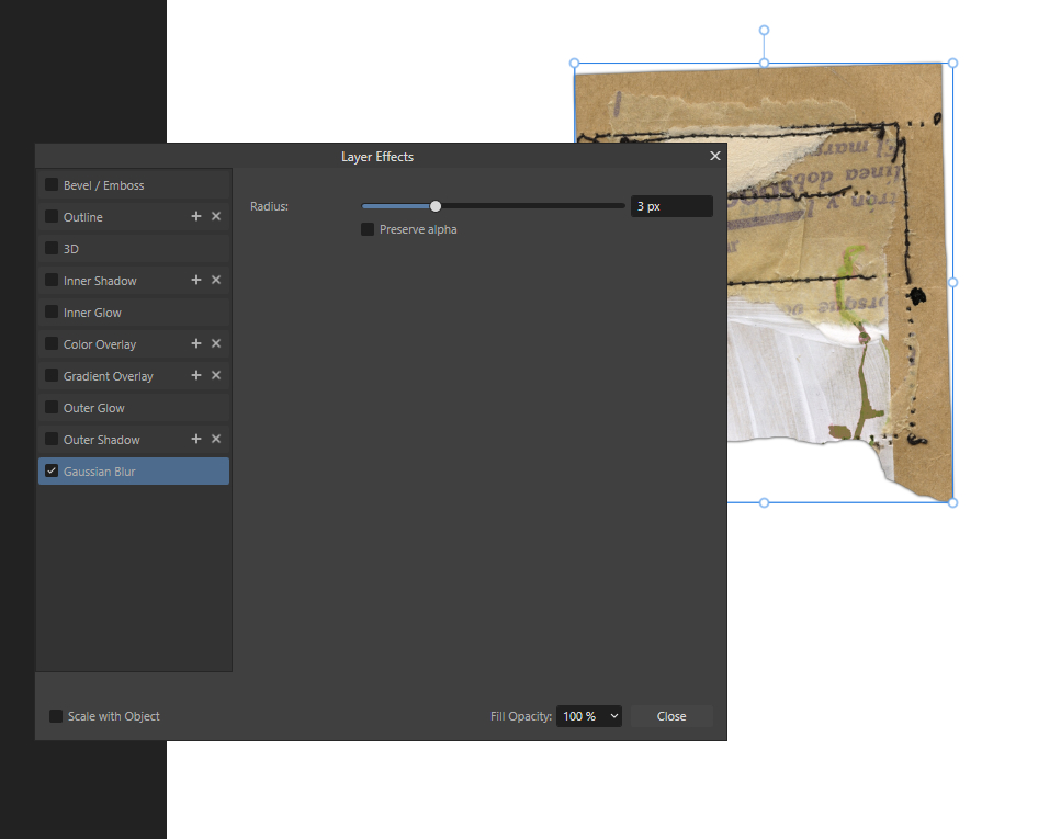
In Affinity Photo we start by creating a seperate shadow layer in one if two ways:
1. You duplicate your layer by right clicking on it in the layer panel. Then you select the one below and add a drop shadow, only this time you untick the “Fill knocks out shadow” box and set the fill opacity to 0%. Now we have a shadow layer that can be edited to create custom shadows.
2.You also need a duplicate of your layer. Now you fill the one below with black and apply the Filter>Blur>Gaussian Blur with 3-5 px. You can also use the Gaussian Blur in the fx menu, it has the same effect. The opacity of the shadow layer can be adjused later when you chose a background paper. Now you have a shadow layer without a preset light direction and can create it completely from scratch. Just experiment a bit which version you like best for your purposes.
Warp Shadows
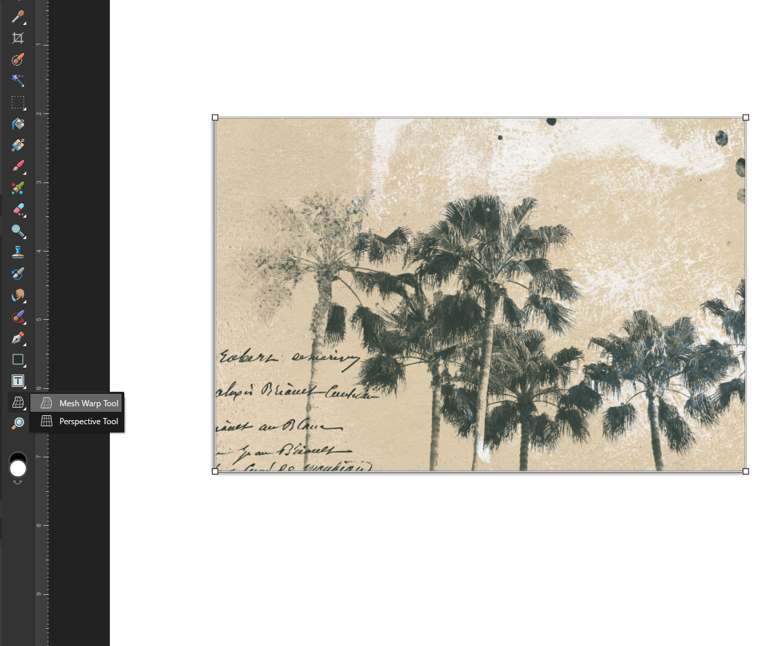
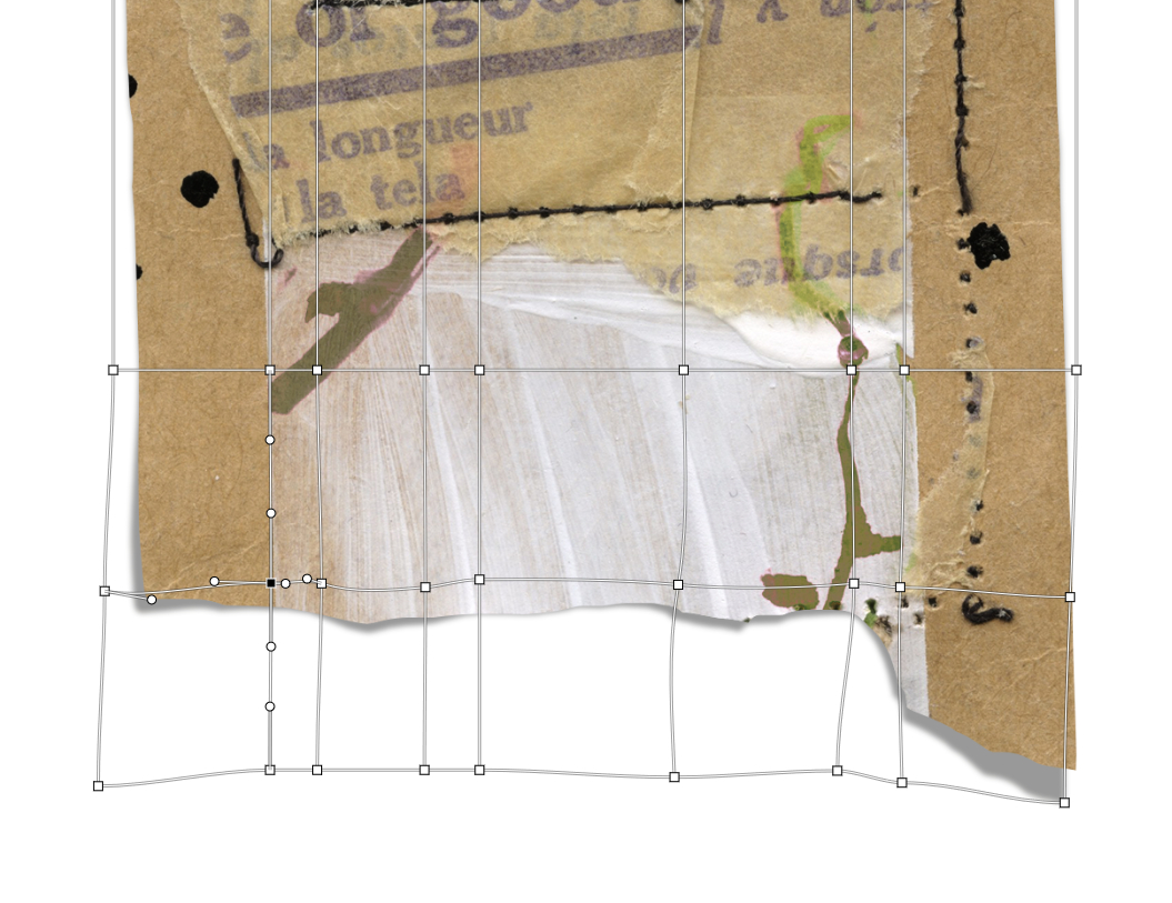
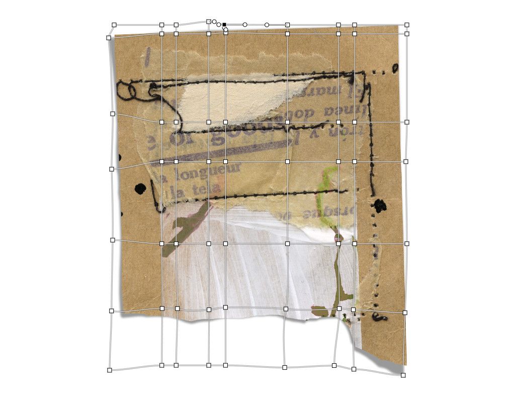
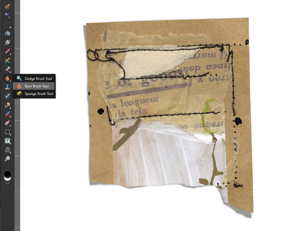
Now we customize our shadow layer with the Mesh Warp Tool from the bottom of the lefthand tool bar.
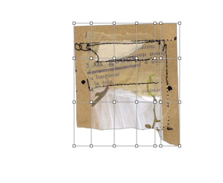
The default mesh only comes with 4 nodes in the corners. But you can add as many more of them as you wish by double clicking on the outer line of the mesh where you want the additional node to be located. For this pocket card by Lynn Grieveson I used 4 additional nodes.
Then you drag the nodes to warp the shadow layer as you wish. Don’t forget the light direction you already chose for the shadow layer. I decided to warp three egdes of the card. The strongest shadow is on the bottom left corner since the light is coming from the top right.
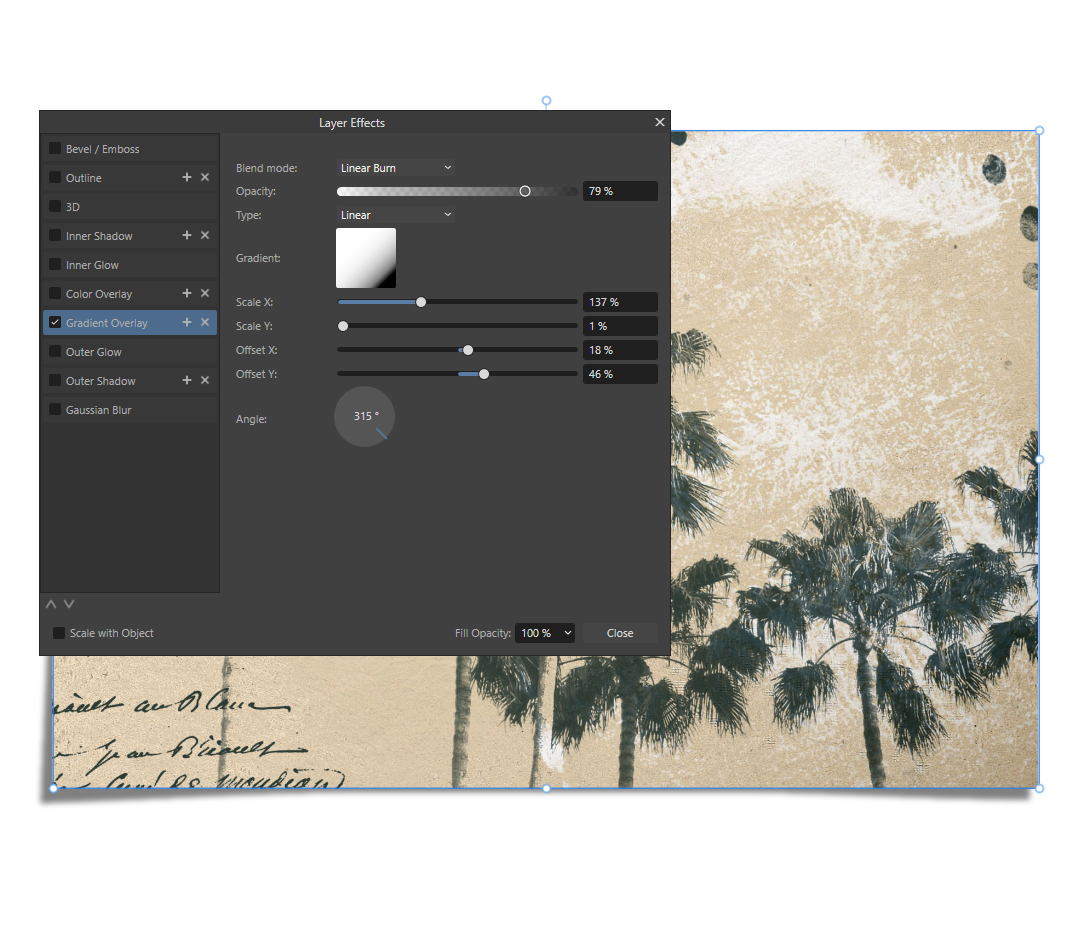
Enhancing the effect with Gradient Overlay fx and the Dodge and Burn Tools
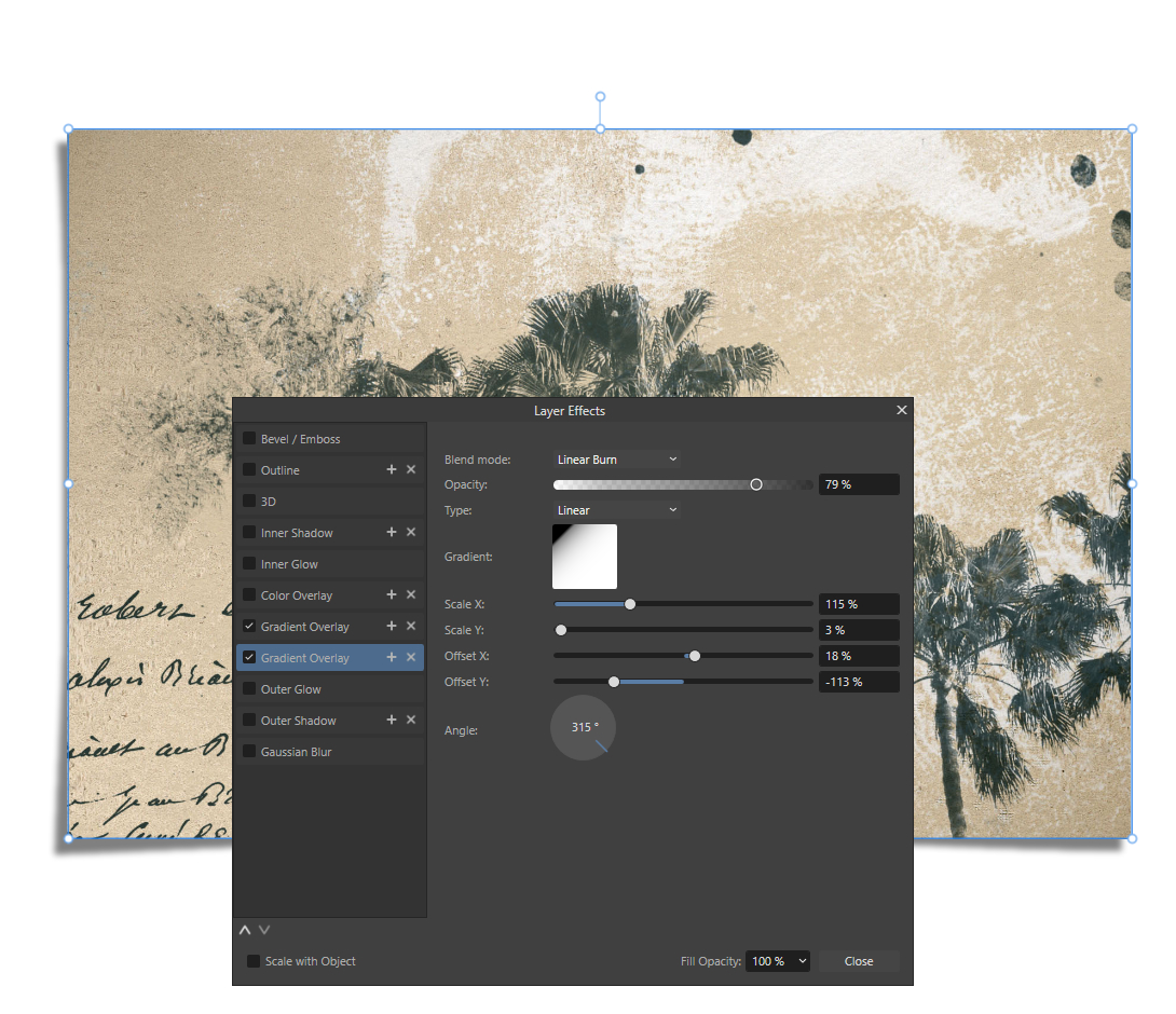
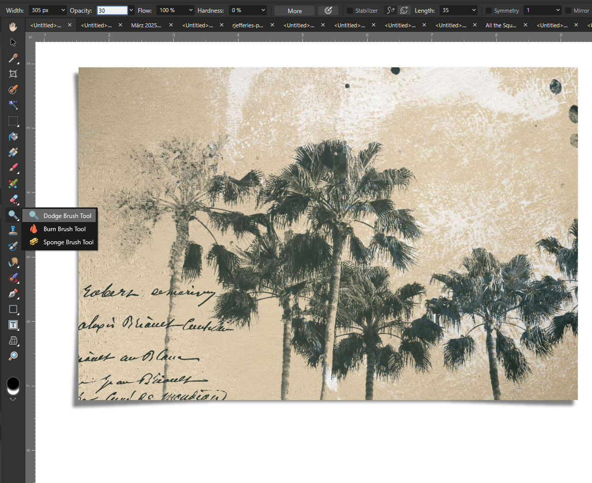
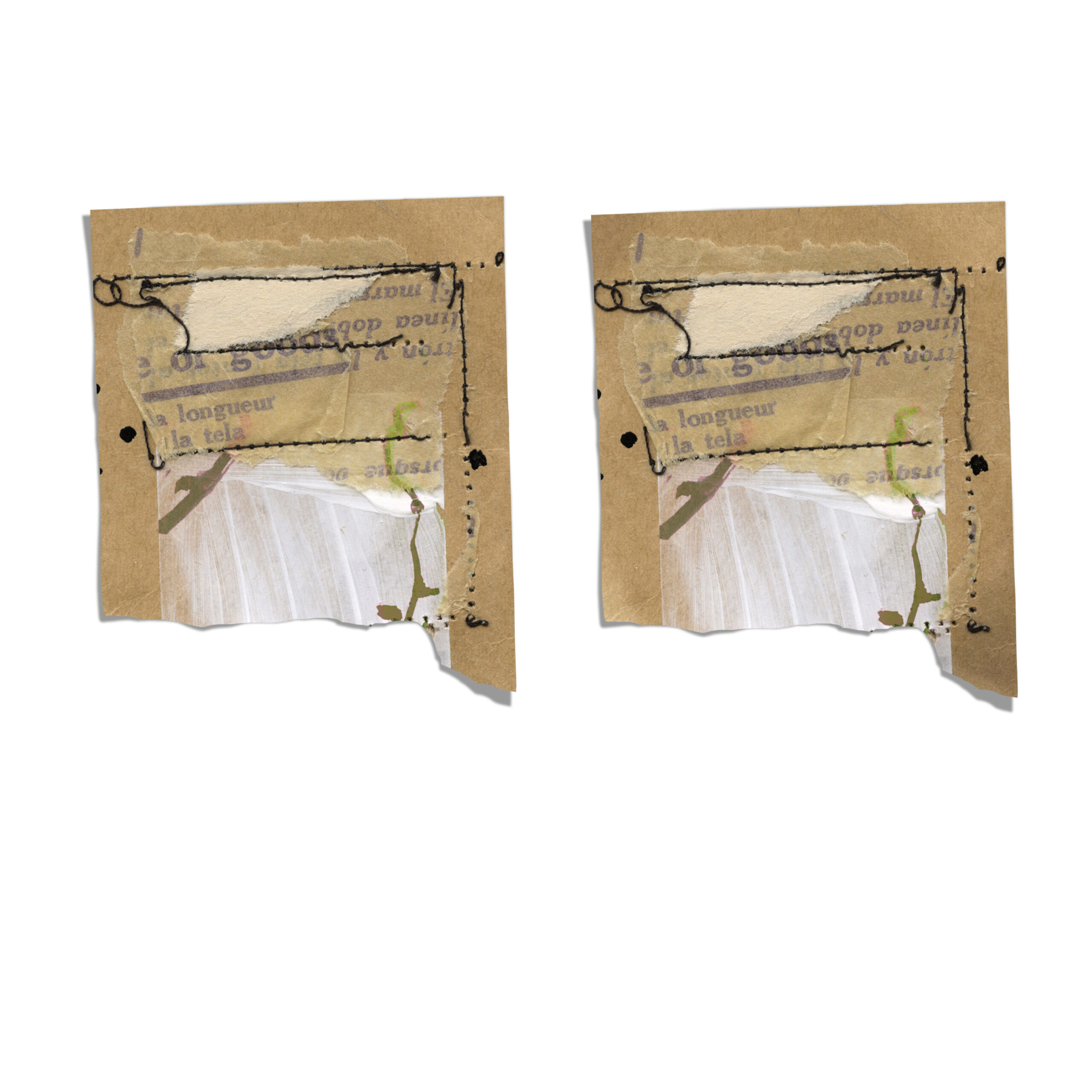
We have different possibilities to enhance the shadow effect even further by working on top of the element. Here I am showing you two of them: the Gradient Overlay fx and the Dodge and Burn tools.
I used the Gradient Overlay in both examples to darken the curled edges a bit. The settings depend completely on your element, just try some settings and find out what fits your layout.
With the Dodge Tool you can highlight areas of the pictures. I used it in both examples to highlight the bottom left corner since it is curled a bit but with the light shining on it directly.
The Burn Tool is the same thing but to darken the areas you brush with it. I used it for the upper left and bottom right corner of the paper piece. The settings for these two tools depend highly on your element and the colours, too. So you just have to experiment a bit to find the best adjustments four your page.
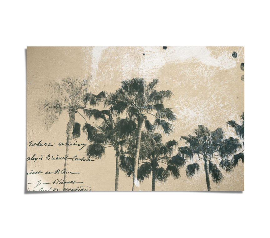
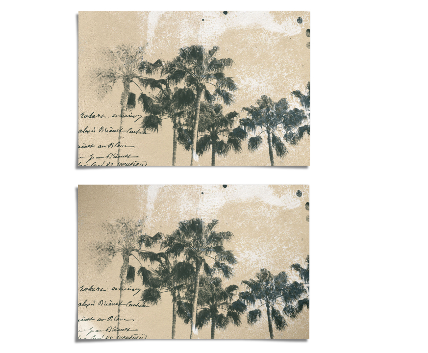
I added comparison pictures for both examples so you can see the effect of these enhancing techniques.
That it’s for today. I hope I could give you a little impression of the endless possibilities of shadowing and how much it can enrich your digital layouts!
Next month we will experiment with creating the look of cut files on your digital layouts using another shadowing technique.
If you want to dig deeper into shadowing til then I can only warmly recommend this course by The Digital Scrapper to you. The steps are shown in great detail and with a huge variety of papers, elements, bows and strings. It is created for Photoshop and Photoshop Elements, but if you use a program that works similar, like Affinity, it totally works for you.
Happy Scrapping!
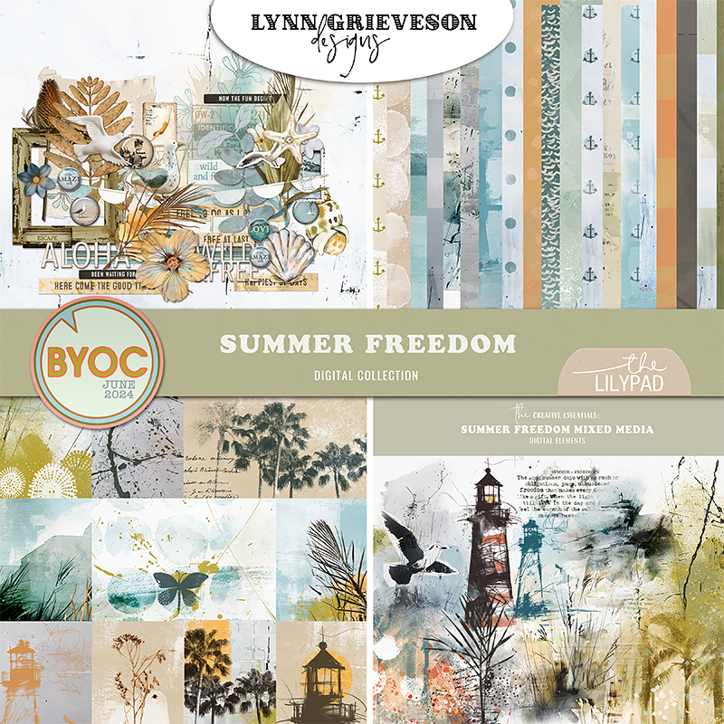
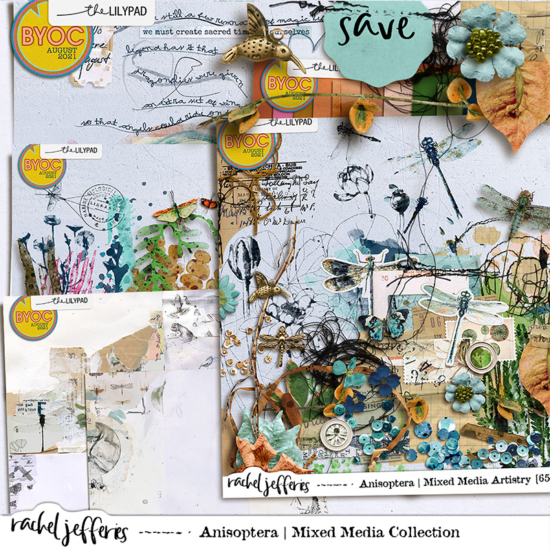
For today’s examples I used Lynn Grieveson Summer Freedom and Rachel Jefferies Olive & Saffron and Anisoptera.