
Springtime Scrapbook Inspiration
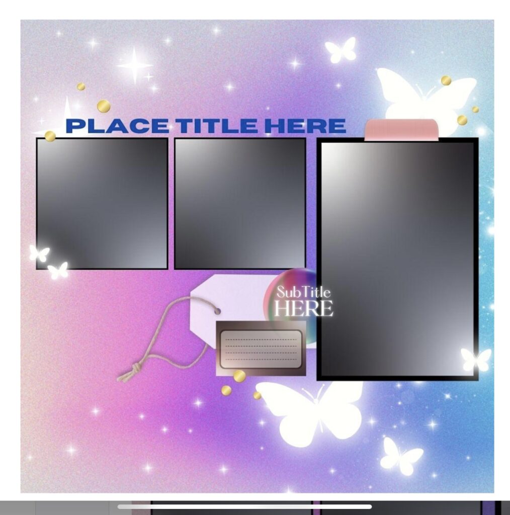
Spring is the perfect time to refresh our creativity, and one of our design team members, Lindsy, has given us inspiration in this dreamy sketch that she designed. Today, I’m sharing how I used this sketch to create a vibrant, tropical layout.
Finding Inspiration
The original sketch features a dreamy pastel background with butterflies, with gold accents, and a structured photo arrangement. While the design is soft, I wanted to bring in bold colors with a tropical vibe.
How I Transformed the Sketch
Here’s how I adapted the sketch into my final scrapbook layout:
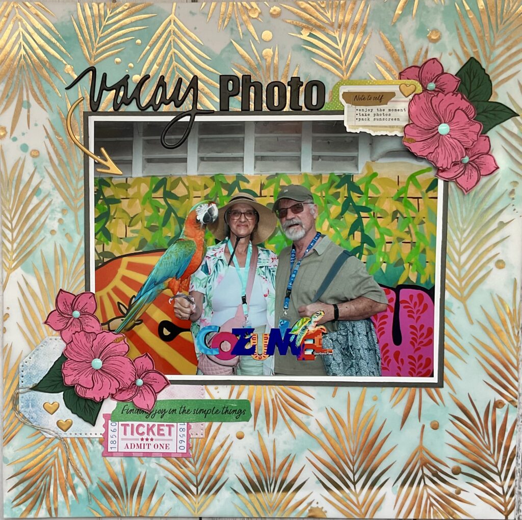
- Instead of a pastel gradient, I opted for a tropical teal and gold mixed background, which is actually a piece of vellum patterned paper that I adhered to a white piece of card stock. The palm leaf pattern adds texture.
- The original sketch had 3 smaller photos, whereas I chose to highlight one large photo instead. This allows the photo to take center stage while still following the general placement of the largest image from the sketch.
- In the sketch, the title was placed at the top. I followed that placement, but used a mix of script and block lettering for visual interest.
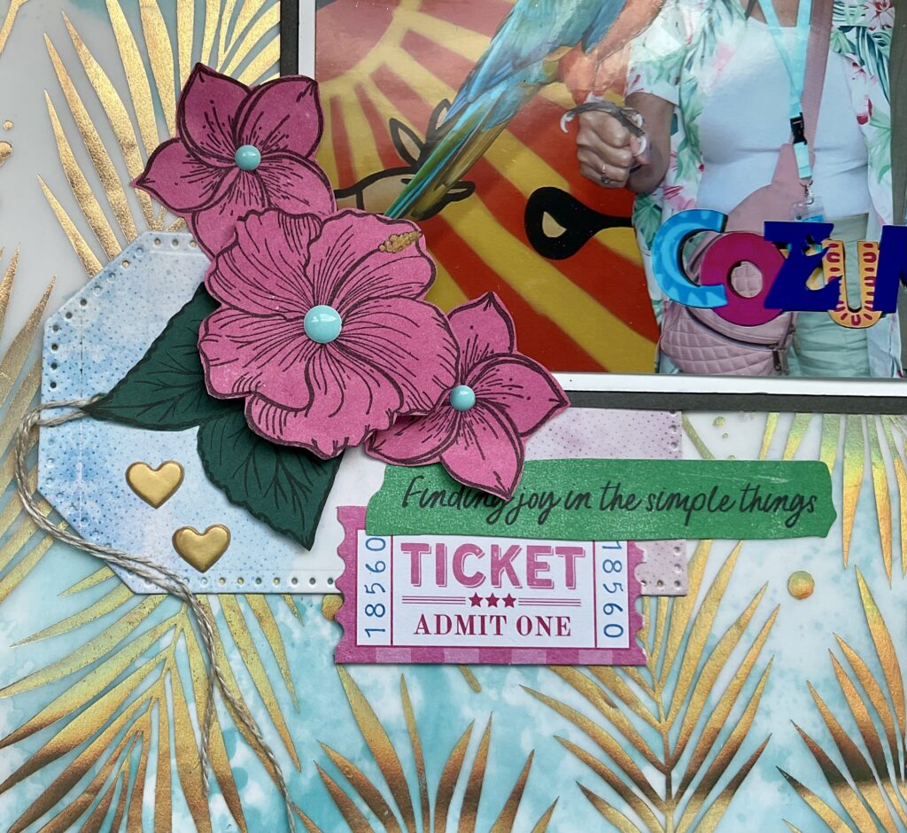
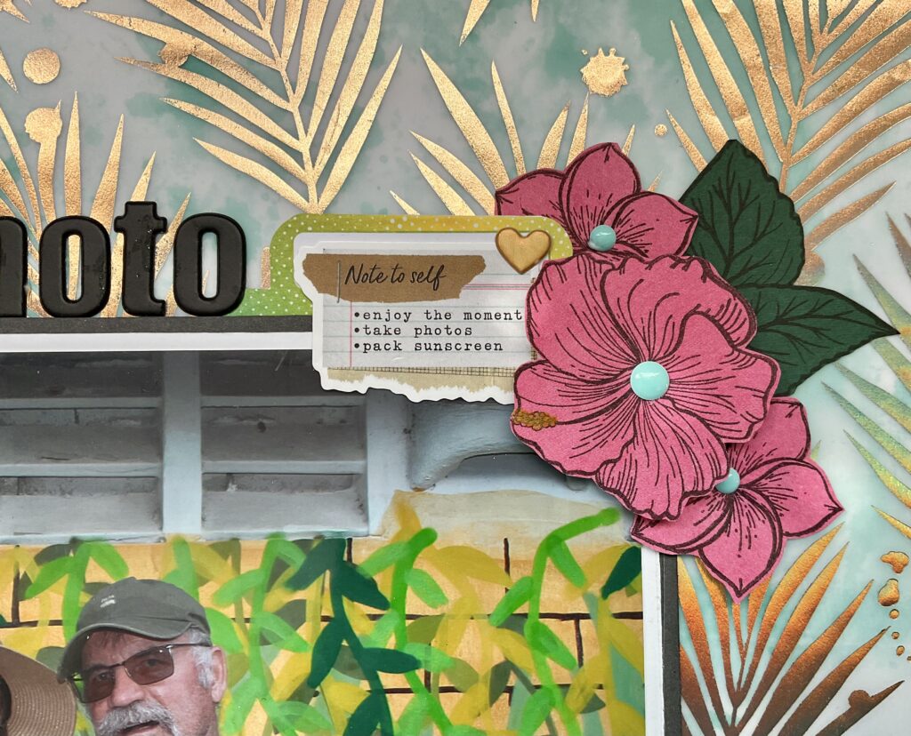
- Instead of flying butterflies and sparkles, I layered hand stamped and cut tropical flowers along with gold accents and vacation themed stickers to frame my photo.
- The sketch’s pastel hues were swapped for bold greens, warm golds, and vibrant pinks to match the tropical mood and feel.
Next up is Lindsy’s scrapbook layout using her own sketch as inspiration. Let’s see what she had to say.
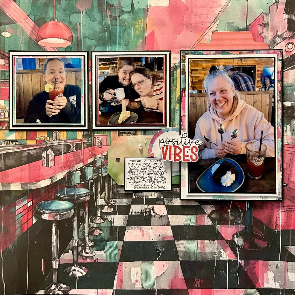
“My layout closely follows the foundation of my sketch, keeping the three-photo arrangement and key design elements (like the sub-title placement and journaling spot). The overall structure remains intact, making it clear how the sketch guided my creative process. I also maintained the balance between the larger and smaller photo areas, ensuring the composition flows just as smoothly in my final piece.”
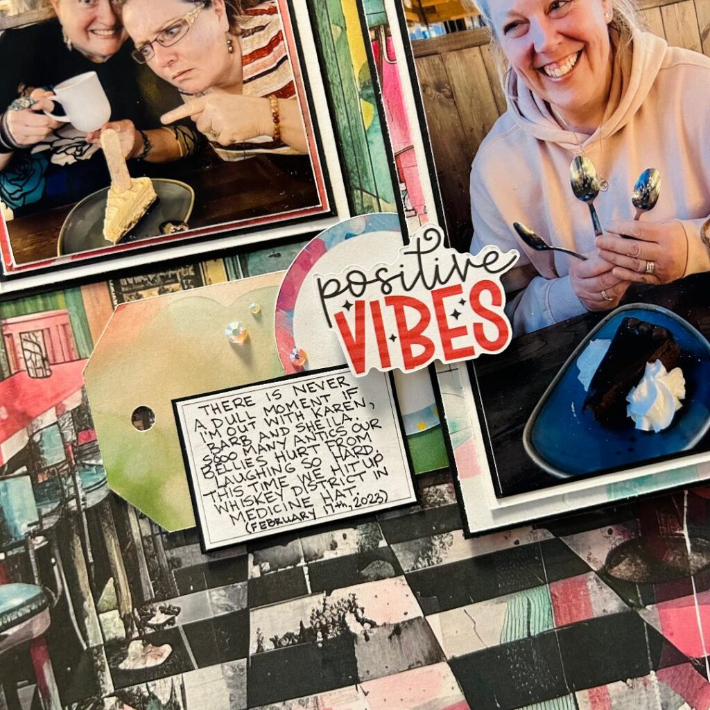
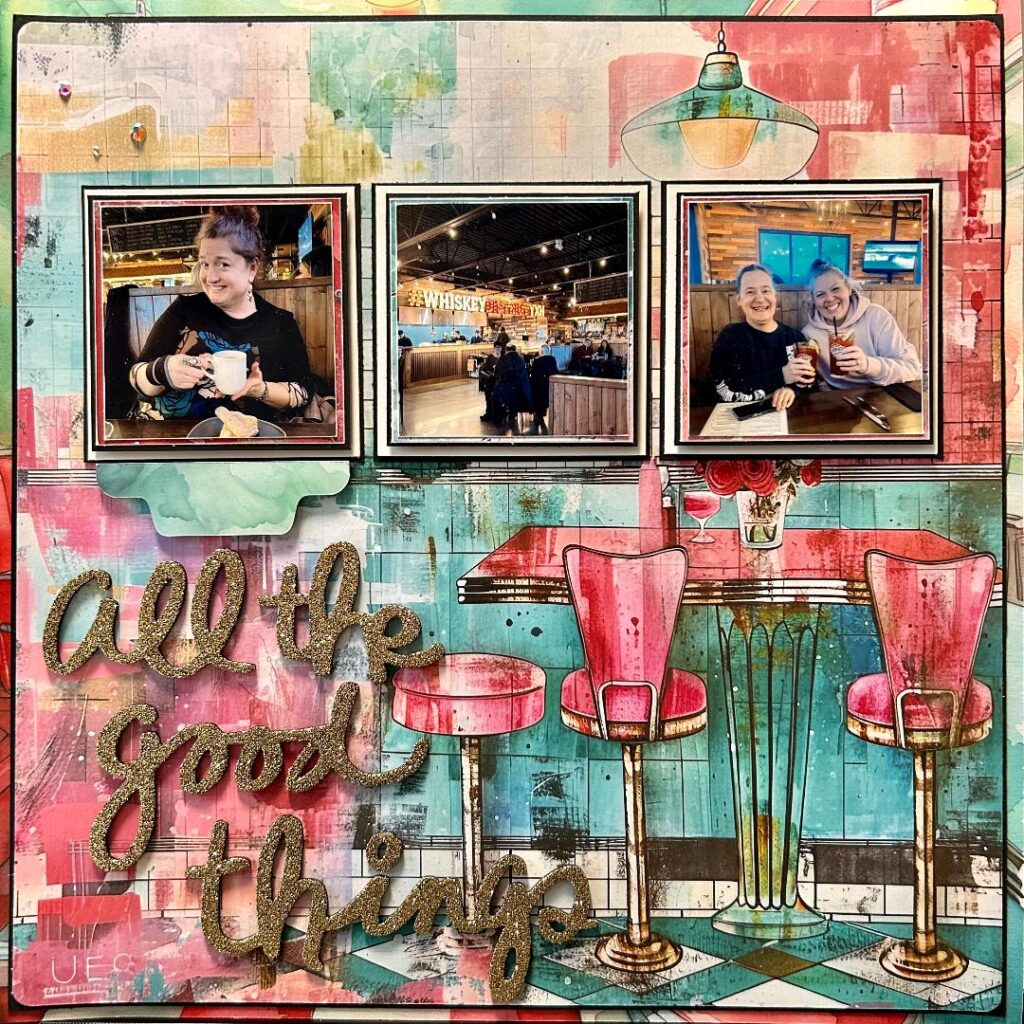
In fact, I liked the retro diner vibe so much I was inspired to create a second layout and turned my project into a double-page spread.”
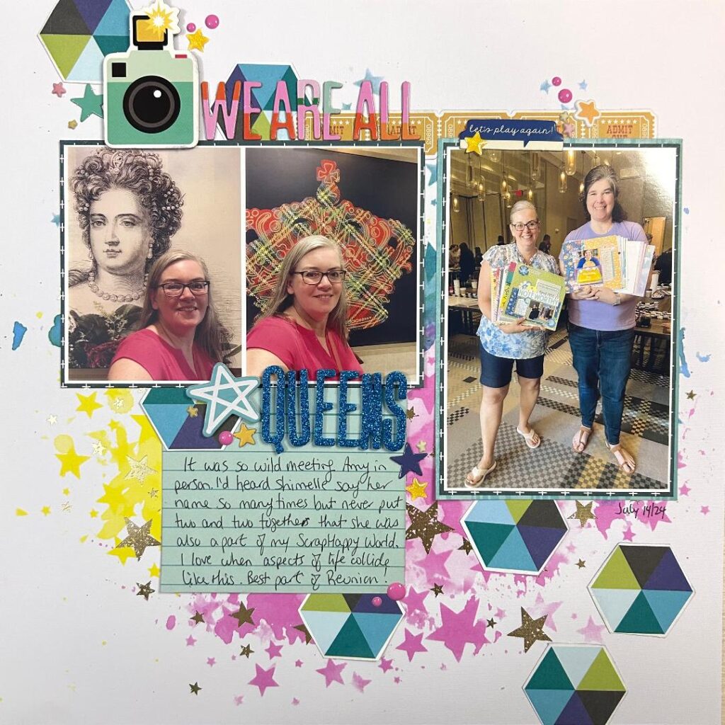
Alison decided to join us this month to create her scrapbook layout using the same sketch. Let’s take a look to see what she created and what she has to say about it.
“I stuck pretty true to the sketch. I recently reorganized all my patterned papers and a lot of my embellishments so this layout was a test of the new system and I have to say, so far so good! (What I did and why will be revealed next week here on the blog.)
Lindsy’s whimsical background made me think of my Vicki Boutin mixed media papers so I started there. Then I pulled in papers for layering and journaling. One of them had this fun, multi-coloured hexagon pattern and I decided to try fussy cutting some of them out to use as the scattered embellishment element. I love it!
In my paper reorganization I found a Simple Stories page kit from their Family Fun collection. I plan to use a lot of the elements in it to tell some of my stories from reunion as there are race car graphics that work with our Race to Reunion theme. For this layout I used the camera, tab, tickets, and a few of the star die cuts.
For reference, I filmed this layout coming together and it took me 53 minutes. I’d say that’s proof positive that my new system allows me to find what I need quickly.”
Final Thoughts
This project is a great reminder that sketches don’t have to be followed exactly. They simply serve as a jumping-off point for creativity. Whether you’re drawn to soft and dreamy themes or bold and adventurous designs, you can always tailor a sketch to match your vision!
Do you use sketches as inspiration? How do you adapt them to fit your style? Let me know in the comments.