
Membership has perks.
I think that is universally known by anyone in a club. Whether it’s your Costco Membership, your gym membership, or you’ve got a punch card at your local book store, membership has its privileges. ScrapHappy Membership is no different.
Every month we have exclusive content like ScrapSchool with Sara Scraps, where she teaches everything from misting techniques, to how to create embellishment clusters, to painting bubbles like a pro. For the last few months we have been learning about how one of Sara’s Go To Designs can be manipulated so that each page looks very different but you in essence start with the same building blocks.
This led Alice down a rabbit hole. What were her Go To Designs? Could she identify them? What about them made her come back to them time and time again? Be sure to check out the ScrapHappyOrg Instagram page for her layout flip through.
So of course, her Creative Team has to explore this in their own layouts too! Here are my Top 3:
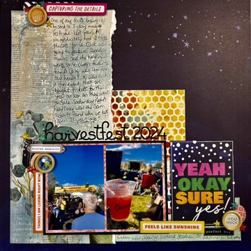
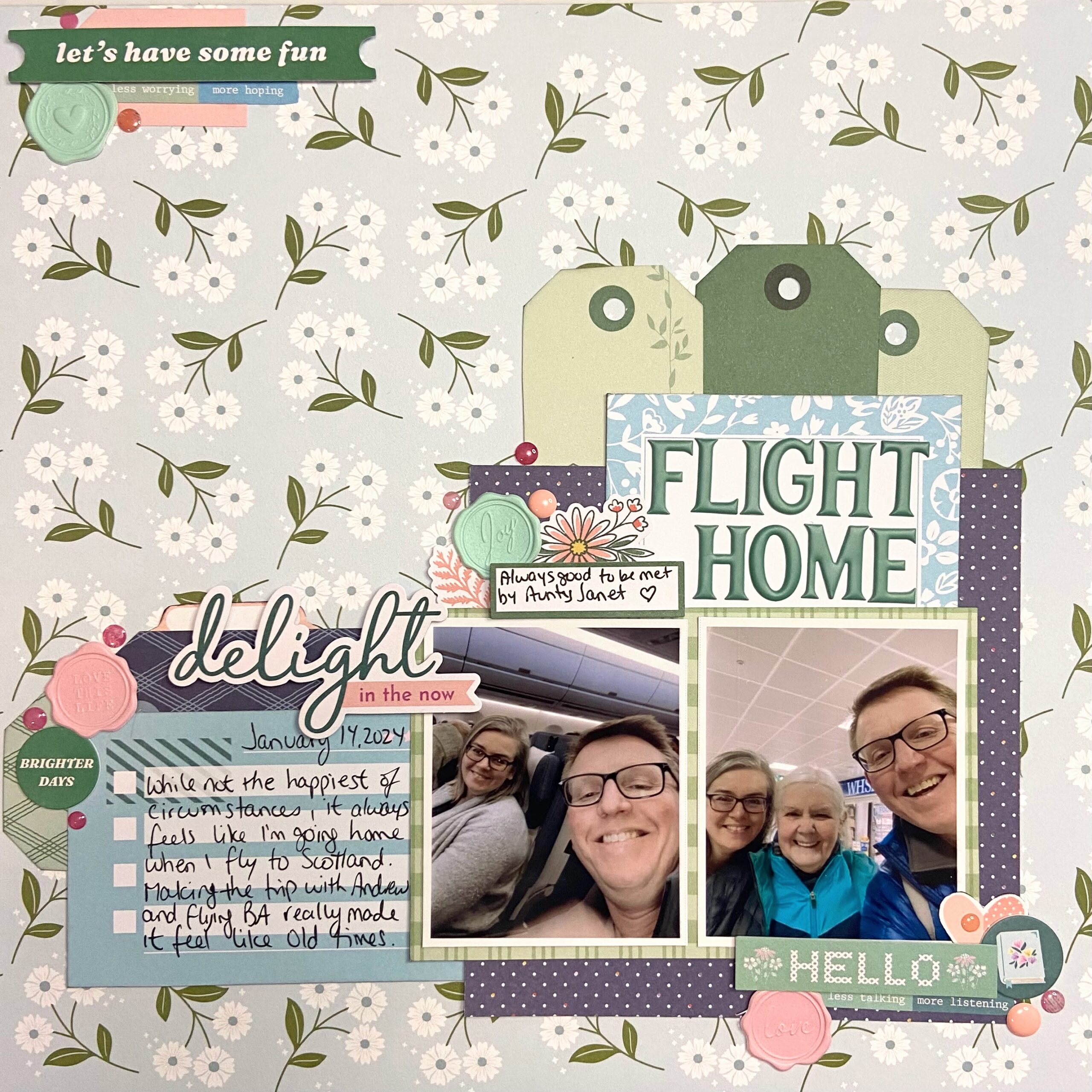
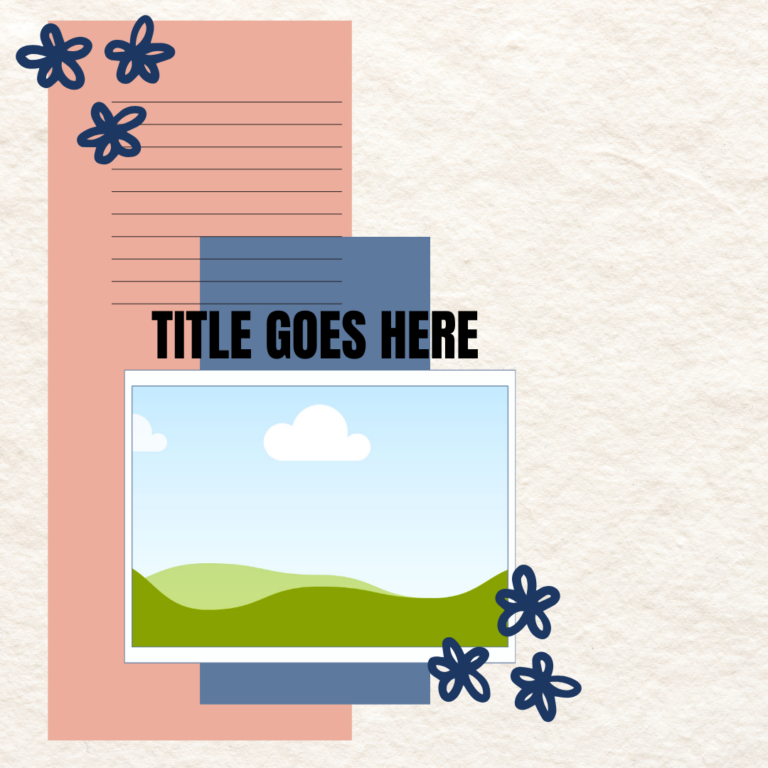
#1 - L-Shaped Designs
The first one (Harvestfest) is very easily recognized as having all my elements in an L-shape. The photos + journaling card make up the horizontal piece and the wider vertical piece allow for a place to journal.
In the middle is one where I’ve flipped the L so now the vertical piece is on the right. To help direct your eye, there is a small embellishment in the top left. The photos + journaling again create the horizontal element.
The third layout is also an L-shaped design but this time I’ve broken up the horizontal and vertical pieces into smaller boxes. The photos + journaling still create a horizontal element and then the rest of the boxes are arranged to create vertical height on the top left.
So you can see how different this design can look from one layout to the next.
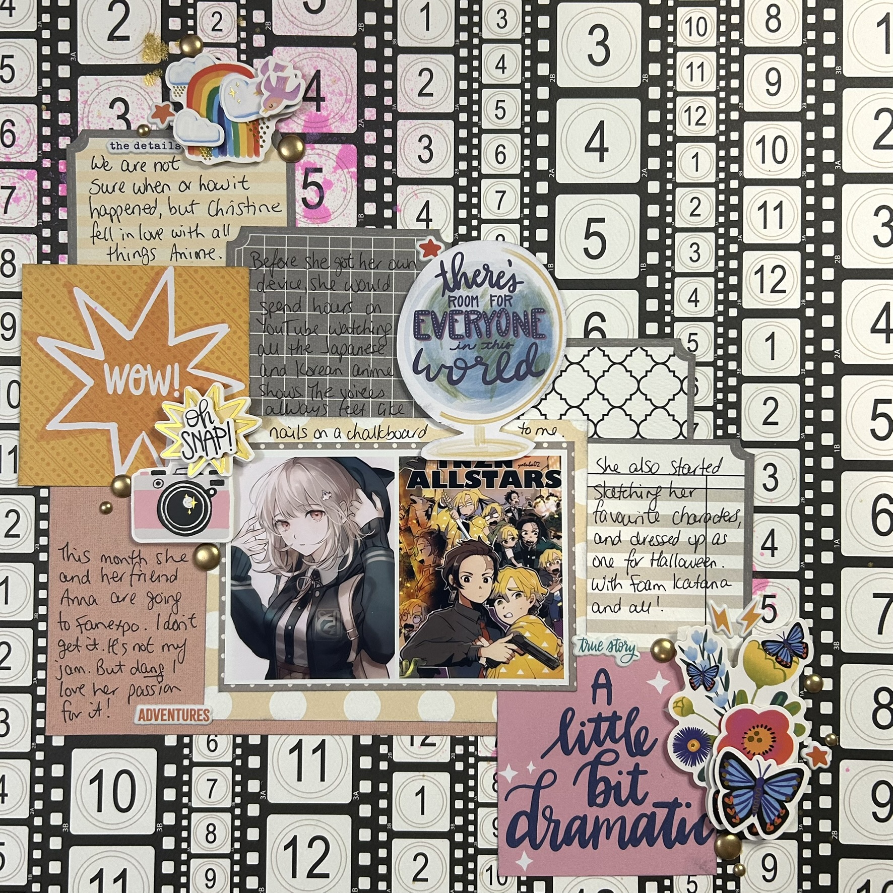
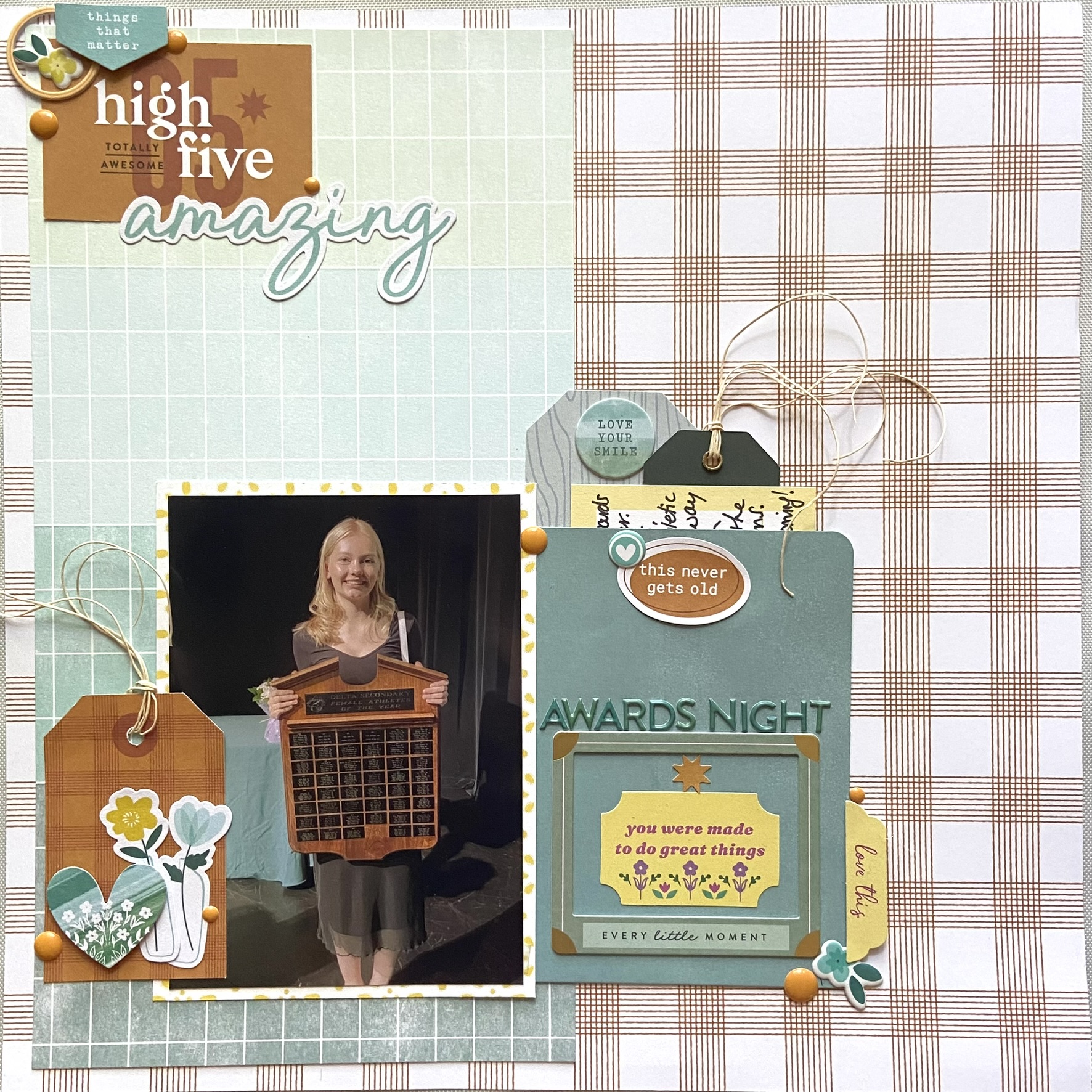
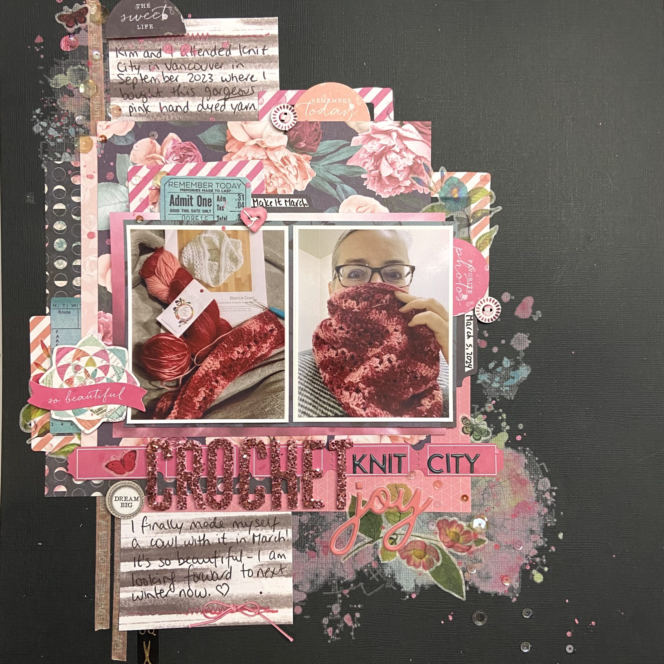
#2 - Vertical Third Designs
This one is closely related to the L-shaped design but instead of having a defined horizontal element, most of the design is kept on that vertical block. Usually my blocks are at least 1/3 of the total page width, but not always, as we can see in these examples.
The layout on the left has the widest vertical block of this design. It’s less a 1/3 design and more of a half and half. But I’m grouping it here as I’m still focusing on using that vertical block to house the important elements like my photo and title/subtitle.
The layout in the middle is what happens when I start with a vertical block and start layering. Actually, I started with mixed media and rub-ons and layered on top of that! This time everything is on or touching that vertical block – my title, my journaling and my photos. All the other bits and pieces (and there are many!) are simply for fun. If I stripped them all away, my main components would still make this vertical block design.
The last layout is almost a flipped L-shape but not quite. I’ve still got a strong vertical block that is anchoring the photos, title and journaling, and is supported by stamping and inking behind it. The embellishment cluster in the lower right is there to balance things off. Without it, the photos might give the impression that they would fall down. It’s a weird visual anomaly, but that grouping grounds what is going on at the top of the layout.
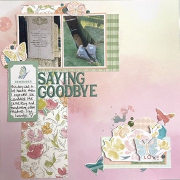
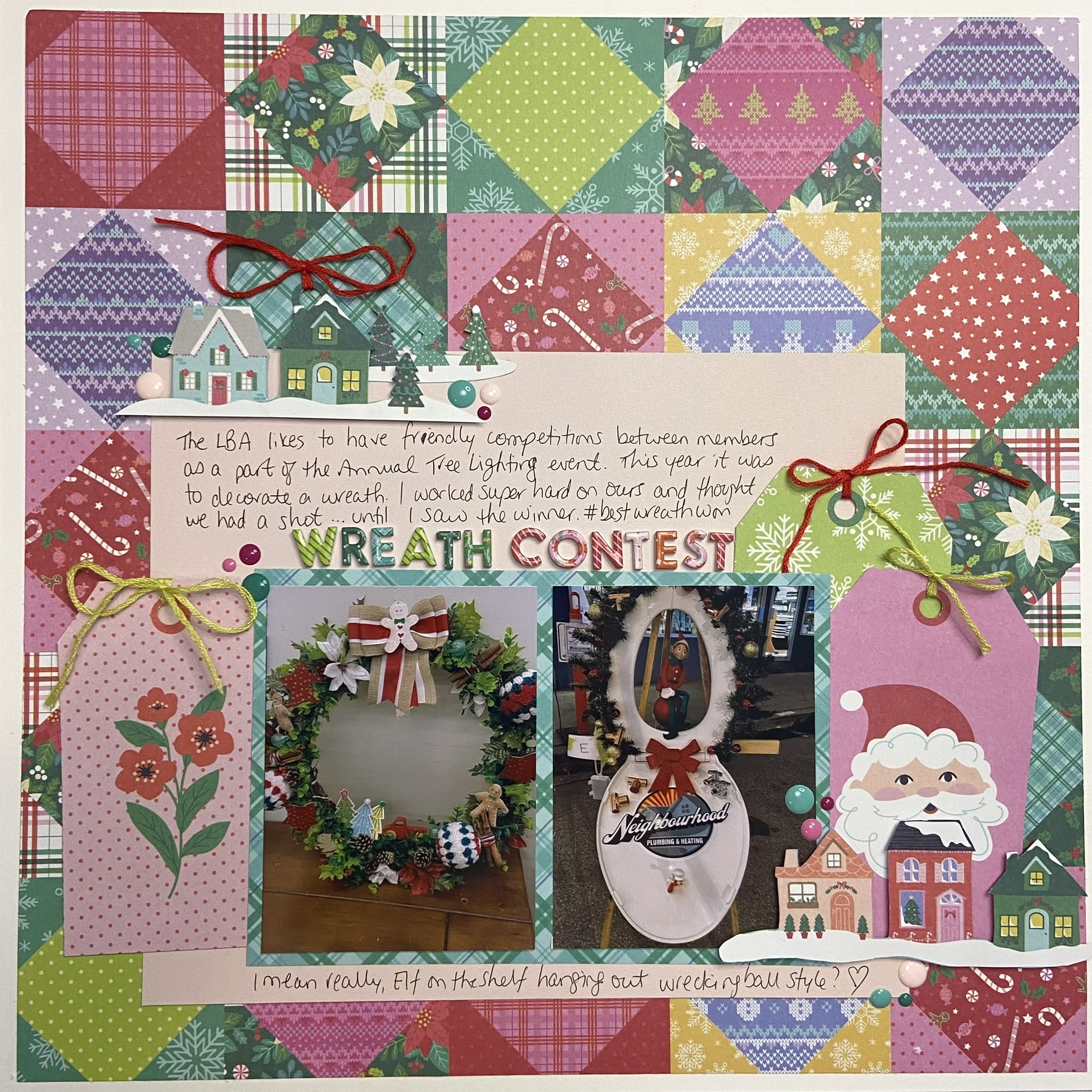
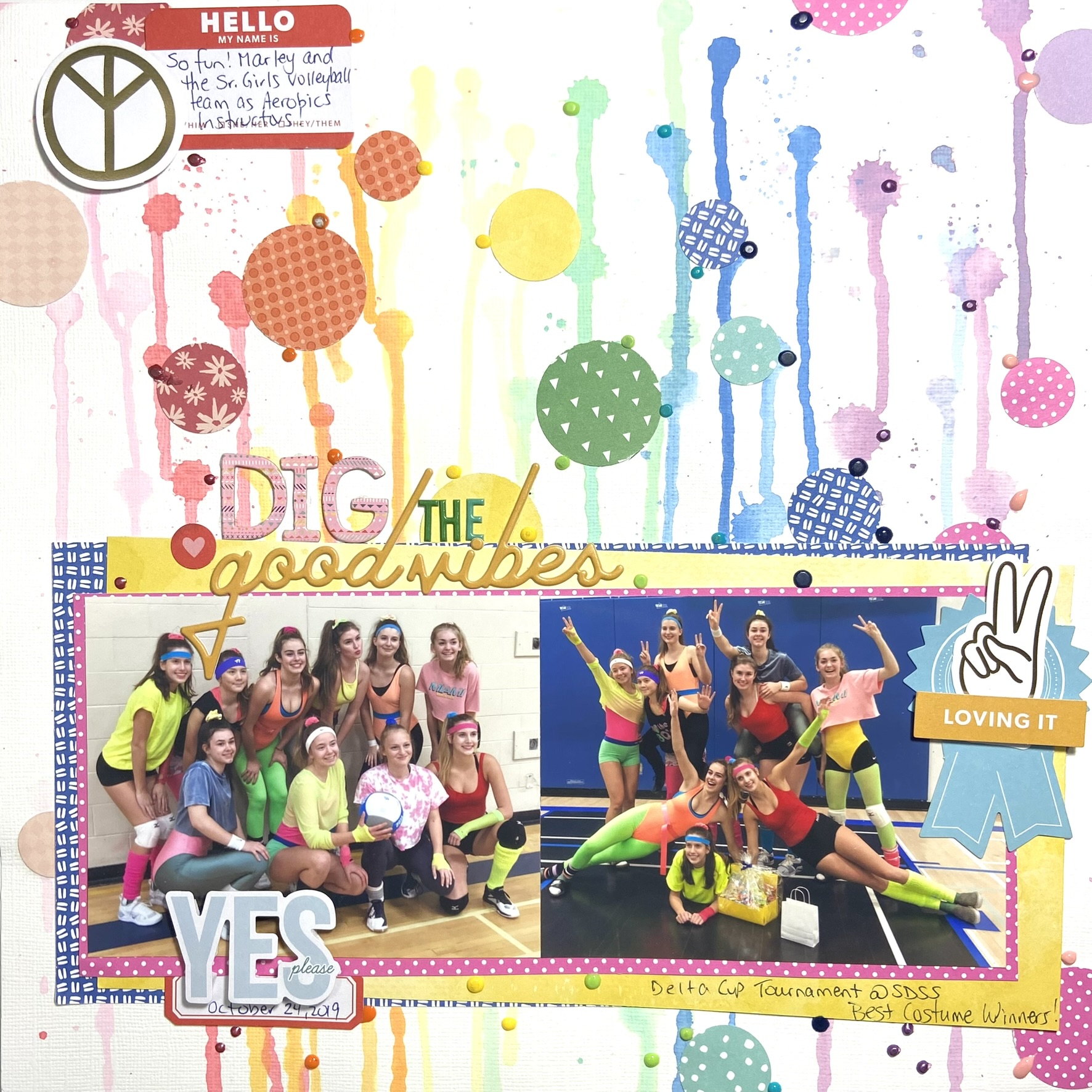
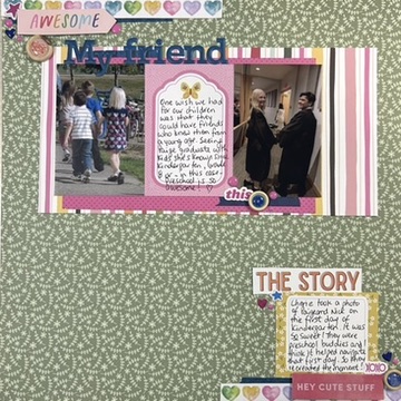
#3 - Horizontal Box
My last Go To Design ignores the vertical altogether and groups everything into a large horizontal (or sometime square) box, usually at the bottom of the layout. I will quite often add a frame around the entire layout, but not always. Sometimes I’ll add a small embellishment at the top left to draw you into the page and encourage you to keep reading. This design is also a good one if you have a gorgeous patterned paper to show off, or you’ve done some amazing mixed media that you don’t want to cover up entirely.
Let’s take a look at some examples.
The one on the left is really busy and I admit this was one I made to display in the store as a way to promote the papers of this Paige Evans Christmas collection. But the design stands. The photos, journaling, and title are all contained in that box of light pink at the bottom. The whole thing is framed with white card stock and the embellishments are kept to confines of the block.
In the middle we have one of the “show off your mixed media work” examples. While I have added embellishments above the photo block, pretty much everything is there. And given all the colour on the page, it’s still weighty enough to grab your attention first.
The last example here is where I’ve used the same design but flipped it. Now the horizontal block is at the top of the page. It still contains the photos, title and journaling only now there are more pieces above and below it.
This pile was by far the biggest and this design seems to be my favourite Go To Design … out of the layouts I looked at that is. There are still two boxes of layouts in my desk that need to go into albums. Who knows how many of each of these designs I’ll find in there! One of the reasons I love this particular way of arranging my papers, is because it’s super easy to create a pocket out of that horizontal block. Here’s an example.
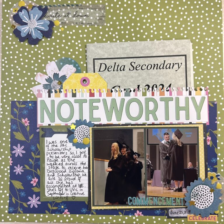
Quite often as parents we are presented with the conundrum of what to do with the dance programs, or school concert hand outs. This is one of my solutions. Create a pocket and tuck the program or brochure inside. I know if I went digging I’d find many more layouts like this one! And you know what, I’m okay with that. None of them are likely to sit next to each other in my albums. None of them are likely to be using the same products. So why not use a design that works over and over again?
We’d love to hear from you. Do you have Go To Designs? What are they and why do you love them? For me, I know these work for the way I scrapbook so I will continue to use them as often as I like. Of course, now I’ll be more conscious of it! Let us know your favourite designs in the comments, and stay tuned for Misty’s Go To Designs later this month.