
Sara Scraps is our community educator here at ScrapHappy. Recently, she has been bringing us classes on go-to layout designs. These designs are foundations that are easy to alter. This opens up many possible layouts with one go-to design. While those classes are for members only, our blog team is giving you a taste of what our membership has to offer.
Alison already shared three of her favorite go-to designs. Today I’m sharing my one favorite design which starts with a super simple idea: cluster three 4×6 photos. Since most scrapbooking photos are printed in 4×6 this means you can go from camera to layout with zero photo editing!

Above you can see my go-to layout sketch. I’ve been using this idea since the early 2000’s! See how my three 4×6 photos all nestle together? That is the simplest foundation of this go-to design. Even years later I still come back to this design. Despite the fact that I can fully edit my photos now, I still come back to this design. That core of using three clustered photos is still a foundation of many layouts today.
Let me show you some layouts that bring this design to life. I will also share how to expand on this idea by focusing on three different options. Don’t worry, I will clearly list those options at the end of the post. That will give you a simple checklist of ideas.
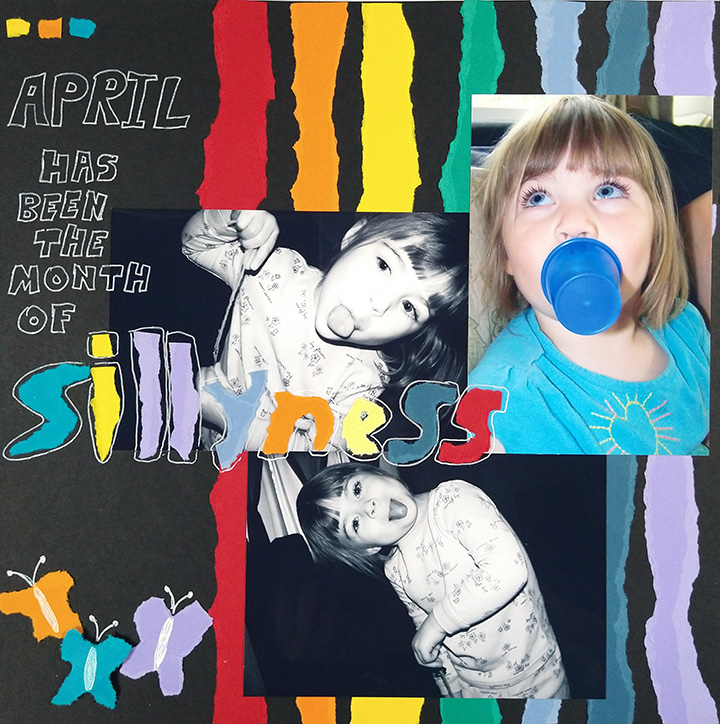
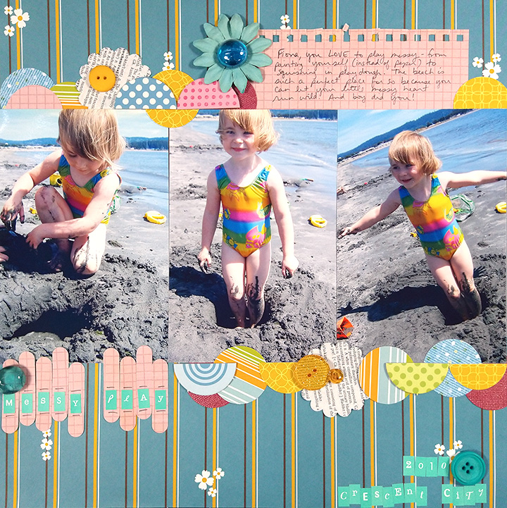
This layout follows the sketch pretty closely in terms of the photo orientations and placement. Most of my photos consist of landscape orientation photos with the occasional portrait orientation. That is how this design came into existence. It was a way to comfortably fit these three photo orientations on a 12×12 background.
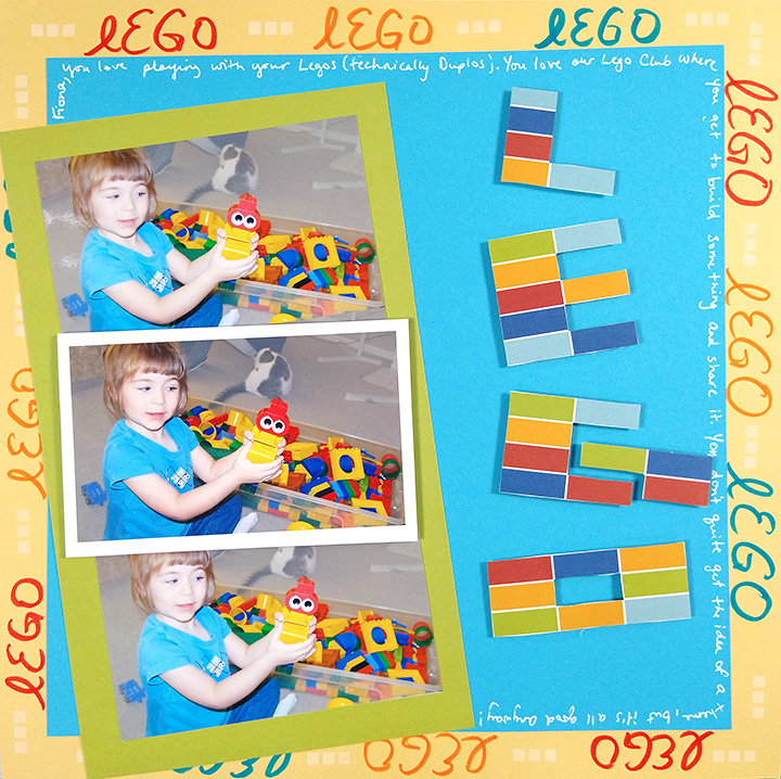
Now let’s look at the same shapes of photos clustered together in a different way. It isn’t a huge change. However it allows for slightly different placements of titles, journaling and embellishment. Sometimes little changes like this can keep just a single design from feeling “stale.”
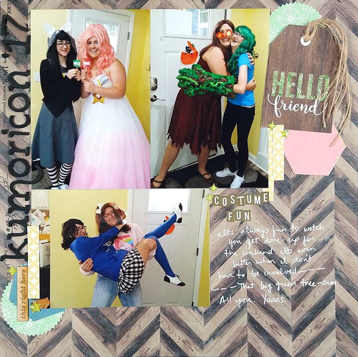
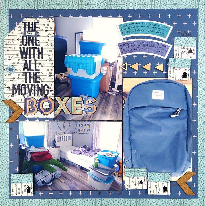
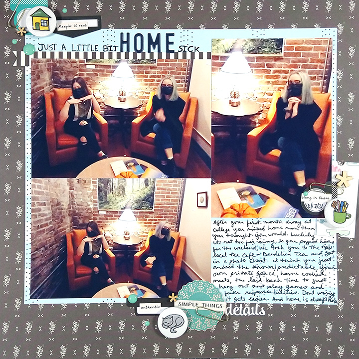
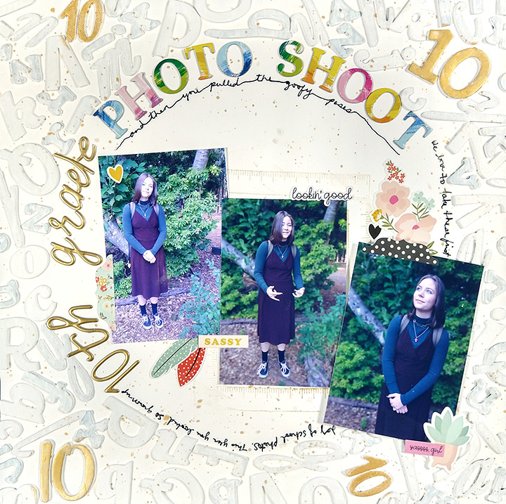
The above layouts were both from around 2010. These next layouts were created in 2016 and 2021 respectively. In this eleven year span I have still found this same 3 photo cluster design so functional. These layouts don’t feel too “samey” or boring to me.
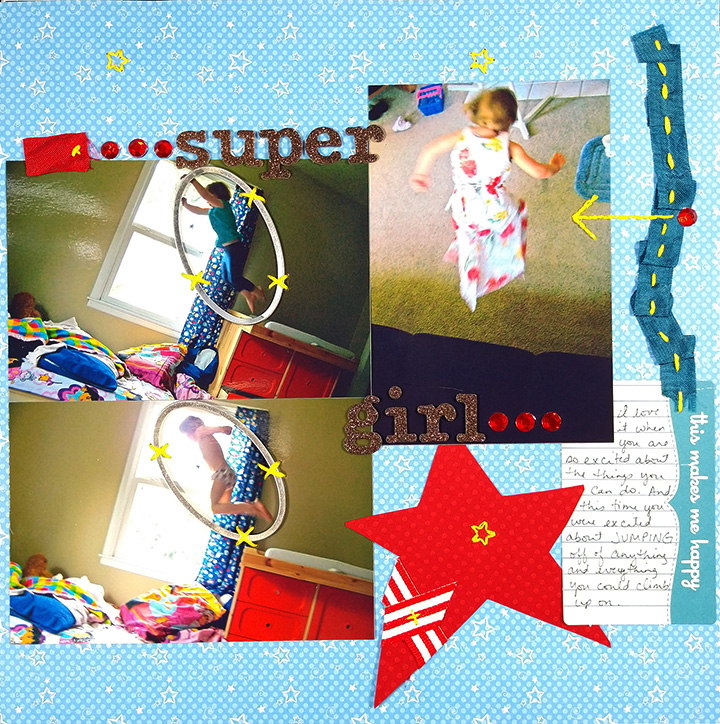
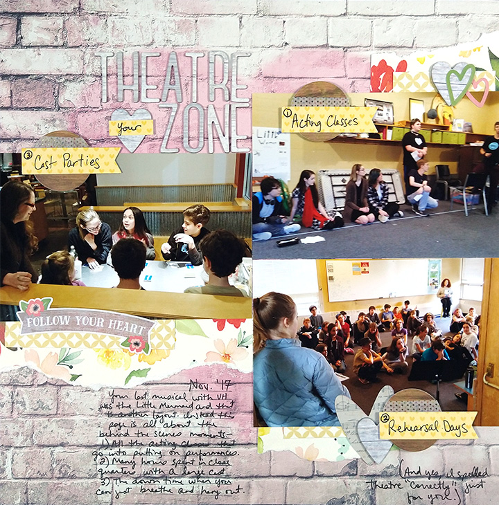
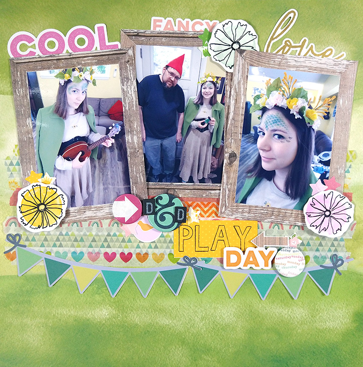
As you can see from these layouts, the biggest difference from the first two is the photo orientation. Two of them are portrait and just one is now landscape. They still cluster just fine!
Like I said earlier, most of my photos are landscape orientation. In fact, this is the most common photo orientation. Even if you can mix the different orientations, you can still cluster your photos.
You likely have many photos in this popular landscape format as well. Don’t worry, these photos cluster just find too!
The opposite orientation case is also true… all-portrait photos can cluster as well. This will now give you a different cluster option: the photo row!
Photos can also stack in a “row” if they are all landscape. We no longer call is a row though. It is now called a column.
The layout below shows the column option. I’ll admit that I did do minimal photo editing on these ones. That is, I printed these photos as 3x5s but on 4×6 paper. That allowed me to trim two of them down to just the photo, but leave one of them with a white border. (Also, these are all the EXACT same photo! I liked the repetition of including three of them.)
Most print services allow the option to print 3×5 so you still wouldn’t have to edit photos. I believe printing with a border is also options at print services. If not, it is easy to mimic this by matting your photo on a white piece of cardstock!
By sizing my photos down I have created a column that does not take up the entire height of the layout. That allowed room for a bit of a homemade-theme border.
This example above also offers another variation: overlapping. Many times, photos can be overlapped in ways that won’t lose photo information. You can cover up parts of the photo that don’t matter. I use this trick to specifically cover up parts of a photo that are distracting!
When you overlap photos that gives the rest of your layout a bit more breathing room. You can also achieve more breathing room by trimming 4×6 photos down to any size. I often snap my photos with a bit more room around the edges on purpose these days. I know I can always trim that off or use it as overlap room later.
Let’s look at a couple of examples of this go-to design using trimmed photos.
The two pages above have the same number, orientation and placement of photos. The difference is that I ever so slightly trimmed the photos on the left layout. I believe these photos are trimmed to 3.5 by 5.5. Doing this allowed me to mat my photo cluster and still maintain some breathing room — the background paper has room to form a nice border.
As you can see, variations start adding up. We’ve talked about overlapping and trimming photos. In the layout above, the photos are trimmed, overlapped, and then also framed. Had the photos not been trimmed and overlapped, there would not have even been room for that framing option!
So far I have clustered and overlapped photos in blocks or rows/columns. In the layout below, the photos are trimmed and overlapped. Not only that, but they are clustered on the diagonal. Now we are opening up even more options! The diagonal opens up ideas for titles and journaling to flow in even different ways around the photos.
I’ll leave you with the above final example. I trimmed down just one of my photos and clustered it to offset it from the rest. This creates a much looser feel to the cluster.
I encourage you to pull out three photos and play with clustering. As you play, think about three things specifically.
- Photo orientation. This plays into your clustering options mathematically. You can’t stack three photos if they are all 6 inches tall. That just won’t fit on a 12 inch layout! Do you have a photo with a different orientation you can swap with?
- Photo sizes. Are they good as is? Can you overlap unimportant areas? Can you trim off something without sacrificing the photo subject?
- Cluster tightness. This one definitely plays off the second point. Do you need to butt photos up edge to edge so show all the photo? Can you overlap? Or, can you go ahead and space photos farther apart to allow a looser cluster?
As always we love to see how our blog posts inform your own scrapbooking. Drop us a message here or show off your work on the socials and tag us @scraphappy so we can see your work.
Until next time, happy scrappin’!