
After creating drop and warp shadows and customizing shadows in various ways in our overview of shadowing techniques from March, we will use the Inner Shadow effect today.
As usually I use Affinity Photo for my projects and this tutorial.
So let’s take a look at the technique first.
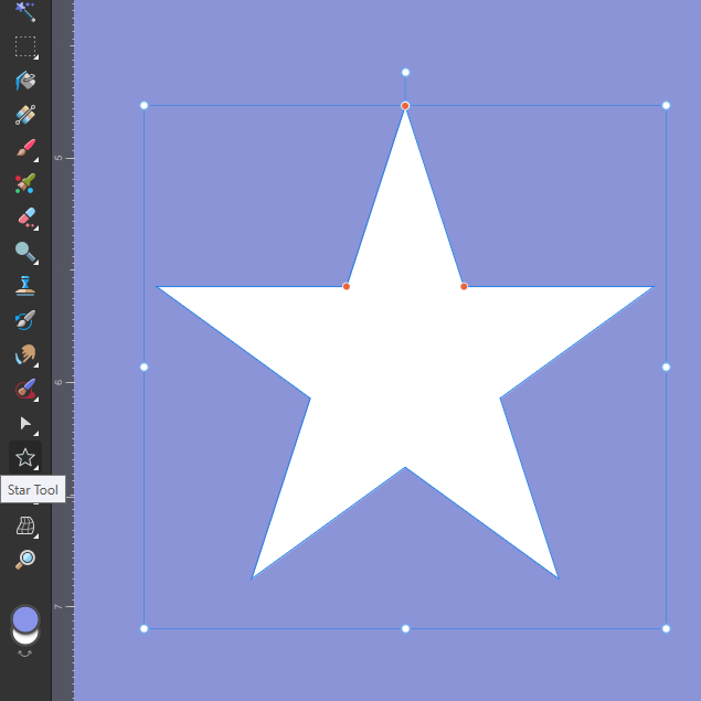
I used the Shape Tool in the left tool bar to create a star for our example.
Make sure to hold down shift while scaling the shape to maintain the current aspect ratio. Alternatively you can rasterize the shape by right-clicking in the layers menu. This will create a pixel layer and you can edit it as usual.
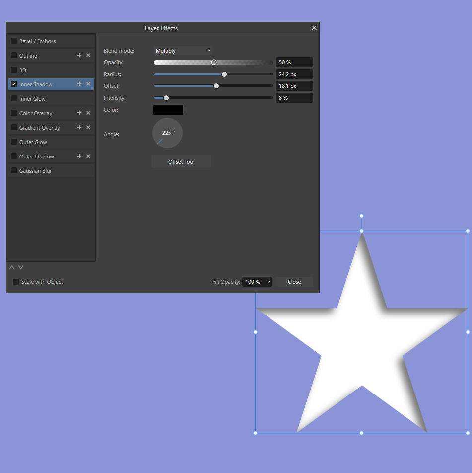
Now we add the shadow by choosing Inner Shadow in the fx menu. This gives the impression of the star being cut out of your background paper and the paper underneath is showing.
As always, experiment with the shadow settings. You can edit Blend Mode, Opacity, Radius, Offset, Intensity, Color and Angle, quite similar to the Outer Shadow effect. With Offset you can play with the perceived distance to the paper underneath.
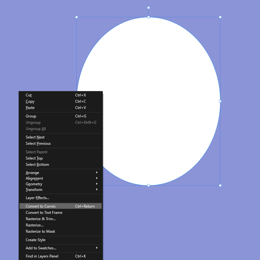
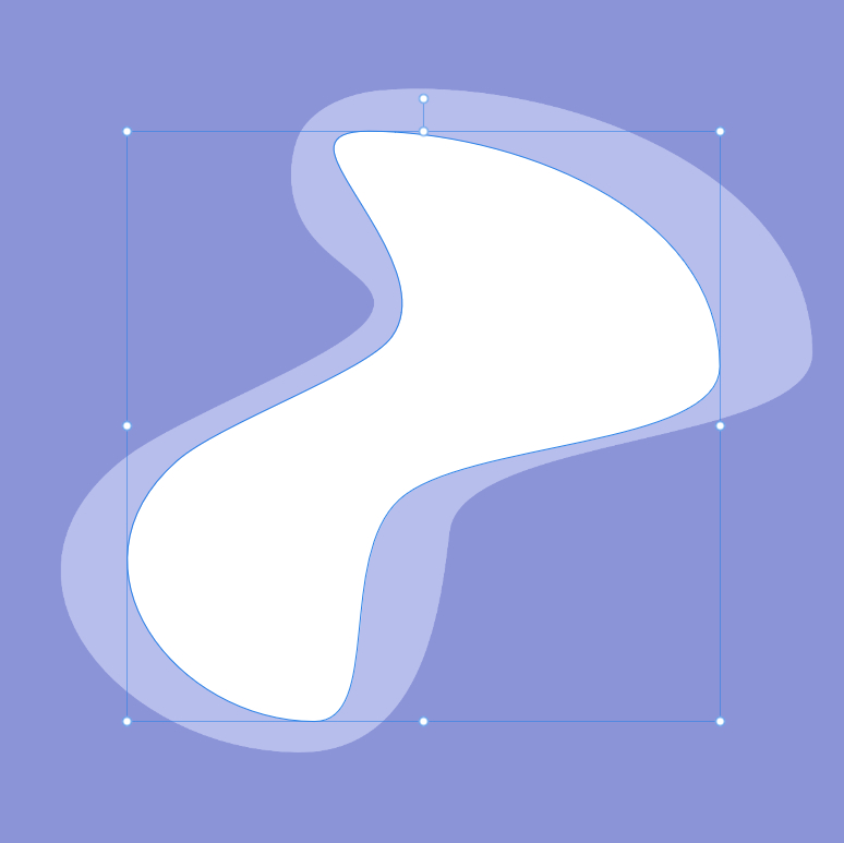
Of course you can use all kinds of shapes, even create your own. I’ll give you a little example with an abstract form based on the Ellipse Tool.
First step is to create your shape with the Ellipse Tool. By right clicking on your shape you Convert to Curves.
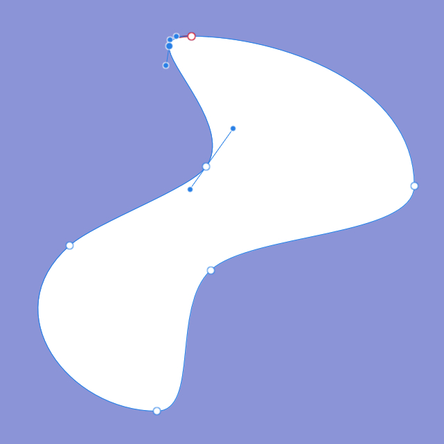
With the Node Tool on the left tool bar you can edit your shape any way you want. You can use the existing nodes and add as many as you wish by right clicking on the outline of your shape.
You can move the nodes to adjust your shape as well as change the angle with the handles on each node.
And who says we can only use one layer of cut out shapes? Let’s stack them to get even more depth.
I duplicated our first curve to make a second, bigger layer underneath. Of course you have to make sure that the smallest shape layer is on top since we are not actually cutting. 😉
Now we add the Inner Shadow to the shape layers and our layered cut out effect is done!

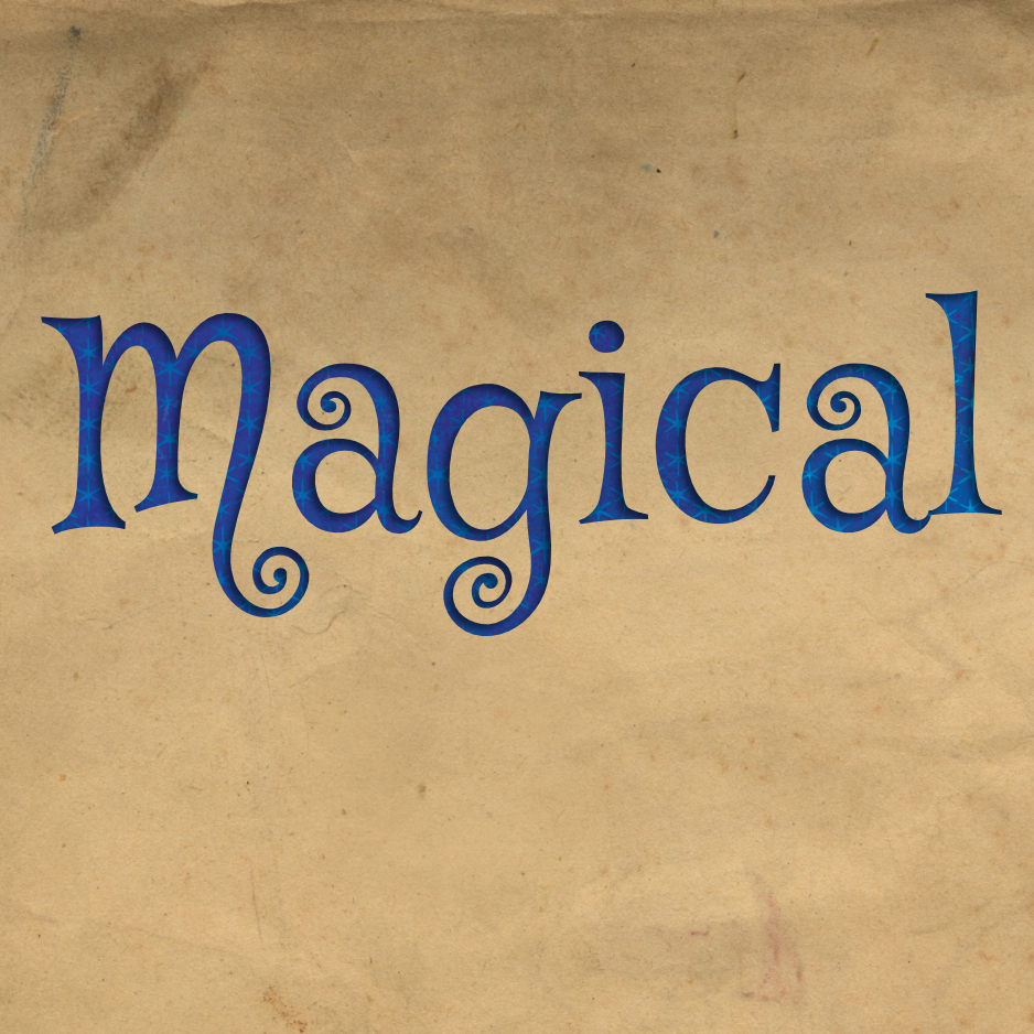
One of my favourite things to do with this technique is titles, it gives them that little extra. You can use the title as a whole, like putting one paper behind it, or each letter on its own, using multiple papers to fill them seperately. For that you just create seperate layers for each letter.
To fill your layer underneath with pretty paper, you just clip the paper to your shape. I you’d like a more detailed look an how that works, just go to my post about using digital templates.
As shown, shapes are perfect for this technique. But what about elements? Can we use all the cute stuff we got in our digital kits here?
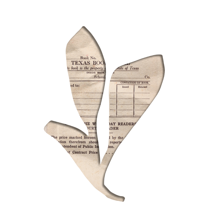
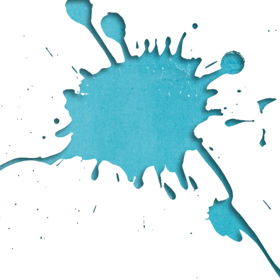
Of course we can! But it depends very much on the specific element whether we achieve the desired cut out effect. Paper pieces and simple forms work quite well, as well as word art. Even paint splatter and confetti might work if you like that effect. More difficult are Elements with a lot af colours, structures and pattern. With those, the Inner Shadow effect often just gets lost. And, of course, the element can’t be black or too dark since you won’t be able to see the shadow. Just dive in and experiment with your favourite elements!
To enhance the effect you can add an Inner Glow effect to have a little edge around the whole object and seperate it even more from the background.
Here are some examples. Just click on the images to enlarge and get further descriptions.
So much for the tutorial. I am really looking forward to see what you create with this technique.
Maybe you noticed already that I used this technique for creating this month’s sketch? I decided for a very basic design to give a lot of space for your own interpretation. You can see here, what Laurie created with it, I love her adorable page!
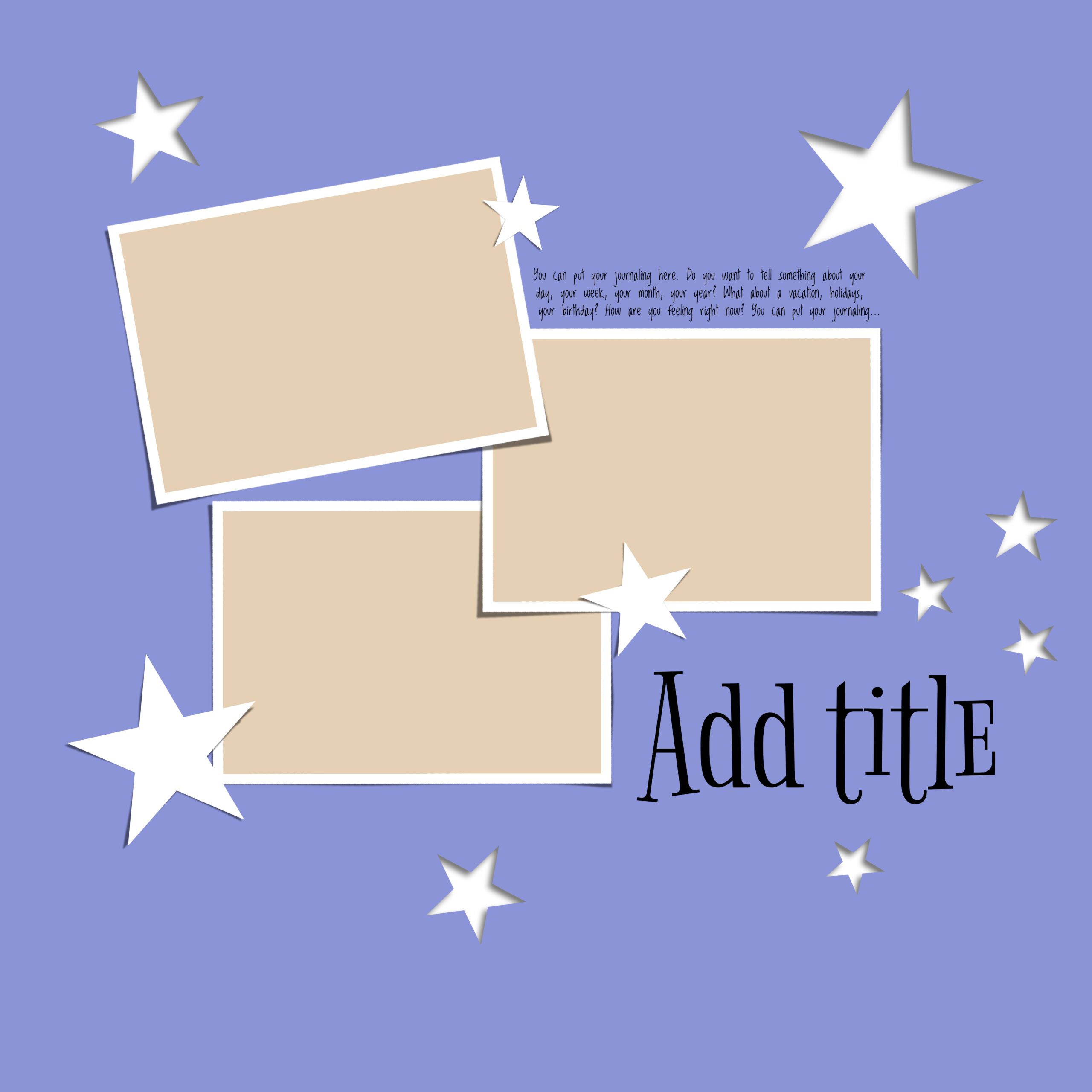
And here is my digi version.
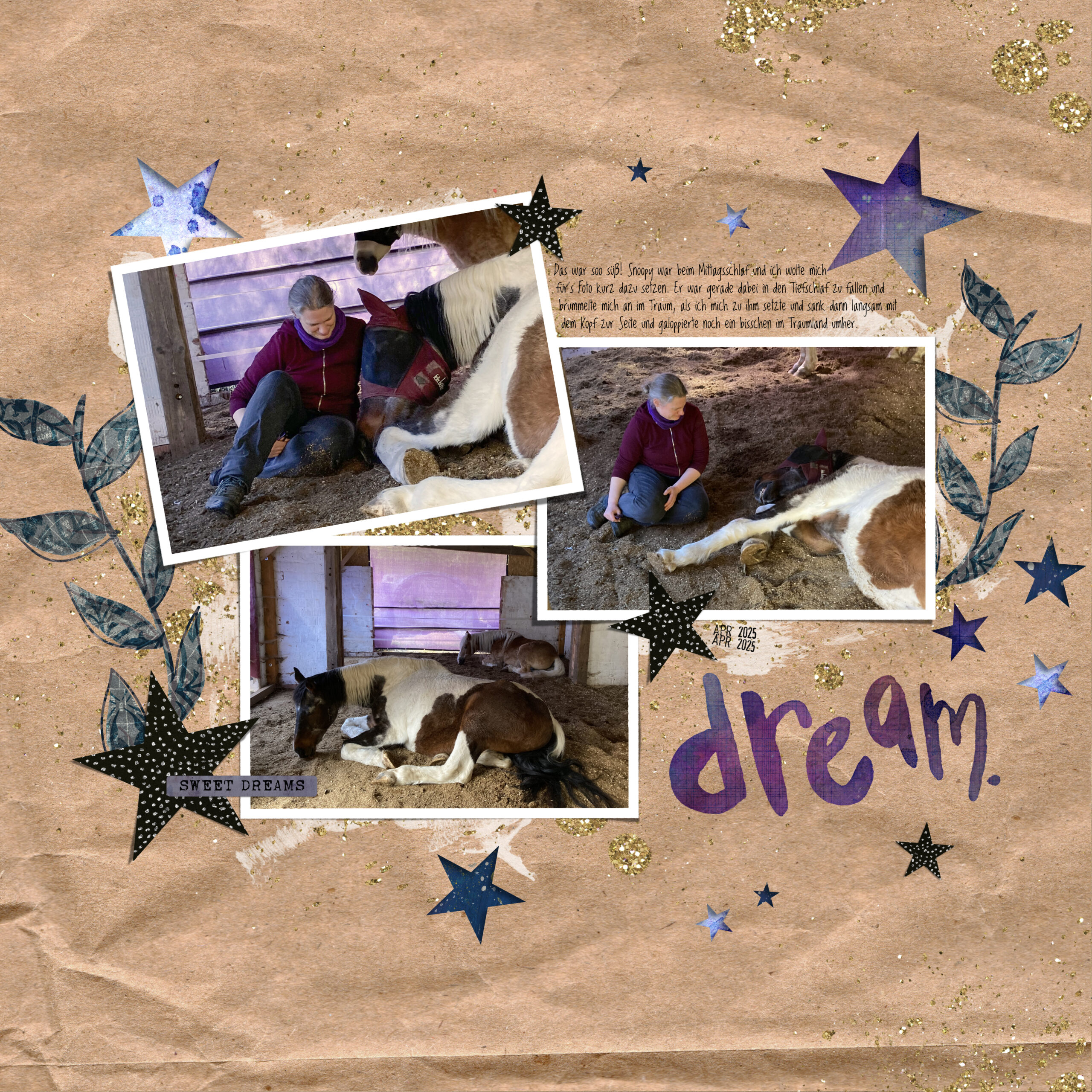
When I was experimenting with the stars I immediately thought of something sleep and dreams related. And then a few days ago a friend caught this moment with my horse. It was so sweet, he was snorting and galloped in his sleep when I was sitting next to him. Just the perfect moment for this template!
I stayed quite close to the template, just enlarged one photo and added some more little stars.
For the examples and this layout I used:
A Whimsical Adventure & Rachel Jefferies Dreamscapes
Just Jaimee Kraft Textures Papers CU
Lilypad Collab Of Wishes, Hopes & Dreams Part Two
Lynn Grieveson Forward
Paula Kesselring Mixed Bits #10
Rachel Jefferies Messy Marks Date Stamps 2025
Vicki Boutin Color Study
And last but not least we have some downloads for you.
If you want to play digitally you find the template in psd and for Affinity here.
And for you paper scrappers Misty created a real cut file from the background.
For your Cricut you can find it here: Cricut cut file