
It is that time again! The time when I ask our ScrapHappy community how they scrapbook. It is always interesting to hear a variety of scrappy ideas. It helps broaden our ideas as well as hone in on the things we love.
Our group’s monthly classes (taught by Sara Scraps!) has been focusing on go-to designs. So, we have been carrying that theme over here on the blog. I’ve shared one of my favorites already. Likewise, Alison shared her ideas. Now it is time for the rest of our ScrapHappy family to chime in.
Where to start?
While I didn’t have a large sample of responses this month, one big thing did stick out to me. Most of the comments said people loved to use sketches as a jumping off point. Sketches are right up my alley so let’s do it! I’ve taken comments, thought about what they said, and put together sketches you can download for your use.
~ Wanda P.
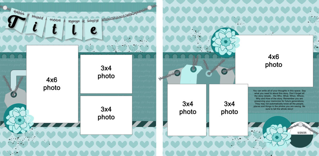
I prefer more than one photo on a page and I almost always use enamel dots in my clusters. I tend to cluster at the bottom right of my photos.
With those few parameters in mind, I came up with this sketch. Honestly, this was a little bit of a “cheat”. That is because my last post on the go-to topic featured three 4×6 photos nestled in a group. It was easy to go from that post to this sketch. This is still one of my favorite go-to designs!

To make these sketches into go-to designs you have to see the flexibility in the designs. Be sure to rotate the sketch. Group the photos in different alignments. Move the title to the bottom or middle. Put things at jaunty angles. Sketches are jumping off points. That is what makes them go-to ideas.
Next up, Karen shared thoughts on her process. I clipped comments to provide ideas to focus on.
~ Karen B.
… double pages are best sometimes, especially with a lot of photos … I tend to write the date I made the page in the bottom right of the LO and… [end] that corner with a small element like a brad or an enamel dot. I often add texture with ribbon, stitching, or fibers.
Karen had a lot to say about what she enjoys on her layouts. She included points like layout flow and design principles. I incorporated her ideas while focusing on a few specific details as noted above. Since double page layouts are much less common these days, I provided that. Notice that page two is really just a variation of page one!
When I mention moving elements around you can see that in action here. The base of each page is the same. Notice the different orientation of the photos on page two. That is one variation of a good go-to design. Simply add a title and you have a single page layout.
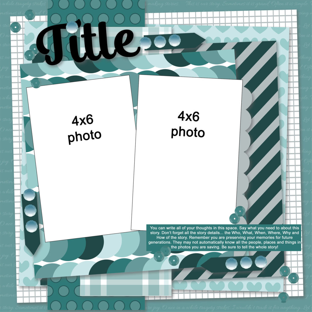
Let’s take one more look at some comments. Lindsy had an idea that I just had to take on.
~ Lindsy C.
I almost always add bling of some type to every layout… [and] you likely won’t see me keeping it plain & simple. I’m all about colours, patterns, and layers!
I design my own sketches in software. I’ve never designed bling before! I now had the challenge of learning to design bling just for Linsy, LOL.
I’ve created this layout with lots of bold layers of paper. There are clusters of gems to add that bling. Plus sprinkles of sequins for extra shine. You can easily tone it down if this is too much. Using subtler pattern papers will create a calmer feel. Eliminating just some of the bling will also calm the page down.
Remember that altering up a sketch is what can make it a go-to design. I hope you enjoy some of these sketches!
Until next time, happy scrappin’.