
How a Single Sketch Inspired Two Different Layouts
When it comes to scrapbooking, a good sketch can be the jumping off point for endless creativity. Today, I’m sharing how I used this single sketch to create two completely different layouts. By sticking to the basic structure of the sketch, but varying my papers, embellishments, and photo choice, I was able to show just how versatile one sketch can be. As with all the sketches I have shared, this one was also designed by Misty Murphy. Click here to see more of her wonderful designs.
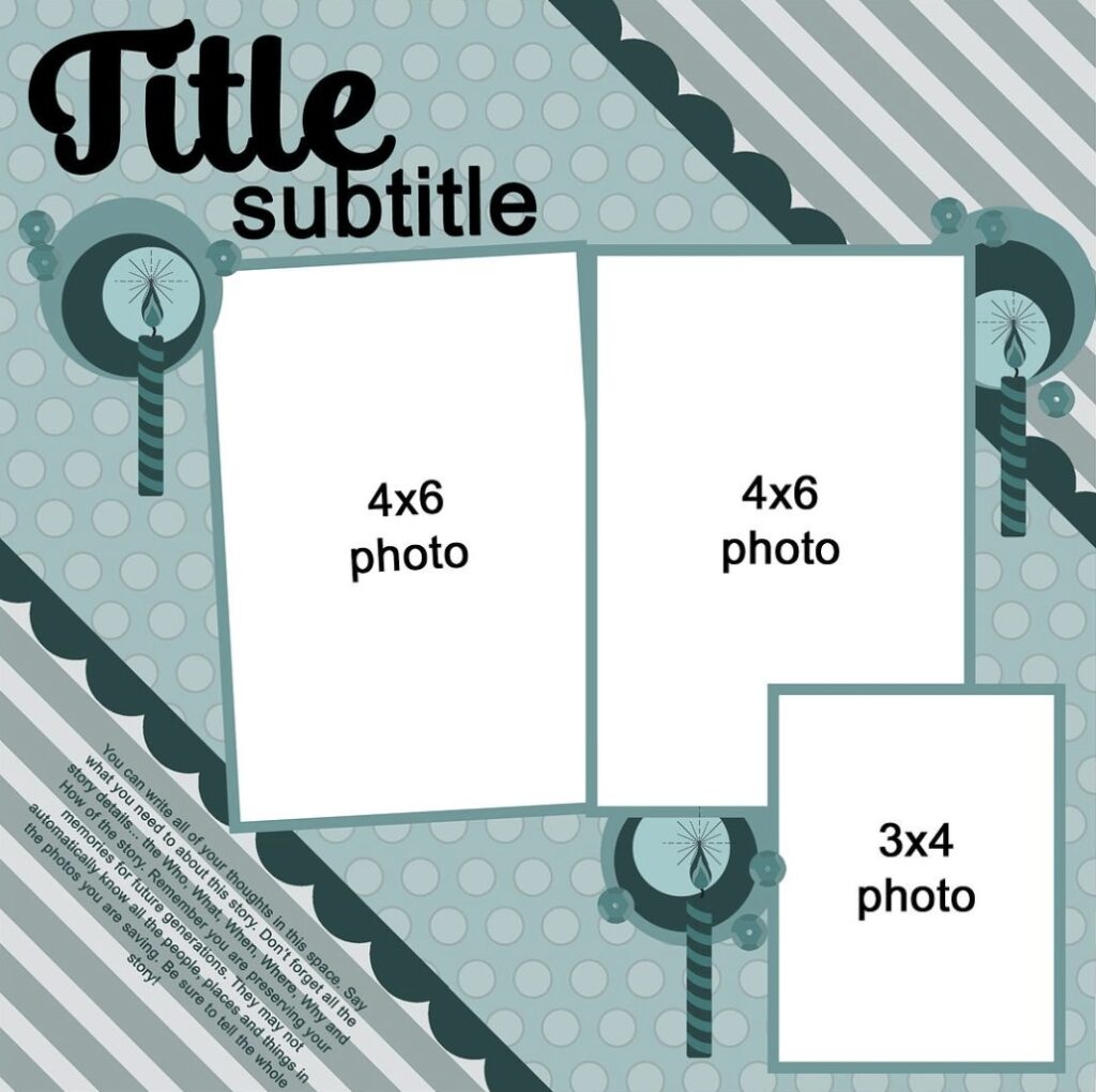
The Sketch: A Balanced Trio with Diagonal Energy
This months sketch features three photo spots, two 4x6s and one 3×4, arranged across a background with a strong diagonal split pattern. The title and subtitle sit prominently near the top, while the journaling is tucked into a corner. Decorative clusters emphasize each photo and repeat circular and candle motifs, which makes this perfect for any sort of celebration.
What I liked most about this sketch was the clear diagonal movement, generous space for photos, and the balance of embellishment clusters.
Layout One: Hello There
For my first layout, I went with a warm, cozy tone, even though, I’m clearly drinking iced coffee.
I used one large photo instead of three, which shows how you can adapt a sketch to suit your photo needs.
The background features swirling marbled patterns and splashes similar to those of coffee stains, giving the page a dynamic feel while still honoring the sketch’s diagonals.
Though I deviated from the sketch’s photo count, I stayed true to the diagonal design proving that flexibility can still follow a formula.
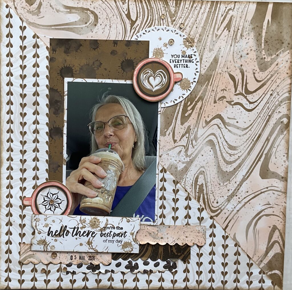
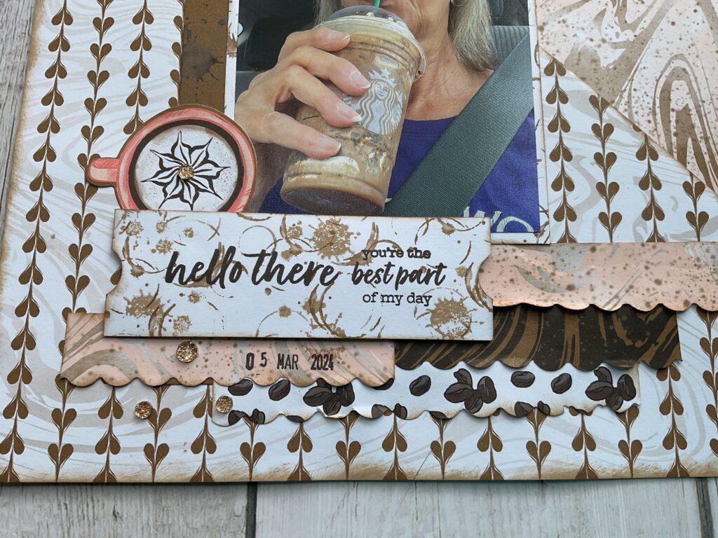
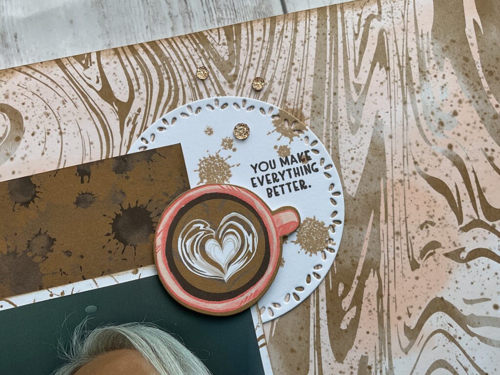
I gave the embellishment clusters a themed twist, with coffee cups and espresso colored splatters, using a stamp, which replaces the original sketch’s candles and circles. I used the scalloped borders by layering them underneath my photo. This provided the perfect spot for my hand stamped title.
Lauout Two: Sweetest Day
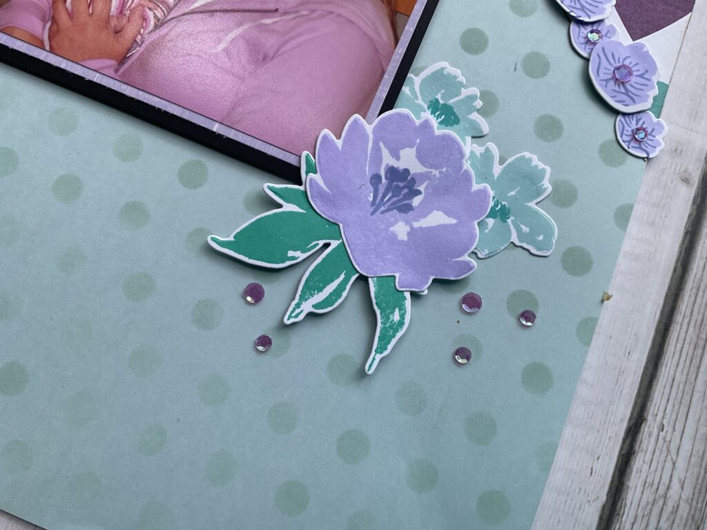
My second layout has a much softer, sweeter feel. Once again, I used just one photo. I kept the diagonal background design from the sketch and used heart and polka dot papers in a mostly pastel palette. I made the polka dot paper by choosing an ink color that was close to the shade of my paper and a circle stencil. I layered the small florals along the diagonal line, much like the scalloped border from the original sketch.
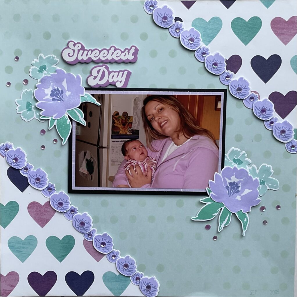
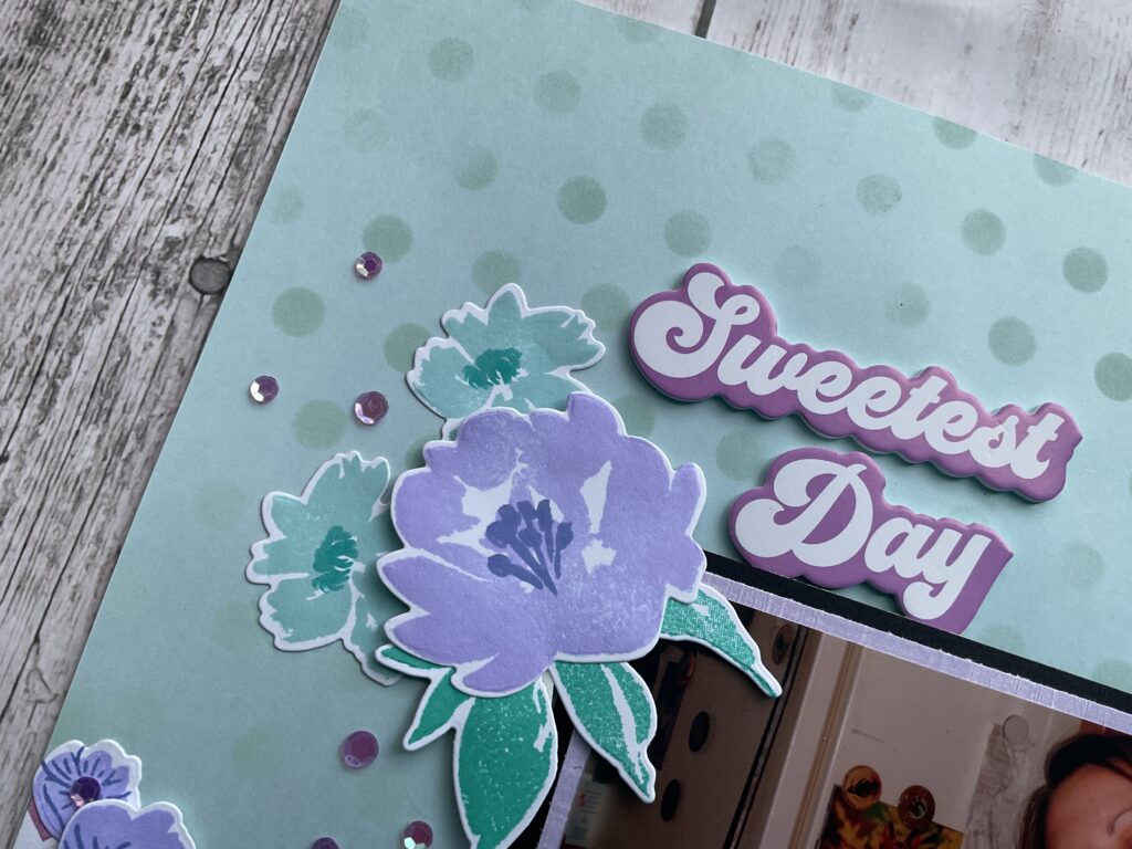
Instead of candles, I created floral embellishment clusters, using stamps and dies from my stash. I placed the larger floral clusters at opposite corners of the photo, keeping in line with the diagonal design of the sketch. I kept the title in the same place, but skipped the subtitle for simplicity.
Final Thoughts
These two layouts show the power of a well designed sketch. While the foundation remains the same, your paper choices, photo count, embellishments and theme can completely transform the final look. No matter what cherished memory you’re capturing, don’t be afraid to interpet a sketch in your own way. Let it guide you, not confine you, and you’ll see that one sketch can spark endless creativity.