
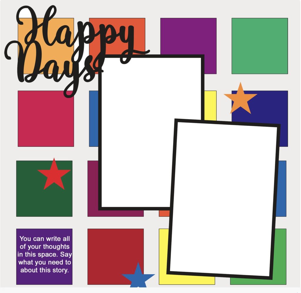
This Month's Sketch
It’s always fascinating to see how a single sketch can be used to create completely different scrapbook layouts. This month’s sketch is a colorful, grid based one featuring bold blocks, two photo spots, and a central title. I loved this sketch so much that I created two layouts. I think you’ll be surprised how different they look. Design team members, Lindsy and Alison also created layouts using this same sketch.
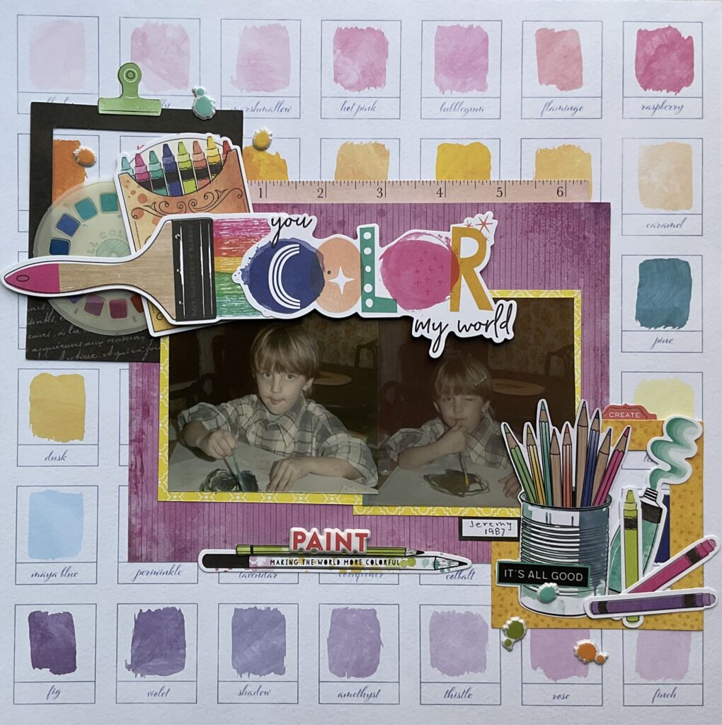
You Color My World
Since the sketch gives me a playful and artistic vibe, I went with that. The paper I chose already had this paint swatch background echoing the idea of multiple blocks of color.
The two photo spots became a single larger double photo block framed with patterned papers. I kept the title central, as in the sketch, but made it larger, using layered die cuts. The embellishments reinforce the creative theme, replacing the simple stars.
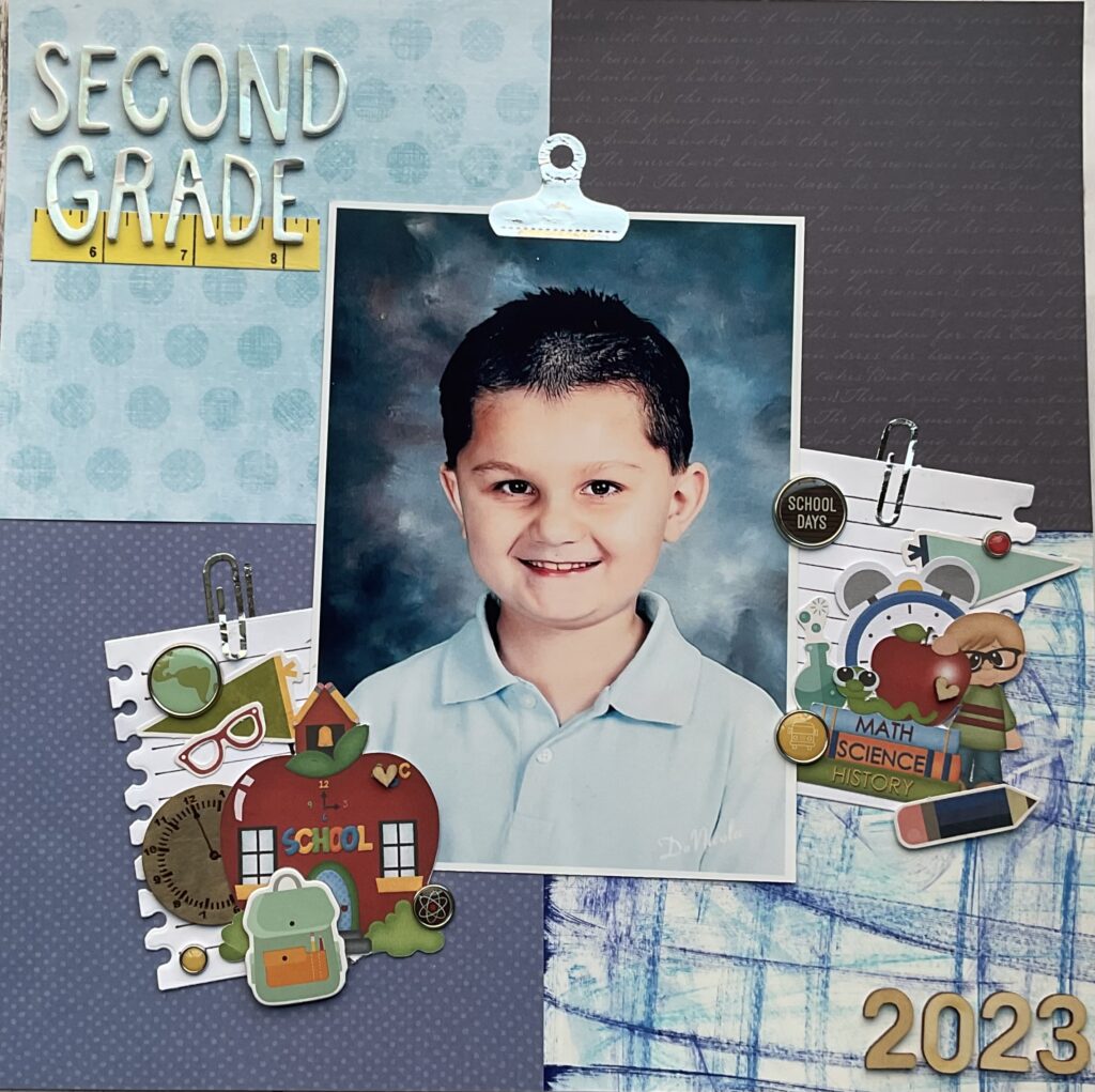
Second Grade 2023
For the second layout I took the same sketch in a completely different direction. Instead of filling the grid with multiple colors, I used large patterned paper blocks to give the background structure while keeping the focus on a single larger photo. I still used squares, but instead of multiple, I used just four.
The way the photos were angled in the sketch inspired me to place my embellishment clusters at an angle. While the sketch used two photos, I chose to use one larger image, letting the extra space be filled with school themed die cuts. I kept the title at the left top as the sketch suggested.
Similarities Between the Sketch and the Two Layouts
Both layouts kept the main concept of a focal point surrounded by smaller design elements. The idea of blocks from the sketch carried through, paint swatches in one, patterned paper sections in the other. Each design used a prominent, eye catching title in a central position.
Now let’s see what Lindsy and Alison came up with.
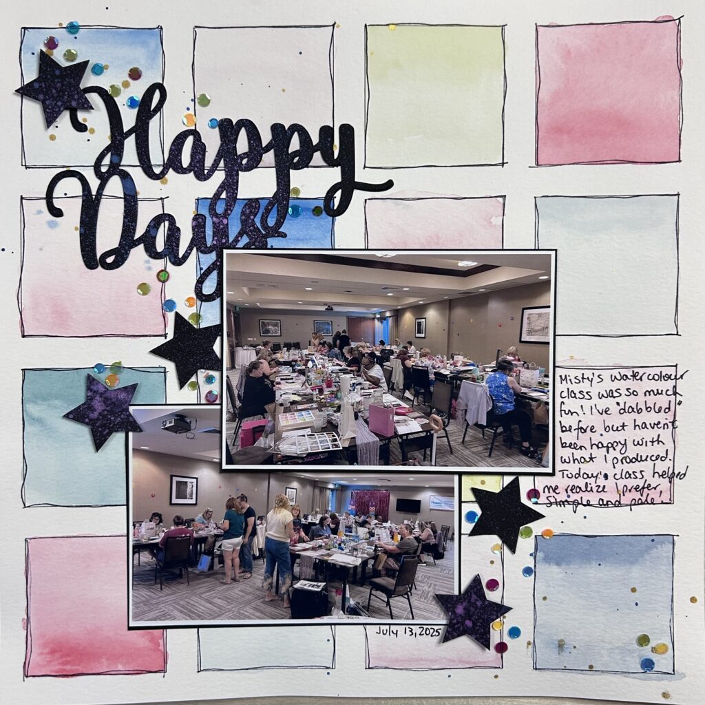
Happy Days
Alison says, “I had the privilege of being present for Misty’s watercolour class and got to use her grid template to make my background.
Each square was traced from her template and then watercoloured. I am not a very adventurous watercolour-er so I kept my square simple and used a gradient wash in each. Since I had my Selphy photo printer at reunion, I took photos of the crop room as everyone was working on their watercolour pieces and used this layout to tell the story of the class. My photos are landscape orientation, not portrait like the sketch, and I moved my journaling to one of the squares that worked better for my design. But otherwise it’s pretty true to the sketch. Misty provided the title cut file, my alteration was to sprinkle it with colours of Distress Spritz.”
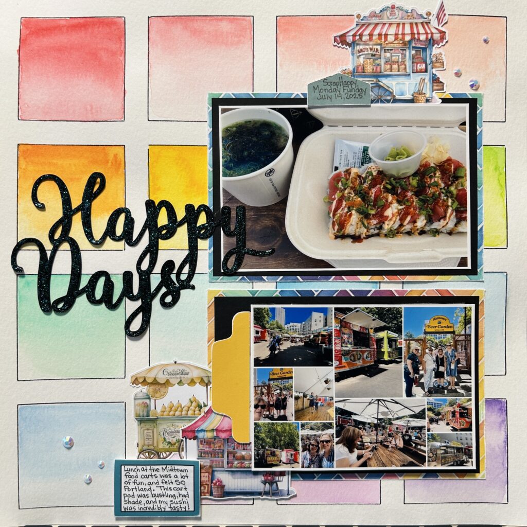
Lindsy's Happy Days
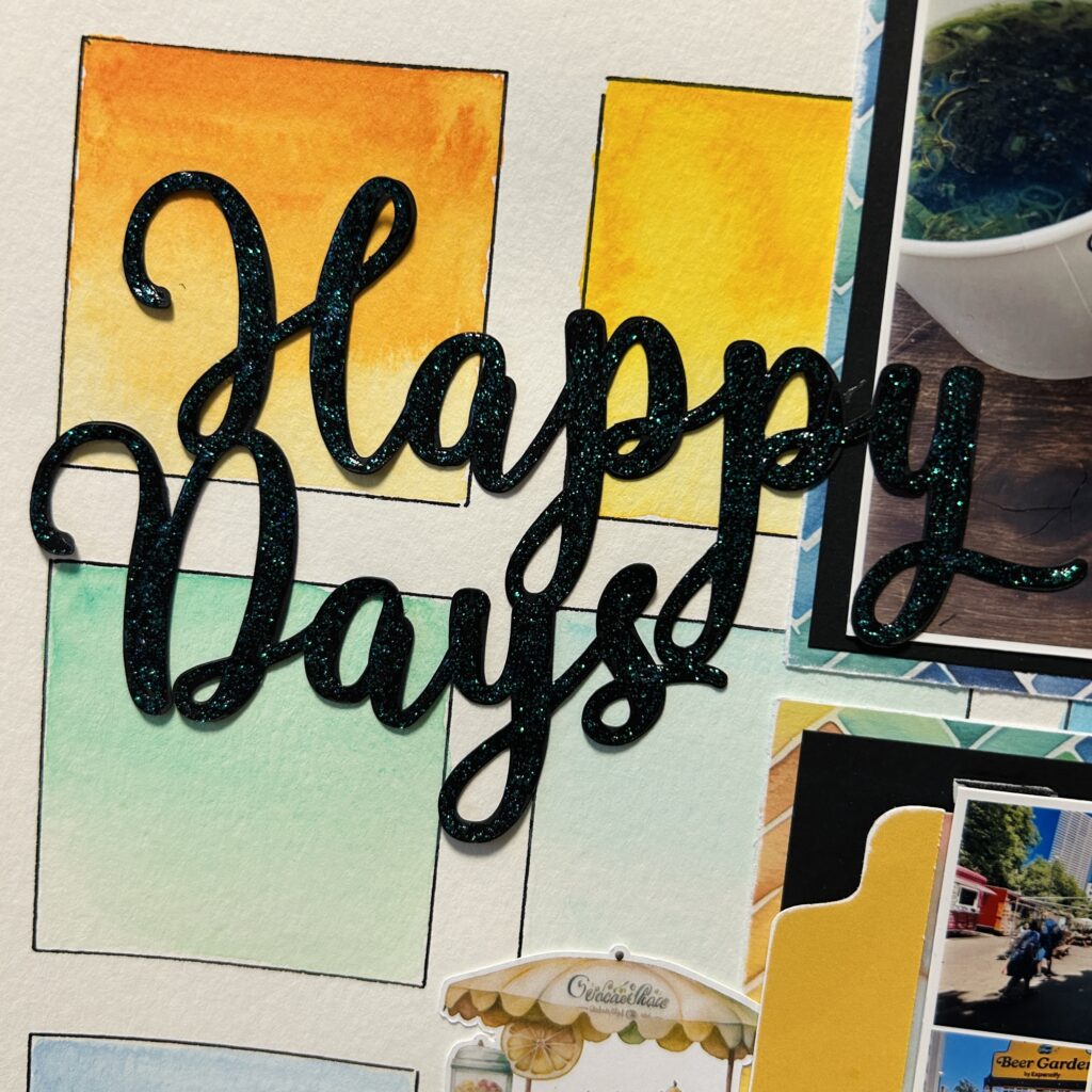
Here’s what Lindsy has to say about her layout. “I followed the sketch pretty closely, keeping the fun grid design and placing the “Happy Days” title in a similar spot. Instead of bold, solid squares, I went with soft, blended watercolours for the background (thanks to Misty and her fabulous class at the ScrapHappy Reunion event).
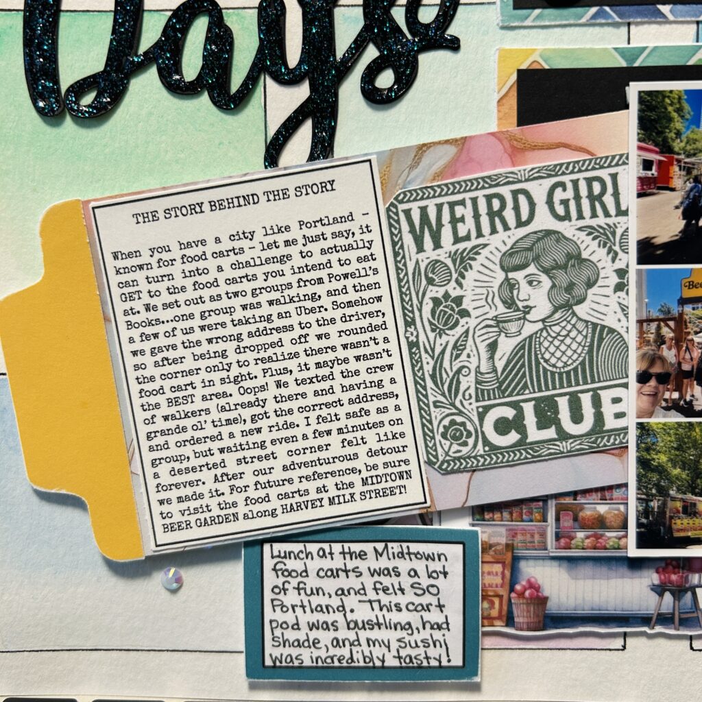
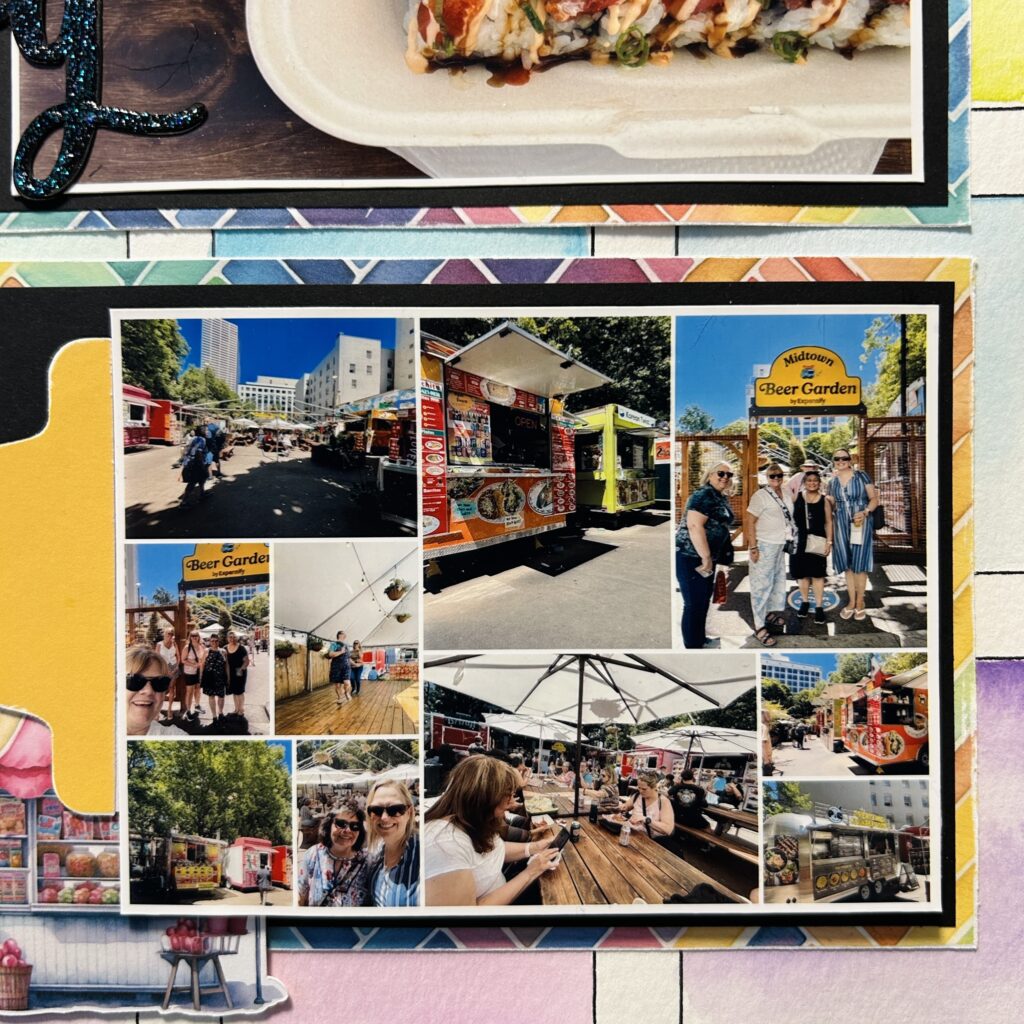
I used two main photo spots in roughly the same position, but layered them with colorful mats, added tabs, and tucked in some cute food cart embellishments to help tell the story. I also used my Selphy to create a collage in one of the spots to get more photos onto the page. My journaling stayed in the lower left, but I made it smaller and worked it into the decorative cluster.
As a fun surprise, I created a hidden journaling tag to tell more of my story. To finish everything off I added gems and glitter to the title because who doesn’t want a little sparkle in their life?!”
Final Thoughts
This project really highlighted one of my favorite things about working from a sketch, there’s no single “right” way to interpret them. By starting with the same structure, we were able to create layouts that reflect very different moods, themes, and design choices, yet clearly connect to the original inspiration. It’s a great reminder that sketches are a springboard, not a blueprint, giving you the freedom to make a design truly your own.