
I love watercoloring. A lot. There is something soothing and magical about sliding pretty paint across a page. I often enjoy the process of painting more than the final result! Yet the final result is what we have left in the end. So, I understand if you want it to look interesting!
I have lots of ideas to help your watercolor look pretty. I want to share with you a directory of ideas that you can use in your watercoloring journey. From those new to watercoloring, to experienced hands, I hope to share something for everyone. We’ll get to all that, I promise.
But first I want to give you a little context behind this blog post. It stared with teaching a watercolor class and popped up again with an unexpected sketch. Let me share what happened…
The Class
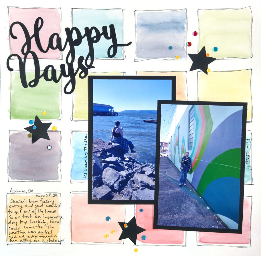
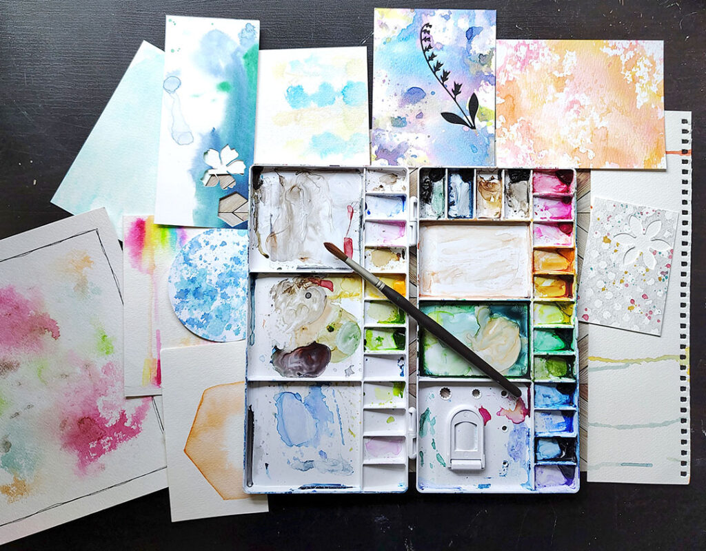
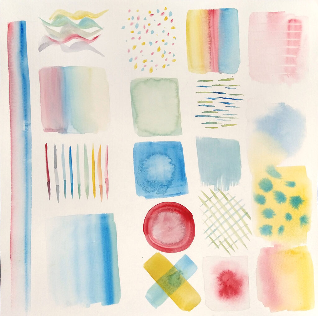
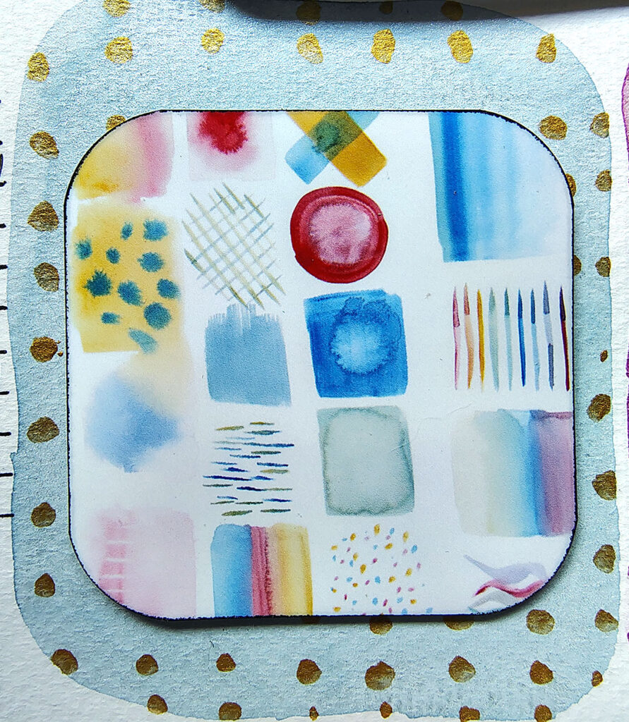
I actually taught a watercolor class at our ScrapHappy annual in-person “reunion”. I kept the layout simple, while allowing everyone the space to add their own flare. As you can see from my sample layout above this isn’t a hard project. But look at the sheet below. This page shows off multiple ways that each little color block could be enhanced! Honestly I think it is just enjoyable to create little swatches like these on a regular basis, LOL.
At It Again!
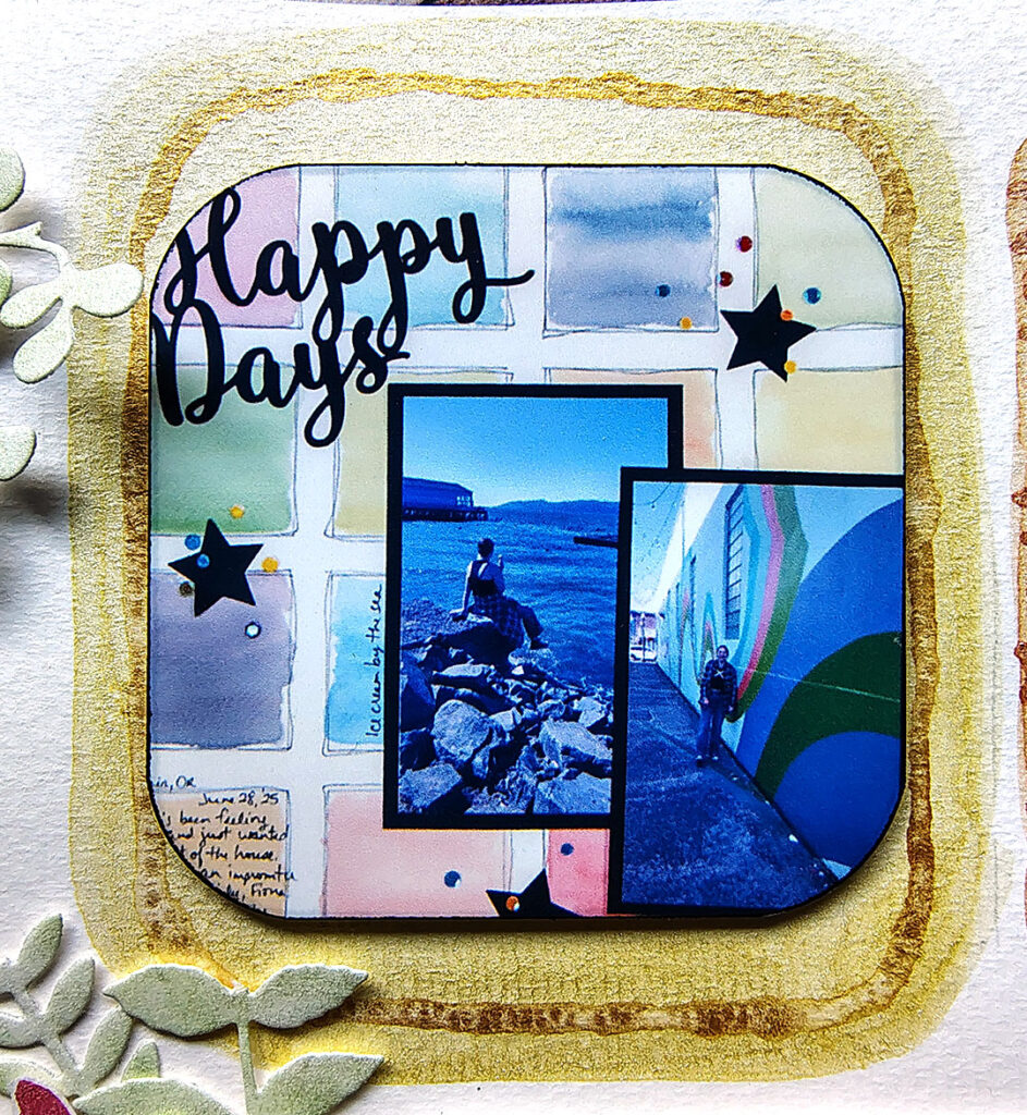
When I was working recently on a project for another group, I realized the sketch we were using was a similar variation of my above layout design—it was blocks of color & pattern. Yes it was bigger blocks, but I could handle that. I knew I had to use this sketch, my story of teaching small block watercoloring, and of course some watercolor paints to create a brand new layout. See how it turned out…
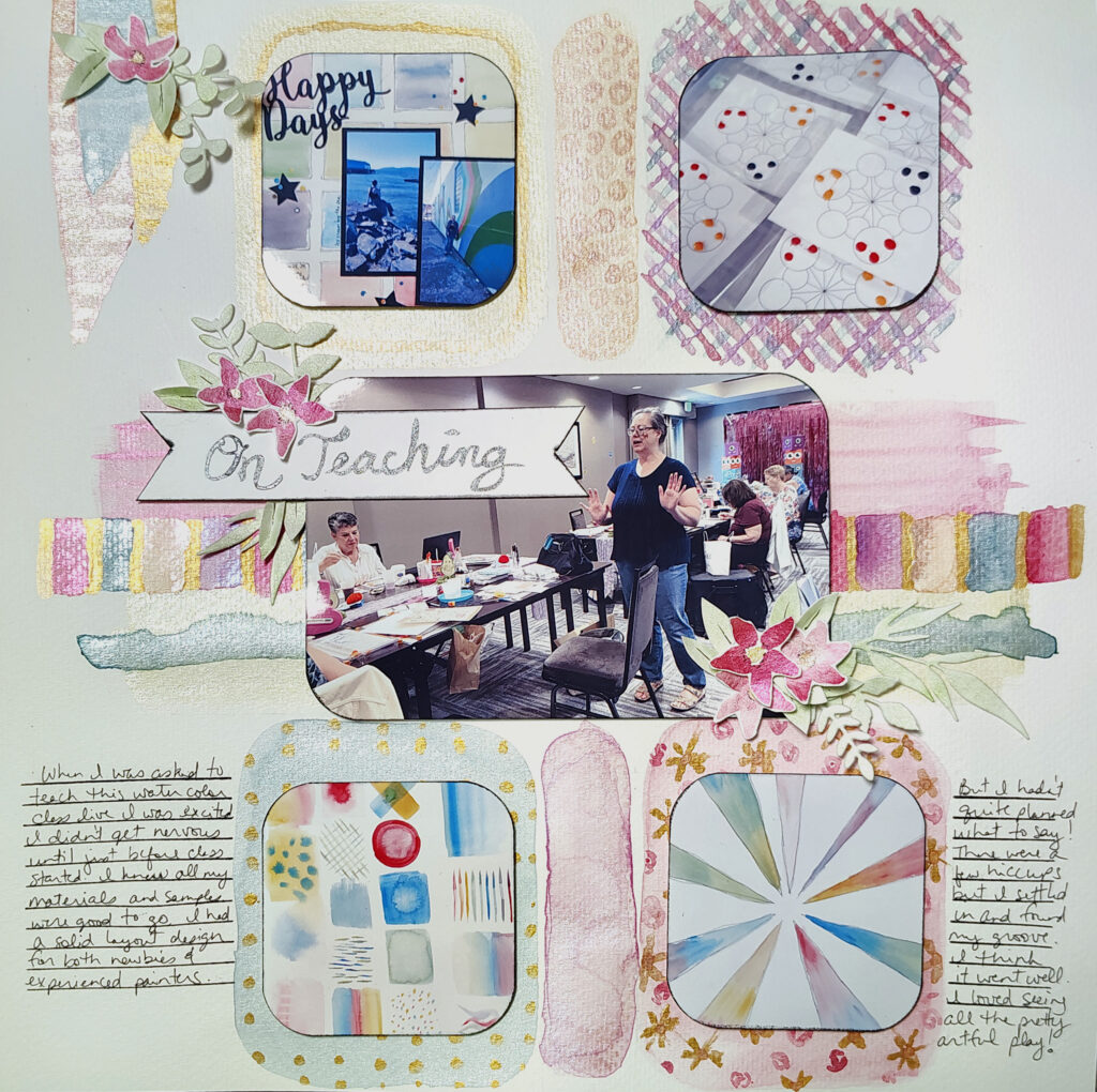
This layout has way more going on—including mica watercolors! But you don’t have to be overwhelmed by something like this. You can break it down in pieces. Let’s take a look at watercolor techniques that can be used to create a variety of patterns and textures.
The Directory
To keep things manegable I’ve included small images of each technique. If you want to see something closer, righ-click on the image to open it in a new tab. Now have fun jumping around and exploring ideas.
Wet on Dry
This is just the technical name for laying wet paint down on dry paper. It really is pretty straightforward. Controlling how much water you use is the trick to success. Too much water and you’ll get run away puddles. Too little water and the paint drys too fast. Adding more wet paint to partially dry paint causes a type of bleeding that can be frustrating (or it can be a technique as we’ll see later!).
Wet on Dry part 2
See the pretty gold polka dots? That is wet paint applied over dry paint. Above I said the wet-on-dry was applying wet paint to dry paper. But it also applies to painting on top of dry paint. Just remember, if you add water to dry paint it’ll “wake up” the dry paint and cause it to move again. This may or may not be what you want to happen. (We’ll talk about this at the very end!)
Glazing
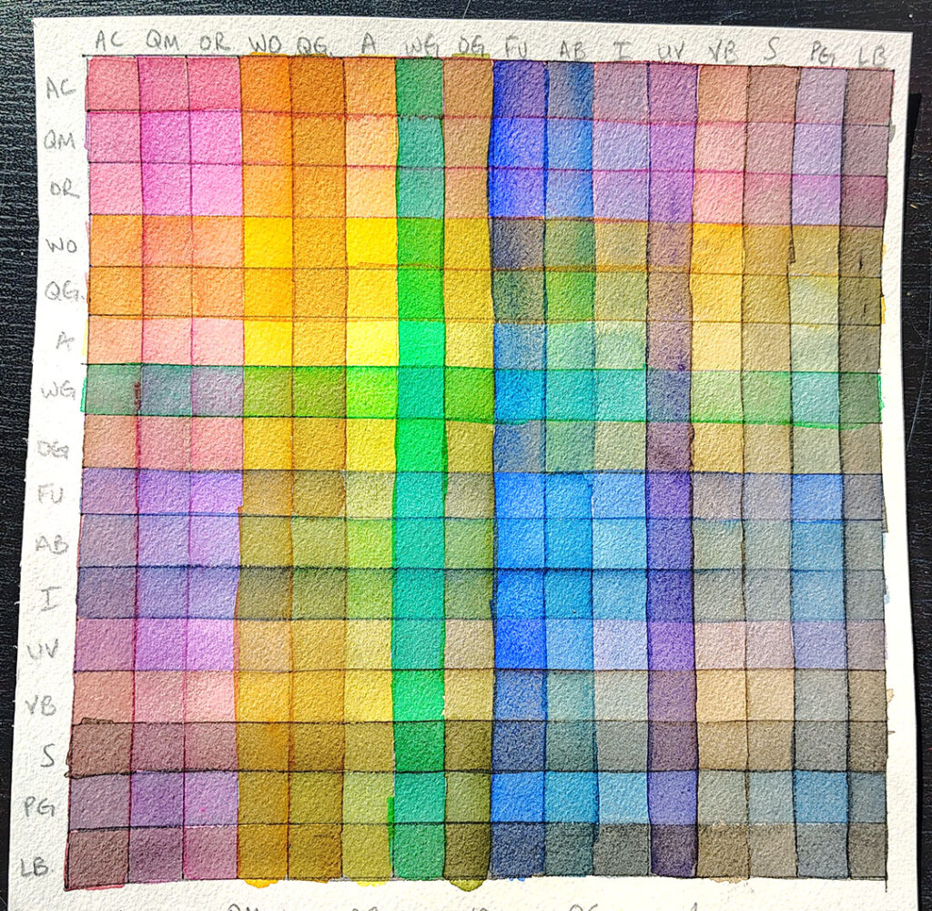
A bonus term for you. When you paint wet paint over dry paint, that is called glazing. It is usually done in a way to blend the colors wihtout actually blending the colors. Since watercolor is transparent, the colors will visually “blend” together. I don’t use this technique often since painting wet over dry can wake up that dry paint and cause streaking. Here is a picture of my practice glazing page. Each column and row is just a single color! Yet when that color interacts with all the colors of each row, you get a myriad of color combos! All these colors come from just the interactions of 16 paints.
Lifting
You may hear this technique refered to in different ways… “erasing” or “thirsty brush” are a couple of terms. But lifting is the the main word. Notice that blue banner. It has white stripes on it. In watercolor, there is not white… except the paper. To achieve white you have to either leave the paper blank, OR lift off some of the paint after you have painted it on. To do this, paint your color on. Dry your brush on a towel. (It doesn’t need to be bone dry.) Run your dry brush over your wet paint. The dry bristles will suck up the water through physics. You can rinse off your brush and repeat the process until you have the look you want. Note: some colors or papers may be stubborn and you won’t get good or complete lifting. TEST your materials first!
(Note, only the blue banner is lifting. The other two use wet-on-on wet techniques to move the paint while also adding another color.)
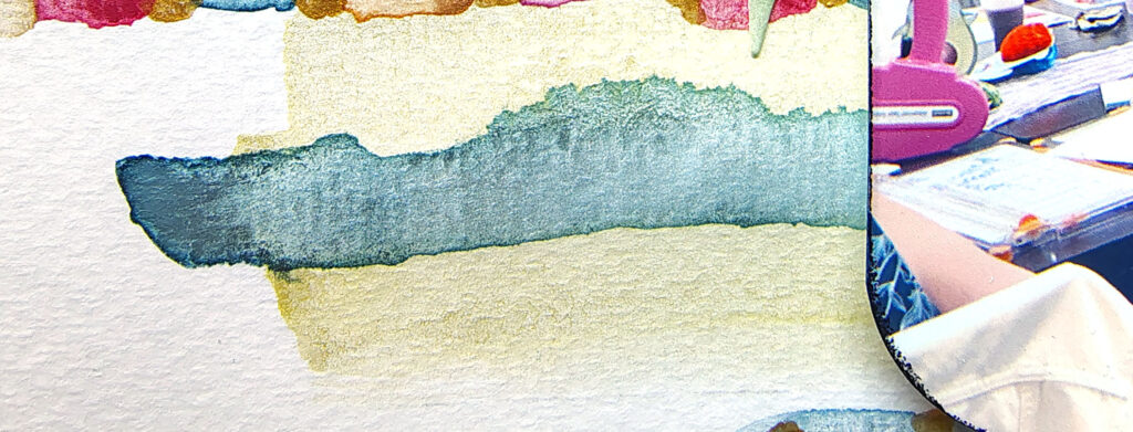
Wet On Wet part 1
If you paint wet paint onto already wet paper/paint you’ll get the paint to flow and bleed. Remember how I said water control is key? That is really true for this technique. Here I painted a less wet blue onto a half dry yellow. The colors mix a bit to give a greenish tone. Plus the edges of the paint start to feather out.
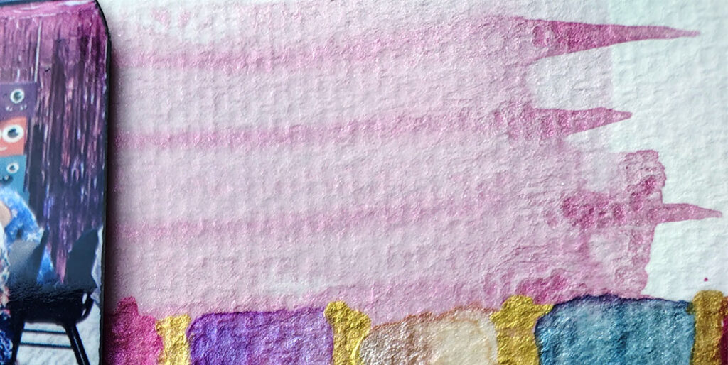
Wet On Wet part 2
For this wet on wet look I painted down a band of pink and then while it was still very fresh, I picked up even more color with the same brush and painted stripes through the wet paint. Because all the paint was quite wet, the stripes fade and soften into the background color. Notice though how prominent they are at the very ends? That is the wet stripes hitting dry paper.
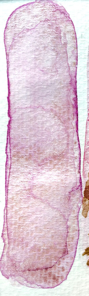
Wet On Wet part 3— aka Blooms
This is the third version of wet on wet. It actually has a name. It is called blooming or cauliflowers. (Some blooms get such wild edges they can look like the frayed pattern of cauliflower.)
For this one I painted down a stripe of color. Then I dripped just plain water into the paint. The water moves and pushes the pigments around. Wherever the water begins to dry, the pigments stays put creating bands and streaks of color. In fact, notice how the very outside edges are intensely pink? Most of the pigment ended up here. This method is hard to control, so you have to be willing to go with the flow… literally!
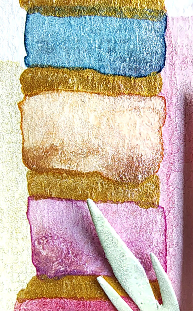
Hard Edges
In the example above I mentioned how the water pushed the pigment to the edges. If you want to get this look without all the uncontrolled striations of blooming, here is (one way) you can do that. Use plenty of paint and plenty of water. Paint your shape/image. Then prop you paper up at an angle to dry. Gravity will pull the water—and thus the pigment!—to one edge. That concentration of color along an edge is called a “hard” edge.
Notice that the blue square has a more even color to it? Yes it has a hard edge but it also has even pigment across the shape. The peach square in the middle has way more pigment pooled at the bottom. That is because the peach paint had more water than the blue!
Technique Combinations
This plaid swatch comes from two different techniques. The first is glazing and the second is wet-on-wet. To create this plaid I first painted blue diagonal stripes. That blue paint was then in the process of drying. Some of the paint was well dry while some of the paint was still wet. Then I painted pink stripes in the opposite direction.
Wherever the blue paint was still wet, the pink and blue would mix and bleed together. This creates a more feathering and ombre blend of purple.
If the blue paint was already dry, the pink would glaze over the blue. This would create a more distinct zone of purple.
Once all of this was dry I added more stripes in between the original pink and blue ones. This leads to a very blended look. Go ahead and enlarge the picture to see if you can spot the different stripes and blending styles.
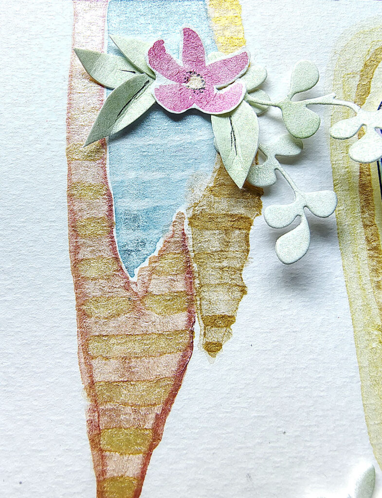
That wraps up the techniques that I used on this layout. I did also paint little flowers. I also just washed green color over scrap paper and then die cut foliage once it was dry. Those use the same basic techniques but for specific uses (to cut out!). Today I really wanted to cover the techniques that can be used to create texture and pattern blocks.
I hope you take these ideas and have fun playing and exploring with watercolor paint. Even if you aren’t creating a final piece, the act of just painting is very zen!
PS If you want to see the creation of this layout, I have the video for you.