

Show notes:
What is WHITE SPACE and how can you use this design element in your scrapbooking?
- What is white space?
- How do you use white space effectively?
- Why is white space important?
- When is white space not white?
Elements of Scrapbook Design (building blocks)
- Photos
- Titles
- Embellishments
- Journaling
Active/Passive White Space:
Active white space can draw attention. Passive white space goes unnoticed, but it serves to increase legibility.
Prompt:
Prompt: Create a layout with active white space. Perhaps a page that features a luxurious moment, or something nostalgic or calm and peaceful.
Tip:
Tip: White Space doesn’t have to be white! You can use colour, texture and pattern to create a white space.
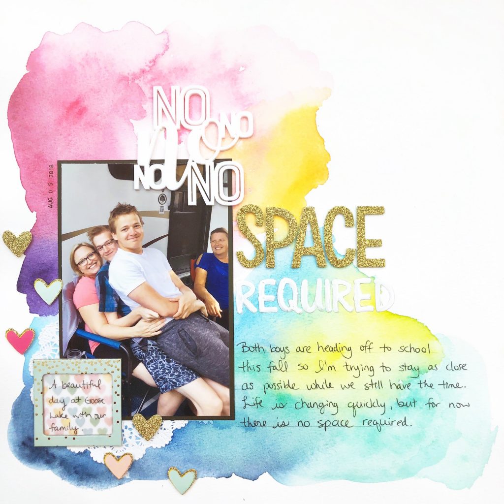
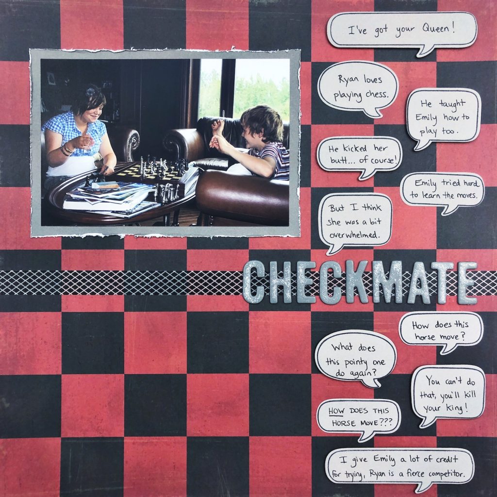
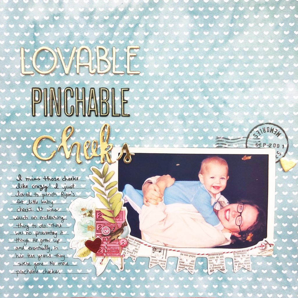
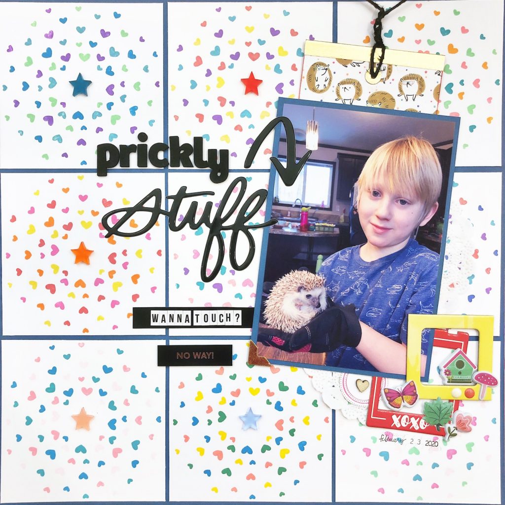
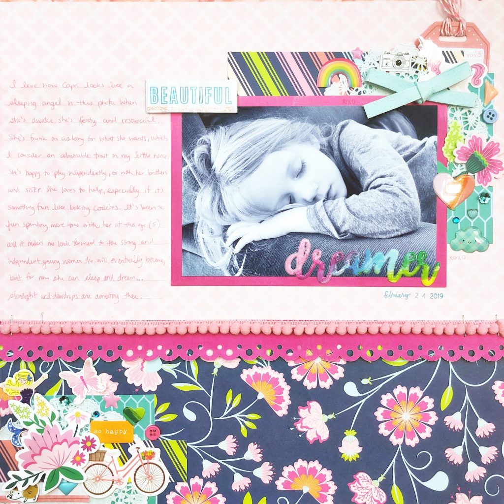
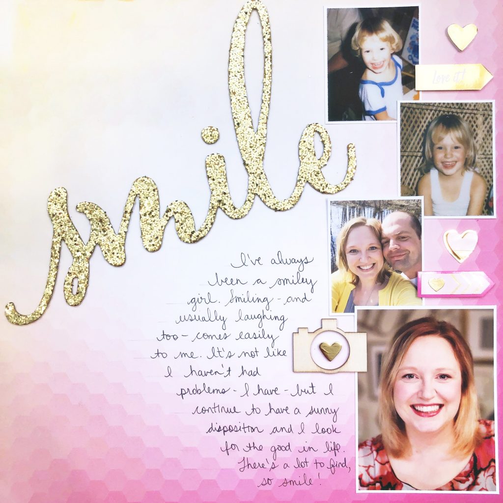
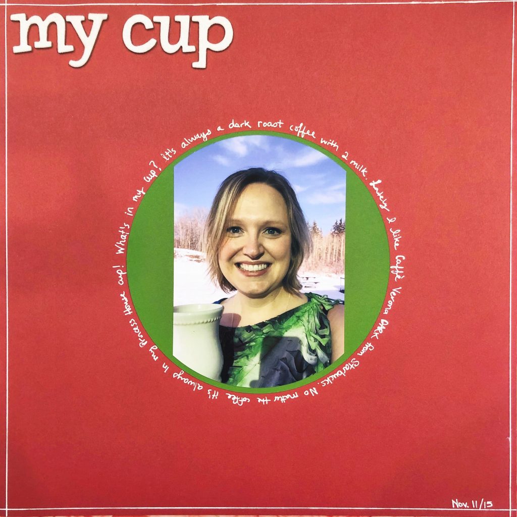
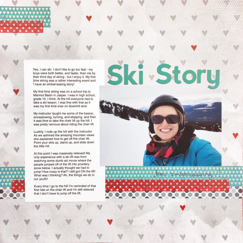
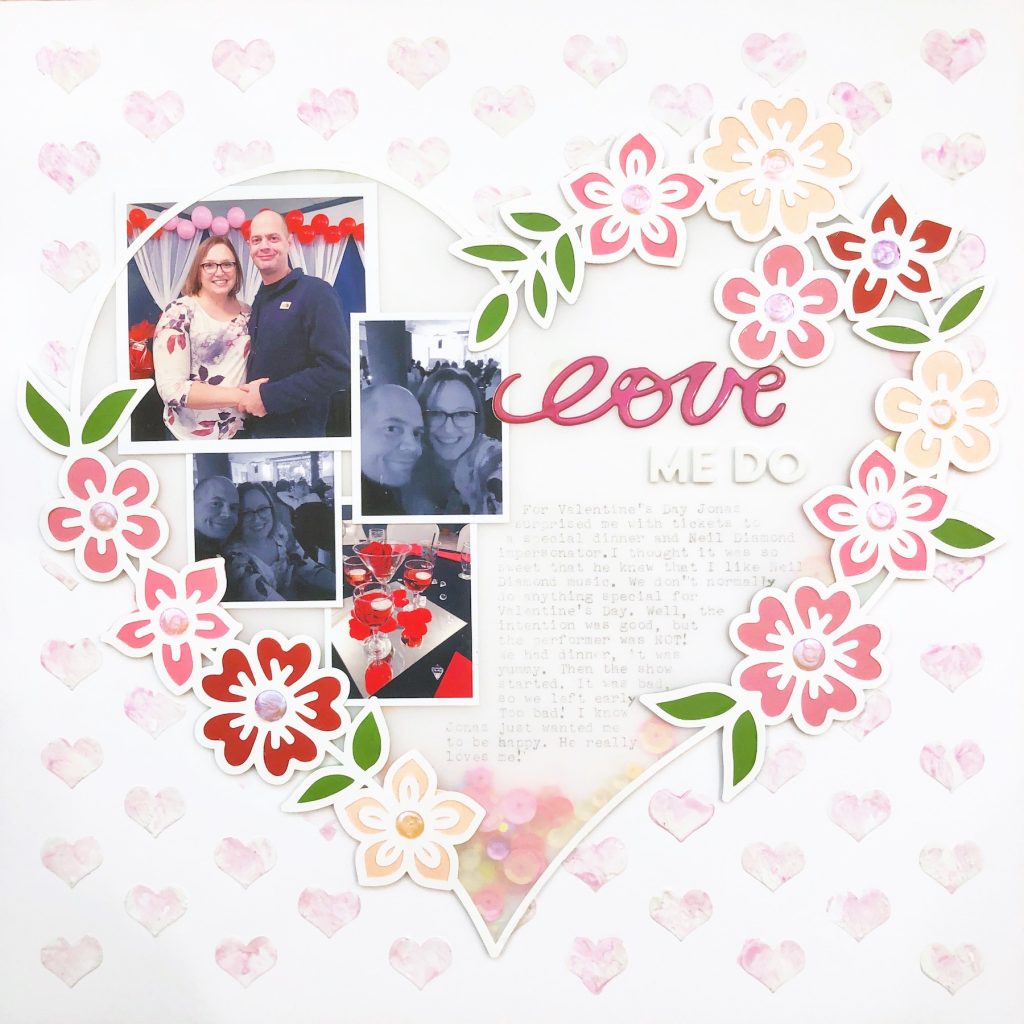
Layouts Shared:

Connect:
I’d love to hear your thoughts on this episode!
Sharing it? Use the #scraphappierpodcast on social media.
Instagram: @aliceboll
Facebook: ScrapHappy
YouTube: ScrapHappy
Transcript:
Welcome to the ScrapHappier podcast, where we share quick tips, tricks, and techniques to help you create scrapbooks you love, and be happier while doing it. I’m your host, Alice Boll.
I’m so glad you’re joining me for episode nine, because today we’re going to solve a problem. What’s all that white stuff? That’s right, we’re going to talk about white space. What is it? How do you use it effectively? Why do you want to? And what do you mean it’s not always white? Yep, we’re going to dig into everything about white space. Now here’s the good news: if you want to see examples and actually understand everything that I’m talking about, you can catch the show notes at scraphappy.org/episode9. But don’t worry, you don’t have to run over there right now. I’ve designed today’s chat about design so that you’ll know exactly what we’re talking about without even popping over to the blog right now.
When we are creating a scrapbook page, there are certain building blocks or elements of scrapbook design that we use to create a page. These are the things that make up most, if not all, layouts. Photos, titles, embellishments, and journaling. I know, I know, a few of you are like, “Ooh, I don’t always include journaling on my pages,” and some people aren’t big fans of titles. And I guess technically you don’t need embellishments. And yes, I’ve even made pages without a photo. But generally when you’re looking at the building blocks of a scrapbook page, photos, titles, embellishments, and journaling are your elements. So when we think about white space we’re actually talking about the space that is surrounding our elements. It can also be called negative space, but I think that it’s not a very good name for it. It’s kind of negative. And here’s the thing: white space is actually really important. So that’s not a negative thing.
White space is there to help your eye scan a design or a text. It helps to increase the legibility and the readability. It helps to create a certain aesthetic or a mood. And those are all good things, right? Now here’s a really important concept. White space is not necessarily white. Granted, a lot of times white space is white, but it doesn’t have to be. White space can have any color, it can have texture, and it can have pattern. So if you’re a big fan of pattern papers like I am, don’t worry, pattern paper and white space still go together. It all makes more sense when you think of white space in terms of active and passive. Is this white space designed to draw attention or not? Active white space is there to draw attention. It’s there to emphasize the elements. Perhaps your title, perhaps your subtitle, maybe your photo.
Think for a moment about buying an Apple product. Usually the packaging is white. It can be black. It can be another color, but usually it’s white. But what else is on that packaging? Sometimes a picture of the item inside the box, the Apple logo itself, and it may say iPhone or iPad. But that’s it. All of that unused white space, or perhaps it’s black or red or another color, is actually active white space. It’s designed like that so you can focus on the product, and it also helps remind you and make you associate it with luxury and high quality.
Passive white space kind of goes unnoticed. It helps you arrange text. It gives you space between your lines of text between your paragraphs. If you’ve ever double-spaced some typing before you’ve actually used passive white space. You made your typing easier to read because you added more space. So now that we understand a little bit about what you can achieve with white space, let’s talk about why it’s so important. White space helps you separate groups and elements. They show you which elements belong together in a group, but they also show you which elements are separate from a group. White space can help you build hierarchy in your design. It can make your content easier to understand. When you make your title larger than your journaling, that’s on purpose, and it helps you to guide your reader so they know what your page is about before they read the text. By using white space, you can put that title in the perfect spot and have it separate from your text so that it makes more sense. It literally shows you what is important.
White space can also help you build a certain look or create an atmosphere. Is the topic that you’re trying to scrapbook a luxury, something premium, a very special experience? Perhaps on that page you’ll use more white space. Just by the amount of white space that you use on your layout, you can create a custom feeling of your page. Think of going into a high end luxury handbag store. There’s a great big shelf with a teeny tiny purse on it. Now think of going to a local rummage sale or a flea market. There are a million things on those tables, and everything is discount priced. Knowing how this works allows you to use that to your advantage when you’re scrapbooking. Scrapbooking a birthday? Feel free to fill in all the spaces and add a lot of embellishments, perhaps more pattern papers to give you a lot more action and excitement on that page.
On the other hand, if you want to create calm, peaceful, maybe you’re scrapbooking about something that made you feel lonely or nostalgic. Maybe you went to an event that made you feel very luxurious and pampered. These are all cases where you’re going to use more white space.
And like I said earlier, white space doesn’t mean that you’re using white paper. It doesn’t have to be white. It doesn’t have to be plain. It doesn’t have to be simple. You can use different colors, textures, and patterns and still have the feeling of white space. When you think of the areas of white space as the area where you don’t have your photos, your titles, your embellishment, and your journaling, that gives you a lot more space to play with. So if you’re building a layout on brick pattern paper, or chevron pattern paper, or stripe pattern paper, or polka dot pattern paper, those can all be part of your white space design.
When we scrapbook we want to tell a story, we want to share our photos, and we want to relive that moment. We are preserving that moment in time. So why are we concerned about design at all? Well for starters, it might just be more fun for you. But past that, using good design helps your reader, helps the person that’s looking at your scrapbook page engage with your page. The title tells them what the page is about. The photos show some of that action. The journaling of course helps to tell the story, and your embellishments helped make it all prettier and bring it all together. But we use the elements of design to help draw that reader into our page, to make them want to look at our story. And good design just does that. By putting white space to work for you, you can also avoid the messy desk syndrome. You know how it is when you have a messy desk. It’s full of stuff, but you can find exactly what you need. But nobody else could. And you look at somebody else’s messy desk and, “Oh, that’s just overwhelming.”
A layout without enough white space can feel the same way. Too busy, too overwhelming, like there’s no place to rest, and you can’t find anything at all. So use white space and use it strategically. Help your reader, help the person looking at your layout have room to breathe. Use the white space to separate the elements or create a hierarchy in your page so that it’s easy to follow and understand. What should they look at next?
Today we learned what white space is, how to use it effectively, and why we’d want to. We also learned that white space isn’t always white, and it doesn’t necessarily mean simple, and it definitely doesn’t mean boring. And here’s today’s prompt: create a page that has active white space. Perhaps it’s a page about a luxurious moment or a nostalgic moment, or you want to create a feeling of calm and peacefulness. And if you share it on Instagram, feel free to tag me at Alice Boll, and use the hashtag scraphappierpodcast.
And for our tip of the day, white space doesn’t mean that it has to be white. You can use color, you can use texture, you can use patterns. So go for it. I hope that learning about active and passive white space, and how you can use it to create a feeling and an effect on your page, have helped you think about your scrapbooking in a new way. If you’d like to see examples of pages that use different styles of white space, some that have white backgrounds and some that don’t, then you can pop over to the show notes at scraphappy.org/episode9. While you’re there you can sign up for the email list you’ll be invited to our fun, free live events. And if you learned something from today’s episode I would really appreciate it if you would tell a friend. Say, “Hey, I learned this thing about white space. It totally makes sense now. Please come and check it out.” Word of mouth is the best way for podcasts to find new people, so I’d really appreciate that. And thank you in advance.
I hope that today’s tip will help you create scrapbooks that you love, and be happier while doing it. Happy scrapping.