
This month the design team is talking about love. No, no, not the cutesy, red and pink and covered in hearts kind of love splattered all over store fronts this month (although, that might come into it too, who knows), but the love of this craft that brings us all here. Together. From every corner of this globe!
Stop and think about that for a minute.
Mind blowing, right?
The joy of sticking bits of paper together with photos has led us all to join together in this virtual community to share that love, learn from each other, and cultivate lasting friendships. So awesome!
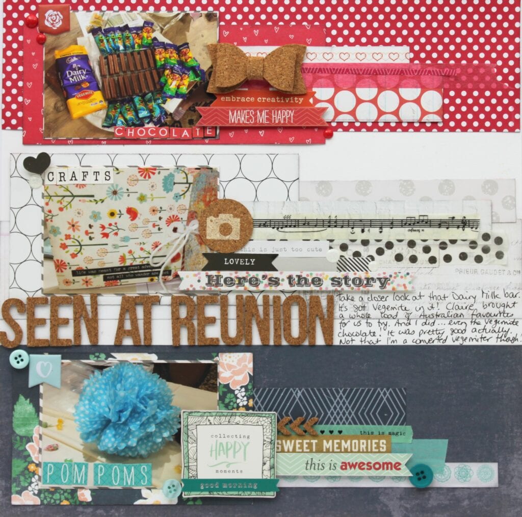
The layout above was made for LOAD216 (February 2016) and I chose it for a few reasons.
Number One, it’s full of memories from Reunion 2015. This ScrapHappy Family that I fell into back in 2011 and finally got to meet in real life in Arizona. Dani already talked about this in her blog post so I won’t repeat her sentiments (fantastic read and walk down memory lane by the way, if you haven’t read it yet go and read it here). Suffice it to say, once COVID is over, our borders have opened again, and things like Family Reunions are allowed to happen again, you just TRY and stop me going!! Just tell me where Alice, and I’m coming. With a tiara April and Tammy!!
Number Two, the prompt was about a flag and I’m really sorry, but I can’t remember which one now! Wait, just looked it up, it’s the flag of the Netherlands and I think it was because we have members in the Netherlands. If you remember the prompt, please post it in the comments! Point is, we are multi-national, multi-cultural, multi-generational, and multi-talented! (And yes, read the journaling, those were Vegemite chocolates all the way from Australia thanks to the lovely Claire – you’re still on my “must visit” list darling!)
Number Three, I made this mostly out of scraps and I made it in my favourite style – lots of layers. I didn’t always scrapbook with lots of layers but over the years I’ve become influenced by several designers (okay, mostly Shimelle Laine) who use lots of layers. As my stash of papers and embellishments grew I felt less and less need to “save” pretty papers and lost my fear of cutting them up.
Which FINALLY brings me to the point of this little blog post – what do I love most about Scrapbooking and Card Making? The pretty paper!
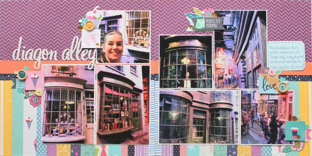
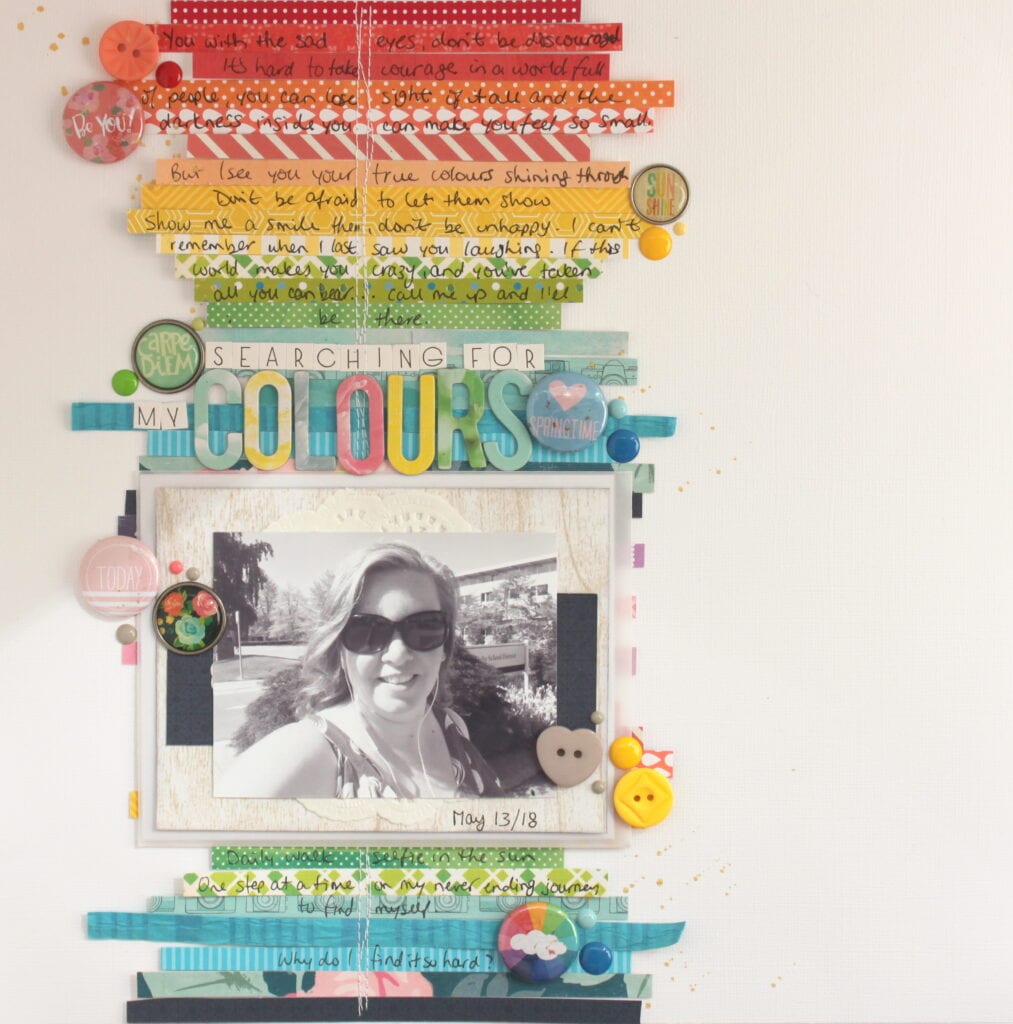
Whether my layout is a riot of colour and pattern like the one above about my trip to the Harry Potter studios outside London in 2017; or a quieter layout with only one band of colour on an all white background like the one below, there is no denying that I love pretty paper, in all the colours of the rainbow, and I’m not afraid to show it!
It’s the one thing that draws me back to this hobby time and time again. Whenever I am having a hard time finding my creative mojo, all I need to do is start going through my stash of pretty papers and suddenly I am full of ideas. And the other great thing about having lots of different papers, is that I can use the same basic design over and over again and always come out with something totally different! Check it out.
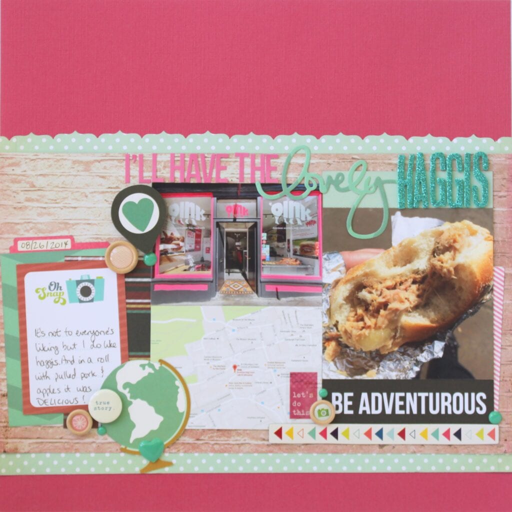
These two layouts (the one above and the one below) are basically the same design with a couple minor tweaks and a 90 degree rotation thrown in. Don’t believe me? Let’s break down the design.
1. Start with a full 12″ x 12″ background in either a solid or mostly solid colour (although I have used this with a colourful back ground too)
2. Add a band of contrasting patterned paper across the middle of the page – slightly off-centre though.
3. Fill that band of paper with your photos and/or journaling
4. Tuck embellishments on either side of that band of paper.
5. Repeat as needed!
In the top layout (and yes, I DID scrapbook about a pulled pork sandwich which contained haggis, LOL), my photos are smaller and grouped together with journaling cards and embellishments so more of the band of paper shows. In fact, it’s clear to see that I’ve layered two patterned papers to create that band.
Contrast that to the layout below which has larger photos to start with so less of the band shows up. If you look closely you’ll see that there are several different papers layered up to create that band. I’ve also flipped the design by 90 degrees to the top layout to make it work for my photos. If my photos were all portrait orientation, this layout would look even closer in design to the one above.
![]()
Why do I love to repeat page designs? And am I worried about them showing up in the same album and having people notice?
Because it takes a LOT of the work out of creating pages which speeds up my process. And no! I’m not worried in the slightest. I highly doubt the people looking at my albums are dissecting my design choices. They’re looking at the photos and reading the journaling. The most they might notice is repeating colours or patterns and that’s okay. In fact, I want them to notice that because repeating elements helps give your albums continuity.
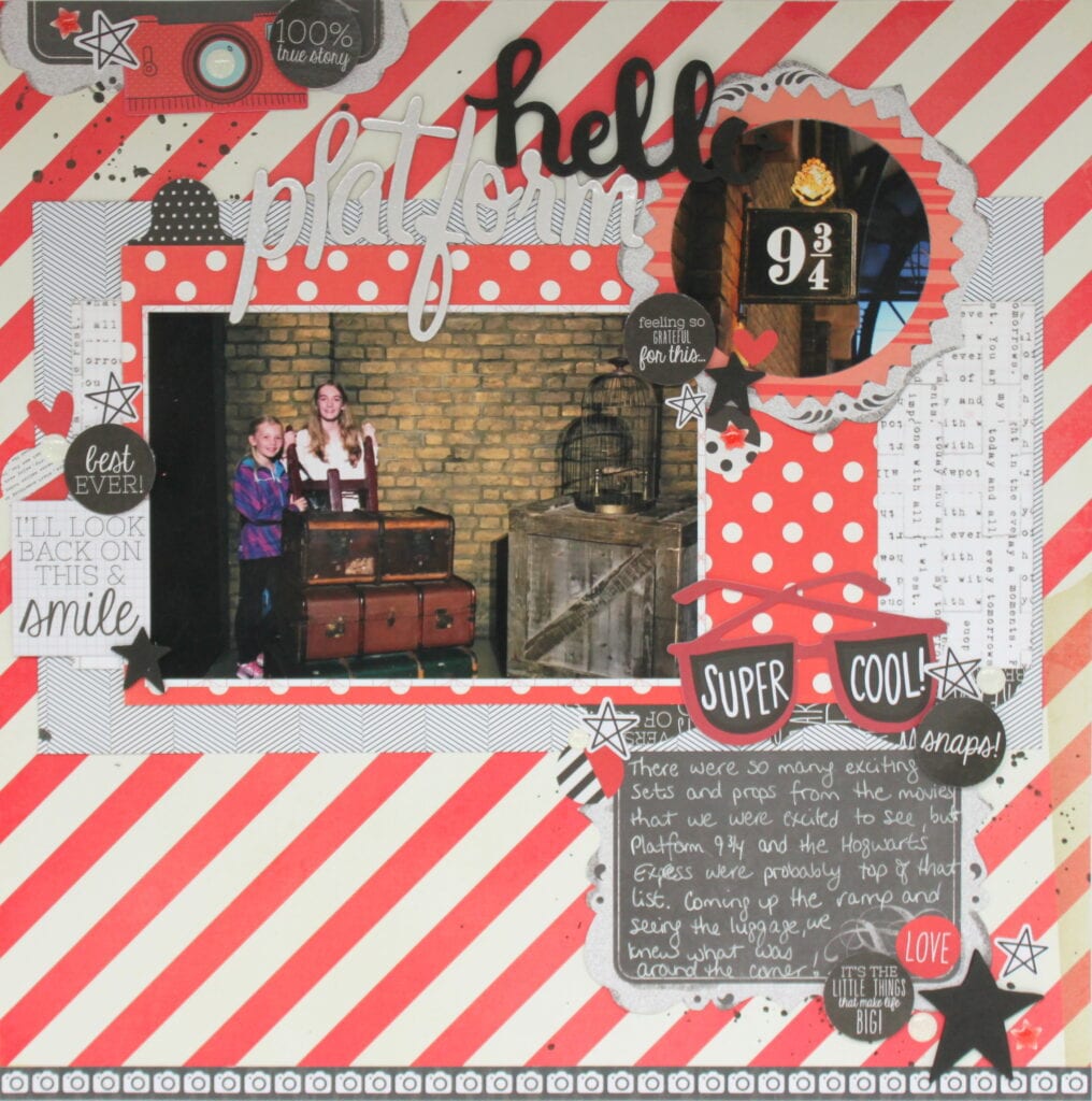
Having a few go-to page designs that you are comfortable manipulating takes many decisions off your plate when you sit down to scrapbook. So if your creating time is limited, this could be a way for you to get more pages completed in a shorter amount of time. When I’m working on a larger project like my Harry Potter Studio Tour album, or the album I made for my eldest with all her Grade 7 Grad photos, repeating page designs helps the project come together faster. And actually helps with the story continuity. Just like using similar products, colours and patterns can help with continuity, repeating page designs throughout an album does the same thing. Let’s look at a couple more examples.
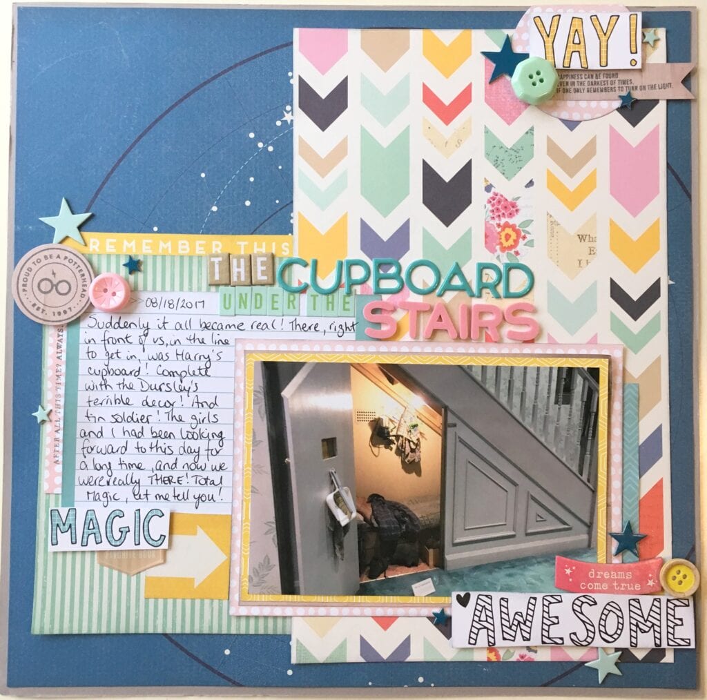
These two pages are in my Harry Potter studio Tour album (I should say albums as this 3 hour tour takes up two full albums at the moment!) The page above is near the front as this view is seen from the line as you enter the tour area. It’s essentially one 4×6 photo on a matte with a horizontal and a vertical piece of patterned paper behind it and embellishments forming a triangle around it. Below is a very different looking page thanks to the different colours and patterns used, but at its heart it’s the same. One 4×6 photo on a matte with a horizontal and a vertical element and embellishments in a triangle around it.
The differences are what trick you into thinking these two pages have two different designs. One is predominantly blues, the other reds. In the top one the horizontal and vertical elements are easily recognized as pieces of patterned paper. The layout below uses a combination of papers and large stickers to create those elements. And I’ve moved the photo from the bottom right to the top left.
Two very different looking pages but since I have that page design in my back pocket, they both came together quite quickly. I call that a scrapbook win!
Thanks to my love for pretty paper I can create unique pages quickly by using some basic page deigns and never get bored! I am only limited by time and album space as my stash of patterned paper never seems to shrink! Go figure! LOL!
I hope these ideas help you have fun creating fresh looking pages from recycled designs. And hey, it’s only paper! Go ahead and cut it up!!
Trust me, there’s plenty more where it came from!