
Is anyone else as surprised as I am that it is September, already? Even though the air is still humid and thick as pea soup here in the deep south of the US, September ushers in my favorite season of autumn with its vibrant colors and crisp, cooler air. In all honesty, though, I also resonate with the following quote by George Santayana. I truly look forward to the transition into each new season. It helps to keep regular life, as well as a creative life, fresh and interesting.
To be interested in the changing seasons is a happier state of mind than to be hopelessly in love with spring.
By George Santayana
Using Pinterest boards for seasonal inspiration
Did you guess that the SH Creative Team is getting inspired by the four seasons this month? My thoughts immediately go to Pinterest boards. I have been interested in seasonal art – or rather creating seasonal tree art- for many years, but haven’t made it happen yet. Instead, for this project, I decided to use this Pinterest board as the starting point for my layout. My goal was to represent all four seasons on one page and incorporate artful play with alcohol inks to represent each one.
Playing with alcohol inks
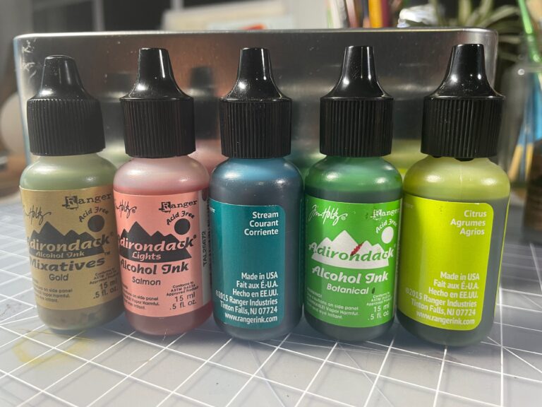
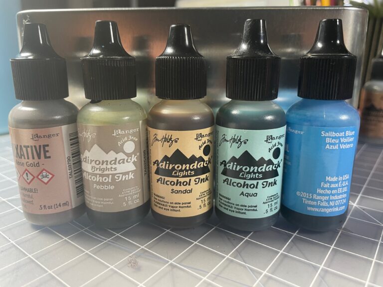
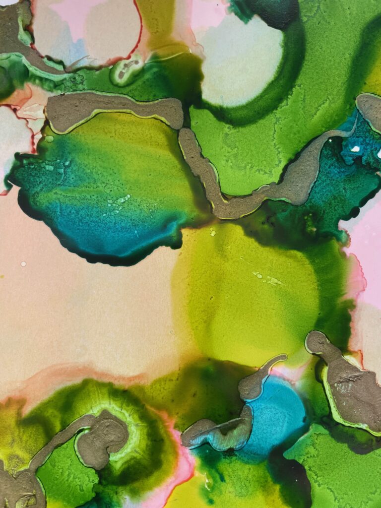
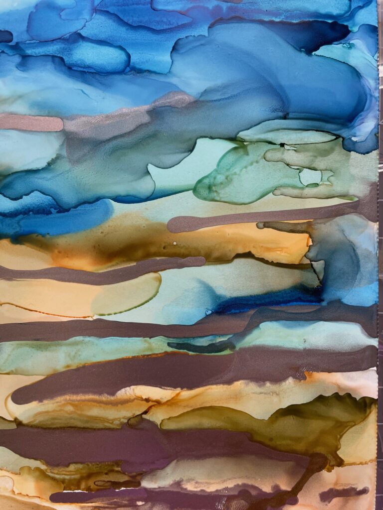
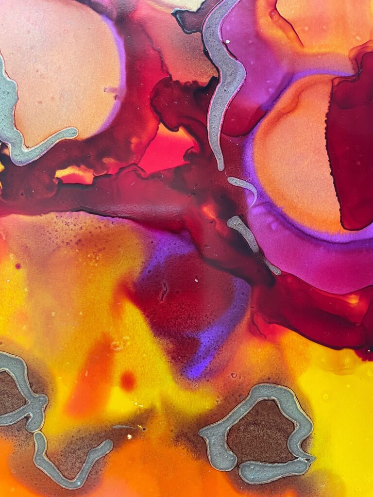
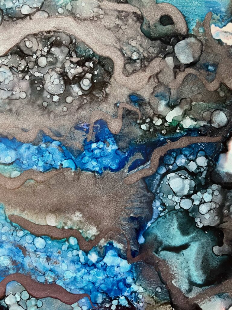
The first step was to look through my collection of Ranger alcohol inks and pull out five colors representing the vibe of each season without repeating a color. Then, I just began slowly dripping the regular colors on Yupo paper, along with straight 70% rubbing alcohol, to help with blending. Sometimes I turned the page or blew on the ink to move it in different directions. The metallic Mixatives were added sparingly, as highlights, after the inks dried completely on the Yupo paper. (With exception of the winter page, where the gunmetal mixative got away from me a bit, which can happen easily.)
Spring
Summer
bright botanicals: gold mixative, salmon, stream, botanical, citrus
aquatic beach: rose gold mixative, pebble, sandal, aqua, sailboat blue
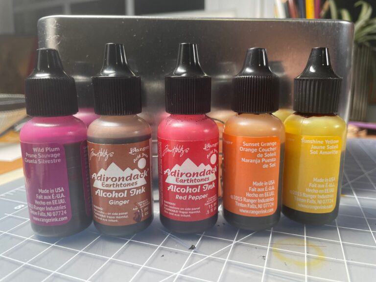
Autumn
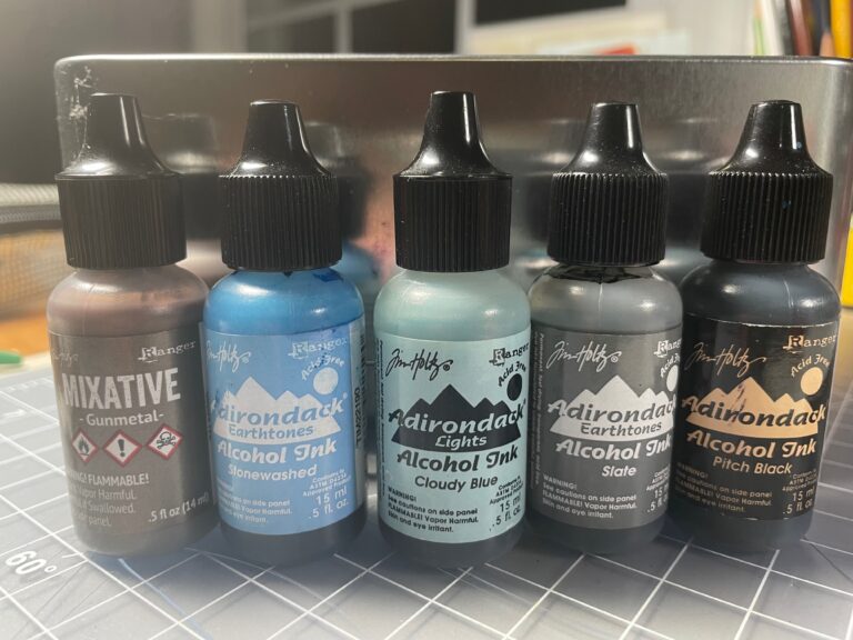
Winter
vibrant foliage: wild plum, ginger, red pepper, sunset orange, sunshine yellow (later added gold mixative, not shown in top photo)
gloomy snow: gunmetal mixative, stonewashed, cloudy blue, slate gray, pitch black
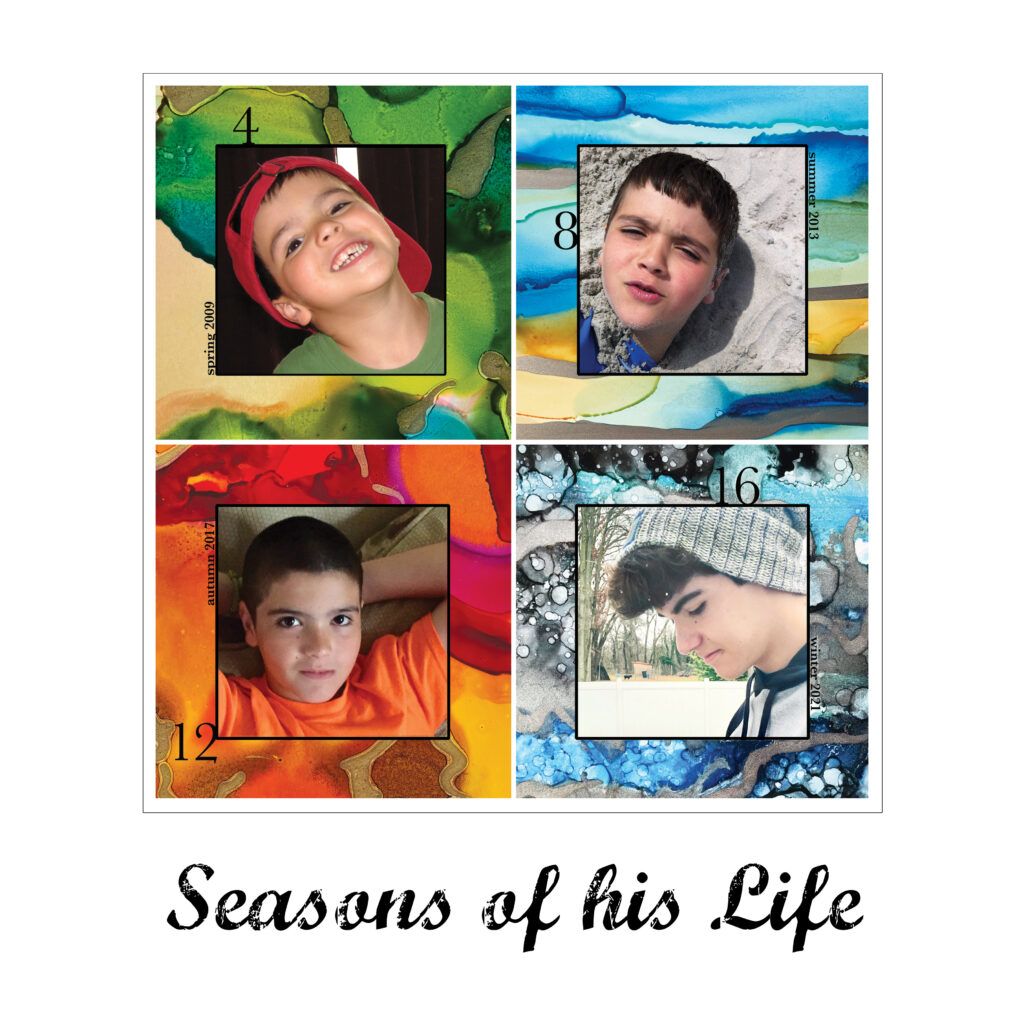
Once I was done creating these colorful backgrounds, I photographed them with my iPhone 12 Pro and cropped and brightened them in Photoshop. While still in this program, I created a new 12×12” document and copied and pasted each seasonal image into the new one. I reduced their sizes and cropped them further into four squares adjacent to each other, while keeping a white line between them and adding a thin black line around the entire grouping.
Hunting for photos
Next step was to decide what seasonal or change story I wanted to tell with photos. I wanted to show the passing of time on this one page using the new art as backgrounds. Since I still have not set myself up with Lightroom for photo organization, I opened the Photos app on my MacBook, and in the search function, typed each season to see which images inspired me. As I viewed our recent family history, I considered photos of me, my daughter, my son or family groupings for the timeline. When I spotted an image that I considered a good possibility, I added it to a newly created album (named Seasons blog 2022) in the Photos app.
Thought process behind my choices
I decided to use images of my son and found many good photos from which to choose. In order to slim down my choices, I created rules for myself. Since spring represents newness or youth (as in spring chicken), the youngest photo of him would be a springtime photo. This was followed by summer, autumn and, finally, winter would represent the most current or oldest age. In keeping in line with the four photos representing four seasons, it was logical to me to have four years between each of the photos to show maturity and growth in his timeline. The photo I chose for winter was from December 2021 (age 16). Then, I selected an autumn photo from 2017 (age 12) and a summer photo from 2013 (age 8). Lastly, a spring (chicken – haha) photo was selected from 2009 (age 4). These four photos were inserted into my 12×12” Photoshop document and cropped or brightened as needed.
The finishing touches
It is important to me to include dates and ages on my layouts for possible future family observers to understand the context. Since the photos were carefully selected to show the passage of time, the seasons and years were placed alongside each photo, but as a small caption. The idea of highlighting his ages, interested me more. Those numbers were made larger and moved to various places to pull the eye around the page. Finally, I brainstormed a few ideas for the title using the distressed font called Marcelle Script. There was one obvious winner: The Seasons of his Life.
Share your creativity
This month’s theme allowed me to express my appreciation for the four seasons in all their colorful glory. My plan is to follow this idea up with a layout of my daughter, at the same ages. I’m thinking I may also frame them and hang them in our living room! Please follow along in the following weeks of September to see what other Creative Team Members create using the seasons as inspiration. Post your seasonal projects or layouts in the FaceBook group or in the Share Your Creativity area of Circle if you are a ScrapHappy Member.y
More on alcohol inks by our team members
In a previous blog post, Alison describes her dive into experimenting with alcohol inks
Misty created a video for a past LOAD layout using alcohol inks: Ep 064 Alcohol Ink Backgrounds (YouTube video) by Misty Murphy at Crafty Soup