
The ScrapHappy Design Team is being inspired by the change of seasons this month. Did you read Nikki’s post from last week? Her alcohol ink colour blocks are amazing! Makes me want to pull out my alcohol inks and play some more.
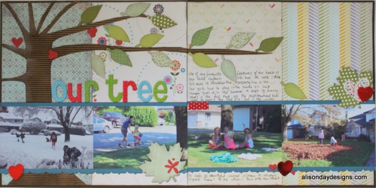
Her post made me think of this page that I created back in 2014 for a challenge I was participating in. I can’t even remember what the challenge was now – something like “the ultimate scrapbooker” – but it really stretched me at the time. And this layout showing the four seasons of the tree in our front yard is so fun. If you haven’t tried created a Four Seasons page, I hope this example and the one in Nikki’s post give you some inspiration.
As fabulous as documenting all 4 seasons is, the Seasons topic I want to talk about is the Back to School Season.
Typically September sees the return of school routines and cooler weather (and my birthday!) This particular September, the return to school spanned the county for our family, as my eldest went off to the University of Waterloo in Ontario (2,000 miles from that tree above!) For the last 20 or so years, I’ve taken photos of her, and then each of her sisters in turn, as they headed out our door and off to school. First it was preschool, then elementary school, and then high school. (Full confession; I do not have all those photos scrapbooked! I’ve taken them and they were posted to Facebook – does that count?)
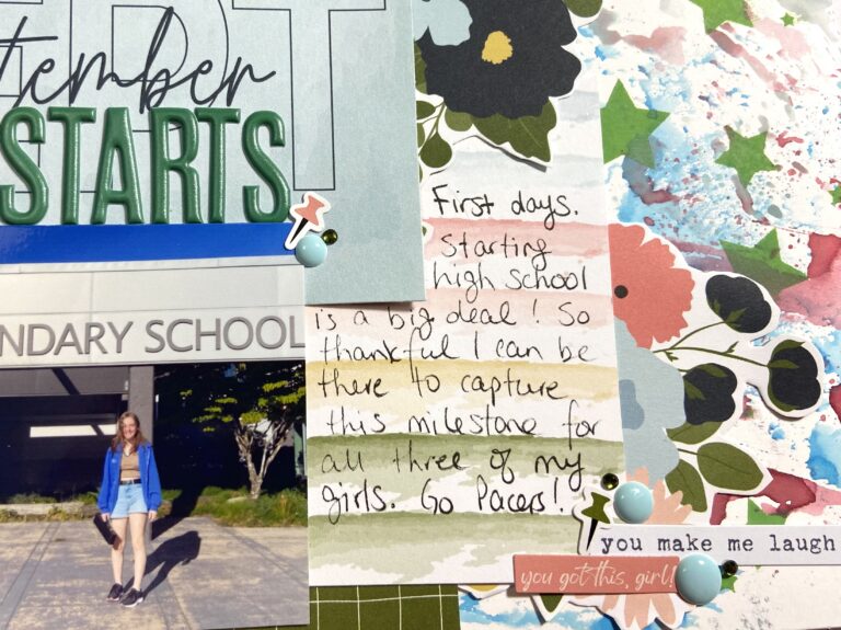
This year I couldn’t take a photo of Marley in our front yard so I had to find a new way to approach things. It started with this layout of her on Move In day at Waterloo.
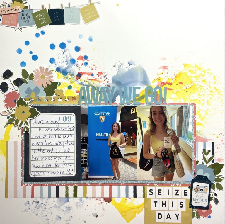
The photo in the middle was taken by a volunteer and is of her picking up her Health Sciences Orientation package at the student union (I was in a Parent Orientation with my husband at the time). The right hand photo is after we got her dorm keys. To me these two photos sum up how different her Back To School experience was. And look at her smile. She was so excited!
I made the above layout as a sample for a live demo I was invited to do for Creative Scrapbooker’s VIP Crop on Saturday September 17th. I used Vicki Boutin’s Foundations paper to create my inky background. This paper is extra thick and coated to help prevent warping when you use watery techniques on it.
I used Distress Oxide inks in Faded Jeans, Mustard Seed, and Candied Apple as they best matched the colours in the paper line I was using – Echo Park’s Day in the Life. To bring in the bright blue of that banner behind Marley, I added stenciled dots using Concord & 9th’s Confetti Dots Turnabout Stamp and Salty Ocean Distress Oxide ink.
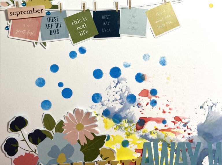
I love the punch those dots give to the layout. And I knew I wanted to embellish on the diagonal so only added them to the top left and bottom right corners of the background. Creating inky backgrounds like this are so fun! And it’s a quick and easy way to add texture to a piece of plain white card stock. Then you don’t need to add much more in the way of papers and embellishments!
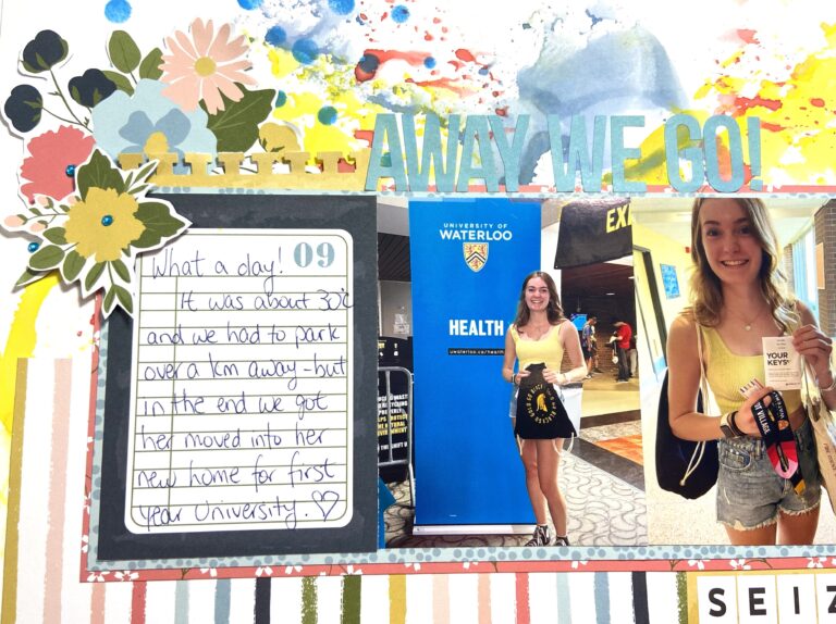
I prefer Thickers for my titles, but didn’t have any in the right colour for this layout, so I used some Simple Stories letter stickers from their Brights Color Vibe Sticker Book. The blue was a perfect match to the blues in my papers. A couple of layers behind the photos and journaling card help them stand out against all that ink. Then a simple strip of paper to act as a shelf to hold everything else – title and embellishments.
In keeping with the school theme I used my notebook edge border punch on a small piece of yellow patterned paper. Actually, the off cut from that ‘Seize this Day’ cut apart piece. Never throw your off cuts away until you’re 100% finished with your layout! I wanted the card down at the bottom right but needed a way to bring the yellow up to another spot on the layout. Punching the strip I had trimmed off was the perfect solution.
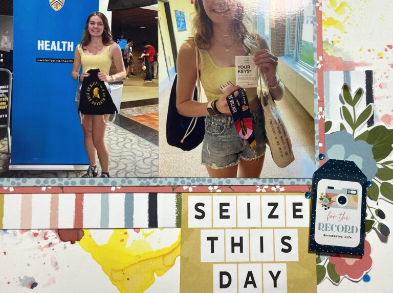
At this point, besides all the ink on the background, everything was looking very boxy to me. So I detail cut out several flowers from one of the patterned papers in the collection, and added them to the bottom right and top left of the photo block. This was exactly what the layout needed to soften it.
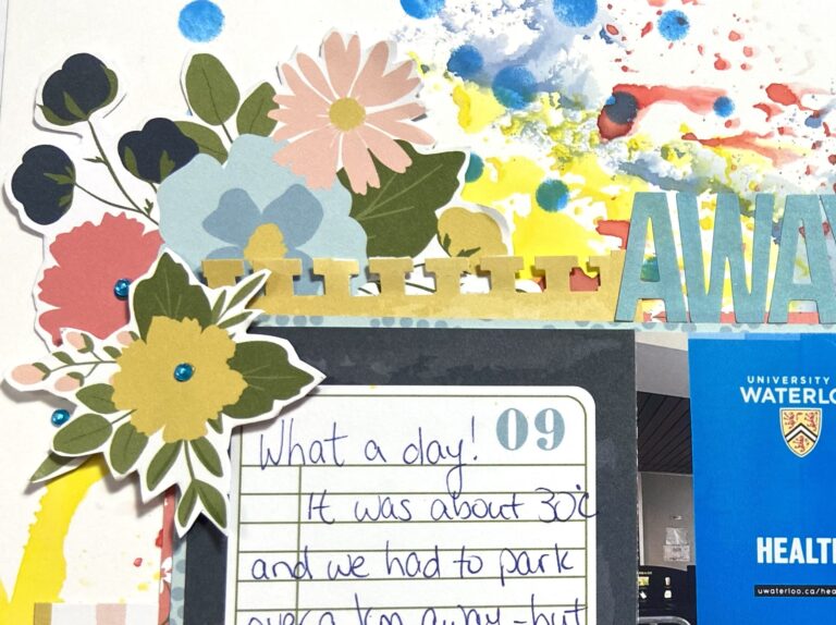
Finishing touches were these tiny bright blue gems from Honey Bee Stamps. They pack a big punch for something so small!
Having created this layout as an example to share during the live crop, you may wonder what I actually created for the VIP attendees. Well, I continued in my Back to School theme and created this compilation page for them.
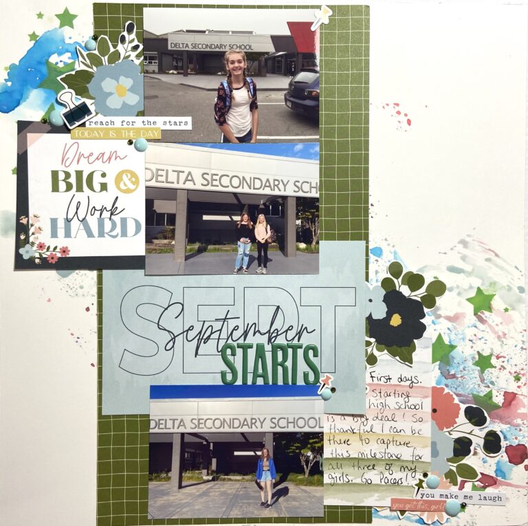
Similar to the Tree through the 4 seasons page, this one tells the story of the first day of high school for all three of my girls. Yep, that top little girl is the same girl I recently dropped off at university!
I went about this page in much the same manner as the first – inky background on Foundations paper with stenciling on top. This time I used Salty Ocean, Speckled Egg and Festive Berries in the background, with Mowed Lawn through a star stencil. The high school my girls attend has green and black in their colours so I wanted to bring green to the forefront. The Day in the Life collection has a lovely green, just not a DSS Pacer green. But sometimes you just have to work with what you have!
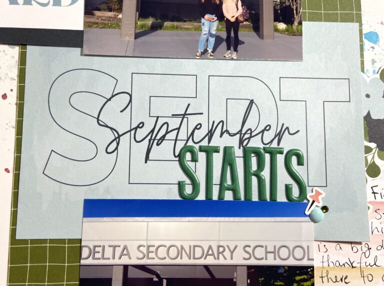
I broke up the row of photos with a cut apart card. I had two very similar looking photos so it made sense to separate them somehow. But I’m kind of a stickler for chronology so couldn’t use the “odd photo out” as it was taken first! Scrapbooker problems, am I right? The Day in the Life collection has monthly cut aparts like this one, so I made it into my title by simply adding one word in puffy stickers.
Once again I softened all the straight lines of my papers by detail cutting some flowers. And these ones also did double duty – they brought down the dark blue from the top left cut apart. It’s all about balance. When you add a colour to one part of your layout, find a way to add it to another part. This makes them both feel intentional, and helps your layout feel cohesive.
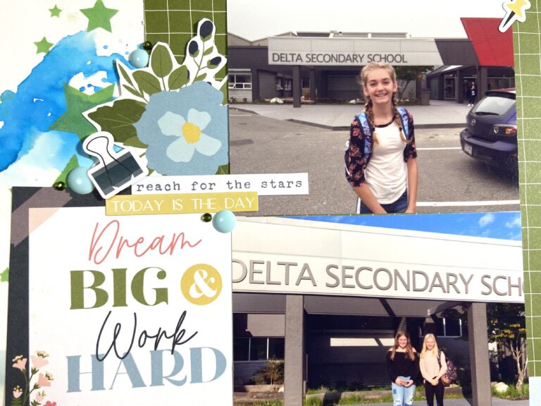
This collection pack comes with a sticker sheet with lots of school related icons on it – like this bull clip and the push pins you can see in the photo above. It also had several word strips that I supplemented with the No Limits sticker sheet word strips too. I finished with more Honey Bee gems (in a green that perfectly matched my papers and ink) and enamel dots from Pink Fresh’s Happy Heart collection.
I created one more page for my Back To School Season, but you’ll have to wait to see that one. It’ll show up on my own blog for Make It Monday. Thank you so much for visiting today. I hope you have fun creating layouts to celebrate the Seasons – whatever that means to you right now.