
Hello everyone, I’m happy to be back on the blog! If you’ve ever had times when life just sucks out your creative joy, then you get an inkling of my November and December. But it is a New Year and we have all new topics to discuss with you which brings me much creative joy!
This month the Creative Team is talking about the design concept of White Space. Nikki wrote an amazing post about it which is a must read for all creatives. She demonstrates the concept beautifully by showing you a layout where she switches out the background paper to show you how that one difference completely changes the feel of the layout. Plus she lays out five benefits of using white space – number two of which is the jumping off point for my topic today.
Readability
As scrapbookers, we are story tellers. It’s right there in the name – scrapBOOKS. Like any good book, you want to keep your readers engaged. We put a lot of time, energy and money into creating layouts to tell our stories so the last thing we want is to have them tossed aside half read!
So how do we do that? How do we keep our reader turning pages in our albums? One way is to switch up your style every now and then. If you primarily create double page layouts, throw in the odd single page for variety. If you primarily use patterned paper backgrounds, try using a solid card stock background. If you primarily use 4×6 or 3×4 photos, make a page with a giant 8.5×11 photo, or conversely, a strip of tiny photos.
You get the idea. Changing up your normal design keeps your reader interested.
I want to talk about how you can use the concept of White Space to create pages within your albums that are in themselves a switch up of style. These pages act like a pause. A chance for the reader to catch their breath, let their eyes rest from what may be an album filled with colour and pattern. To demonstrate let’s take a look at my (in progress) December 2022 album.
Did that make sense to you? By sprinkling those pre-printed divider pages throughout the album, and by keeping some of them really simple, I am creating “pauses” in the otherwise frenetic pace and look of the holiday stories.
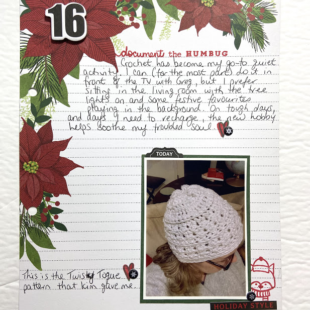
Here is a closer look at the page I completed in the video. I am loving how my album is coming together with the mix of paper pages like this one that feel more restful, and the pocket pages full of activity and colour.
And now it’s your turn. Take a look through your albums. Have you used this concept of white space pages on purpose, or without even realizing what you were doing? If so, now that you know why they work, try to keep this design concept at the forefront of your mind and purposefully add “break” pages into your stories from now on.
If this is a new concept to you, give it a go! And be sure to report back. We love to see others work.