Before I answer that question—although I’m sure you know the answer!—let’s talk about what a grid actually is first. A grid is a pattern of repeating rows and columns of squares or rectangles that neatly nestle edge to edge across a page creating vertical and horizontal symmetry. Alison’s post uses just that style of grid in her layout example. She also shares a few tips on avoiding the rigidity of grids. Nikki breaks up the rigidity further by using a partial grid. I’m going to take it even further by changing up the expected shape of the grid.
The Circular Grid
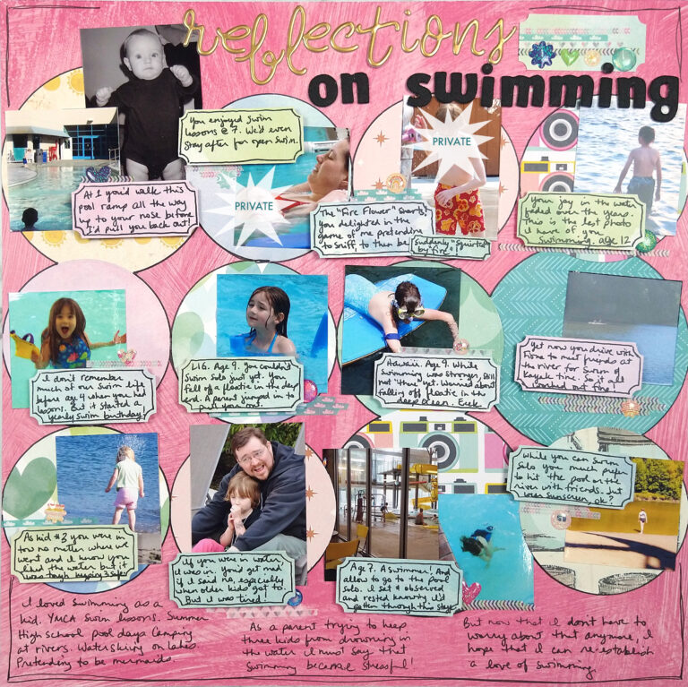
Now wait a minute, you probably noticed that I defined a grid as being composed of squares or rectangles. While that is technically true, if we just swap out squares for circles, you still have a grid. Remember that a grid is a repeating pattern of the same shape. Circles can nicely become that repeated shape and adds a design element that is more playful and less rigid.

Part of the success of a grid is to break down the information into smaller chunks. This layout is jam packed with photos and journaling, but the grid offers the viewer a way to tackle the layout one step at a time. Each circle acts as its own information unit.
Take It Smaller
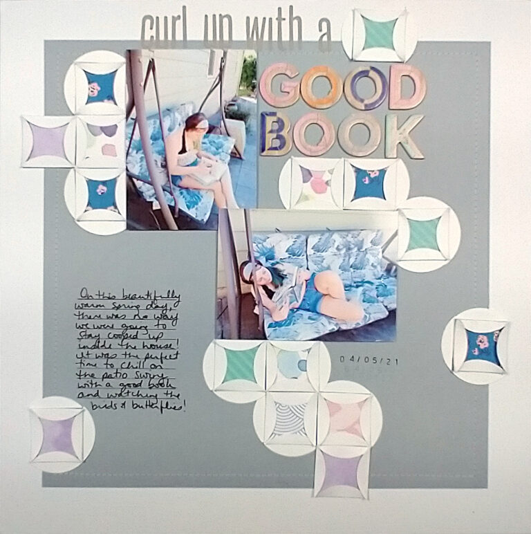
If you are a bit intimidated by the big circles, you can take the circle grid down to a smaller scale as well. These next two layouts show off pops of circle grids as embellishments. (Full disclosure these layouts were from a scrapbooking class I took but they show this example nicely.)
Partial Grids
As you know from Nikki’s post, grids can be partial as well. In this next layout I’m using circles again as embellishments but their grid isn’t quite as obvious. However, if you follow the circles across or down, you’ll notice the grid pattern is there. It is just broken up with gaps of “missing” grid spaces. Here is a bit of a bonus: What I really like about this layout is that the circles are also squares. Take a look and see what I mean.

Change the Symmetry
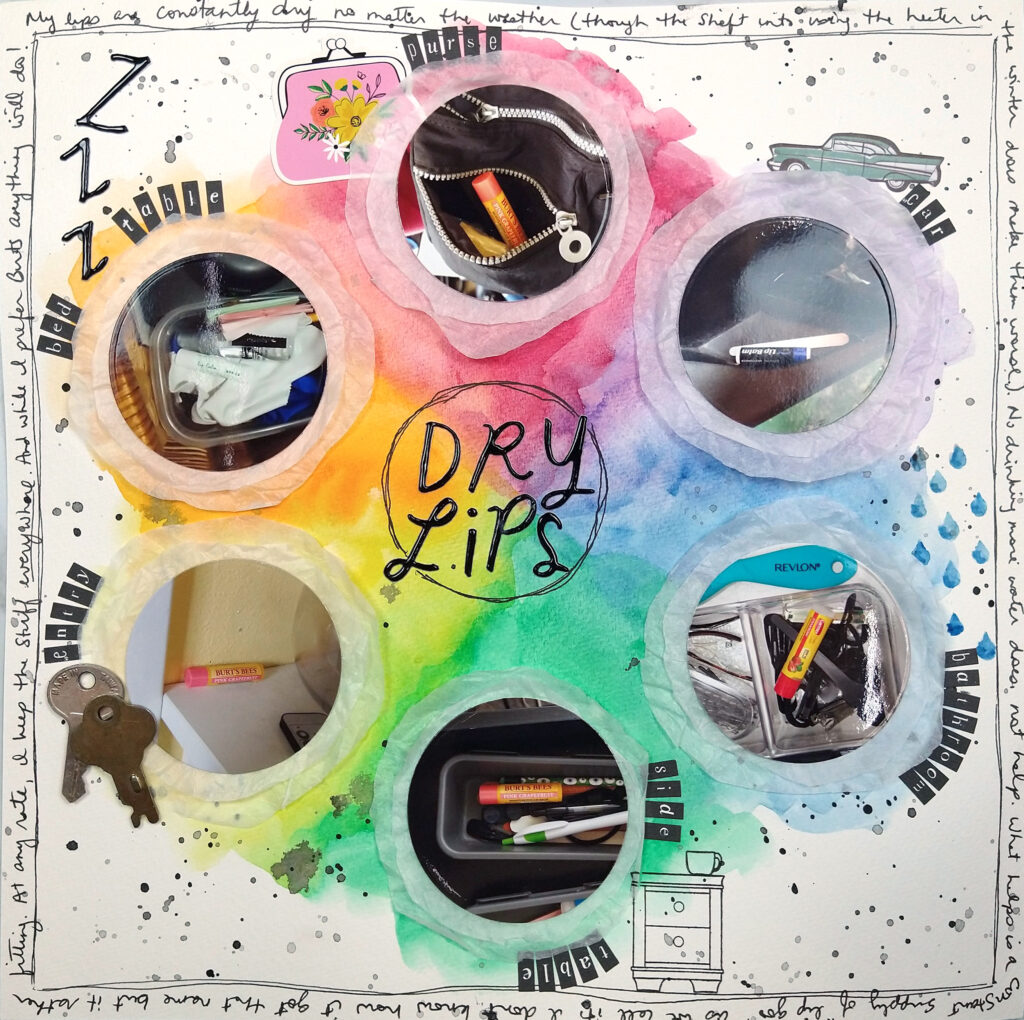
This next layout takes another shift on the grid. Previously we changed the shape portion of a grid and now we are going to change the symmetry portion! Another version of symmetry is radial symmetry, where a shape repeats around a circle. If I use circles within that bigger circular symmetry shape this is what happens…

What do you think about that one? Do you still consider it a grid design?
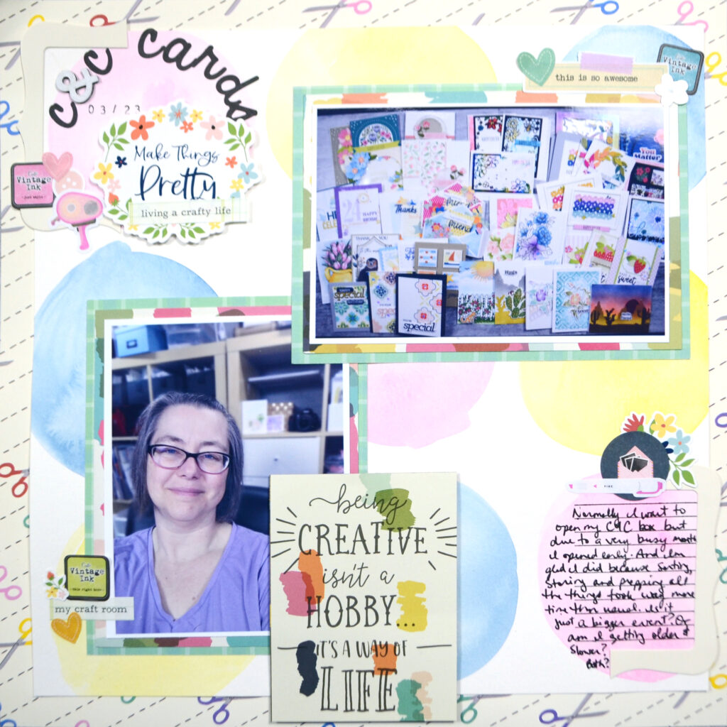
I have just one more circle grid layout to share with you today. This one is much more subtle and may not even be considered grid design by some. But, I did use the circles in the grid as anchors for all the elements. The corners of my photos are placed to line up with the circles of the grid. My title uses one “box” of the grid. My journaling uses another. But with the flow of the layout, the grid fades more into the background. This is a good way to use a grid if you want something less structured. And of course it can be done with regular square grids too! Or hexagons, or triangles, or…

I hope I gave you some ideas on how to incorporate circles into your grid designs. Until next time, have an artful month!


