
DON’T PANIC! The math is not hard!
This month the ScrapHappy Design Team is talking about split page designs. Nikki had an amazing blog post last week where she broke down her whole process. And the way she split her photo was awe inspiring too. If you haven’t read her post yet, you can do that right now by clicking here.
She mentions in her post that the most popular way to split your page is in half and I agree with her. In fact, Shimelle Laine has a whole class on that topic called Half and Half (you can take it here – not an affiliate just a huge fan of all things Shimelle!) I love to split my page in half for a few reasons; it’s easy math (12/2=6), it allows me to show off and use up two different patterned papers, and it creates a lovely and natural place, both on the horizontal and the vertical, to position design details so that my reader notices them.
So let’s talk about math for a minute. Assuming you are scrapping at the 12×12″ size, splitting your page in half, thirds or quarters is easy math. Super simplistically, you are looking at two 6×12″ spaces, three 4×12″ spaces, or four 3×12″ spaces. I don’t get into dividing on the diagonal today, but that is always an option too, as are 6×6″ quadrants. Another day perhaps …
Starting with halves, you may think that every page that is split in two will look the same. But you’re wrong! Putting aside the fact that you are likely not using the same papers and photos on every page, there are ways to change things up so each page looks unique in design even though you start with the same principle of dividing the page in two.
Your basic split page design construction can go one of a few ways. You can either have one full 12×12″ background piece that you then layer a 6×12″ piece on top of (vertically or horizontally), OR you can adhere two 6×12″ pieces onto another full 12×12″ piece that you don’t care if no one sees, OR you butt two 6×12″ pieces together and hold them together with washi or a border strip. I’m not going to talk about construction today though. I’ll assume you can figure that part out. Let’s look at some examples of what they can look like.
Horizontal Divide
Two different background papers make up this page. And in fact, the top half is a transparency so I had the added challenge of creating a mirror page for the back (you can read all about it on my blog here). This type of half and half page is easy to create (transparency aside) and if you have three 4×6 photos like I have here, needs very little in the way of extra embellishment. That means it can come together quickly.
I think you can see how easy it is to do this for a single page, but what if you’re a double page scrapbooker? No problem, this next example shows how you can create a horizontal split page design over the 12×24″ canvas too.
This is a great page design to use if you have two papers that you love but your story needs a bigger canvas than a single page allows. You will need a couple of “throw away” sheets of card stock to back your horizontal patterns onto, but it’s probably safe to say most scrapbookers can find a couple of those in their stash, right?
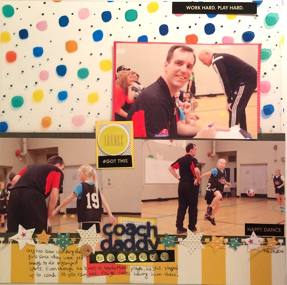
We don’t always want to work on the horizontal. Sometimes our photos are portrait orientation and a vertical design is called for. Here’s an example of that.
Vertical Divide
This is also an example of a certain “cheat” you can make when creating half and half pages – cutting one of the 6×12″ pieces down slightly to allow your background paper to create a frame all the way around the entire page.
How does the half and half design look on a much smaller canvas? Check it out on this card.
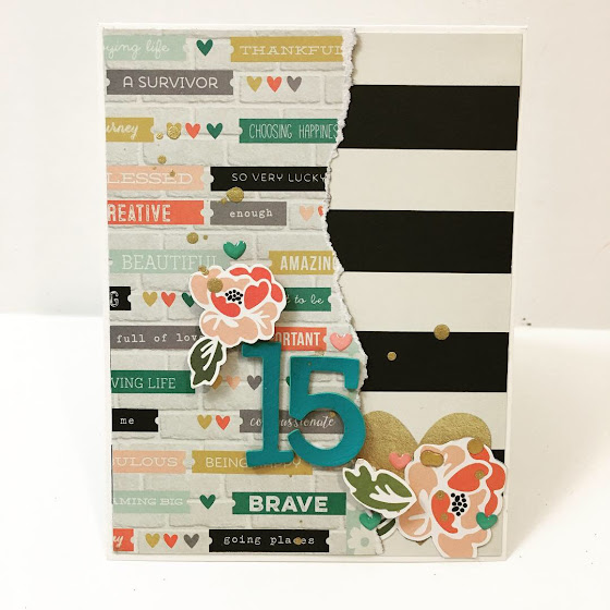
I make both scrapbooks and cards so finding a design that is easy to use on both makes my life so much easier.
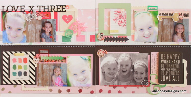
Okay, let’s do more math … let’s split our page into three. Once again I am using the 12×12″ page size as my base. So when we split into three we get three 4″ columns – either vertically or horizontally. Let’s look at this next example for a great representation of that.
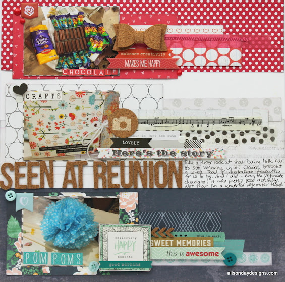
Horizontal thirds
This was made for a LOAD challenge where we had to recreate the flag of Luxembourg which I did by colour blocking. You can read more about it on my blog here. Visually, this is quite striking. From a practical standpoint, this is a great design to use up scraps, or the last bits of a subscription kit. Start with three 4×12″ strips and layer on from there!
Now let’s see a couple of examples where we are using a one third/two thirds design.
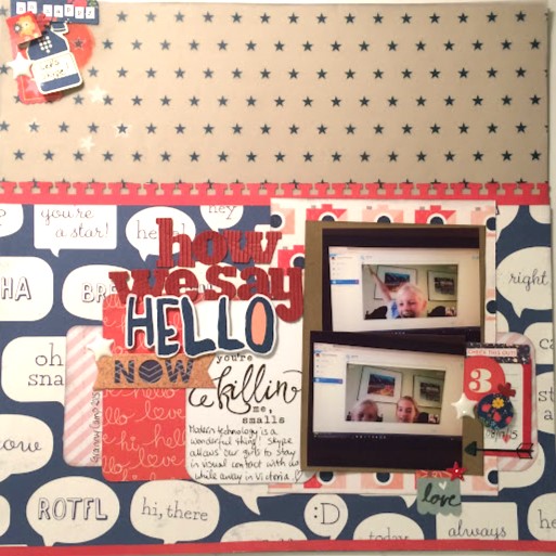
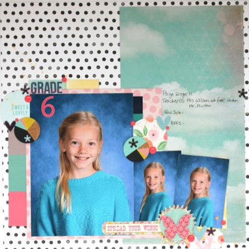
Two Thirds Design with Paper
In this first example, I wanted to highlight that fun speech bubble paper but felt a full page of it would be a bit much so only covered the lower two thirds of the page with it. This is a great way to highlight a favourite paper.
In Nikki’s post, she used a giant photo and cut it into sections over her page design. This next example uses a giant photo in a different way.
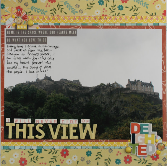
Instead of covering two thirds of my page with a fun pattern, I used a photo! I don’t have the ability to print 12″ wide photos locally so the biggest I could get was 8.5×11″ but I think you get the idea. The page is still split into 1/3 and 2/3, just in a different way.
And speaking of different ways … here’s one that you may not immediately think of as a split page design.
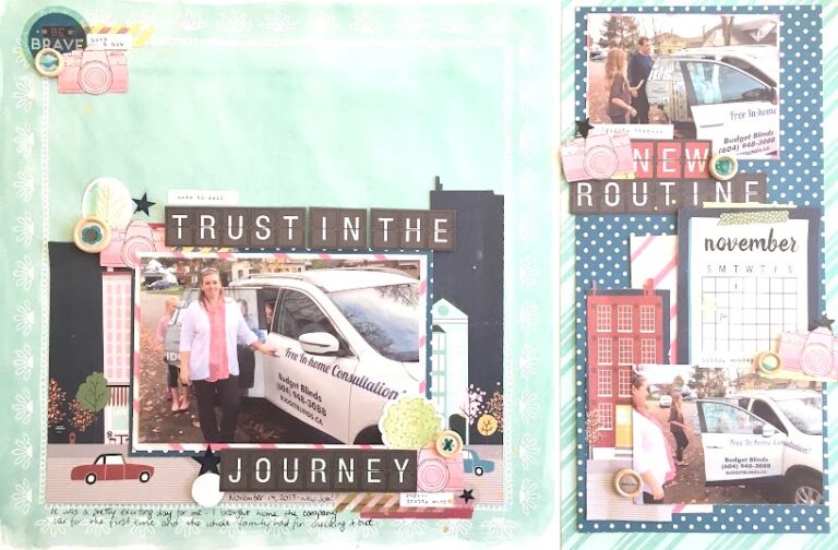
Pocket pages are the ultimate in split page design! As you no doubt know, pocket pages come in all sorts of configurations too. I don’t do many pocket pages as I love my 12×12 canvas, but I am a fan of the 6×12″ pockets. Sometimes I find extra photos that go with a story I’ve already made a layout for, or I have extra journaling to tell that I don’t want to squish onto my 12×12 layout. This is when I reach for those 6×12″ pocket pages. And guess what? This entire 18×12″ layout is now a one-third/two-thirds split design!
I have one last example to share with you today and it’s our final math equation – divide by 4!
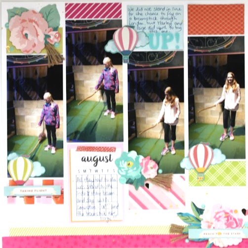
Divide into equal columns
This layout was made during LOAD218 and used a couple pieces of inspiration. The first was an image I found on Pinterest that I used as a sketch inspiration and then I also used a colour inspiration from the CSI Challenge blog. This design would work really well with one of those giant photos we talked about earlier and you can see that done on the site where I found the sketch.
There you have it. The divided page design is not a one-trick kind of design. There are just about as many ways to divide your page as there are pages to be made. If you scrapbook in a different size, simply do the math accordingly. It may be a bit trickier, but not impossible!
Thank you for visiting today. If you enjoyed what I shared I’d love for you to leave a comment. Until next month, happy scrapping!