
When you have a pile of embellishments on the table, do you struggle with where to start. In particular do you like the idea of clustering embellishments, but don’t know how to achieve a cohesive look? The team is here to help with clustering embellishments this month!
Nikki’s post highlighted great ways to use embellishments clusters from a simple smattering of enamel dots to a grouping that works to frame a photo.
I’m here to help you create those clusters in the first place. I’ll walk you through some design tips for this challenge. When I say design tips, I do mean to turn to your layout design principles when creating clusters!
The biggest design principles I use are the rule of three (or the rule of odds), contrast, and proximity. Let’s look at each of these.
Rule of Threes (or rule of odds)
You’ve probably heard it many times that the eye prefers odd numbers. Three is the most common odd number we use in scrapbooking. We’ll divide our layouts into three portions, or we will use three photos. Placing items on the three points of a triangle is yet another way the rule of three works in layouts.
This same rule can be applied to our clusters very simply… pick three/five/seven embellishments and cluster them together. Done, right?
Well maybe not. This is where the other principles come into play.
Rule of Contrast
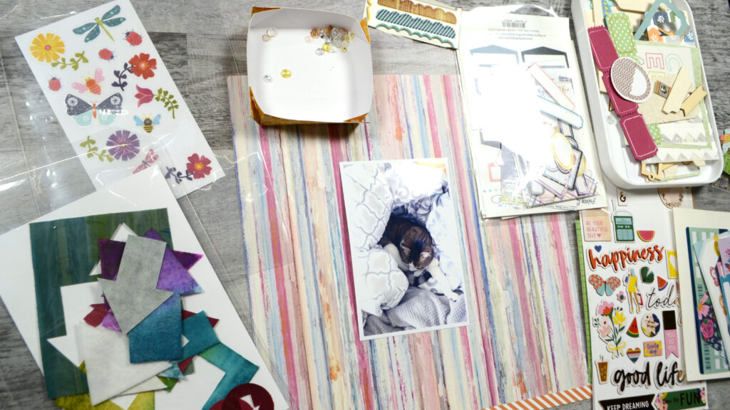
In the photo above I have sorted my embellishment options into piles by relative size. This isn’t perfect since the chipboard sheet has some larger and some smaller elements. This is a general categorization and I can narrow down from there. (Don’t worry about that little box at the top for now, we’ll get to that later.)
Why did I sort my embellishments by size? Well, different sizes are one way to create contrast. The design principle of Contrast simply boils down to some type of difference among the elements.
Contrast comes in various flavors. Things can differ in color, size, shape, texture and materials. When I select my three/five/seven embellishments this is how I start choosing items… Size comes first. I have to get the biggest embellishment squared away right up front so that I won’t run out of room for it.
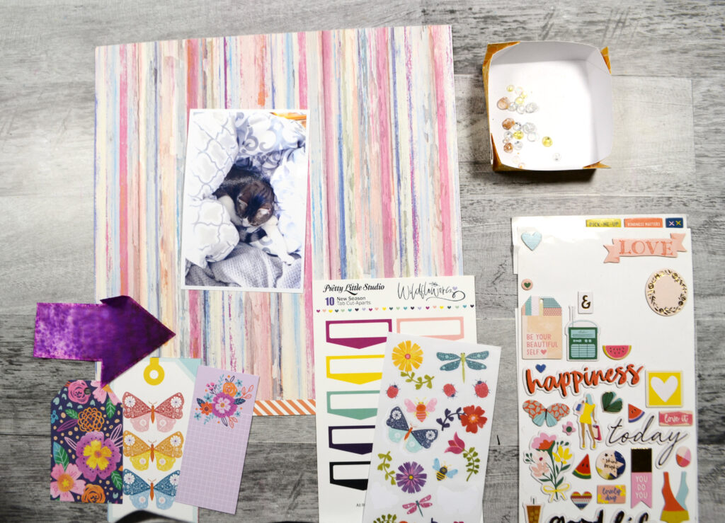
Once that largest item is chosen, then comes a medium element and a small element. (In picture 2 below I also have my title that plays nicely with the cluster.) Let me highlight the other contrasts I selected for, besides just size, in the next list.
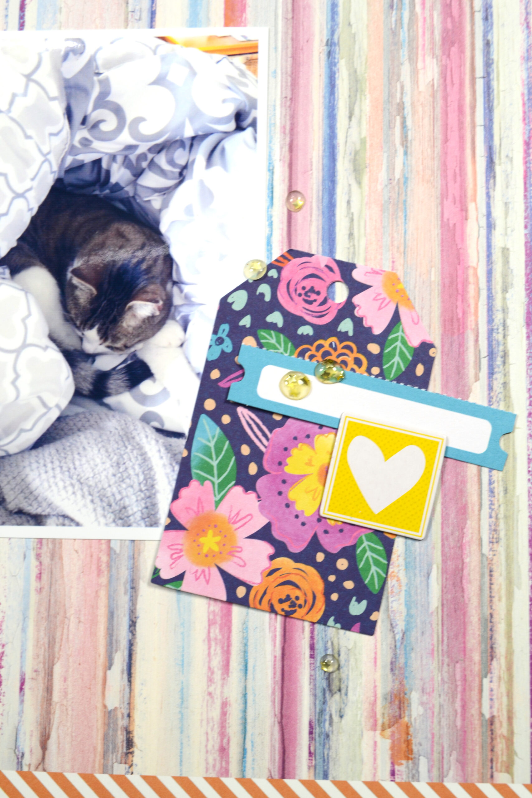
Picture 1:
- Item #1: large, tag shape, multicolor, paper
- Item #2: medium, square, yellow, chipboard
- Item #3: smallest, long rectangle, solid blue & white, paper (but with a small perforated edge)
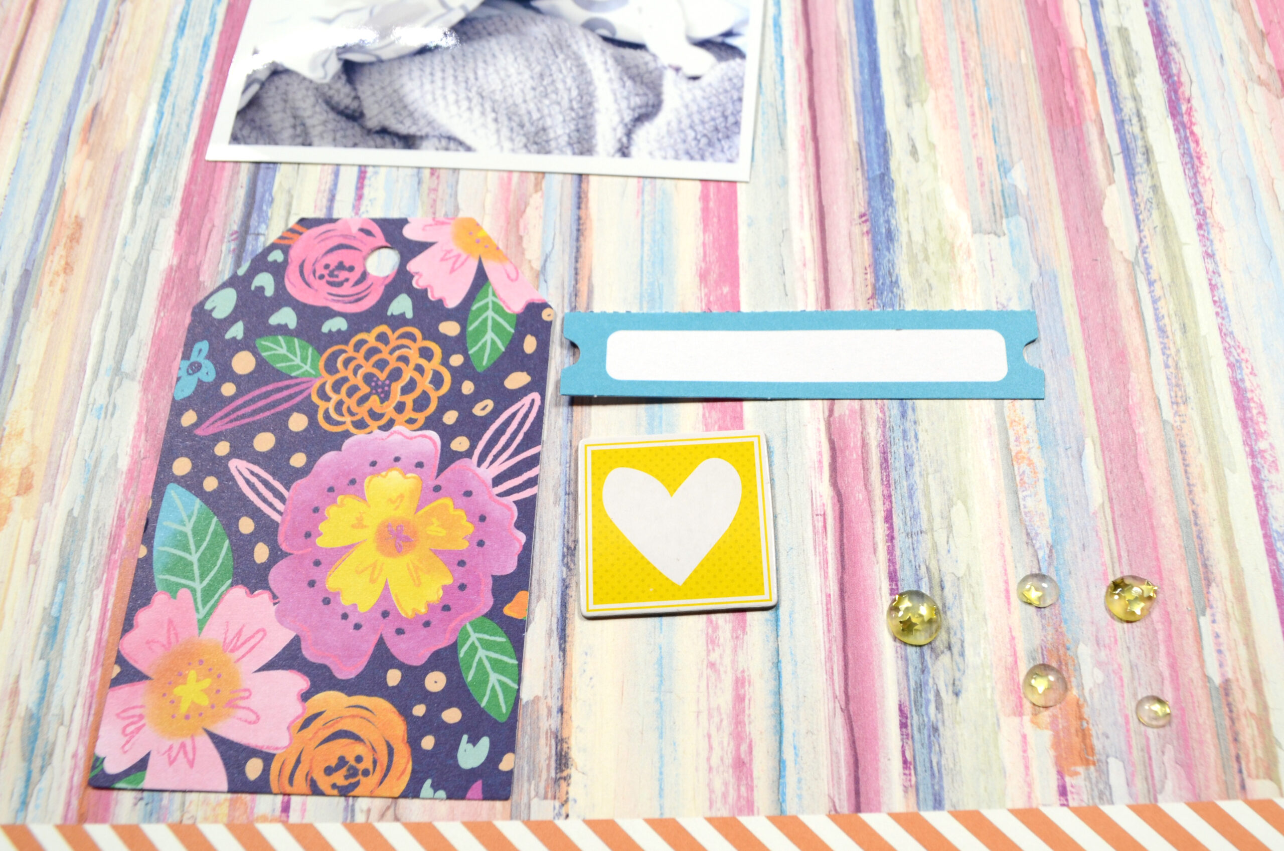
- Item #4: sprinkles (we’ll get to this concept)
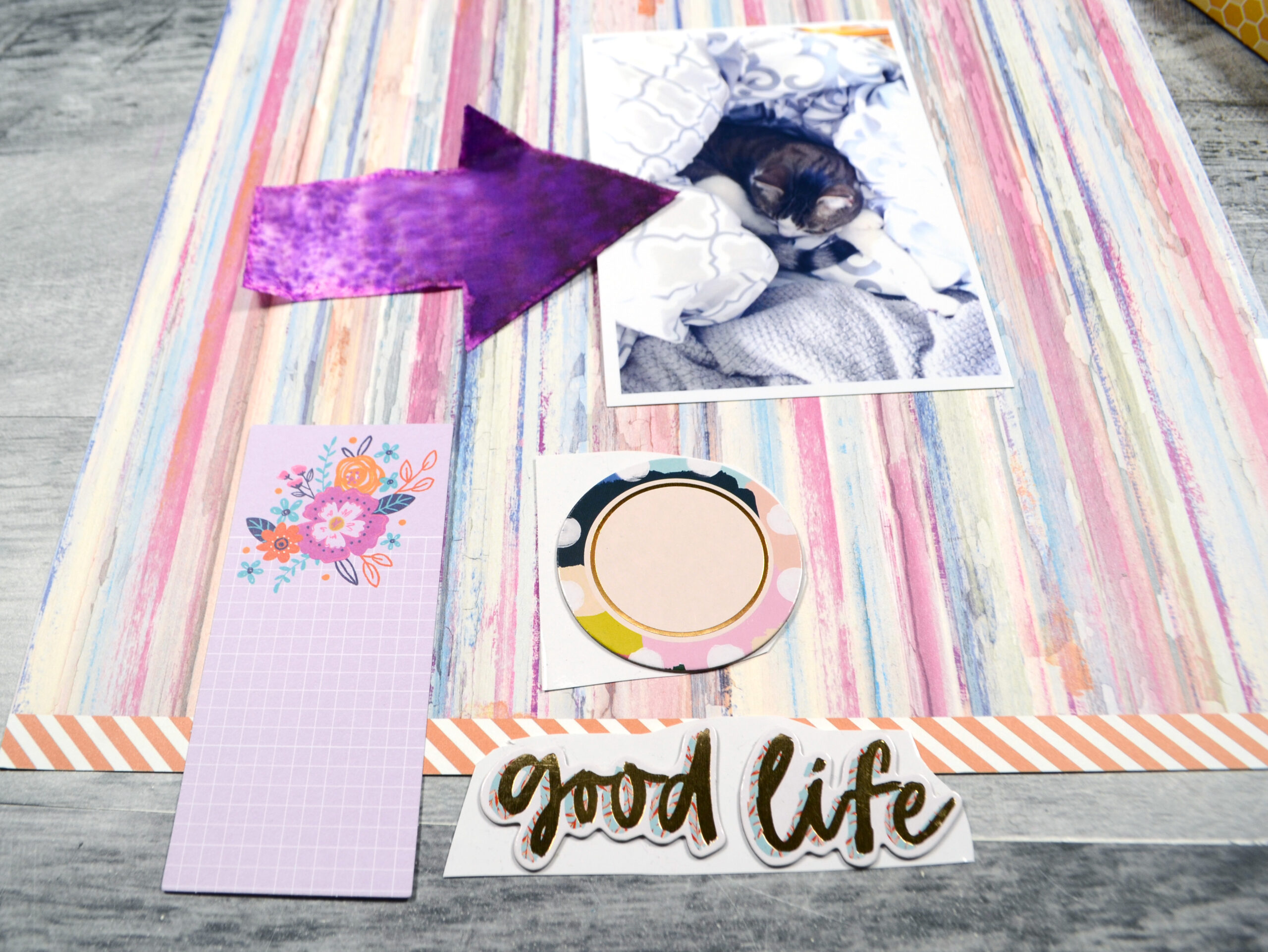
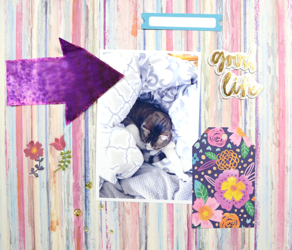
Picture 2:
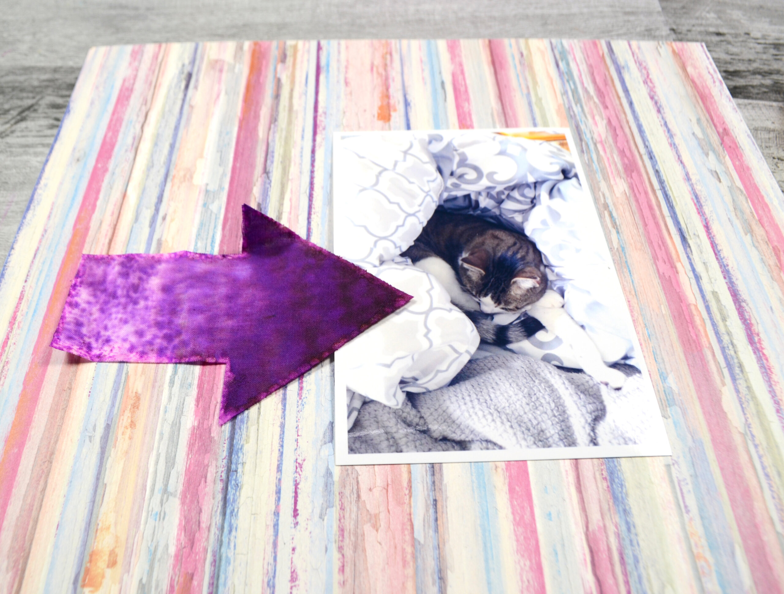
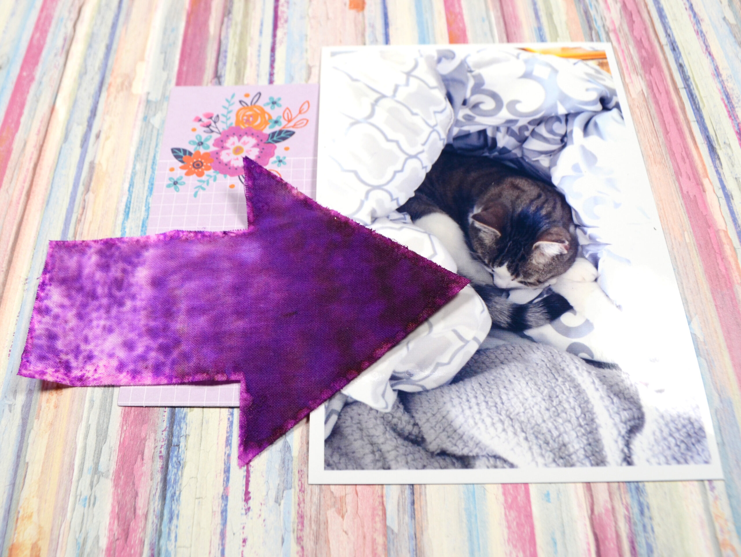
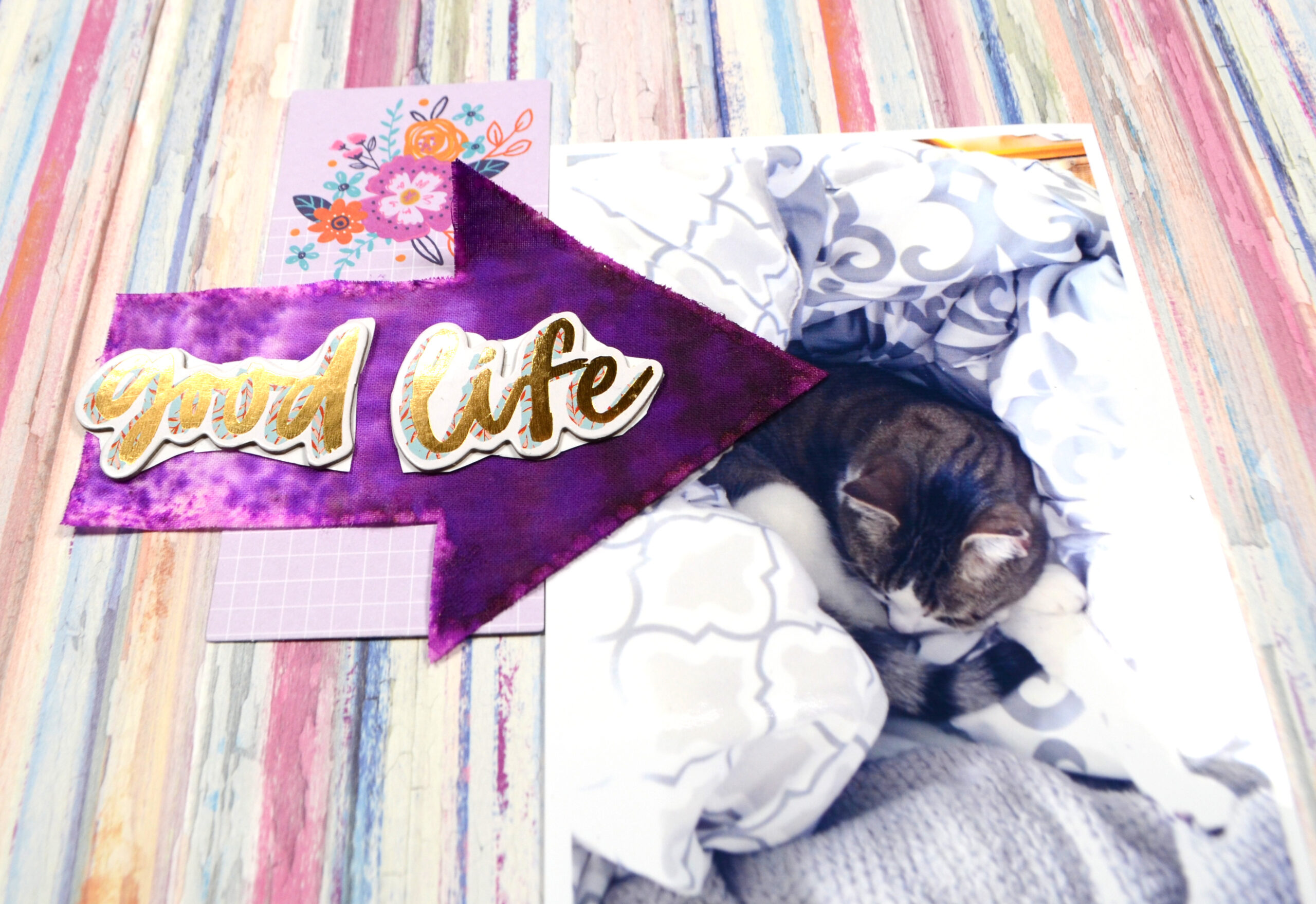
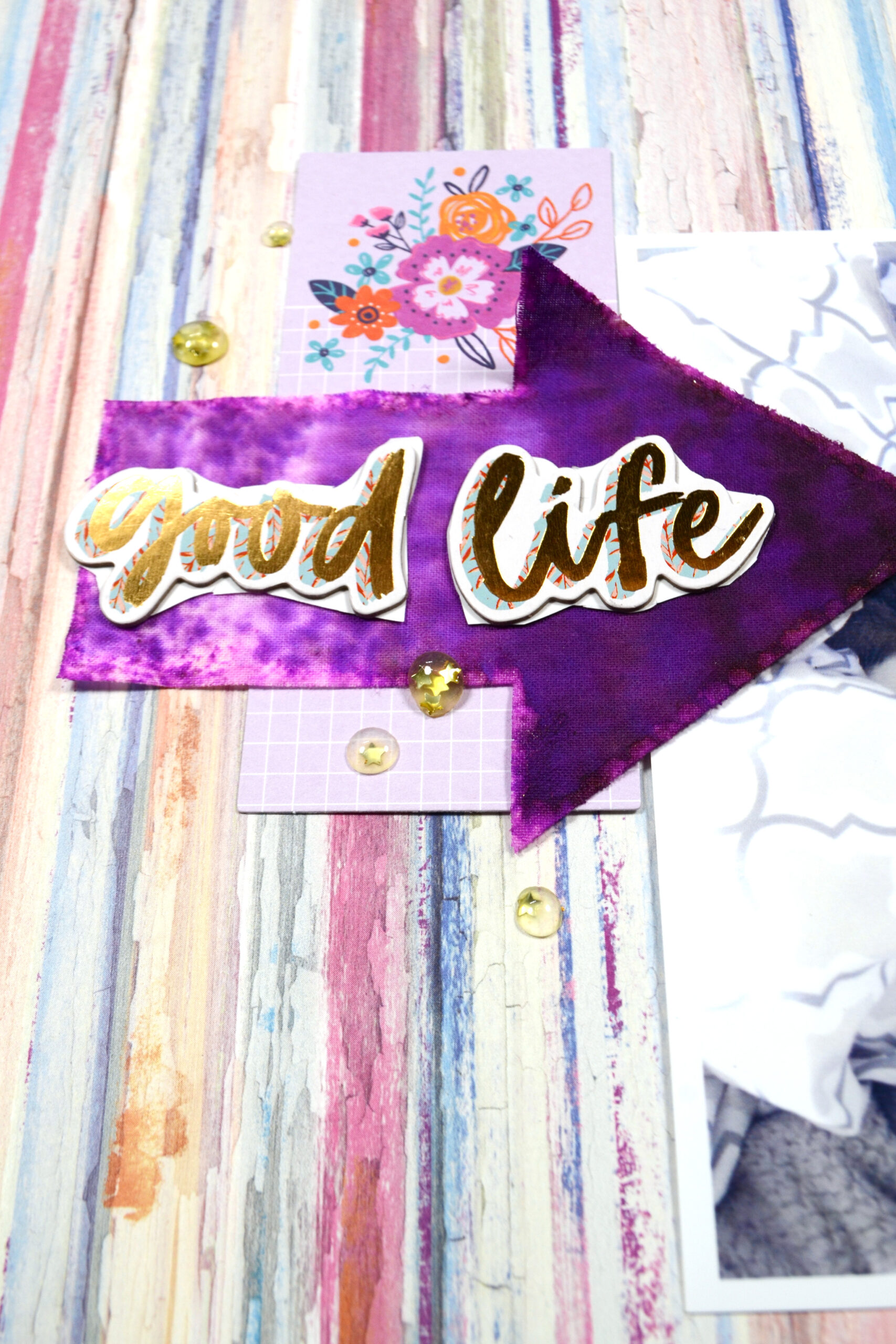
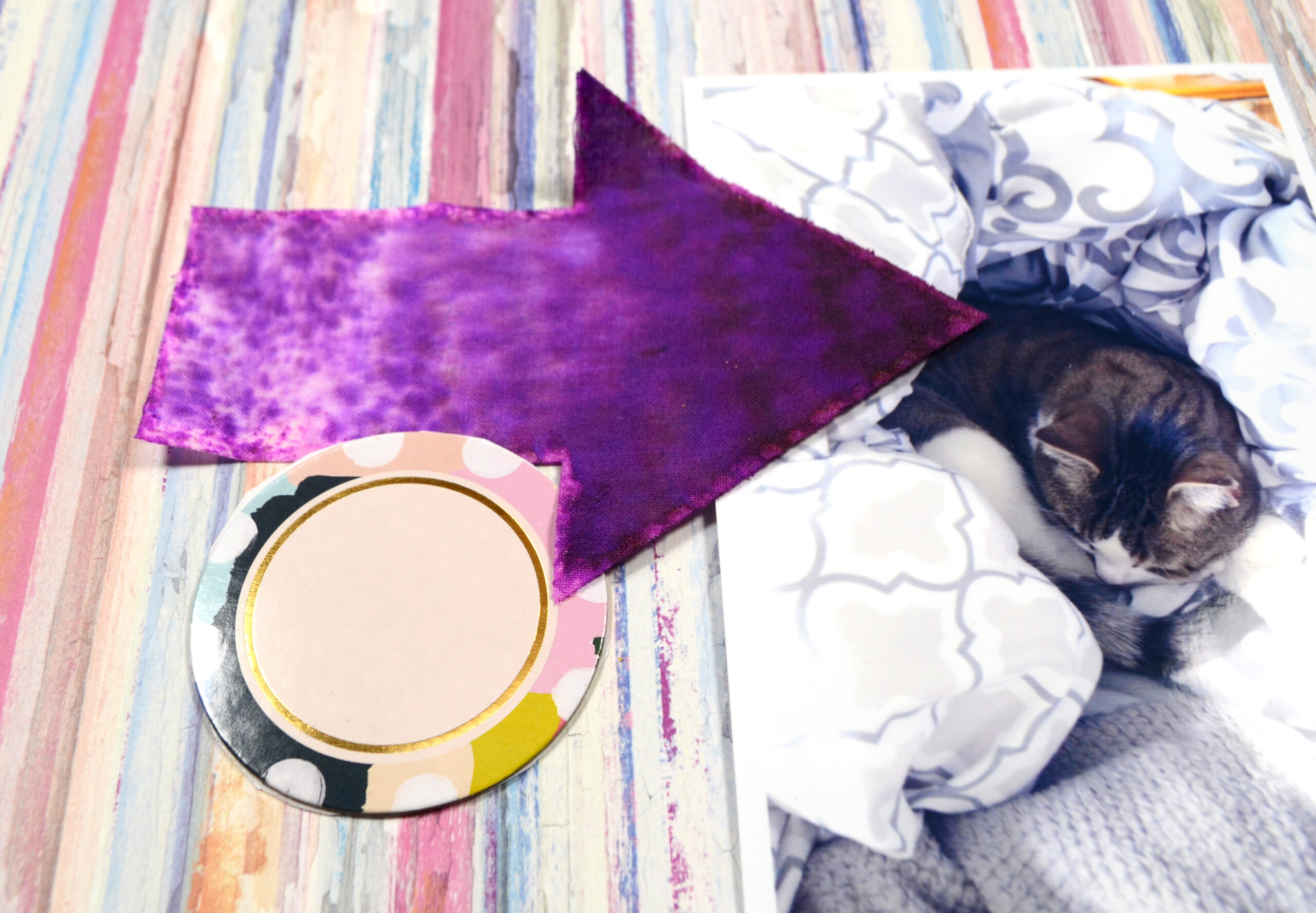
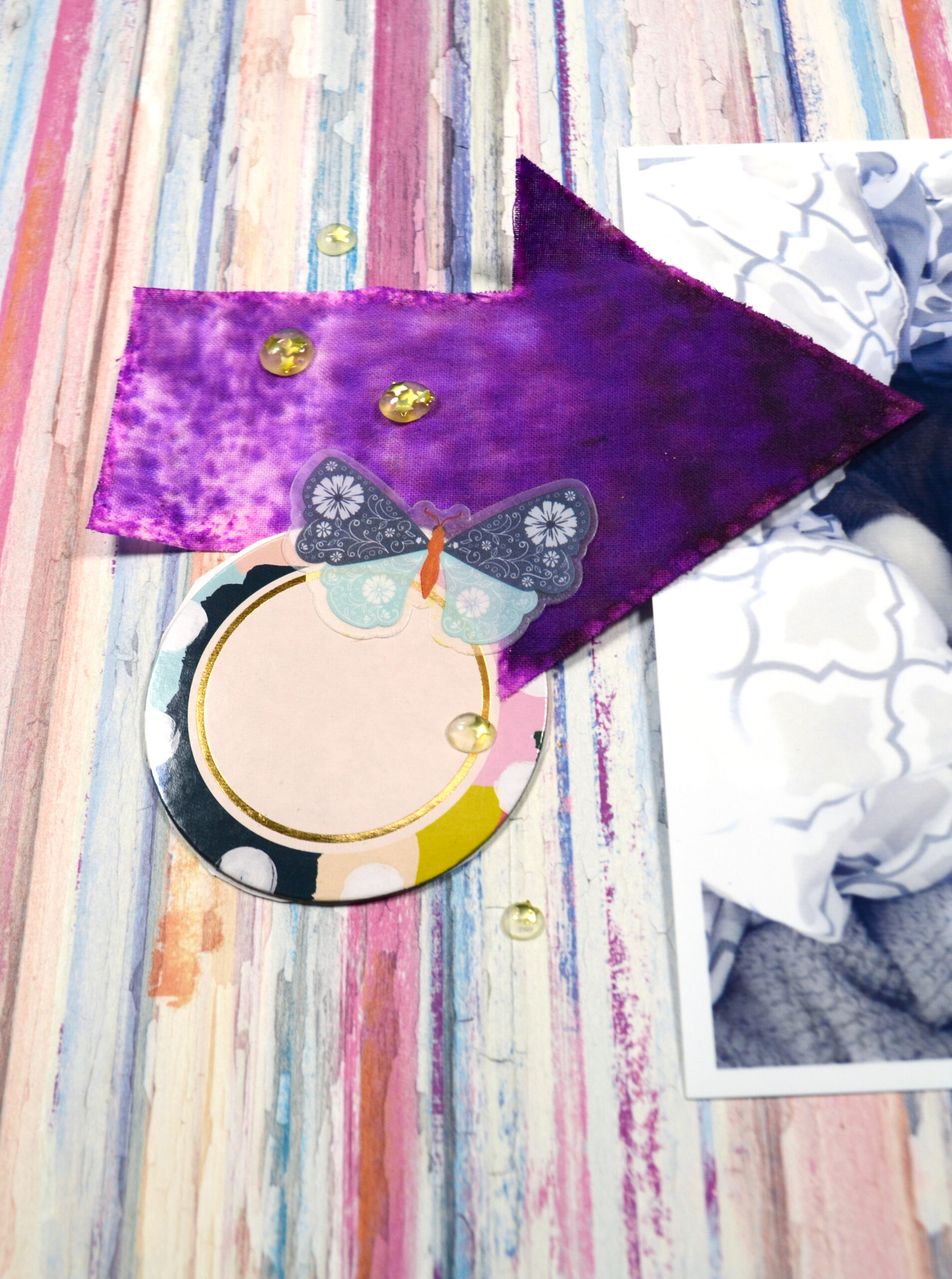
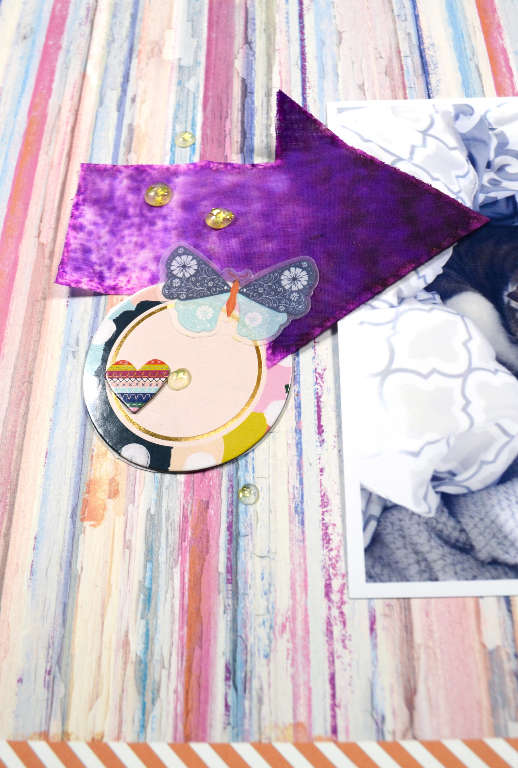
- Item #1: large, arrow, purple, fabric
- Item #2: medium, rectangle, lighter purple, paper
- Item #3: smaller, circle, multicolor with some solid area, chipboard
- Item #4 is my title using some of the same criteria: size = medium, shape = letters, color = gold, material/texture = chipboard
Rule of Proximity
It wouldn’t be called clustering if the embellishments were distributed all across the page. What makes a cluster a cluster is the fact that most elements will touch each other. I am always sure to overlap or underlap elements not only to each other, but to my photos or other elements of my layout.
When overlapping I return to the rule of threes again. I will overlap about one third or two thirds of the largest element with the next layer. I continue this principle on down to my last element. The more elements you have in a cluster, the less likely you can make every single one layer up exactly at a third mark. This is just a general guide on how to start the cluster. My first three main elements almost always follow this pattern and then I diverge from there.
Once you have at least three elements that are connected together you can add in some scattering elements as well. This can expand the overall size of the cluster and help lead the eye to other page areas. Scattering elements are best on the smallest scale of items in your cluster. I usually use enamel dots, sequins or even ink splatters for scattering elements.
Let’s use some of the items that we have chosen to actually build a cluster. Note how things are over or underlapped in ways that divide elements into thirds. The journaling card has about a third of it peeking below the arrow and about two thirds showing above. The title lies in about the middle third of the arrow. The final touch to this cluster is that scattering of enamel dots.
Here is another example. I want to note two things here. First, the edge of the arrow is underlapping the circle AND the head of the arrow is overlapping the circle. This adds more dimension and depth with the rule of proximity. Second, do you notice the gap between the circle and the arrow head in that middle photo? I use my butterfly (small element) to cover this gap. Odd gaps can be a pitfall of clustering so be on the lookout for them!
Now you’ll notice that I didn’t overlap these items using the thirds rule. However, take a look at how the scattering of enamels cut across the arrow element. The arrow has been visually divided by the line the eye flows along the path of the sprinkles. And that division is at about the 1/3 mark.
Let’s take one last look at a simple clustering example before we move on. Can you see all the rules coming together?
One final thought on sprinkles and proximity. When I place my sprinkles I will often overlap edges of elements to keep the proximity intact before I allow some to flow free. Can you see how that is working in this example? You can click on the final image to enlarge it if you are having a hard time seeing all those enamel dots.
Keep It Going
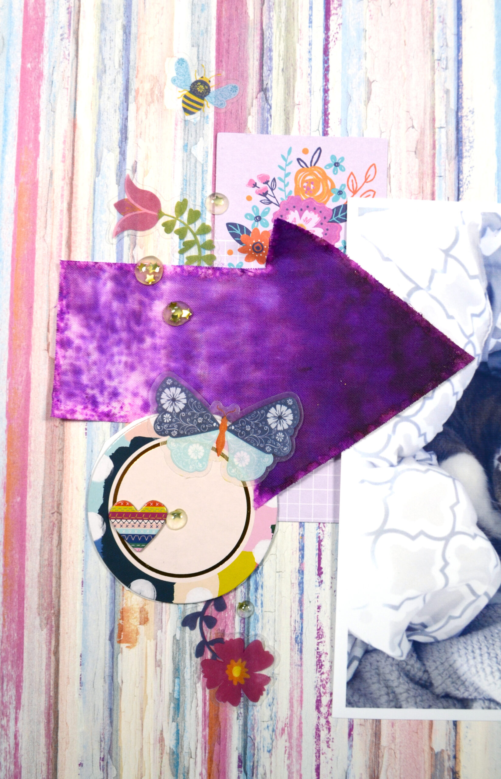
I’ve expanded the size of this cluster with more elements. I placed another chipboard heart onto the circle. Notice the color difference of where I place the heart? Also notice that the heart is touching the gold border on that circle. Those are subtle uses of contrast and proximity.
To keep it going, I brought that light purple rectangle back. I’ve also added more curves with the arching flowers. They extend the line of the enamel dots a bit more. The bee is slightly detached from the whole cluster, but not so much so that it seems like an independent element.
I hope I have shared some clustering tips that you’ll find helpful when you go to make your next layout.