
This is a LOAD month meaning I am creating a layout every day in October. That gives me plenty of examples of how I scrapbook; specifically it gives me plenty of example of how I tackle multi-photo layouts.

In looking over my projects from just the past 25 days I have come up with quite a few examples of how I put more than one photo to use on my layouts. As I was examining my own process, I quickly came up with an acronym for my “system”. (If you come up with a better acronym, please let me know since my brain wasn’t doing a good job at creating something catchy.)
So, here it is. CROG. Yep, CROG. That stands for Cluster, Reduce, Overlap and Grids. (See why I need a better acronym??)
When I CROG my layouts I often use more than one of these tips at a time. Let me walk you through some examples so I can share a few expanding thoughts.
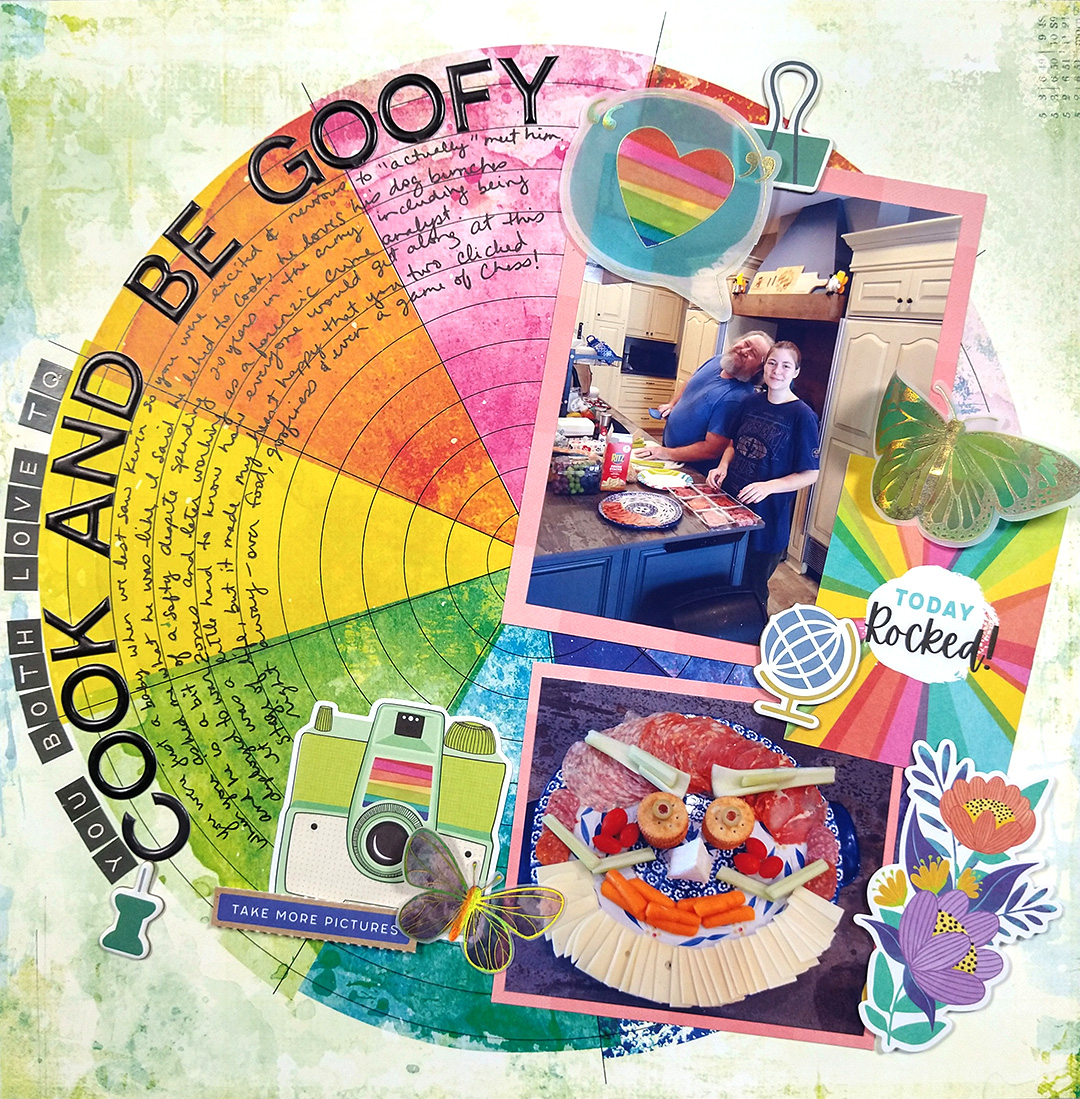
Cluster
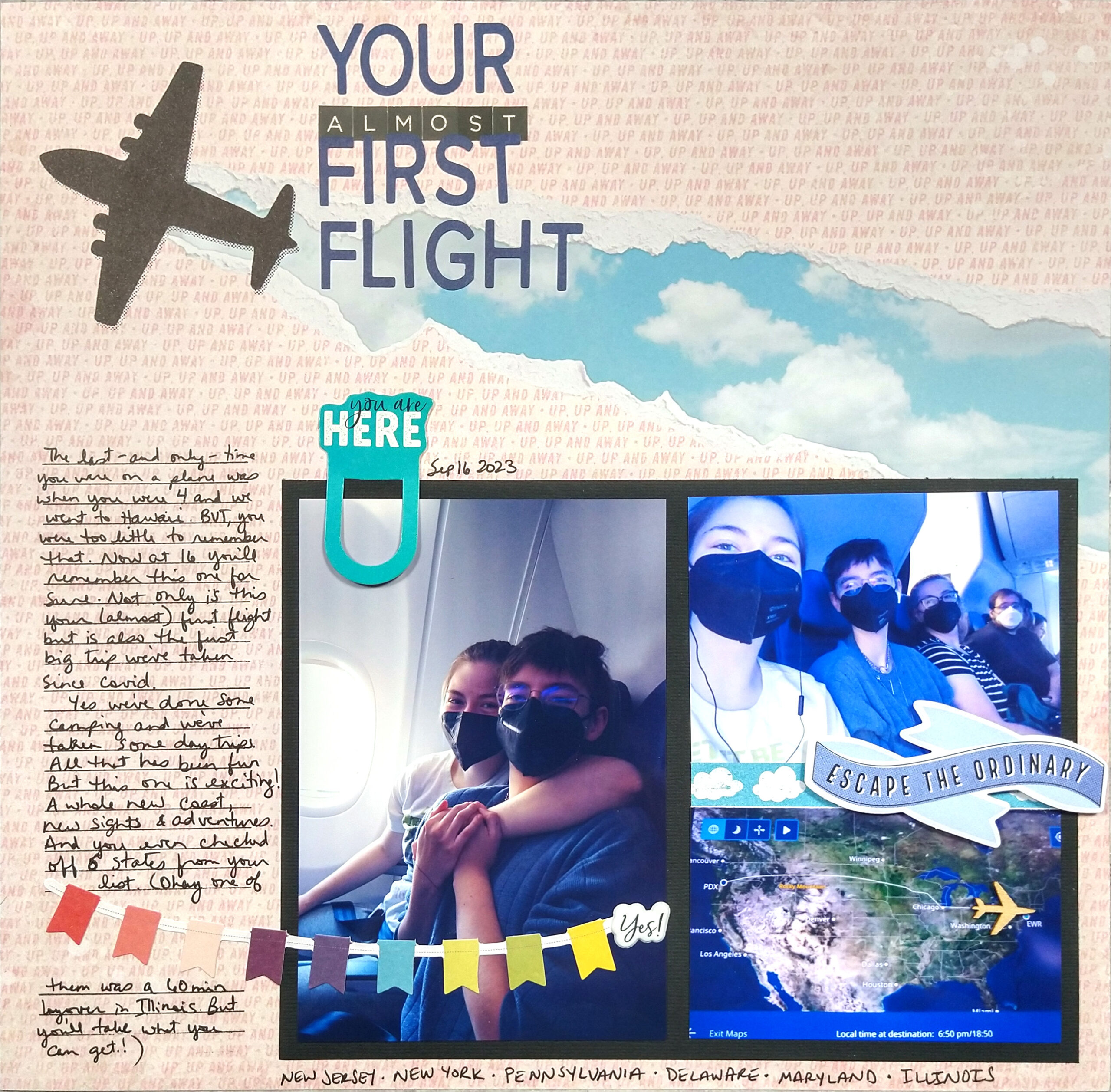
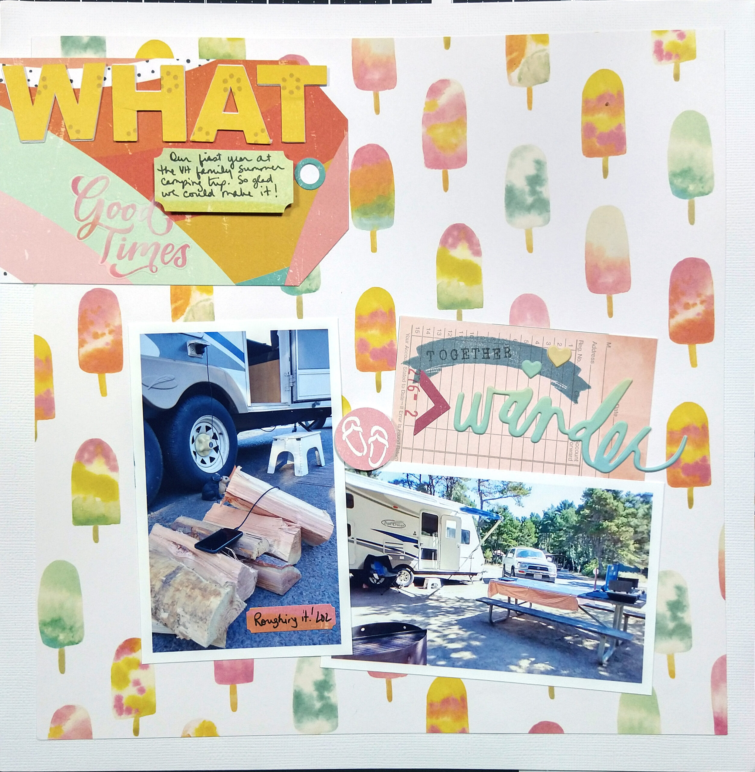
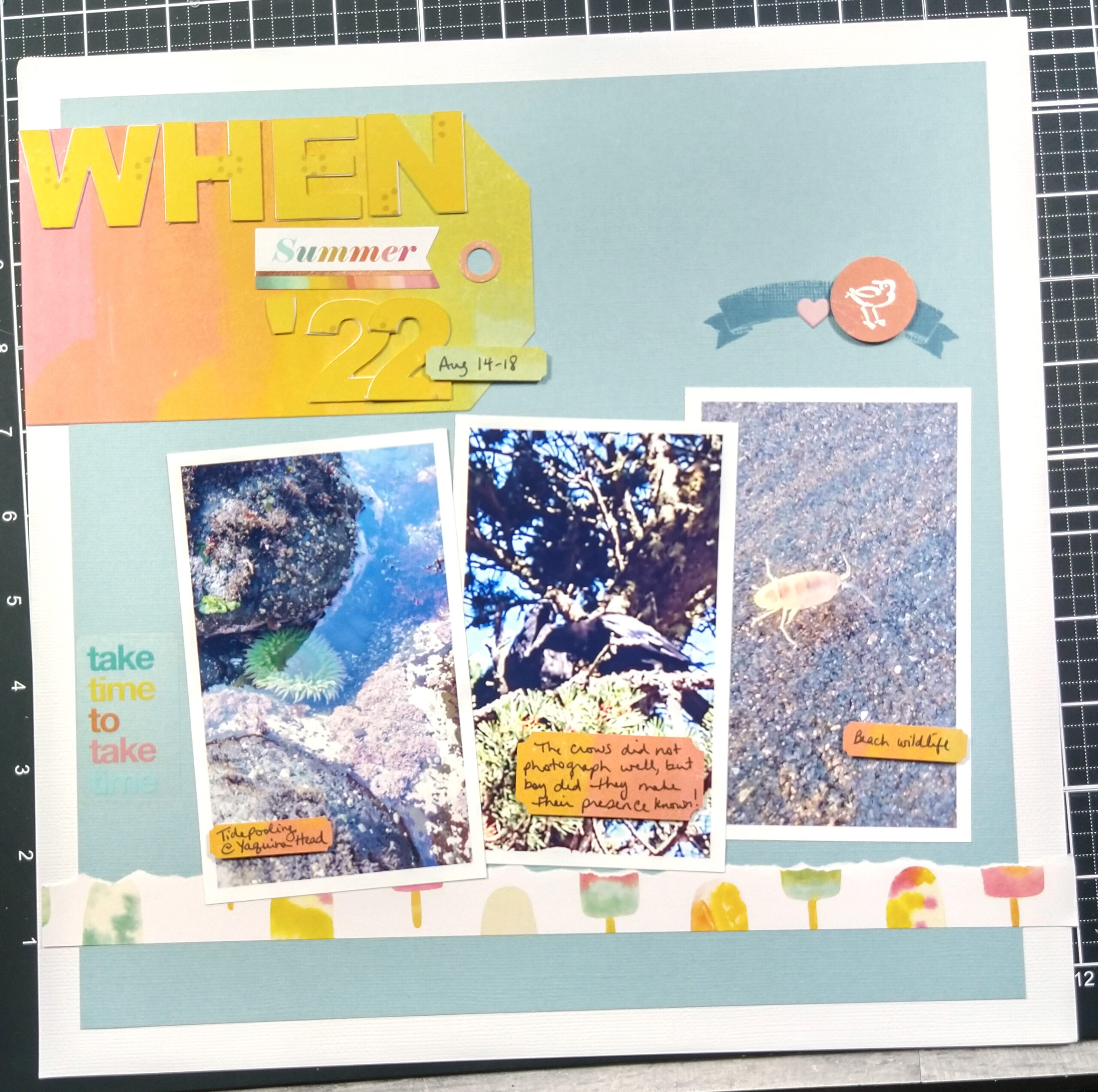
The first thing that I usually do is tuck my photos in next to each other. Now, there are other layouts where I have placed my photos farther apart but those are exceptions to this rule. Placing photos near each other leaves plenty of room on the layout for a title and journaling. So go ahead and nestle those photos together—even on the same photo mat!
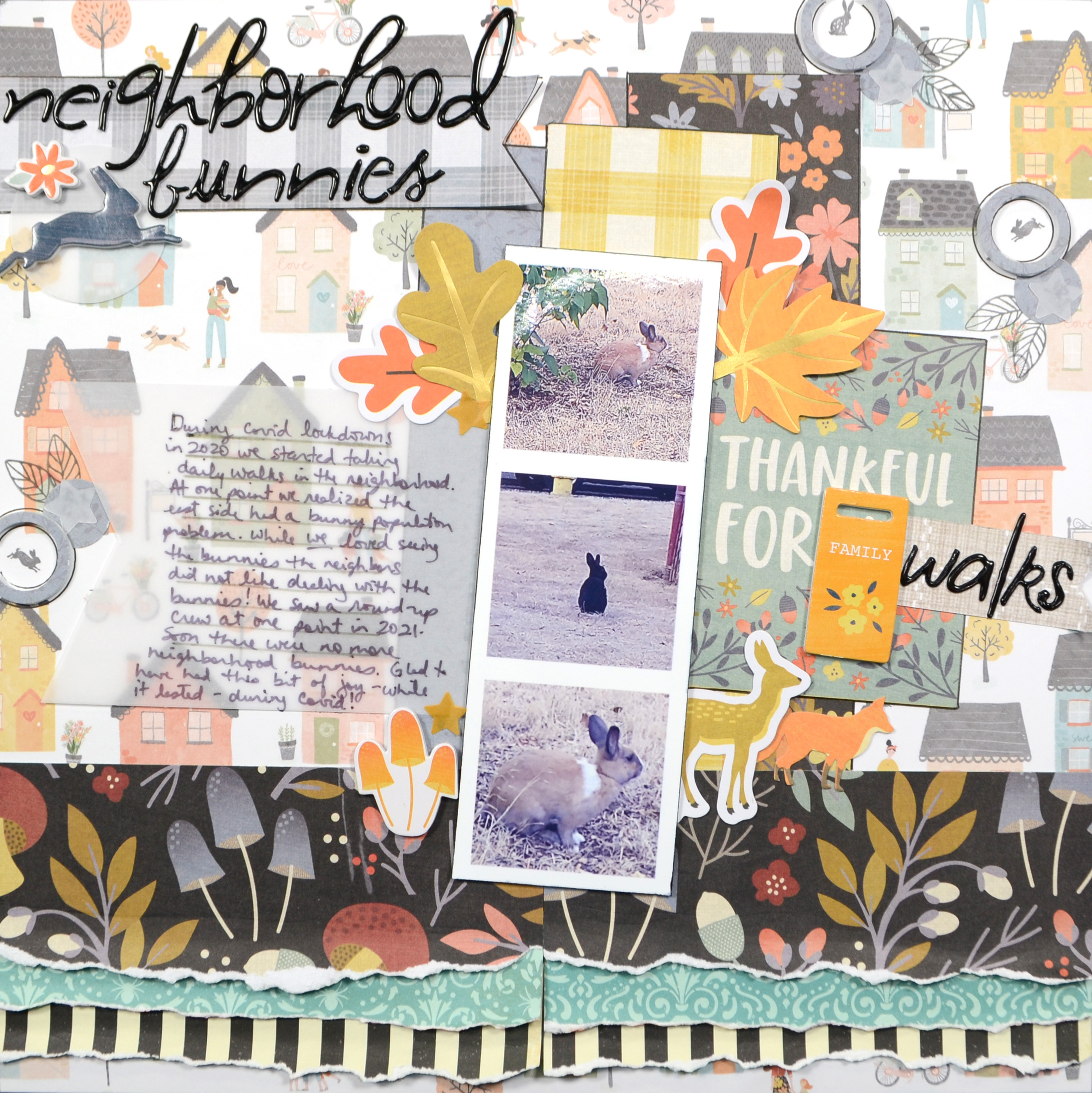
Resize
This has got to be the biggest tip. You can imagine that 10 4×6 photos will never fit on a single page layout, but 10 2×2 photos certainly can! Resizing photos will be a life saver if you need to fit many photos on a single layout.
While I use photo editing software to resize and print my photos at home, there are many apps out there that will let you resize and even collage your photos to save as a new file. Then you can print those photos yourself or send them off to your favorite printer. (The Project LIfe app is the one I use, but there are others out there!)
When you resize your photos you can not only fit more photos, but also still have plenty of room for the other goodies that we enjoy putting on our layouts!
However, you don’t have to digitally resize your photos to get them smaller. In the first two layouts I manually trimmed the photos of all the excess and distracting stuff to really bring the focus of the photos down to where I wanted them to be.
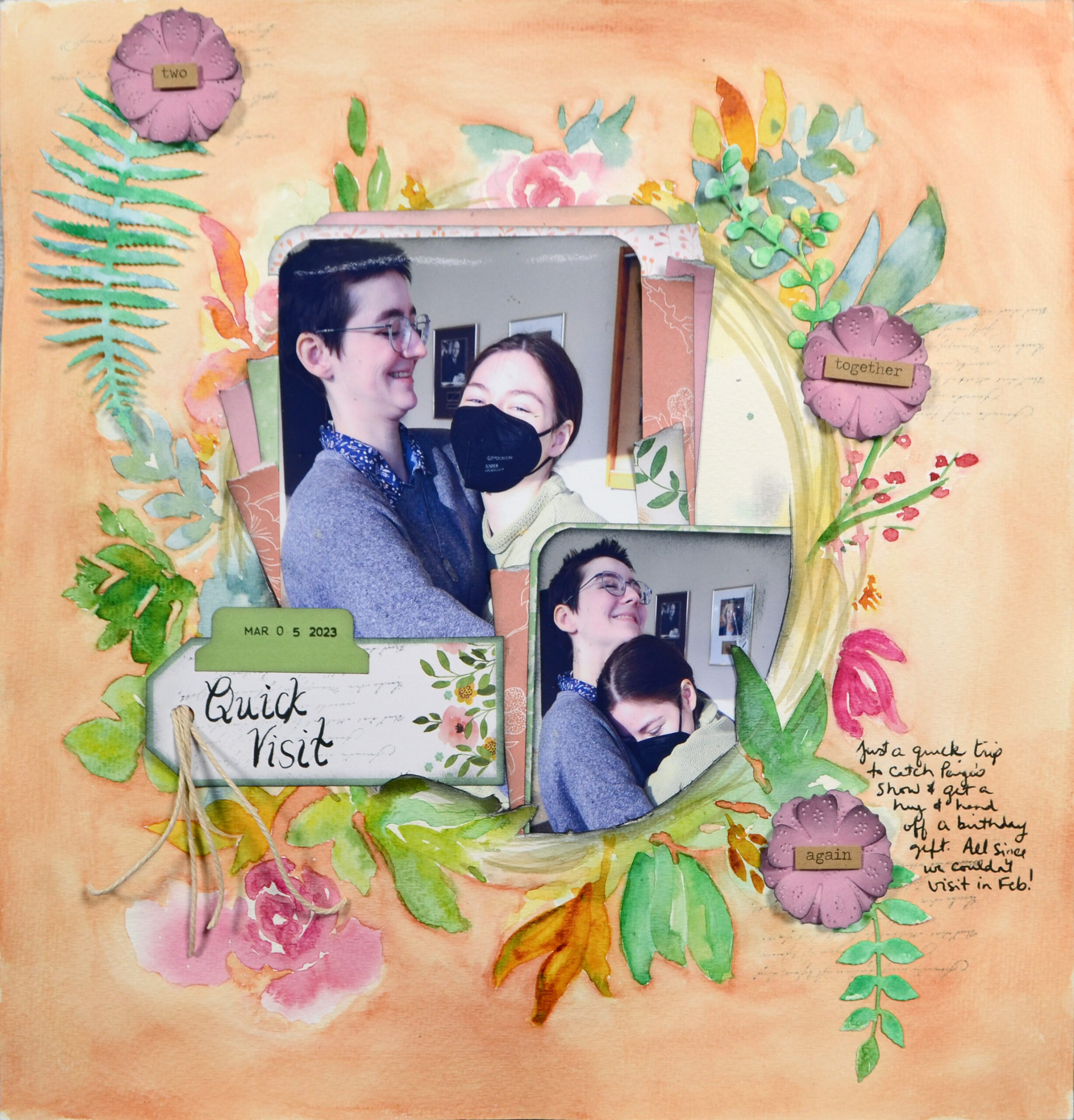
Overlap
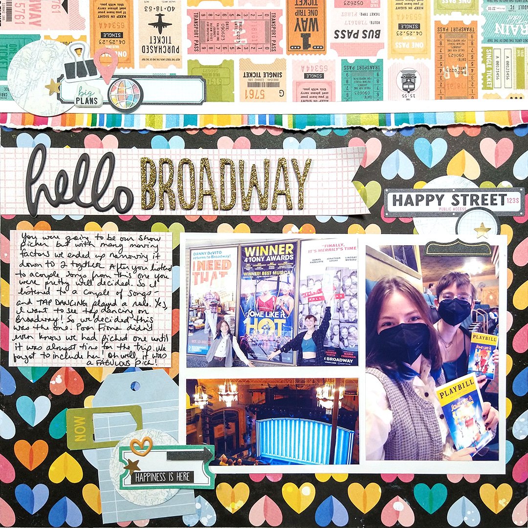
The next tip is to overlap photos. Find the empty space on those pictures and allow another photo to cover that empty space. This can be a bit of a puzzle, but go ahead and give it a try.
Overlapping can accomplish some of the same thing as physically/digitally cropping your photos. Yet it adds a different mood to your layout. It becomes more of a collage and less of a grid. This just may be the different feel you need for that specific story,
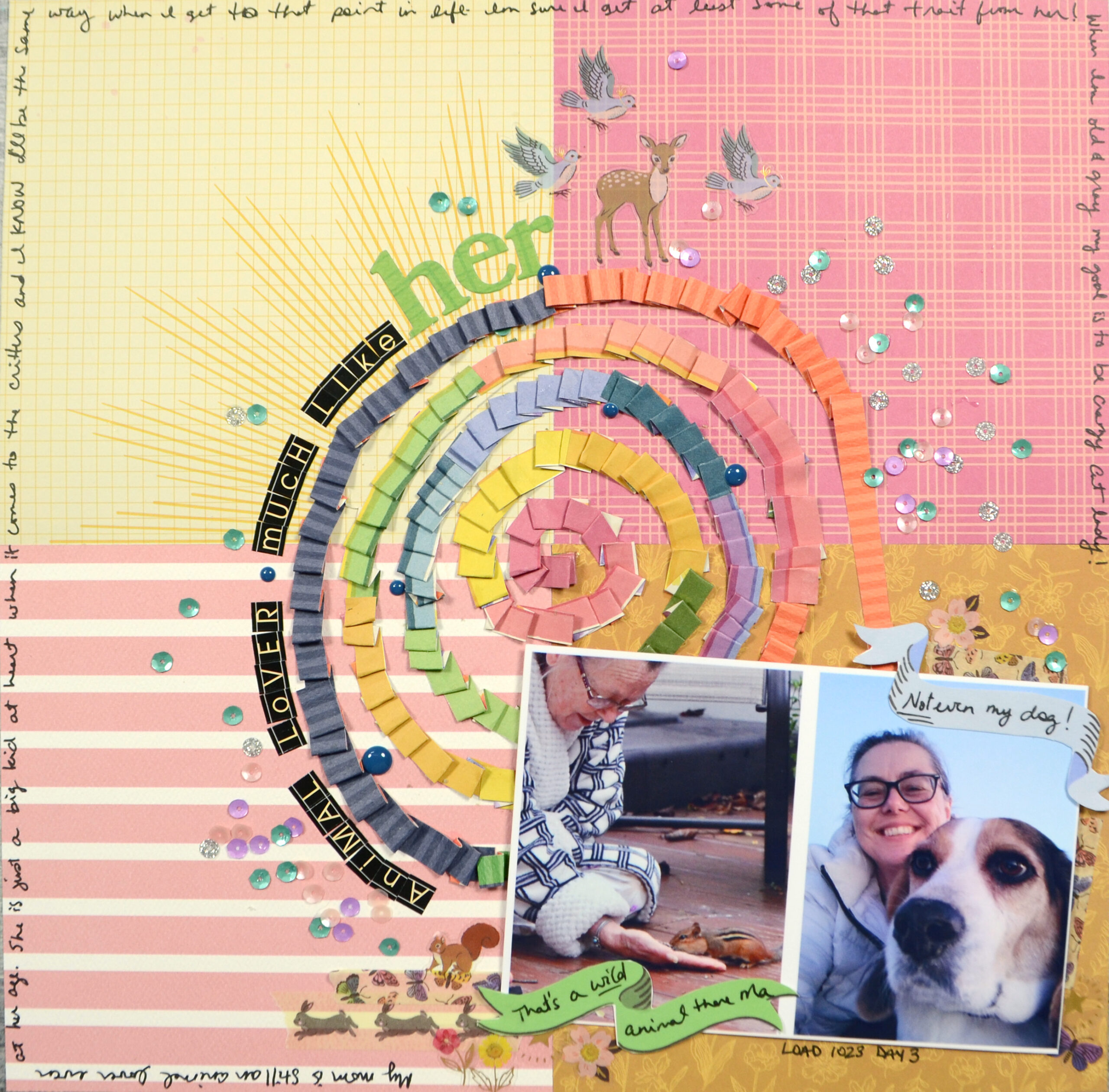
In the examples below the first layout’s overlapping photos lend a sense of coziness and connection to the story of my kids hugging. In the next two the tilted overlapping style adds a sense of playfulness. Same technique but two different moods.
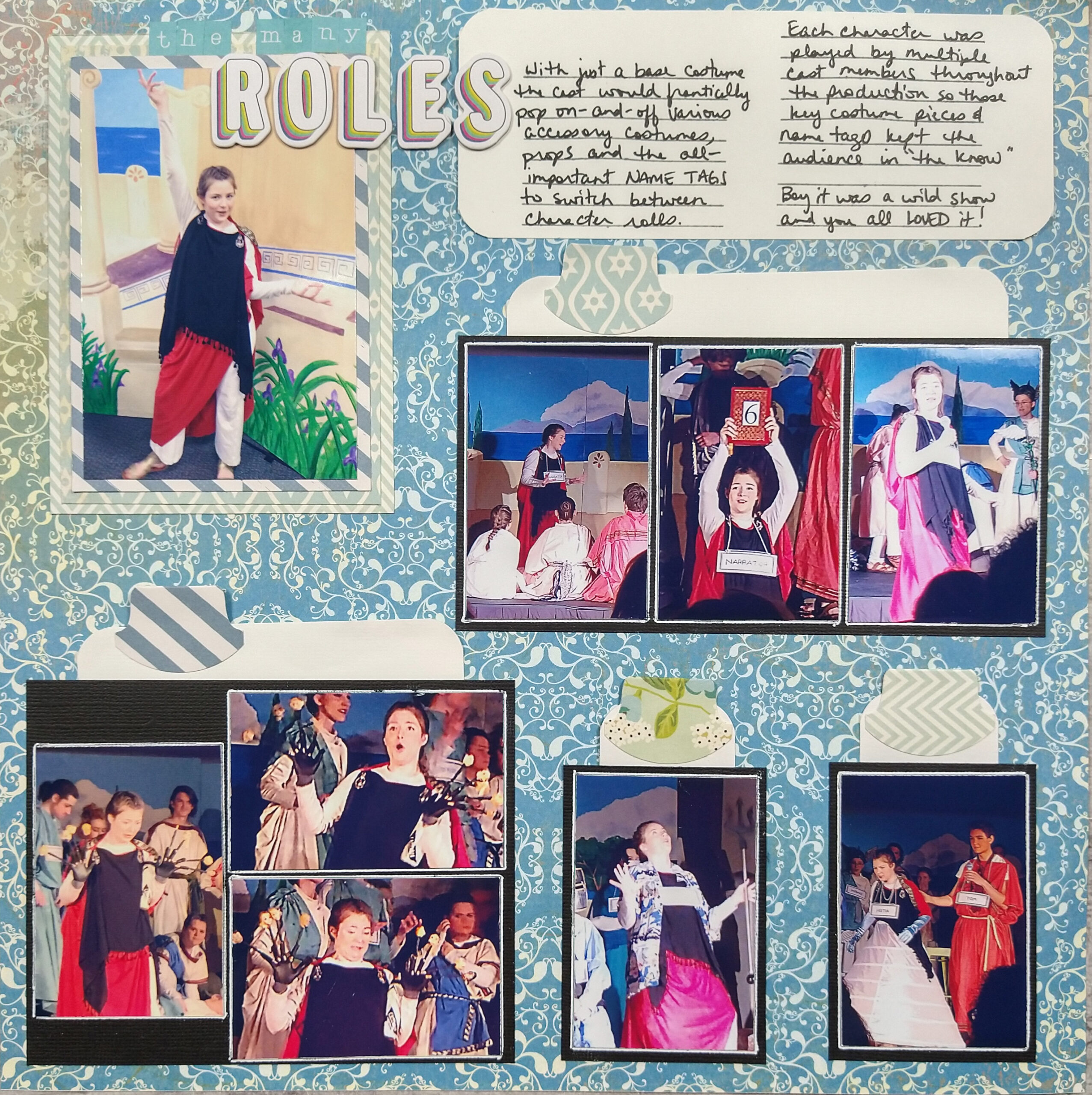
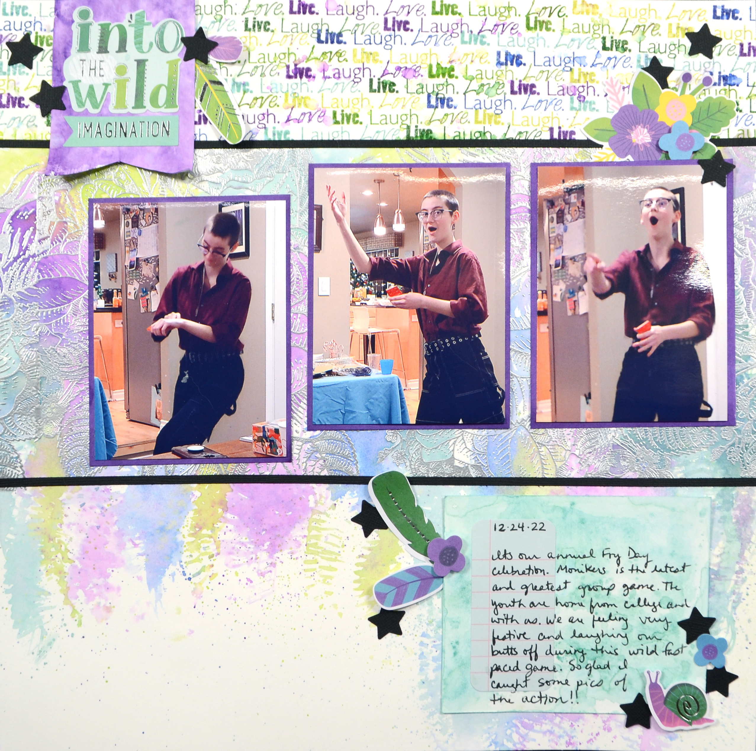
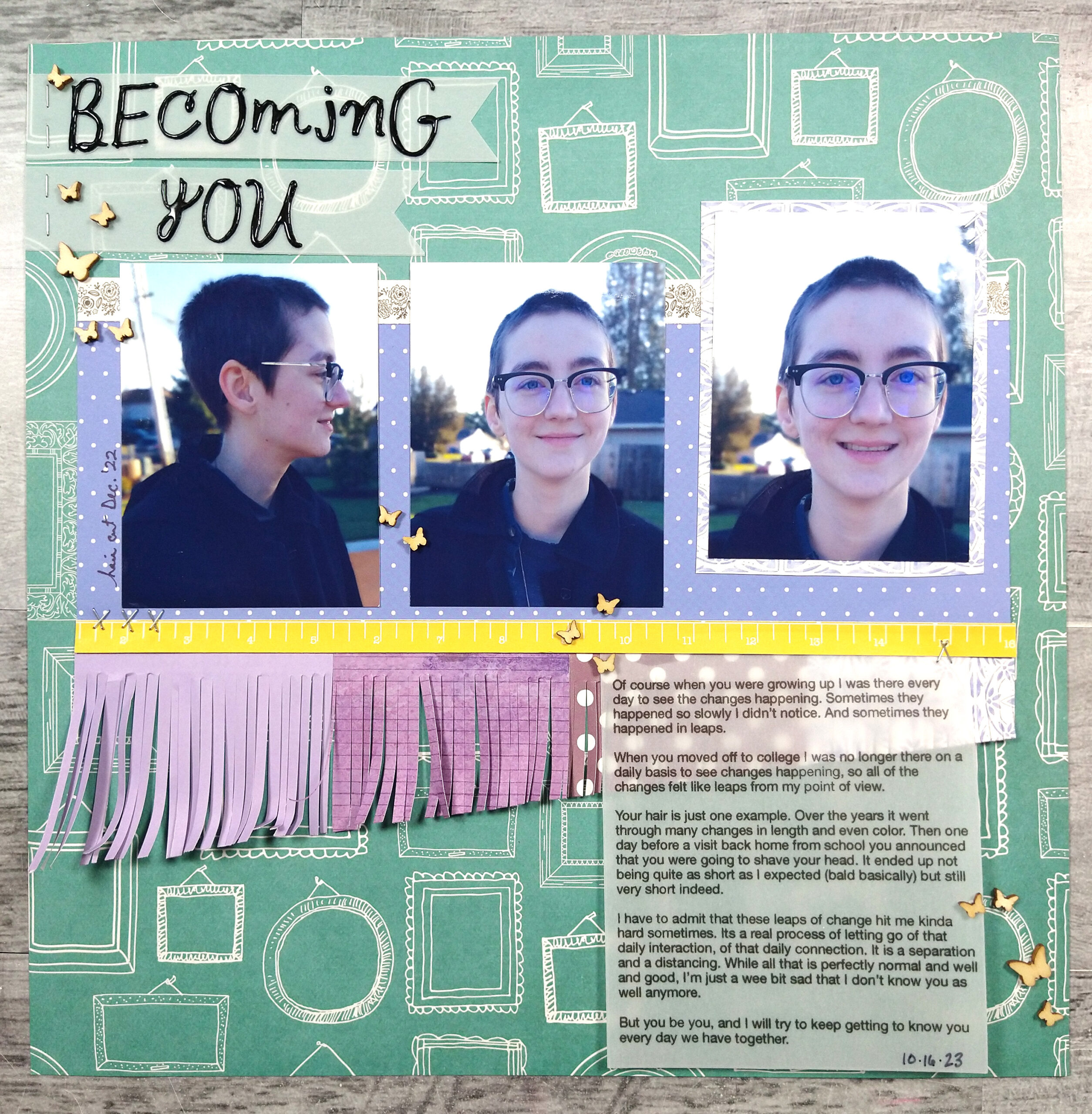
Grids
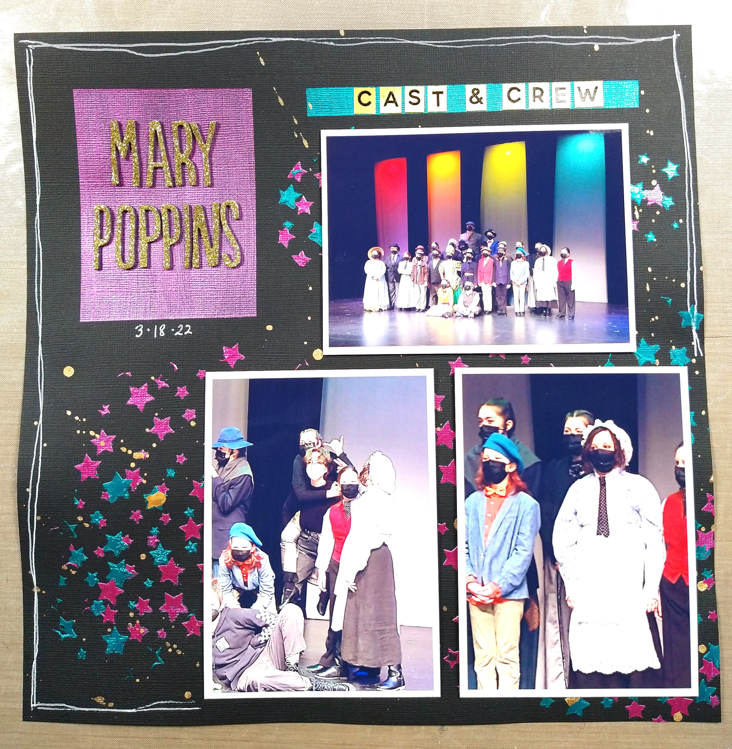
Placing multiple photos onto a grid is a very classic way to tackle many photos. It helps to keep them organized and individualized.
Nikki this month shared a great post on how she used a grid—and grids within grids!—to document a year of life at a time. Be sure to catch her post! In addition the blog team lead an entire month of grid inspiration. Find those posts by Nikki, Alison and myself.
With grids well covered, I will just say this: most of my layouts contain a grid of some sort— whether it be a row of photos or a block of photos. Grids are just classic and easy on the eye.
I challenge you to take a look at your multi-photo layouts and see what tricks you use often to tackle getting more photos in less space! I’d love to know what you discover! Drop me a comment below.