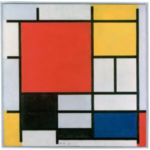
Whenever I hear the term color blocking, I immediately recall Piet Mondrian’s contemporary abstract works of art from the 1920s. I imagine the grid he created with crossing horizontal and vertical black lines. The squares or rectangles within the grid were then filled with the primary colors of red, yellow or blue or sometimes black. In Art History class (back in the 90s), we also learned that in the 1960s, Yves Saint Laurent, a fashion designer, reinterpreted Mondrian’s color blocking for the runway. This artistic trend has continued to be popular throughout the years in many forms of design. Scrapbooking is no exception.
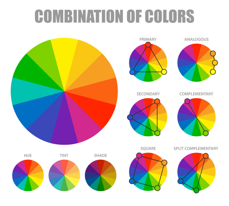
To put it in simplest terms, color blocking can be described as clean lines and sections filled with 2-3 bold colors. Looking at a color wheel helps to make those choices. Primary, complementary and analgous combinations create the most impact.
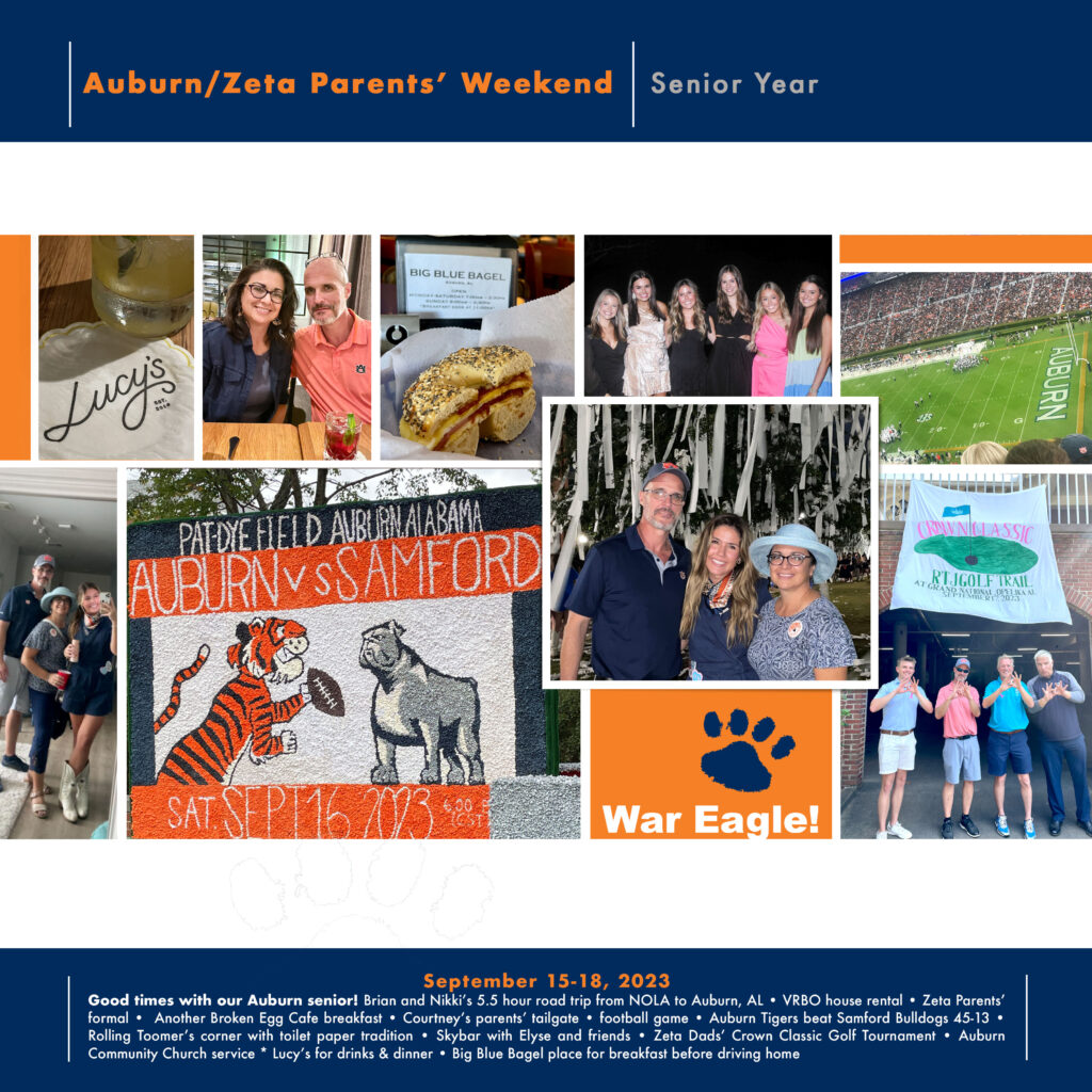
Since color is a big part of this month’s topic, I could not help but think of the blue and orange (complementary) colors of Auburn University, where our daughter attends. So, our recent visit there for Parent Weekend was the perfect story to tell. In honor of Mondrian’s original work, I wanted to maintain a graphic style with a digital layout, but also do something a little different with the grid. I found the ideal expression in a digital template by LYNN GRIEVESON DESIGNS at https://the-lilypad.com/store/Sharpshooter-Album-Templates.html. I really liked how the lines of the grid are white instead of the traditional black and the header and footer were separate from the central color blocked grid.

I wonder what unique color combinations you will use on your next color blocking layout? Did you read Misty’s clever “CROG” process for using multiple photos on her layouts? Check it out for sure! Then come back to the blog and find more ways to be inspired by color blocking later this month.


