One of the perks of ScrapHappy Membership is having access to a private message board and fun challenges. Alice and our in-house instructor, Sara Scraps, have been bringing us a series of Unexpected Inspiration Challenges all year. You will have seen Misti and Nikki tackle them on the blog and Misti already posted her response to the latest challenge here.
So what is the latest challenge? To be inspired by Wedding Cakes.
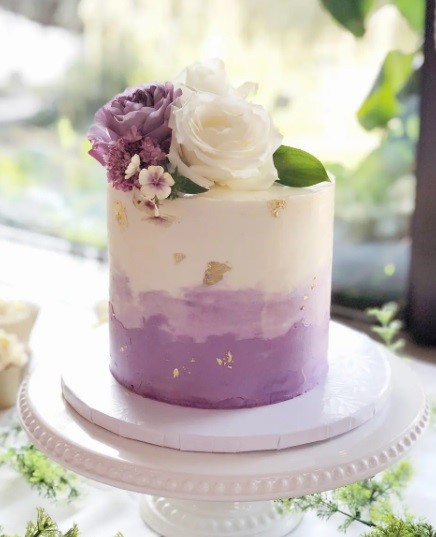
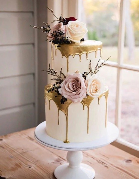
What image(s) came to mind when you just read that? For me, I think of the icing, the decorations – usually a whole lot of flowers, and the fun textures that are added. When I went looking for inspiration images, here are the two that spoke loudest to me.
I loved the ombre icing on the first cake and the gold drips on the second so I set out to recreate both using pastes and paint and whatever else I could find in my stash. I filmed the whole process for you so take a look.
This layout took me DAYS! Mostly because of the drying time for the pastes, but also because … well, it’s summer and my windows are open and every time I went to film the kids next door decided to run up and down between our houses yelling. Sigh. If I’d known that I’d end up doing a voice over for the majority of the video I would have gone ahead, but … live and learn.

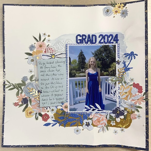
Here is the finished layout, and as I say in the video, it is so warped that I can’t get a proper, square photo of it. I’m sure that once it’s in my album it will flatten out a bit more but honestly, this is just one of those highly textured layouts and I’m okay with that.
I did end up covering up most of my gorgeous “icing” and gold drips but that’s just the way it is with mixed media. You have to be prepared to do a whole lot of work that isn’t going to be seen.

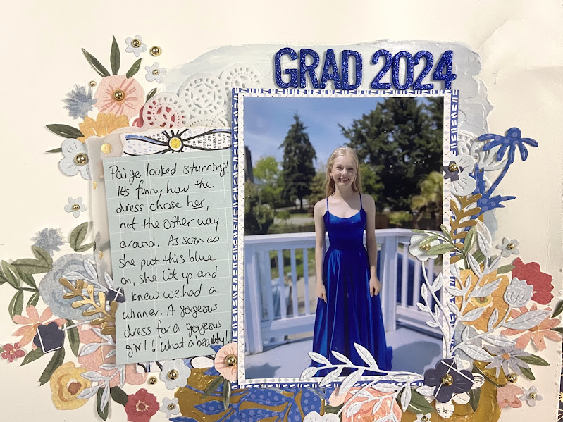
This photo gives you a better idea of how much texture and body that gold has. That is the Hero Pearls in Gold. I’ve tried to use it like I would Nuvo Drops on cards, but I find it doesn’t create the same hard, round, shiny drop that Nuvo does. But this I love! I will use it like this from now on.

I moved my accent papers around a lot before finding an arrangement that made me happy. In all that moving, I placed the journaling card on top of the two scraps I’d put beside the photo. Turns out I loved it there and that’s where it ended up.
Two lessons here: don’t be afraid to move and alter an arrangement you initially thought would work in your mind. And two, this journaling card is upside down as I didn’t want the text that was printed down one side. You would never know unless I told you! I know I can get a bit stuck in my own mind and think I must use items as they have been intended. Not true!

I talked in the video about formal vs informal when it came to matting my photo. If this were a casual snap, I would probably have used slightly crooked mats behind the photo to accentuate its informality. In this case, my subject matter is dressed in clearly a formal way so I wanted to strengthen that by keeping my mats both straight to the photo, and with even margins all around.
Angles add energy, fun and informality. Keeping things perpendicular and even, are more stiff and therefore formal. Hope that helps you decide how best to mat your photos on your next layout.
Thank you for reading this post on Wedding Cake inspiration. If you create something based on a wedding cake, please let us know about it. And if you are a ScrapHappy Member, don’t forget to add your entry to the Circle space and be entered to win a prize!
Until next time, Happy Scrapping!


