
It is all about seasons here on the ScrapHappy blog, and I want to focus on how we use color in our ways of thinking about seasons. If I were to ask you what colors “go with” Halloween, you’d likely say orange and black. If I asked about Christmas, I’d hear green and red most of the time. Color palettes play a big roll in our seasonal lives and celebrations. Part of that certainly comes from actual seasonal changes: tree leaves turn orange and red and golden yellow in the autumn leading to an obvious color connection. In fact blog team member Nikki put this seasonal color change to amazing use on her alcohol inked layout. You must check it out!
While nature plays a big role in seasonal colors, the other connections come from culture, traditions and personal preferences. These are the “rules” we make up about color. For instance in much of Western culture black is used for mourning, yet is parts of Asia, white is the mourning color and in South Africa (for some) red has taken on the same meaning based on this history of apartheid. This goes to show that color can be variable, depending on who we are, where we live and the traditions we hold. That means since we made up the rules, then we can change the rules when it come to color!
Don’t get me wrong, I like traditions, but sometimes those color palettes are not for me. I’ve never been a big fan of orange or black, or for that matter red and green—especially in combination. So today I want to share some ways of mixing up those colors palettes and breaking out of the box of tradition just a bit.
Adjust shade and tint
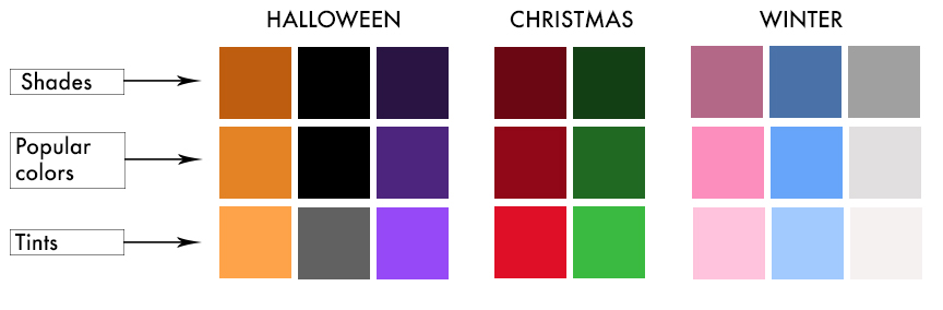
When we talk about colors, the words shade and tint have very specific meanings. A shade is a color that has been darkened by adding black. A tint is a color that has been lightened by adding white. We all know that light blue is a lighter shade of blue, but we don’t always give these shades and tints their own unique names. The most classic case of us giving a name to a color that is really a tint is in the case of pink. If you squirt red paint onto a palette and then mix in white paint, you end up with pink. Pink is really just light red my friends! Want another mind blowing shade color with its own name? Brown is just a very dark orange! We’ll talk more about brown later, but for now just know that these examples we can show that color is both a scientific and a cultural construct!
Okay, now that we have grasped the idea of shades and tints, let’s use those ideas to shift some traditional color palettes! In the graphic below I’ve got a row of more traditional color tones in the middle, bracketed by the shades above and the tints below. How do these color changes make you feel? Do some feel classic? Or fresh? Or even “off”?
Think about complementary colors
If we look at the color wheel (below) notice that we have our three primary colors stepped out. When you follow your eye to where that color wedge is pointing—directly opposite—on the color wheel, that color is called a complimentary color. Complimentary colors paired together tend to have more oomph to them since the “difference” between the two colors if quite large. This is another way we can shift seasonal colors.
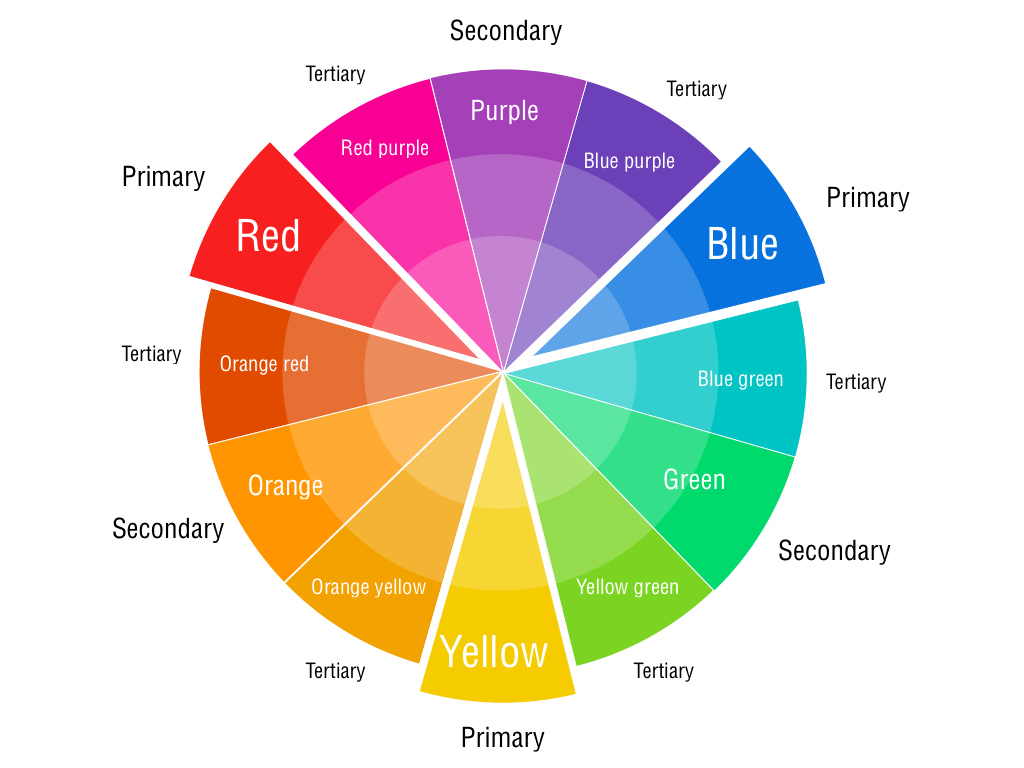
Complementary colors open up other options, but notice that the red and green of Christmas are already complimentary! So a tactic here is to keep one color as is and choose the “split complimentary” colors instead. For example if we keep our traditional green then we look to red as it’s compliment. Red’s “split compliments” would be the colors on either side of “true” red, so a red-orange on one side and a red-purple on the other side. In the color chart below I’ve kept red and used the split compliments of green (option 1). I’ve kept the green and used the split compliments of red (option 2). As a final option I ditched true red and green altogether and just chose some of the split compliments to pair up (yellow-green, blue-green and purple-red, see option 3).
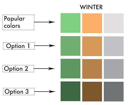
Now see how the use of complementary colors affects the color choices for Halloween and Winter.
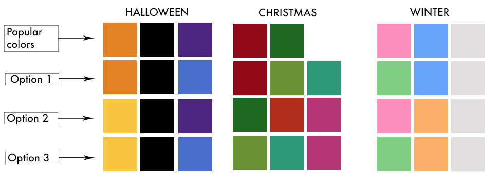
Yes, things start feeling a little sideways when we look at all complimentary colors (option 3) to the winter palette. Sometimes the traditional colors really do work well and that is part of how they became a tradition to begin with! However, let’s take this color shift just one more step. If we take option 3 and then also find the shades of those colors we will end up with a deep green, a rich brown and a dark gray. I think that could certainly work for a nice winter layout. Reminds me very much of a brisk evergreen forest on a cold stormy day!
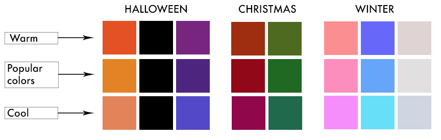
Use "warmer" or "cooler" tones
- A cool green will have more blue, but a warm green will have more yellow.
- Conversely, a warm orange will have more red, but a cool orange will have more yellow.
- In these terms, yellow is acting both as a cooling addition and as a warming addition depending on where you start on the color wheel.
- It all comes down to which way around the wheel you move in determining a warming or cooling effect
In the next chart I created warmer (top row) or cooler (bottom row) versions of our seasonal colors (middle row) to show how they can shift. So how to you feel about those color choices?
Put it to use!
Okay, now that we have covered some ways to shift colors, let’s take a look at this chart where I combined multiple ways to come up with a grid of color options for the fall season.
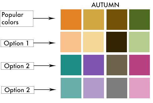
Option 1: These are mostly lighter versions (tints) of our original palette. Except the brown. If we create a lighter brown we get back to orange. So I went the opposite direction and created a darker version. This also create a nice contrast between all the almost-pastel colors. I think this helps pull it back into the autumn realm.
Option 2: This one takes the compliments of our original colors. For the brown I had to take a look at how much yellow was in the brown mix. Since it was pretty yellow, I chose a brown that had more blue tone (cooler color) and I also lightened it up some (tinted it) so that the cooler color would show through better.
Option 3: This is a lightening of all those previous colors for a much softer palette. These colors could easily take on a spring vibe if you get rid of the gray/brown color. Keeping that color in there helps anchor this color palette to the original fall colors a bit better.
For a fun way to keep looking at these colors, why don’t you follow the colors down a single column instead across the row? What do you think about those? Or perhaps follow the colors on a diagonal path for yet another option. Color possibilities really are endless!
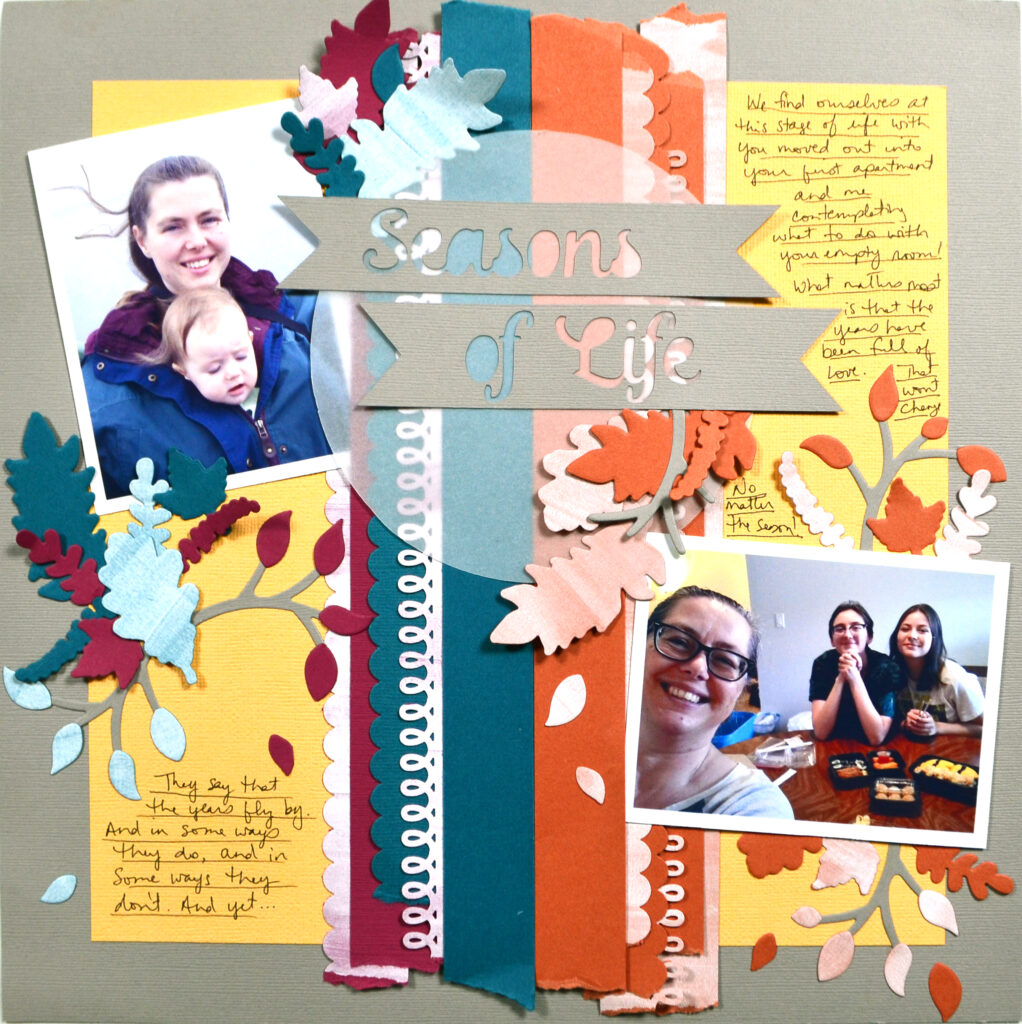
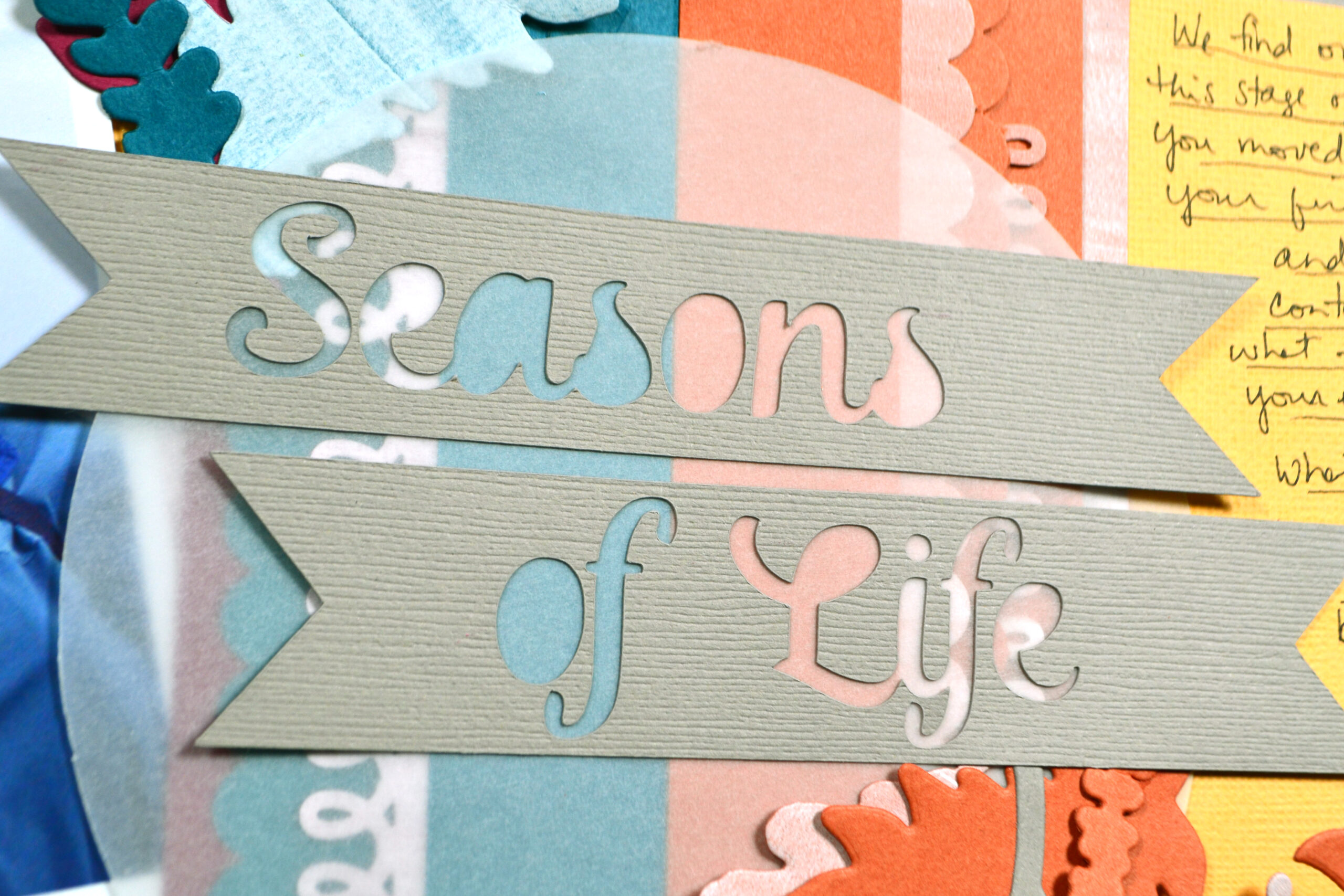
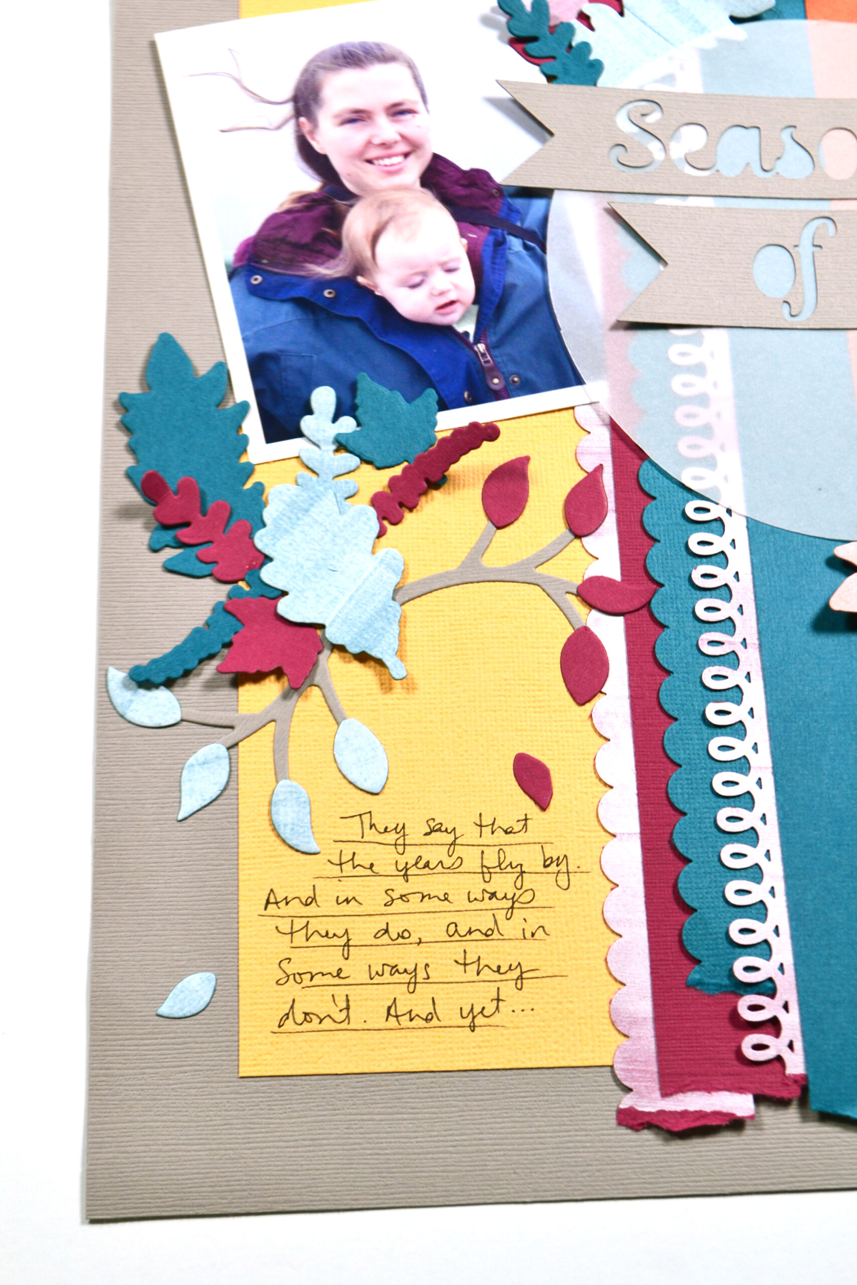
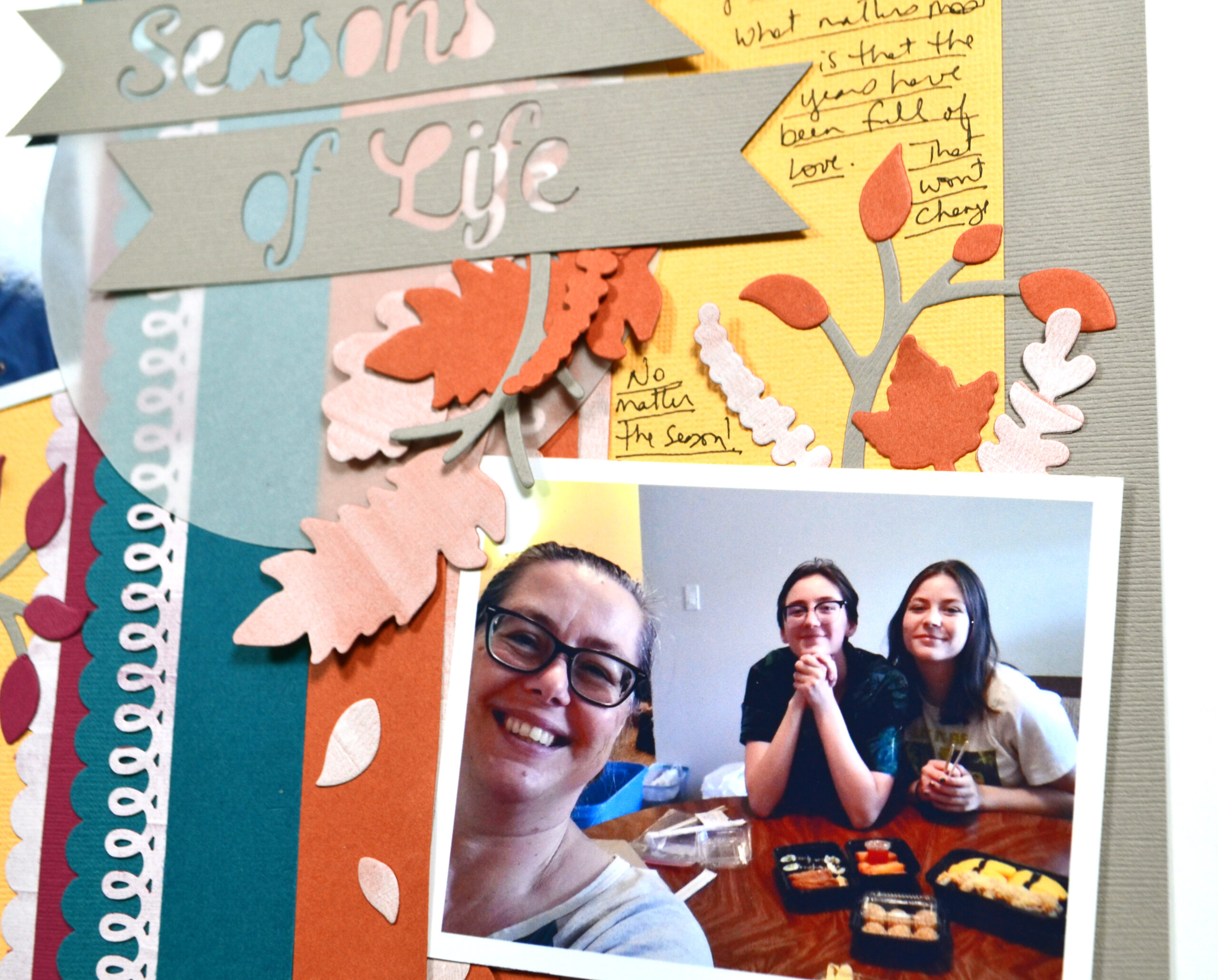
Okay, time to use those colors on a layout. In this project I’m talking about the changing seasons of my life—moving toward the “empty nester” season! Blog team member Alison does a great job showing examples of how she has documented her life’s seasons in her blog post, so be sure to read her take as well.
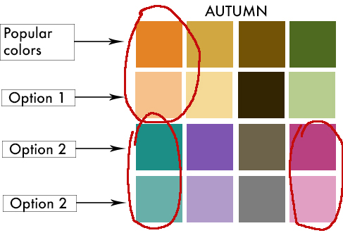
For my color palette I actually picked and chose among the grid. I created my own tints of the colors by painting white gesso over my colored cardstock! This color feels so much more fresh and modern, but still has an autumnal vibe. What do you think?
The process video below has more details on this layout coming together. That’s it for me this month. Until next time, have an artful day!
(If the video is not showing up, you can follow this link to YouTube until we have the video glitch resolved!)