We are working on color challenges here on the blog this month. Nikki created her 2022 Christmas card using two different color palettes from Pantone. Plus she offered up a free file for you to use, so be sure to check out her post.
As for me, I’m going pastel. Pastel in December you ask? Many people may only think of pastels as being spring colors, but I’m here to share that they can work well for our winter holiday season too!
For my color challenge I am going to revisit the color shifting information I shared back in September. That post covers a bit of color theory with plenty of visuals. If you haven’t read that one, you may want a refresher before we dive into this one. One of my color shifting ideas from that post is all about lightening up your colors. So my challenge to you is to use lighter tints in place of more traditional colors. In particular I am going to take traditionally saturated color palettes and tint them into pastels!
Pastel Christmas
Let’s start with Christmas. The traditional colors would be rich red and green. I’m going to go with lighter versions of those colors. That means tinting red to end up with pink (yes, pink IS light red!) and shifting rich green to a more minty color.
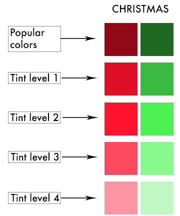
In choosing tint level four I now have a pastel color palette! Take a look at the layout using this version of Christmas colors. Doesn’t this lighter version of the colors lend a more whimsical feel? If I had used the richer colors it would have changed the mood of the layout entirely. I wanted a lighter mood for this silly Christmas event I share with friends every year. By using this color palette the reader instantly gets the feeling of fun. Perfect mood setting for the story.
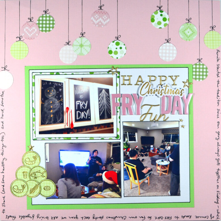
If you enjoy process videos I have one up for this layout.
Pastel New Years
Up next is a New Years layout. For this next project I’m going to shift my colors to very light tints again, but for a very specific reason. The colors in my photos were purple, orange, black and a bit of red. I hid or cut off as much of the red as I could from the photos to simplify the color palette. That left me with orange, purple and black. Those are very Halloweeny colors, yet these photos are for new years! Now the reason for the color shift should be clear. I need to do something different with my colors so it doesn’t give off an instant Halloween mood!
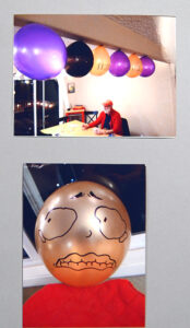
I could go with an entirely different color scheme than my photos… OR I could use those colors but change them up enough to fit the season. I knew I could change up Halloween colors to work for this New Years layout! Another pastel color challenge accepted!

I really liked the last option: a blush color, a silvery gray, and lavender. The colors feel very light and fresh—a good feeling for a new year. Plus silver is a the sparkly version of gray so this gives me a good excuse to bring some bling into the layout. That is perfect for New Years also!
The hard part of a color challenge of course is finding products in my stash that work. I thumbed through my papers and came up with things that felt as close as I could possibly get. My “lavender” leaned toward blue and was an ombre including much deeper shades. But I could make it work. My blush/peach felt pretty close. Choosing between two grays, I chose the lighter gray that had more of an orange undertone to it so it would pair well with my peach. That top most gray paper fit the bill.
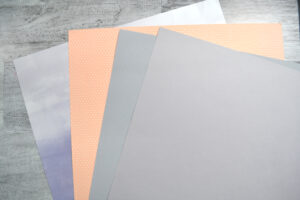
With my color palette in place I was ready to create! I did frame the whole thing out with black since that lends a solid foundation without distracting from the overall color scheme.
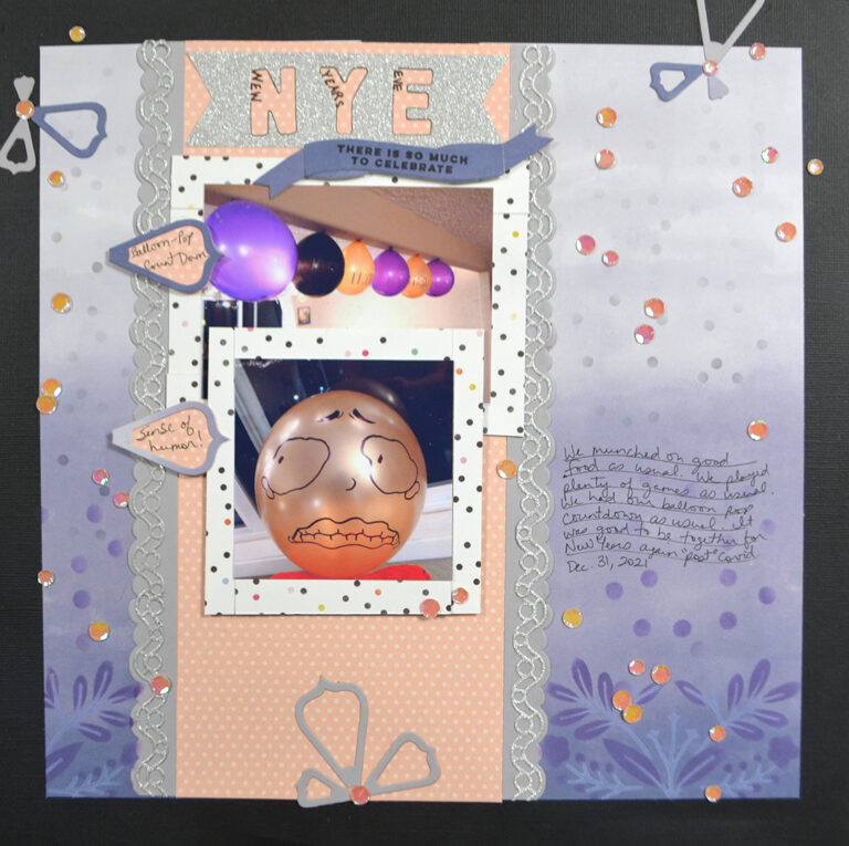
There you go! Two pastel color palettes used in December. So, what do you think? Are you going to take on this pastel color palette shift? If you do, share your work by tagging @ScrapHappy on your social media.
Happy New Year!! Our team will be back with you in January for more scrappy inspiration.
