
White space and I are not currently buddies. I admit that my layouts lately tend to be, what I lovingly call, full bodied — what others call “too busy”. When I sit down to create I often lose track of the bigger picture and I continue to add stuff because the flow feels satisfying in the moment. When I step back I find that I’ve filled up every inch of space.
Sound familiar? Well let’s work on this problem together. First we need to know why filling up every inch isn’t necessarily the best approach. Nikki reminds us in her post why white space matters. One of the points from her post that I’d like to reiterate is that it improves readability! If we are telling our stories, we want people to be able to read them!
So what is white space exactly? This website’s definition clicked with me the best. Check it out.
“White space… refers to any blank or empty space surrounding all the other elements in a design composition. It is the space between text, images, buttons and other objects that a user can see on a page or a screen.”
JOAN ANG
I particularly like the reminder that white space includes the space around and in between elements. I will come back to this point a bit later on! For now let’s take a look at different ways white space can be implemented on our layouts. I will walk you through layouts I created in the past, when I payed more attention to my use of white space! By doing so I hope I can help you—and me!—incorporate more white space to keep our stories readable.
Surround Your Focus
When I hear the term “white space” this is the idea that comes to my mind first. This version of white space feels classic. All the main elements lie within a zone that is entirely surrounded by nothingness. As just a quick reminder, that “nothingness” doesn’t have to be white either. Other solid colors or very subtle patterns count as “white” space also. Here, none of my white space is actually white!
Also, notice in the final example that the white space is getting pretty thin. This is where it can shift into more of a border design element than classic white space. I think design ideas can exist on a bit of a continuum. Where one begins and another ends can be up to personal interpretation.
Split Design White Space
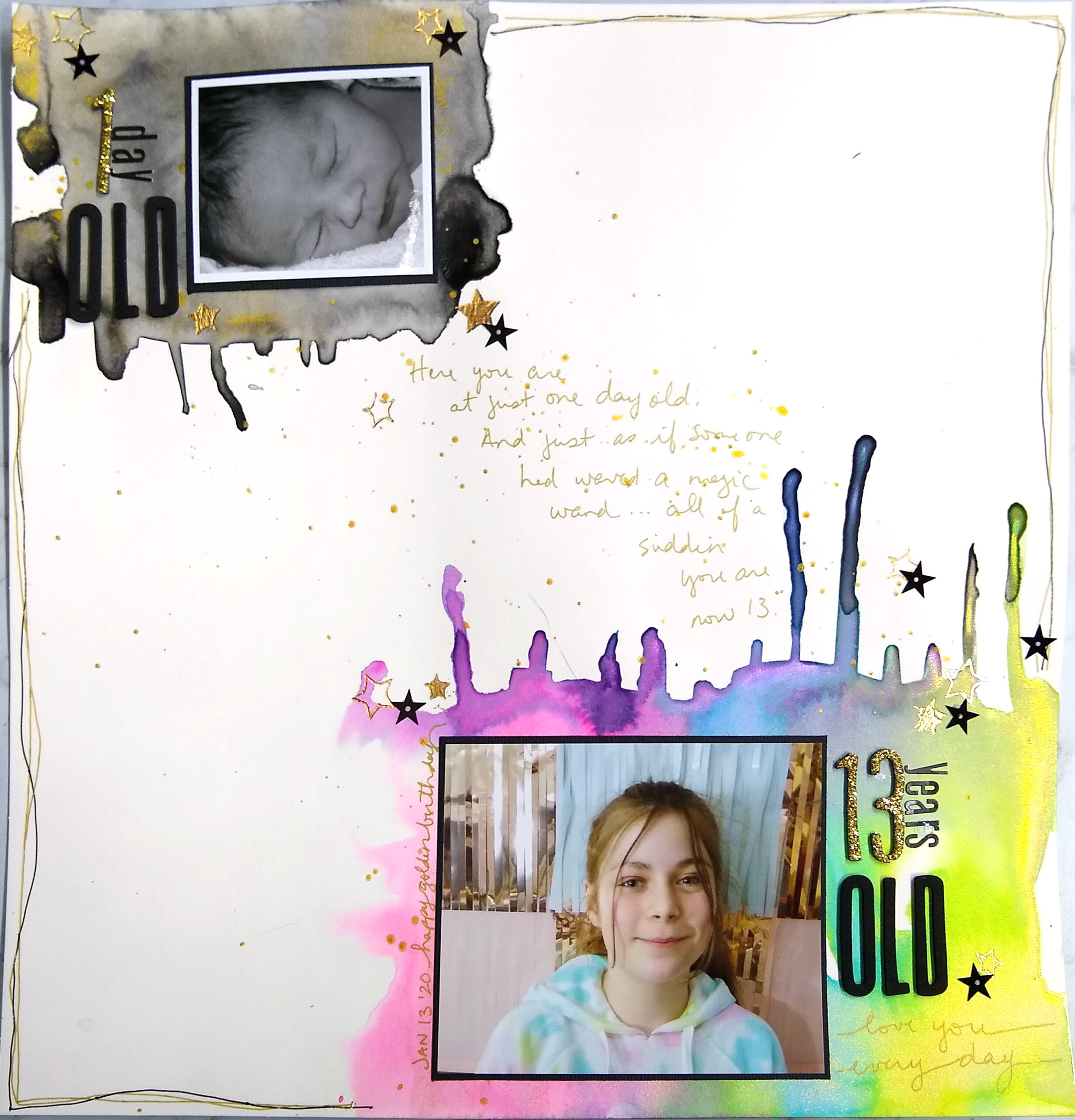
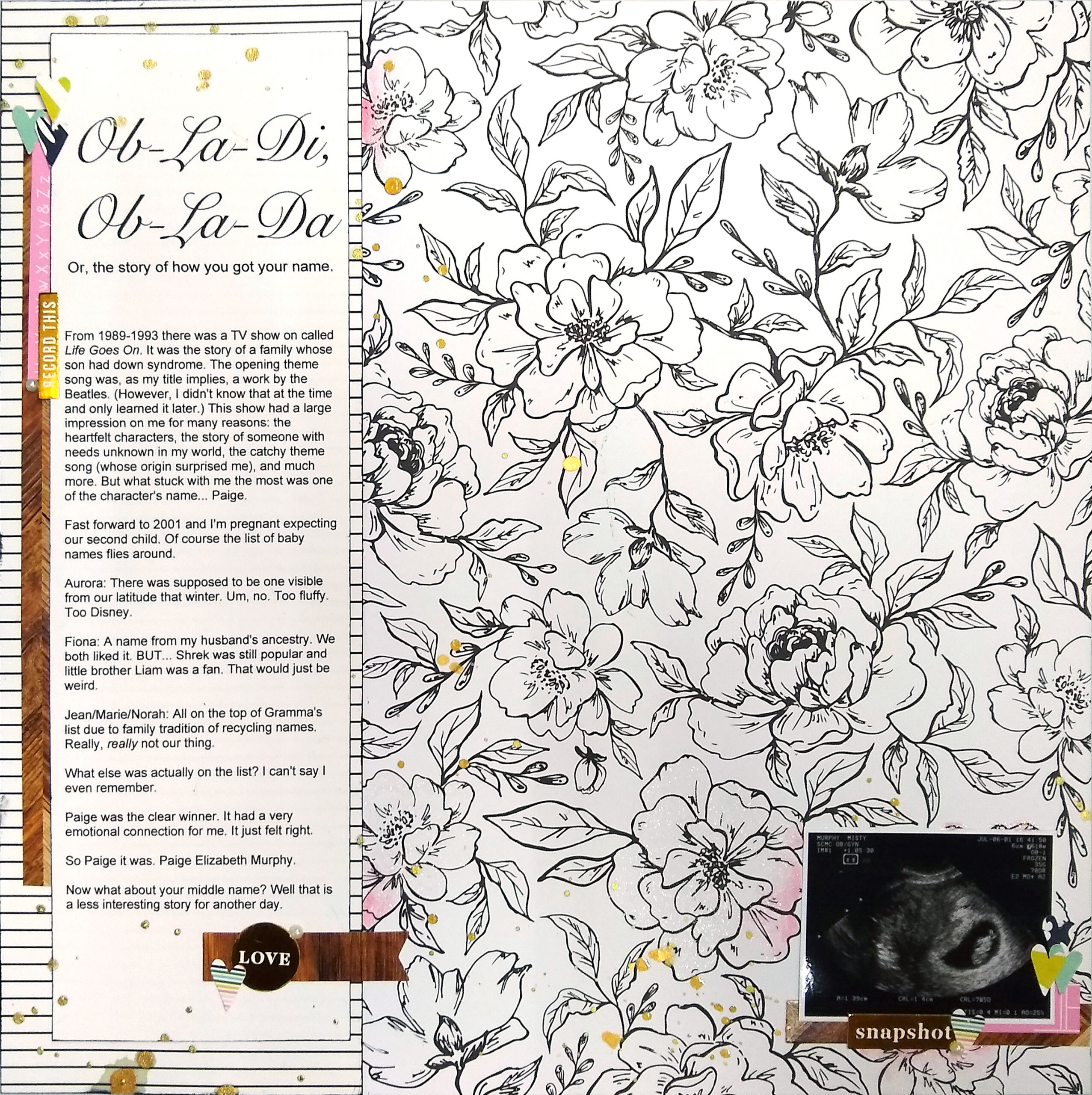
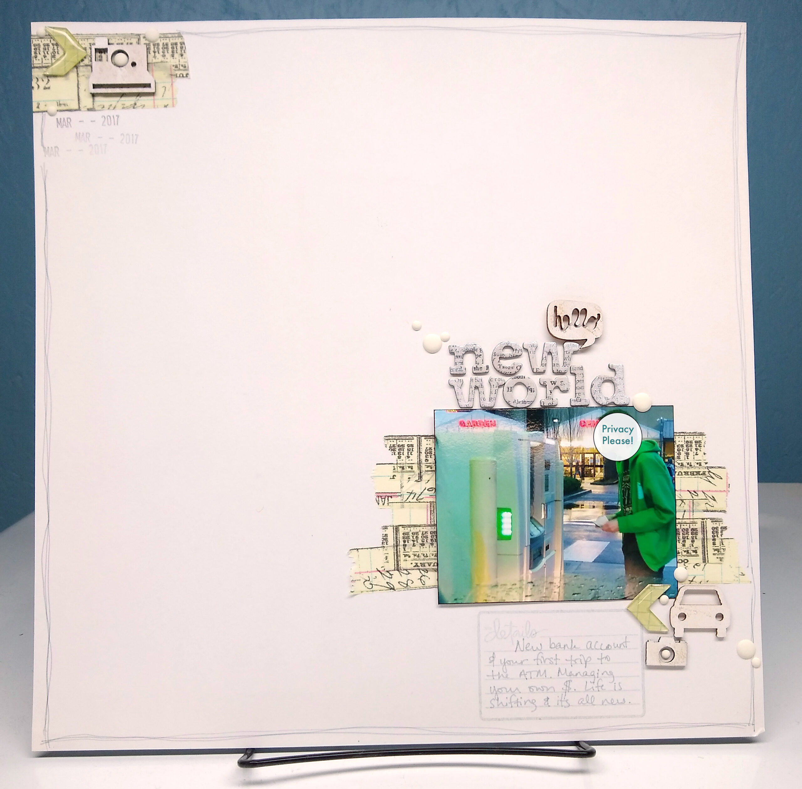
Surrounding your images with white space isn’t the only way to go about adding in this resting design element. You can divide your project with half of it being focus space and the other half being resting space. Dividing the project perfectly in half isn’t the point. The point is to allow a good portion of the space on one side be that open white space. The next three layouts will tackle that idea of divided space.
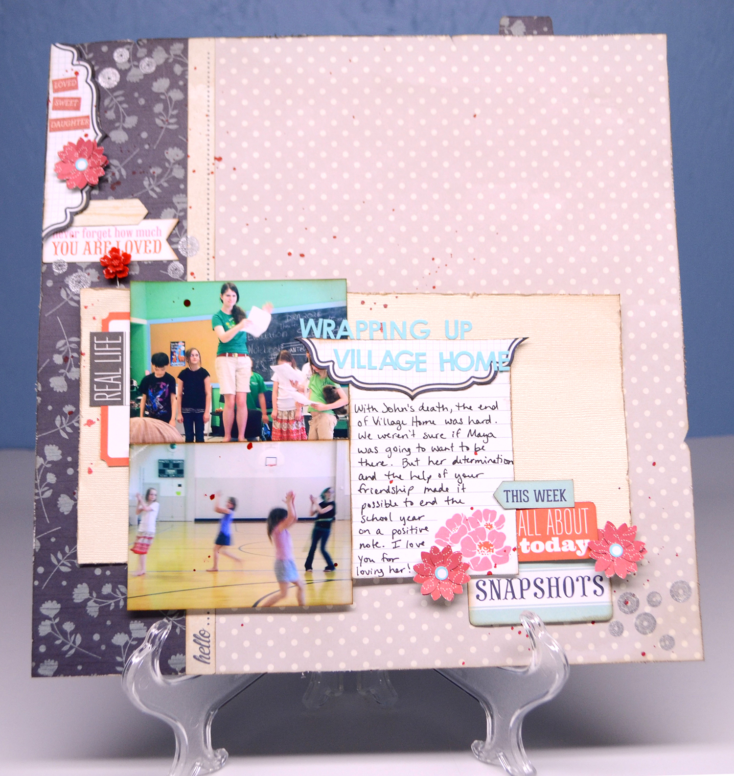
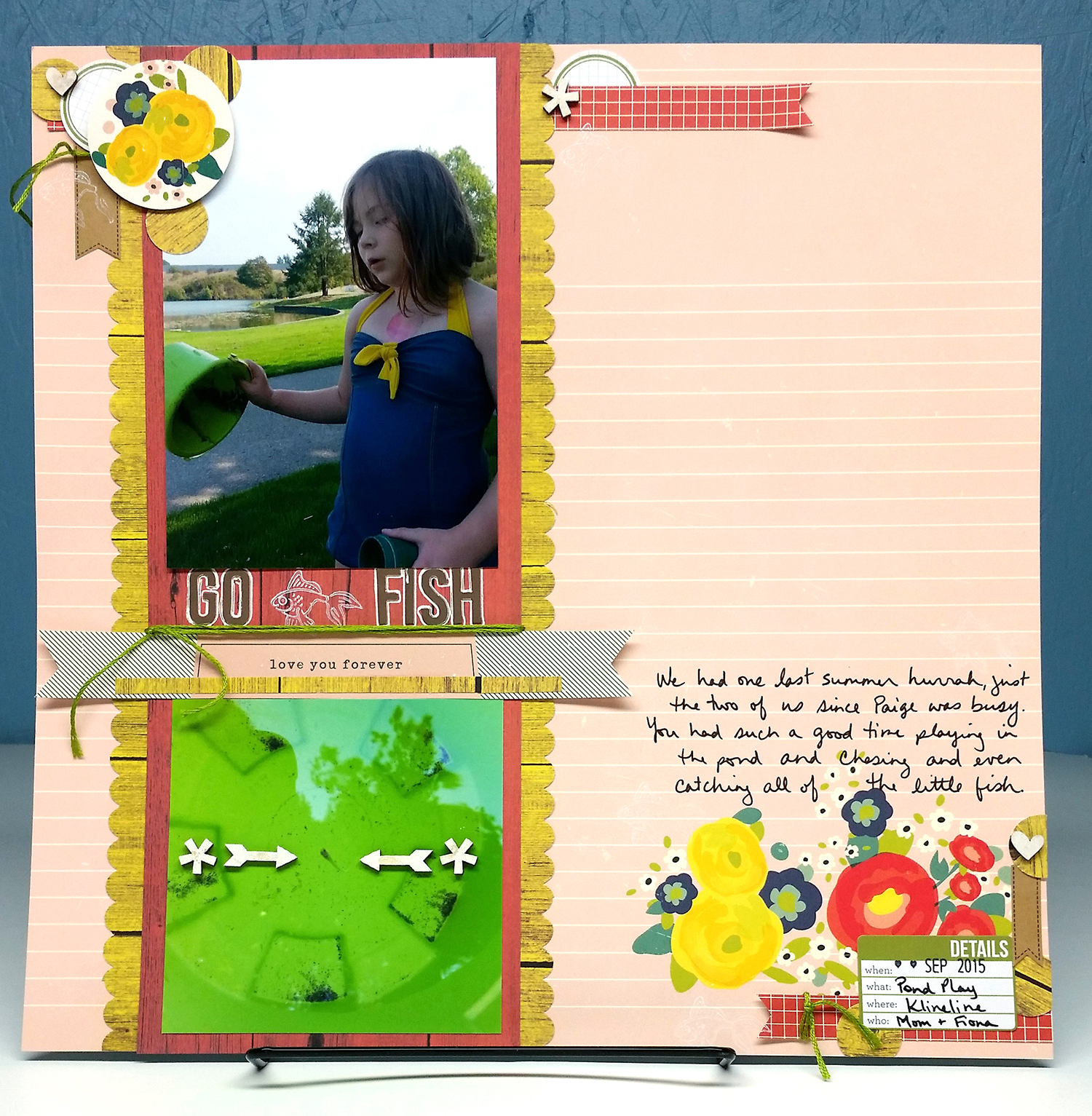
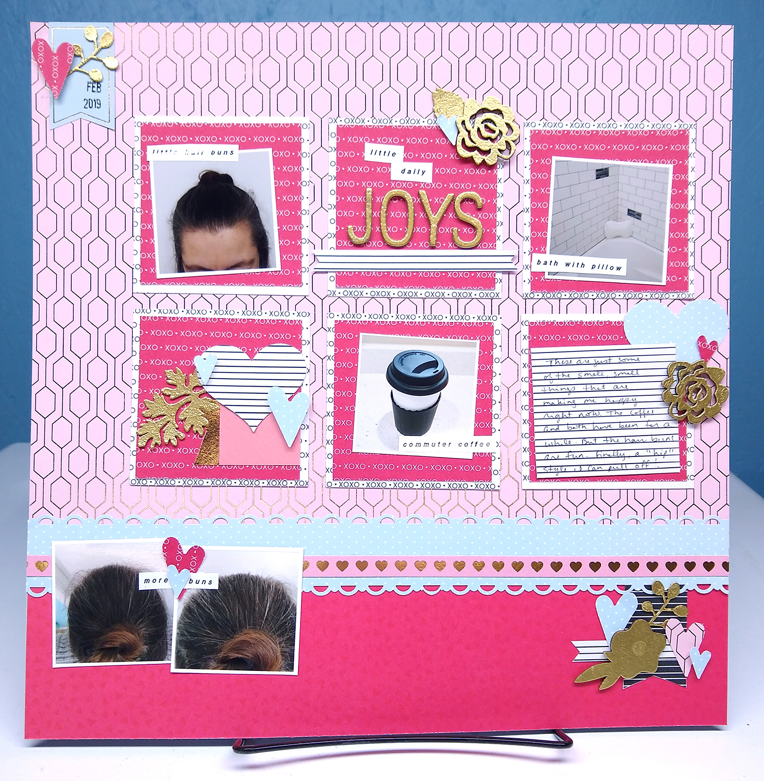
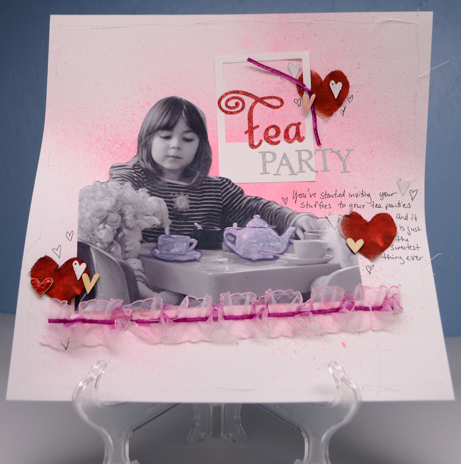
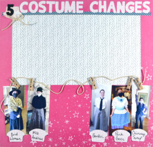
Image 1 almost divides the layout in half from top to bottom and leaves that top half more open.
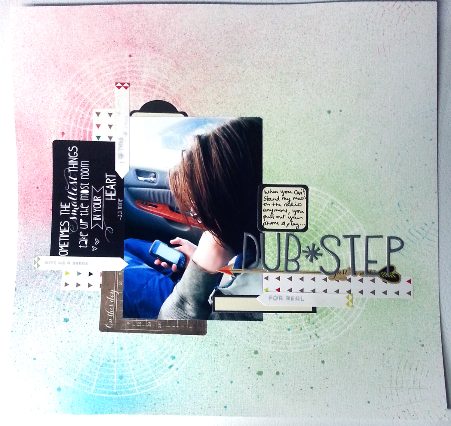
Image 2 actually divides the layout into quarters and only leaves one quarter open.
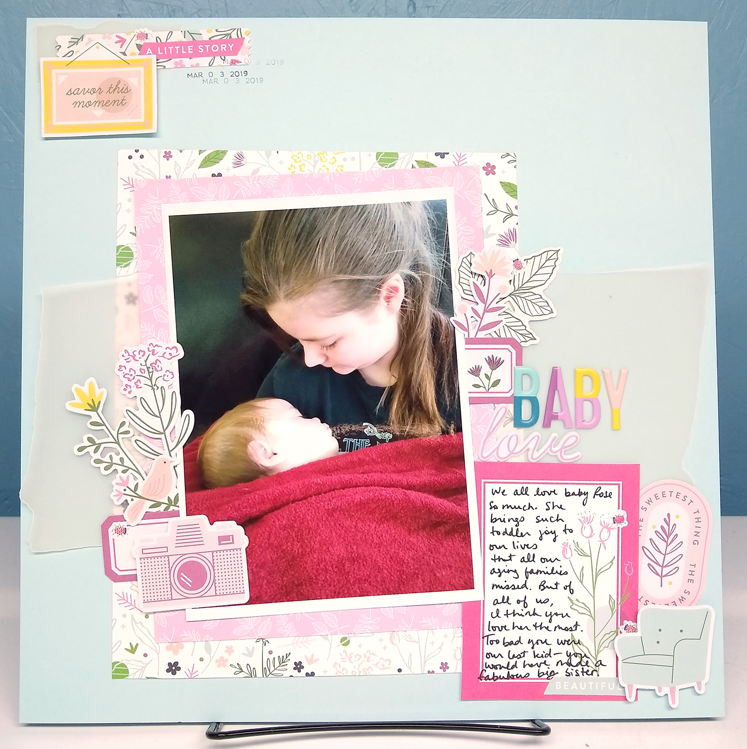
Image 3 takes a mixed approach. The layout is divided, but the white space is used differently between those divide spaces. The upper portion takes a surrounding approach and the lower portion takes a central white space approach (more on that next).
Before we move on, the next two layouts are double pagers and offer a couple more perspectives on split white space.
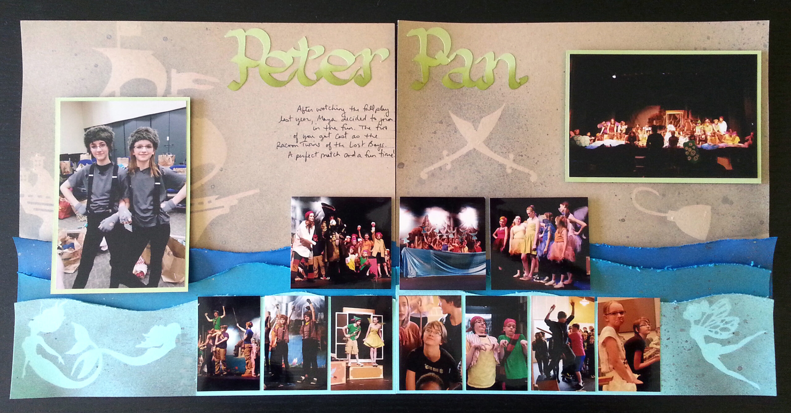
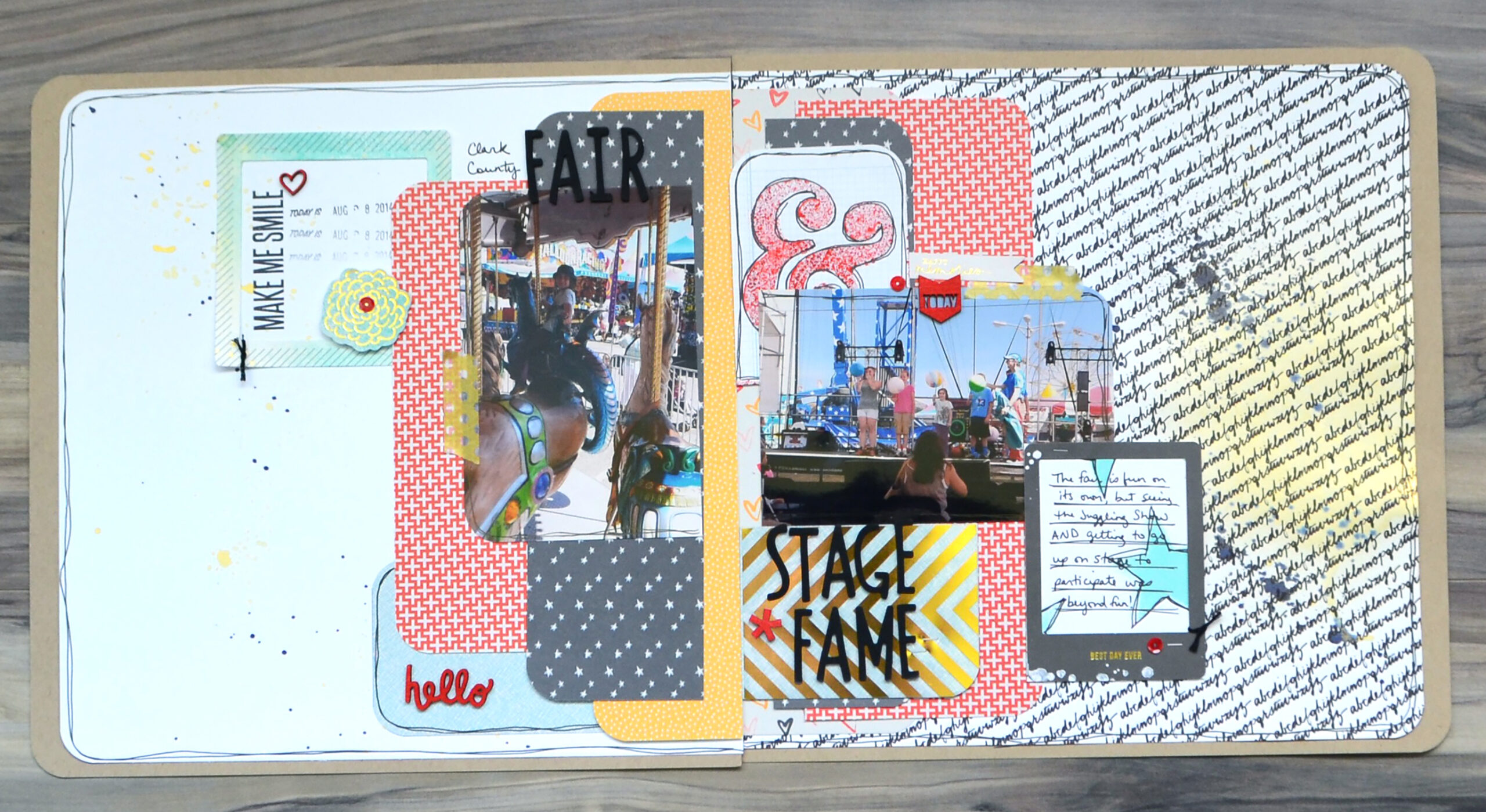
Image 4 stretches the idea of white space just a bit. Yes the design is split, but that upper portion has more elements to it than typical empty white space. However, those elements are fairly subtle so they can still read as white space. What do you think? Does that still count in your book?
Layout 5 takes the split space idea across a double page layout. Only about one third of this project is classic white space on the left. Do you think that is enough resting space to offset the very busy print on the opposite side?
Central White Space
White space can also be found sandwiched between other elements. I think of this white space as being central white space. Here are three examples of what I mean by that. The first layout feels very much like the white space is the filling in between the main elements—much like an Oreo cookie. (Did I just invent a new design style? The Oreo cookie layout? LOL). The second two examples aren’t quite sandwiched, but these were the closest examples I had from my photos.
Let It Breathe
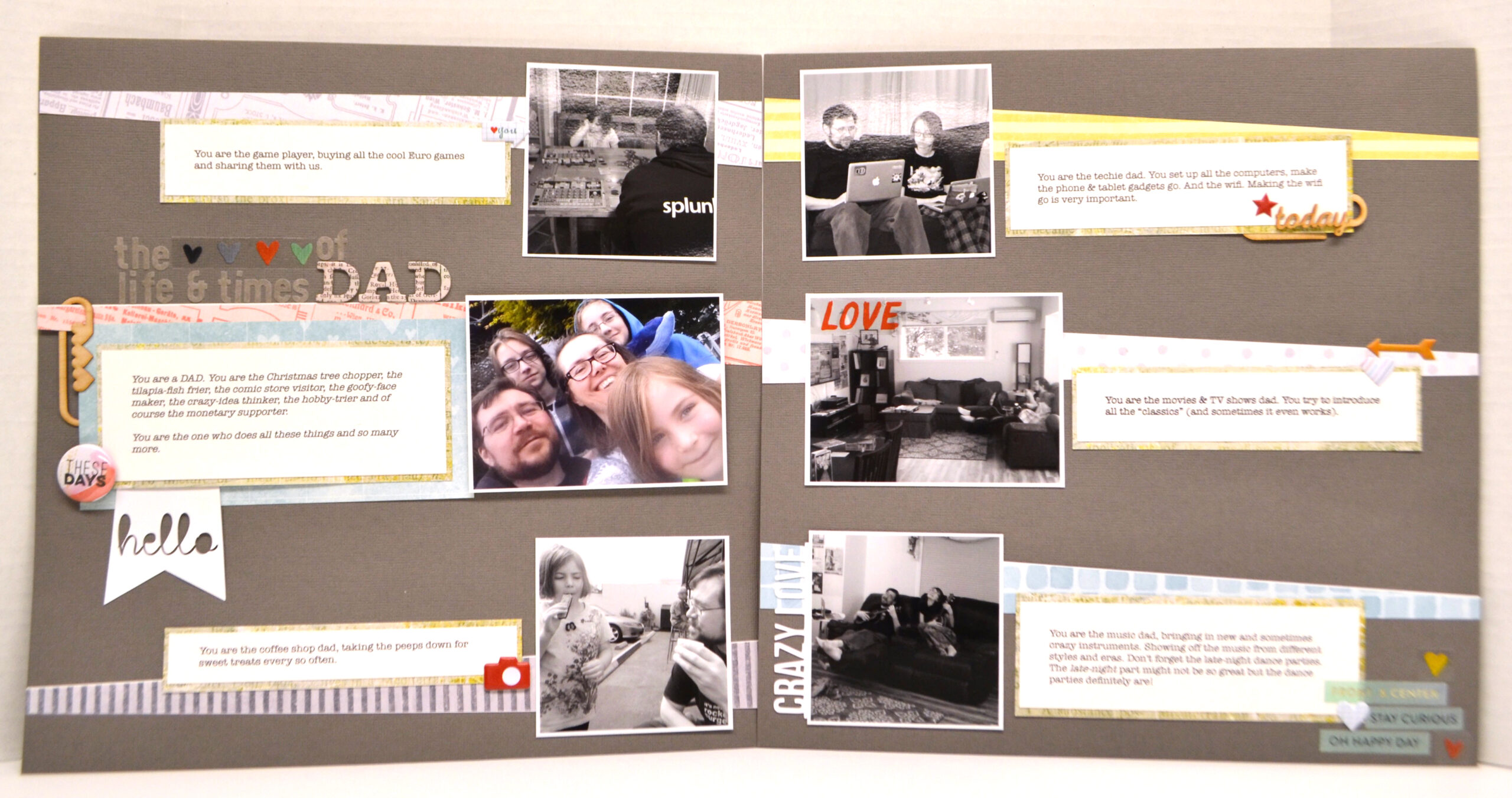
Remember when I mentioned white space including the area between elements. I think of this as letting elements have breathing room. When you put all those elements on one page, that container holds them as one story, but when you give them room to breathe they can act as their own sub stories as well.
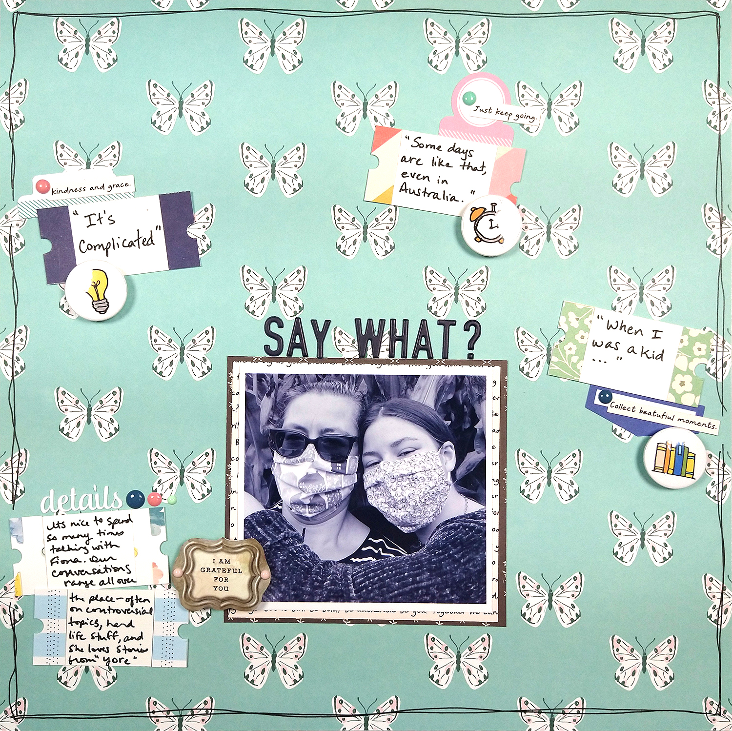
You can see in layout one how each section is it’s own story about an aspect of my husband’s fatherly personality. Layout two isn’t quite true white space with that busy butterfly pattern. But you can see how the story elements have been given their own breathing room on the page. They stand alone as their own element and yet work together as part of the whole.
Reverse It
I started off by this post by discussing surrounding focal elements with white space. Well, we can also reverse that concept and surround white space with elements. When I was pondering this concept the next layout came to mind.
Imagine if you will that the area outside of the circle was a pattern paper. That would mean the empty space inside the circle would be surrounded white space. I wanted to explore this idea more.
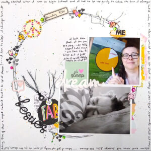
I thought for sure I had an example of this type of layout in my photo catalog, but no luck! So that meant I needed to create a new one just for this post. Here is what I came up with. I’m not entirely convinced about this one for several reasons. If I had more time I would give this concept another try.
What do you think? Would you try a surrounded white space layout?
That is it for me this month. Before you go, if you haven’t seen Alison’s post on using white space in your Albums you should go check that out. I had never really thought about albums in this way since my books are just running narratives. But I can really see how her idea can add punctuation and emphasis to the flow of a much longer narrative.