
This year the ScrapHappy membership is looking at unexpected sources for layout inspiration. Alice Boll, our ScrapHappy leader, and Sara, from Sara Scraps, will be bringing inspiration and classes to the group to share their ideas. Here on the blog we will take those ideas/sources and put them into action on our own layouts.
January’s source of inspiration is book covers! This is a fantastic place to find ideas. Book covers need to be clear and eye catching to compete with all the other books on the shelf. They also need to lend a sense of what the story holds inside based on a simple glance. Those elements come into play for layouts as well.

I scrolled through my GoodReads reading list from 2023 to find book covers. There are plenty of other sources for book covers as well. You can search a library catalog, Amazon, or any bookstore online. There is no shortage of places to look.
Since I read every day, my GoodReads profile had plenty to choose from. However, finding covers that were reproducible was another story. While I felt the need to eliminate covers with heavy artistic graphics, I will touch on those a bit later in the post.
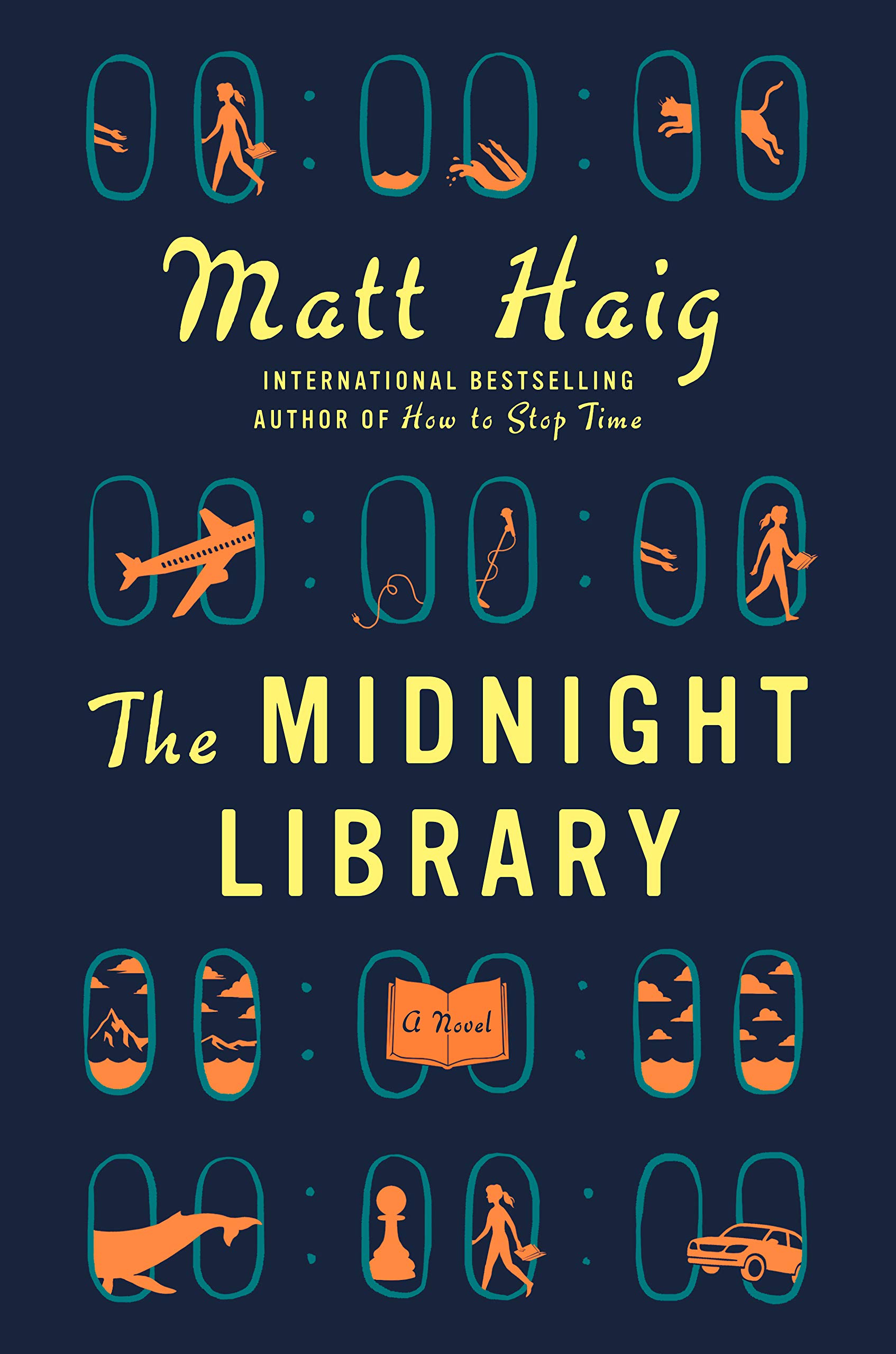
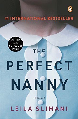
As I was scrolling and eliminating ideas, I hit on the cover pictured above. It felt perfect. It had simple rectangles, a semi-monochromatic color scheme, and a bit of visual depth and shadow to play with. In addition, I liked the unexpected angle everything was set on. My plan was to closely replicate it. However, this is not the only way to be inspired. More on that later.
I had no idea what story I would pair with this layout design at first. I started flipping through my story album (a binder I keep pre-printed photos and ideas in) and landed on the photo below. A mental click happened. The cloud image on the book cover made me think of the internet cloud. That gave way to telling this story of modern day connection via “futuristic” technology!
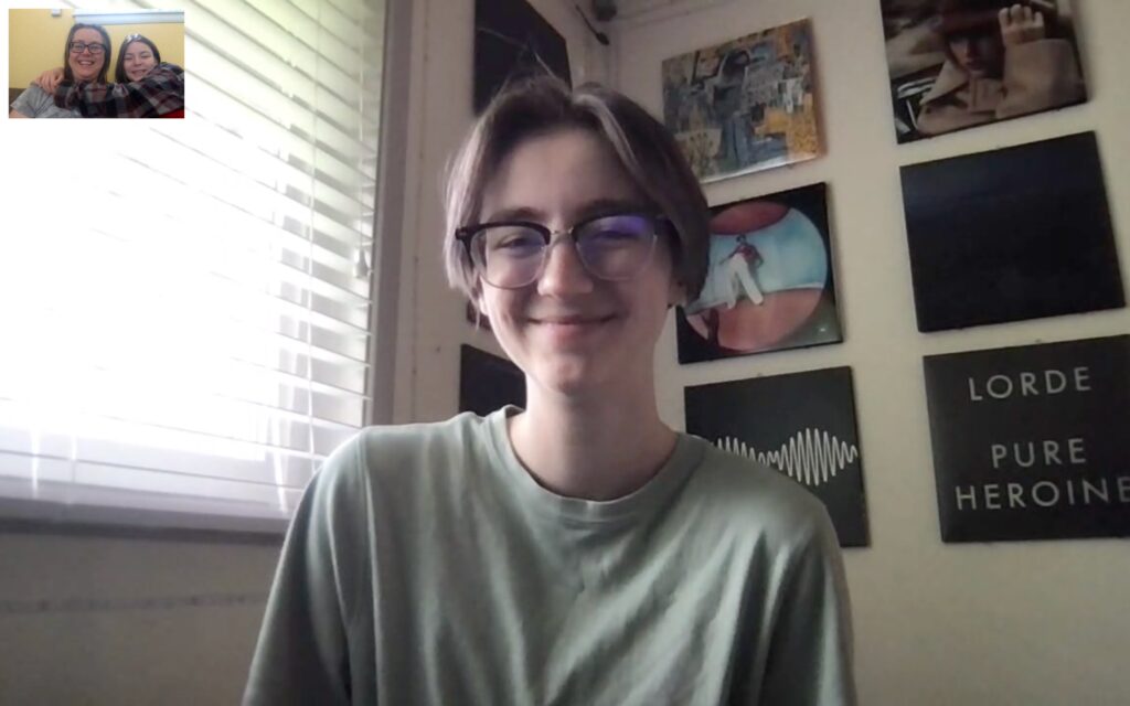
This photo had a couple of challenges. First, it was rather large for the overall layout design. Also, it has a secondary tiny photo up in the upper left corner. That secondary images plays a big role in the overall story, yet it is getting lost in all the visuals. So, fitting that picture onto this layout was the next stage I had to work on. Yet, I didn’t tackle that right away.
Instead, I set about creating the base page first while my brain contemplated the previous problem. My base page consisted of 3×4 rectangles of red card stock layered with slightly offset black cardstock. This gave me the shadow effect I found interesting in the inspiration. I saved aside one red block to be popped up on foam before layering on the black paper for a truer depth effect. This central block will hold my photo(s). I also planned on incorporating the cloud in some way on that central block.


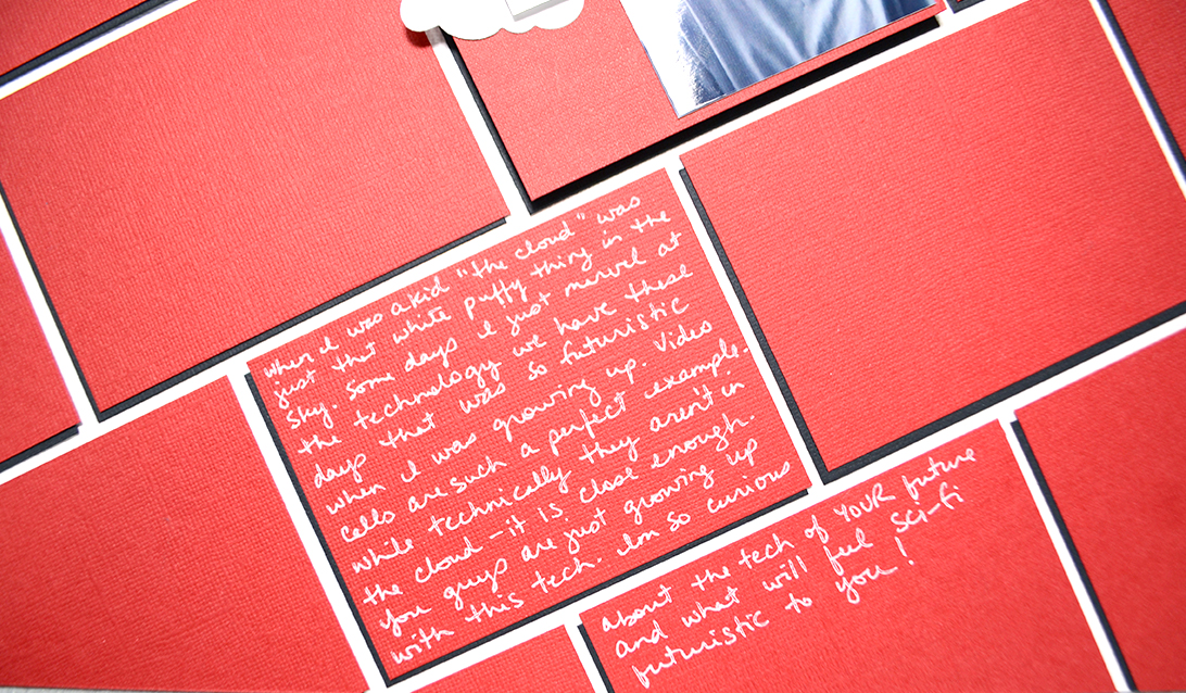
With a bit of photo trimming and finding the right cloud die cut, I was able to fit the photo elements right onto that central block. Plus the teeny tiny photos (I had two similar prints of the same photo to trim images from) nestled on that cloud gave them the emphasis they needed. With my journaling added in to visually offset the tile, my layout was complete.
You can easily see how the book cover directly led into my layout. However, I do want to touch a little bit on less direct ideas. While I won’t share full layouts, I will walk through just some of the ideas that can be taken from the book covers shown below.
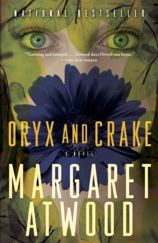
The above images were three book covers that I paused at when I was trying to make my final choice. They each had elements that caught my attention. Let’s take a look at them from left to right.
The left cover has an interesting color scheme of yellow, teal and orange. While those colors are more stark that what I would normally use, the small doses and the grounding on black mellows them out. The cover also has a grid structure that could translate very well to a layout. (By the way, the blog team talked all about grid designs here, here, and here if you want more inspiration.) The other thing that caught my attention was the plethora of little images. These could be places for small photos, or lots of embellishments. I found plenty to inspire me from this cover!
The middle cover is very different. It has a large bold image. This could lead to a layout with one extra large focal photo. The colors are always an option as well. They range from yellow to chartreuse to deep green. The flower also ranges from navy to black. Speaking of flowers, this cover could inspire a botanical heavy layout, either as pure decoration or as part of telling some sort of garden/nature story.
The cover on the right is a closeup picture of a shirt. That may seem an unlikely source of inspiration. However that is exactly why we are doing this challenge! What could you draw from this image? Of course colors are an option. The one thing I thought of was the layout design itself with columns bordered by scalloped or lacy edges. You could also take an embellishment idea to use buttons. Or perhaps that row of dots could inspire some bulleted journaling.
I hope you can see that there are a variety of ways that book covers can inspire your layouts, from overall design to simple smaller details. It does not have to be an all-or-nothing process. You can pick and choose certain elements that call out to you.
I’m very curious to see how everyone will interpret book covers. I’m off to check out the gallery in our Circle community! If you aren’t already a ScrapHappy member, you may want to join us for this year of unexpected inspiration!