We are all about split page design on the blog this month. Nikki leads you through her thought process when creating a divided page, and boy is it lovely. Alison uses EASY math to teach you how to split your pages. Finally April shares a gallery of split page designs and proves that these ideas are timeless.
What my team mates mentioned, but only touched on, was the idea of diagonal split page designs. I decided that is where I could fill in the gap this month. So let’s talk 5 reasons why diagonal split designs are effective. (Okay, honestly these reasons apply to any split design, but it made my title catchier!)
Here is the basic list of what can be accomplished with this design style, then we’ll go over each idea one by one.
- Create an attachment point/grounding/anchor
- Divide information
- Create a Focus
- Add resting/white space
- Lead the eye
1. Create an anchor
This idea is called grounding in the design world. Much like the actual ground holds objects, creating a space on your layout to attach elements to can help them feel anchored. Without this attachment, things can seem to be floating around. Imagine if your house wasn’t touching the ground. That would feel really wrong wouldn’t it? Our brains are geared toward the reality of grounding. (If you’ve ever looked at a page and felt like something was off, check for grounding as a starting point in troubleshooting.)
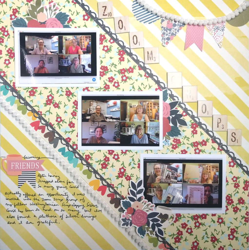
This layout uses diagonal stripes to divide up the space. But imagine those stripes weren’t there. That photo would be sitting on “nothing” and it would feel off. The paper strips also give the title and subtitle/journaling words a place to sit.
Plus this diagonal split gives the layout some resting space and offers the eye a path. But we’ll cover those topics as we go!

2. Divide Information
In the above layout I overlapped my divided space with a large photo. However, most of the time a split page design is there to actual split up, or divide, the space into sections. Those sections give you compartments to contain various aspects of your stories. I mentioned this last month as well when we talked about grid design.
The layout below roughly splits the design into thirds (remember Alison’s easy math split design??) Now I have three spaces to hold the three key elements of my layout: photos, journaling and title. This grouping of elements can help the reader take in one thing at a time before moving on to the next.
(I know my photo has glare, but the title reads Zoom Crops.)

3. Create a focus
When dividing up space as in the last layout, we can use space to separate out information. That give us another opportunity: to highlight the most important information. If we create a space that is larger than the other spaces, it will draw more attention and feel more important. That definitely gives it the focus. The remaining space can be used to add in more details.

4. Add white space
This next layout is a different shape of dividing up space on a diagonal, so I’ll call it a semi-diagonal. Definitions aside, it still represents a reason that it is effective: creating resting space. White space is the design term given to this concept and the team tackled white space back in January, from Alison’s White Space in Albums post, to April’s Solution for Busy Photos post.
Now, I took this photo before I had added in my journaling, but the central focus of the page really tells a story on it’s own. In the last layout we created a focal space and used the rest of the space to add detail. In this one the central space really is all that is needed. The rest of the page is a place for the eye to rest as we think over this information.

As you look over this page, what thoughts are going through your mind? Did the title alone start sparking your own memories of music and/or holidays? Your mind can mull those thoughts over as your eye drifts to quieter areas of the page. Then you can dive back into the focus and see what other thoughts come up—perhaps ideas around fire, or cooking? Then your eye can take a break again while those new thoughts float around. That white space literally leaves room to think!
5. Lead the eye
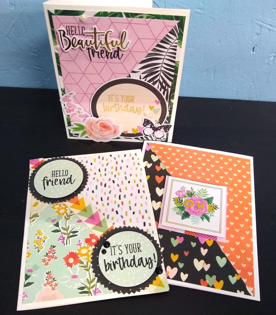
I think leading the eye is particularly well suited to a diagonal split page design. In Western cultures we read left to right from top to bottom. So if you create a diagonal from the top left corner to the bottom right corner, you get an automatic lead for the eye. Your brain naturally wants to follow a familiar path. (Especially if arrows reinforce that path as in the bottom left card!)

I don’t want to stop there with this concept since using this idea can work to our advantage for different types of stories. Imagine if you reverse the direction of the diagonal—top right corner to bottom left. By doing that you create an awkward feeling, which could be a technique for a story that has jumbled or confused feelings.
Just be careful with the reversed diagonal. Sometimes it can be a detractor instead of a benefit. Notice the two flat cards used the left to right diagonal and I fell like they are way more effective than that upright card. With that card I did the right-to-left diagonal and I feel like it draws the eye to the diagonal line first, then down to the “sub title” and then you are left searching for the rest of the elements since you don’t normally go back up again to keep reading. Like I said that can be a technique if you want to create some confused feelings in your design, but in this case it was just a design oversight as I used up my scraps of paper! Sometimes we learn just as much by things that don’t work, as we do by things that do work.
Circling Back

That brings us back to the first layout in this post. This layout is a “reverse” diagonal. So why does this one work when the card example doesn’t? I think this layout shows how interconnected design concepts are. The photo is so large that it draws the eye first: design concept of proportion. Then the eye catches the title next for a couple of reasons, one of them being: contrast. The colors stand out from each other and draw the eye. Then our reading brain kicks in and we follow that top to bottom path as we read the text. At the end of the text the eye is left on a diagonal path leading back up to the photo. That leading line keeps the eye going back to the beginning and the process starts again. That is the idea of movement in design. All of these concepts together create an admittedly simple, yet functional design.
I hope you can see as we break down design into different chunks over the course of this year, these concepts all mesh together in various ways. So, while those are five reasons why diagonal split design is effective, these reasons certainly do apply to other design concepts as well!
What do you think? Did I miss anything? Would you expand on anything? Let me know in the comments. And until next time, have an artful day!
